The best way to judge a branding consultancy is to look at its case studies. A good case study shows the business problem, the approach and how the brand was applied in the real world. Below, we share Creativeans’ own case studies, grouped by sector, so you can see how our method works for companies like yours.
This article is for owners and senior managers of growth and mid-size companies in Singapore who are considering a brand project.
Why Case Studies Matter When Choosing a Branding Partner
A portfolio of logos shows taste. A case study shows thinking. It explains why each decision was made and how the brand works across the business, not only how it looks. For a business owner, that difference matters. A beautiful logo that does not fit your customers, channels or growth plans will not move the business forward.
A brand project is a large commitment of time, money and management attention. Before you choose a partner, you want evidence that they can handle a business like yours. Case studies give you that evidence. They also help you picture what your own project might involve, from the first research interviews to the final rollout. When you read one, look for three things.
The Starting Point
What challenge did the company face? It might be growth, a new market, a generation change, a name that no longer fits or a brand that looks different everywhere. A clear starting point tells you the project was driven by a business need, not just a wish for a new look.
The Approach
How did the consultancy understand the business before designing anything? Was there research with customers and staff? How was the brand positioning decided? A strong case study explains the thinking behind the work, so you can judge whether the same thinking would suit your company.
The Application
Where does the brand appear? Look for packaging, signage, digital platforms, sales materials and spaces, not only a logo on a white page. A brand only works when it is applied consistently wherever customers meet it. Case studies that show real applications, such as a shopfront, a product range or a sales brochure, tell you far more than a logo on its own.
A case study in a sector close to yours is most useful. It shows how brand positioning works for customers like yours, and that the consultancy understands the channels and pressures you deal with.
How We Approach Every Project
Creativeans is a brand strategy and design consultancy with teams in Singapore, Milan and Jakarta. Since 2012, we have built 300+ brands. We start with research, then design the identity and every touchpoint, through to brand rollout.
Our co-founders are Kimming Yap, a Registered Management Consultant (RMC), and Yulia Saksen, a Certified Management Consultant (CMC).
Our method for brand development is BrandBuilder®, in five stages. Each stage builds on the one before.
Stage 1: Brand Audit
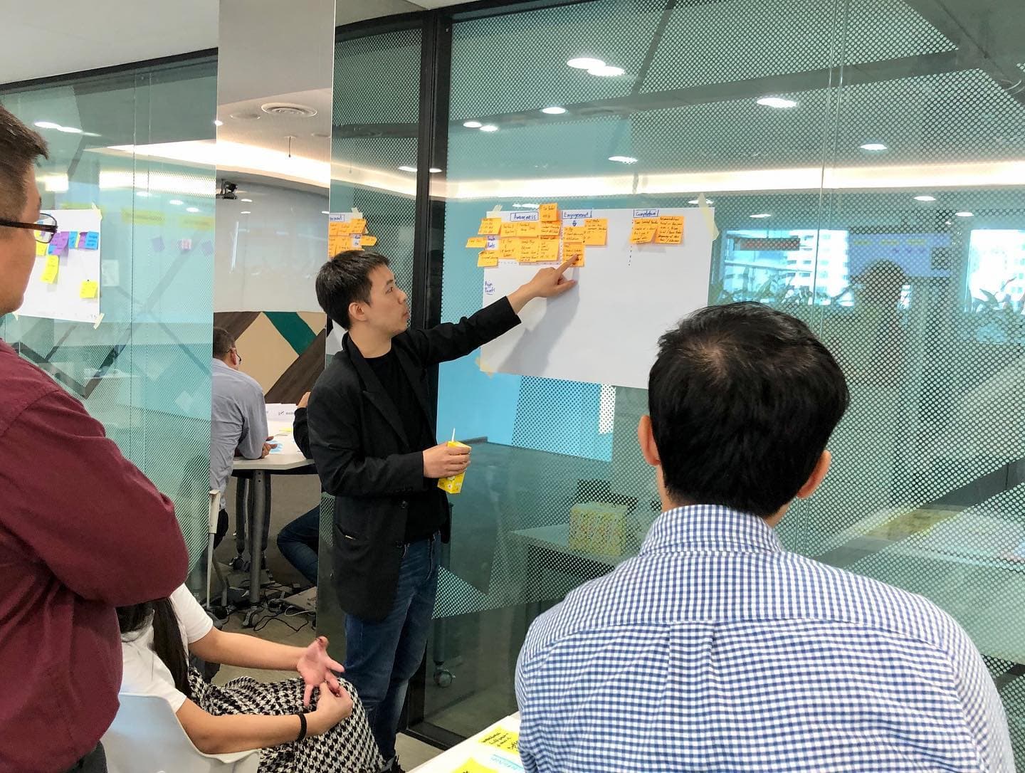
We study the business, its customers, its competitors and its market, often using a positioning framework to map competitors. Interviews with leaders, staff and customers show how the brand is seen today and which elements still hold value. This builds the brand foundation for every later decision.
Stage 2: Brand Positioning
We define the brand’s role, its promise and what makes it different. The result is a brand platform, captured in a clear positioning statement. Brand positioning is the step most companies underestimate, yet every later decision depends on it. This stage usually involves workshops with leadership, so the final direction reflects the ambitions of the people who will drive it.
Stage 3: Brand Identity
We turn the strategy into a visual and verbal system, including brand personality. This can cover the name, logo, colours, typography, imagery and tone of voice. Because the identity grows from the strategy, each element has a reason to exist. For established businesses, we look carefully at which existing elements customers already recognise, so the new identity builds on that trust.
Stage 4: Brand Touchpoints
We apply the brand wherever customers meet it. Depending on the business, this can include packaging, signage, websites, sales materials, uniforms, vehicles and spaces. We map the customer journey to decide which touchpoints matter most and in what order they should change, because few companies can update everything at once.
Stage 5: Brand Rollout
We plan the launch, the guidelines that keep the brand consistent and ways to track brand performance. Clear ownership after launch helps the brand stay consistent as the business grows. Internal launches matter too, because employees who understand the change become the brand’s most credible ambassadors.
Each sector brings different challenges, so each project starts with understanding the business before any design begins. The case studies below show this method applied across three groups of companies.
B2B and Industrial Brands
B2B and industrial companies sell to buyers who compare suppliers carefully. Products can look alike on paper. Purchases often involve several decision makers, long sales cycles and distributors or tenders. For these companies, a brand must explain expertise clearly and build trust before the first sales meeting.
Clear brand positioning helps a supplier stand apart when products look alike, and a value proposition that buyers understand quickly can turn expertise into a competitive advantage. Brand messaging must work for engineers, procurement teams and management alike. Companies with several divisions also need a clear brand architecture. Done well, the brand supports ambitions for market leadership in the sector.
VOREL (Electrical Distributor)
VOREL is a Singapore electrical distributor serving the data centre, industrial, oil and gas, and renewable energy sectors. Formerly known as NOKS Offshore, the company had a name tied to offshore products, although it offered much more, and its identity lacked consistency. We renamed the company VOREL, built its positioning around the essence “Experience Reliability”, and created a new logo, a graphic system with three patterns, a brand manual, communication materials and website interfaces. The rebrand received a Gold at the Indigo Design Awards in Branding for Technology, and VOREL’s Executive Director has credited it with raising the company’s perceived value and giving it a more professional image.
See the VOREL case study.
tesa (Adhesive Tapes)
tesa is a global adhesive tape company serving industries such as automotive, electronics and construction. The brief was to make a highly functional industrial product more engaging and memorable across diverse markets in Asia Pacific, while adapting to different cultural contexts. We developed a consistent visual language and a unified communication system across print and digital, along with branded merchandise such as tote bags, umbrellas and coasters, and Chinese New Year invitations.
See the tesa case study.
Davco (Construction Materials)
Davco is a building and construction materials company established in 1985. It needed a more consistent visual identity and packaging so customers could recognise its products among competitors, and so its packaging could communicate quality. We created an identity built on an icon and pattern system around Davco’s mascot, and a packaging system that classifies products through patterns, icons and colour coding. The new system was rolled out across stationery, the website, marketing materials, advertisements, exhibition stands, video content and a brand system booklet.
See the Davco case study.
Lessons for B2B and Industrial Companies
Across B2B projects, a few lessons stand out. A name or identity that describes only part of the business can hold a company back, so it is worth checking whether your brand still reflects everything you offer. Packaging and product systems matter in industrial markets too, because buyers and contractors need to find the right product quickly. And consistency across catalogues, websites and sales materials helps buyers trust a supplier they have not worked with before. Finally, industrial products can still be presented in an engaging way, which helps a brand stay memorable among buyers who see many similar suppliers.
Family and Heritage Brands
Family and heritage businesses carry history that customers value. The challenge is to keep the brand equity and brand loyalty built over many years while staying relevant to new customers and a new generation of owners.
Some businesses need a brand refresh. Others need a deeper change. A good heritage brand project decides carefully what to keep, what to modernise and how to shape the brand narrative. Brand positioning must respect the past while speaking to new customers.
Pek Sin Choon (Chinese Tea)
Pek Sin Choon is one of Singapore’s oldest Chinese tea merchants, founded in 1925 and known for its “Shepherd Boy on Buffalo” trademark. Working with the Singapore Tourism Board, we repositioned it from a functional tea merchant to a heritage brand offering a tea-drinking experience. The work included mascots and graphic elements drawn from the brand’s legacy, packaging for the Heritage Portable Tea Brewing Set, and redesigned brochures, point-of-sale displays, a vehicle decal and paper bag labels. The Heritage Portable Tea Brewing Set received the Singapore Packaging Star Awards 2019 and a Gold Prize at the ASEAN-Korea Excellent Design Award 2020.
See the Pek Sin Choon case study.
Meiko Tailor (Bespoke Tailoring)
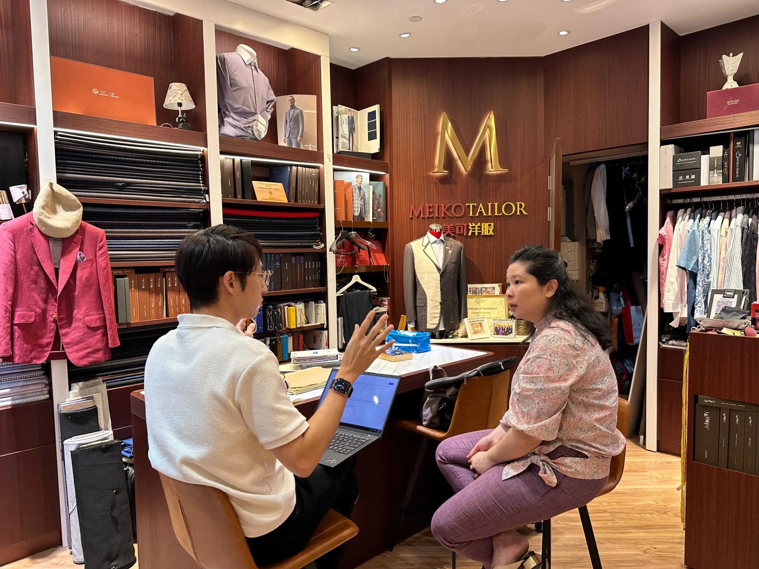
Meiko Tailor is a Singapore bespoke tailoring house founded in 1977, with its storefront at Boat Quay. It needed to evolve its image for a new generation of clients while keeping its legacy and craftsmanship, and to stand out against modern tailoring brands and international labels. We positioned the brand around the essence “Tailoring Your Every Chapter”, created a new identity and website, launched the endorsed sub-brand Uncommon Hem by Meiko Tailor for a younger audience, and designed touchpoints from garment tags and hangers to storefront signage. Meiko Tailor’s Director has said the project strengthened the brand’s foundations and gave it a clearly defined position, essence and personality.
See the Meiko Tailor case study.
Farmer Brand (Food Products)
Farmer Brand is operated by Mei Heong Yuen Food Industries, a Singapore food producer with over 50 years of history serving B2B and B2C customers. Its positioning was unclear, its product brands were hard to manage under one heritage name, and its identity felt dated to younger customers. We repositioned it around the essence “Taste of Reunion”, moved its product brands into a sub-brand structure, and created a new logo featuring the founder as a mascot, applied across packaging, posters, MRT and billboard advertising, and Instagram. The rebrand received Indigo Design Awards 2024 in Branding and Packaging Design.
See the Farmer Brand case study.
Lessons for Family and Heritage Businesses
Heritage brands often have assets that newer competitors cannot copy: a founding story, a trademark, a mascot or a long relationship with customers. The best projects build on these assets instead of replacing them. Mascots, founders and historic symbols can be updated into a modern visual language. Sub-brands can help a heritage business reach a younger audience without losing its core customers. The key is to decide early what makes the business special, and protect it. Involving the family or founders in this decision helps the new brand feel true to the business, while giving the next generation room to grow it.
Companies Expanding Overseas
Entering a new market means meeting buyers who do not know you yet. A brand may need to adapt to a new language, culture and set of competitors, while staying consistent with what it stands for.
Brand positioning that works at home may need to change abroad. Brand awareness starts from zero, and brand visibility online matters because buyers research before they reach out. Expansion works best as part of a wider brand growth strategy. Projects in this group show how brands are built or adapted for audiences beyond their home base.
Rasa Indonesia (Culinary)
Rasa Indonesia is a national culinary initiative by Indonesia’s Ministry of Trade that promotes Indonesian food and beverages internationally. Indonesia lacked a consistent way to communicate its culinary diversity abroad, and inconsistent materials across certificates and promotions limited recognition. We created a logo symbol to anchor the identity, a visual language of food imagery and people-centred visuals, and supergraphics built from the logo motif. These were applied across certificates, posters, banners, business cards, letterhead, shop decals and digital platforms.
See the Rasa Indonesia case study.
LETZ Inn (Co-Living)
LETZ Inn is an Indonesian lifestyle brand based in Semarang that combines co-living, co-working and leisure spaces under one roof, aimed at budget-conscious young professionals. Its integrated concept was unclear to audiences, and its messaging and online presence were inconsistent. We built its strategy around the positioning “Live, Work, Play, Affordably Connected”, created a single-brand structure with a modern-classic visual system, wrote search-optimised messaging, and applied the brand across signage, wayfinding, the website, a mobile app and social media.
See the LETZ Inn case study.
LAWE (Social Enterprise)
LAWE is a women-led community social enterprise in Indonesia that preserves traditional handweaving and turns it into contemporary products. It wanted to reach more customers while keeping its mission, but its identity did not clearly show its social impact or the quality of its craft. We repositioned the brand around female empowerment and weaving traditions, refined its logo, colours and design elements, revamped its website and social media, and redesigned products and packaging to be more environmentally friendly. The relaunch coincided with LAWE’s 20th anniversary.
See the LAWE case study.
Lessons for Companies Entering New Markets
Brands that travel well usually have a clear core idea that stays the same, with flexibility in how it is expressed. Visual systems built from a simple motif can be applied across many formats and partners. Messaging should be tested with the target audience, and online channels deserve early attention because overseas buyers often meet a brand there first. Planning for several markets from the start is easier than changing the brand again later. Local partners and teams also need simple guidelines, so the brand stays consistent even when materials are produced far from head office.
What These Case Studies Have in Common
The sectors are different, but the projects share a few principles.
Research Comes First
Every project begins by understanding the business, its customers, its market and the customer value buyers look for. Decisions rest on evidence, not taste. Research also brings internal teams together, because discussions move from personal opinion to shared facts. It often reveals strengths the company rarely talks about, which can become central to the new brand.
Strategy Shapes Design
The identity grows from clear brand positioning, so each element has a reason to exist and supports brand differentiation. When design choices can be explained by strategy, approvals are faster and the result is more coherent.
The Brand Goes Beyond the Logo
The brand is applied across the touchpoints that matter most to each company’s customers, creating a consistent customer experience. For one company that means packaging; for another, signage, uniforms or a website. The choice depends on where customers form their impressions and make their decisions.
Rollout Is Planned
Guidelines and clear ownership help the brand stay consistent after launch and build brand recognition. Many projects include a brand manual covering logo use, colour, typography, imagery and tone of voice.
To see how strategic branding links to business results, read our article on how strategic branding drives revenue growth for Singapore SMEs.
Signs Your Business Is Ready for a Brand Project
Reading case studies often raises a practical question: is it time for our own brand project? These signs suggest the answer may be yes.
Your Brand No Longer Matches Your Business
Your company has grown, added services or changed direction, but your name, logo and materials still describe the business you used to be. Sales teams spend time correcting first impressions, and prospects may underestimate what you can do.
You Are Planning to Grow or Expand
You are preparing to enter a new market, launch a new product line or target larger customers. A brand that worked locally may not be strong enough for the next stage. It is easier to prepare the brand before expansion than to fix it while you are already competing in a new market.
Your Brand Looks Different Everywhere
Your website, packaging, brochures and social media all look slightly different. Different teams and vendors have created materials over the years without shared guidelines.
Customers Cannot Tell You Apart
Buyers describe your company in the same words they use for competitors, and many conversations end in price negotiations. This usually means the brand is not giving customers a clear reason to choose you. Research and a sharper strategy can change that.
How to Use Case Studies to Choose a Consultancy
Case studies, alongside articles and thought leadership, show how a consultancy thinks. They are a starting point. Use them to prepare better questions for your first conversation:
- Which of your projects is closest to our situation, and why?
- How did you research the market before deciding the brand positioning?
- Who from your team led the work?
- How did you help the client roll the brand out internally?
- What would you do differently for a company like ours?
Clear, specific answers show that the consultancy can explain its thinking, not only show its results.
It also helps to ask how the consultancy works with your team day to day. Who will you speak to each week? How many review points are there? What will you receive at the end of each stage? A good partner is happy to explain this before you commit.
You can browse more of our projects on our works page.
Frequently Asked Questions
What should a good branding case study include?
It should explain the client’s challenge, the approach taken and how the brand was applied across touchpoints. Look for evidence of research, brand positioning and strategy, not only final visuals.
Why are Creativeans’ case studies grouped by sector?
Each sector faces different challenges. B2B companies deal with long sales cycles and many decision makers. Heritage brands balance history with relevance. Companies expanding overseas must adapt to new markets. Grouping by sector helps you find the projects closest to your situation. You can still learn from other sectors, as many lessons, such as starting with research, apply to every brand.
Does Creativeans only work with large companies?
No. We work with organisations of different sizes and types, including growth and mid-size businesses, family firms, social enterprises and government initiatives.
Can Creativeans help a Singapore company expand overseas?
Yes. With teams in Singapore, Milan and Jakarta, we support brands entering new markets, from research in the target market to adapting brand positioning, identity and touchpoints.
What is the first step in a branding project with Creativeans?
Every project starts with a brand audit. It gives both sides a shared understanding of where the brand stands today. We study your business, customers, competitors and market before making any recommendations on brand positioning or design.
Next Step
Contact Creativeans to discuss your brand: https://www.creativeans.com/contact




 INSIGHTS