Davco's Bold New Identity:
A Construction Branding
Case Study

{ Project Overview }
Established in 1985, Davco is a globally recognised leader in the building and construction industry, trusted by professionals around the world. With a strong legacy and established market presence, the brand needed a clearer and more organised identity system.
We developed a visual identity that places Davco’s iconic mascot at the centre while considering the needs of its diverse target audiences. The result is a more cohesive brand experience across branding, UI/UX, packaging, and communication touchpoints.

{ Creative Challenge }
- 01
Davco needed to express its symbolic values more clearly in its identity to reinforce what the brand stands for
- 02
Existing visual identity and packaging lacked consistency, reducing the impact of the product range
- 03
Without a strong, unified design system it was harder for customers to recognise Davco’s products among competitors
- 04
Packaging was not optimised as a design touchpoint to communicate brand value and quality
{ The Solution }
Developed a brand visual identity with a strong icon and pattern system to represent Davco’s symbolic values
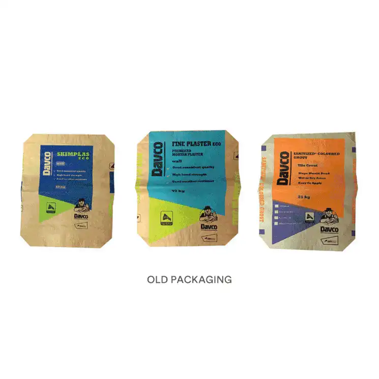
Designed packaging that aligns with the new identity, ensuring consistency across product lines
Ensured visual branding across touchpoints reflects quality and reinforces trust in the construction materials market
Elevated the brand’s presence, making Davco’s offerings more recognisable and differentiated
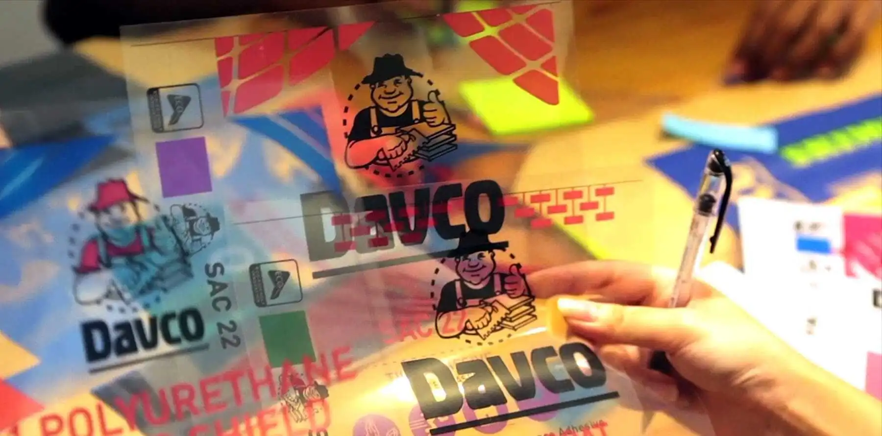
{ Visual Identity }
{ Packaging Design System }

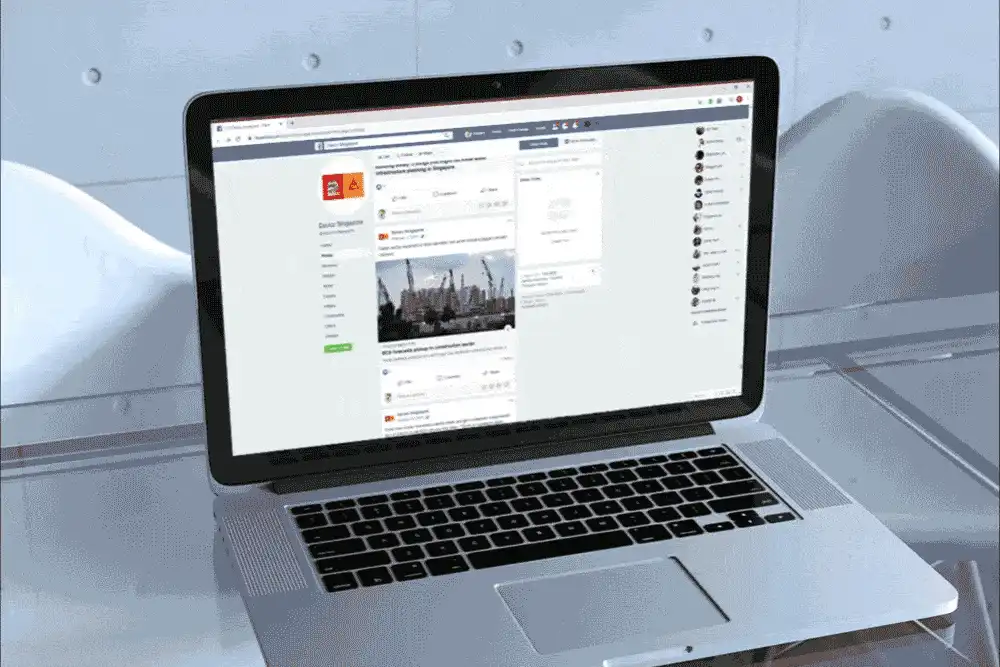
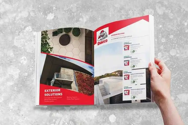
{ Brand Touchpoints }
We extended Davco’s refreshed identity across key brand touchpoints to create a seamless, cohesive, and differentiated customer experience.
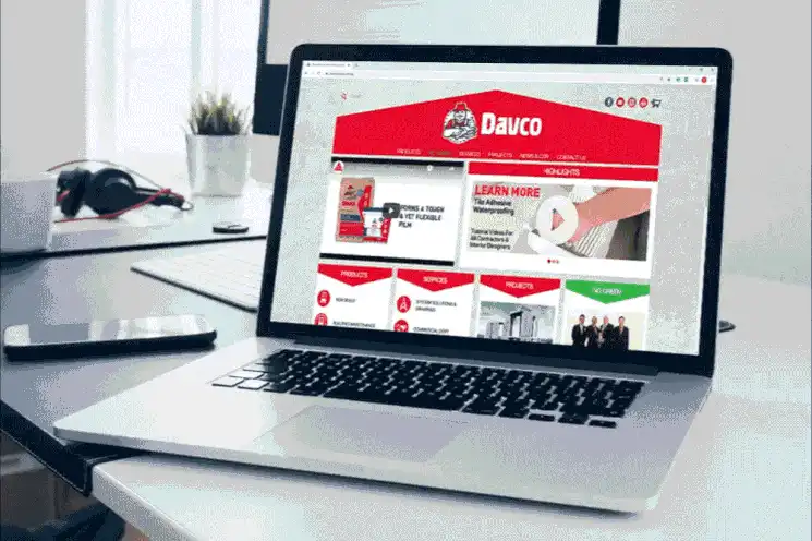
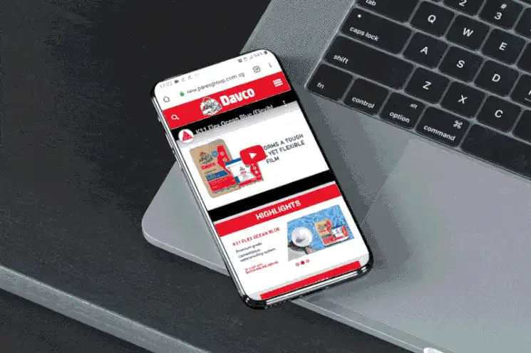
The brand system was applied across a wide range of applications, ensuring each touchpoint communicates Davco’s identity with clarity and consistency. From corporate stationery and website design to marketing collateral and advertisements, every material was aligned under one recognisable visual language.
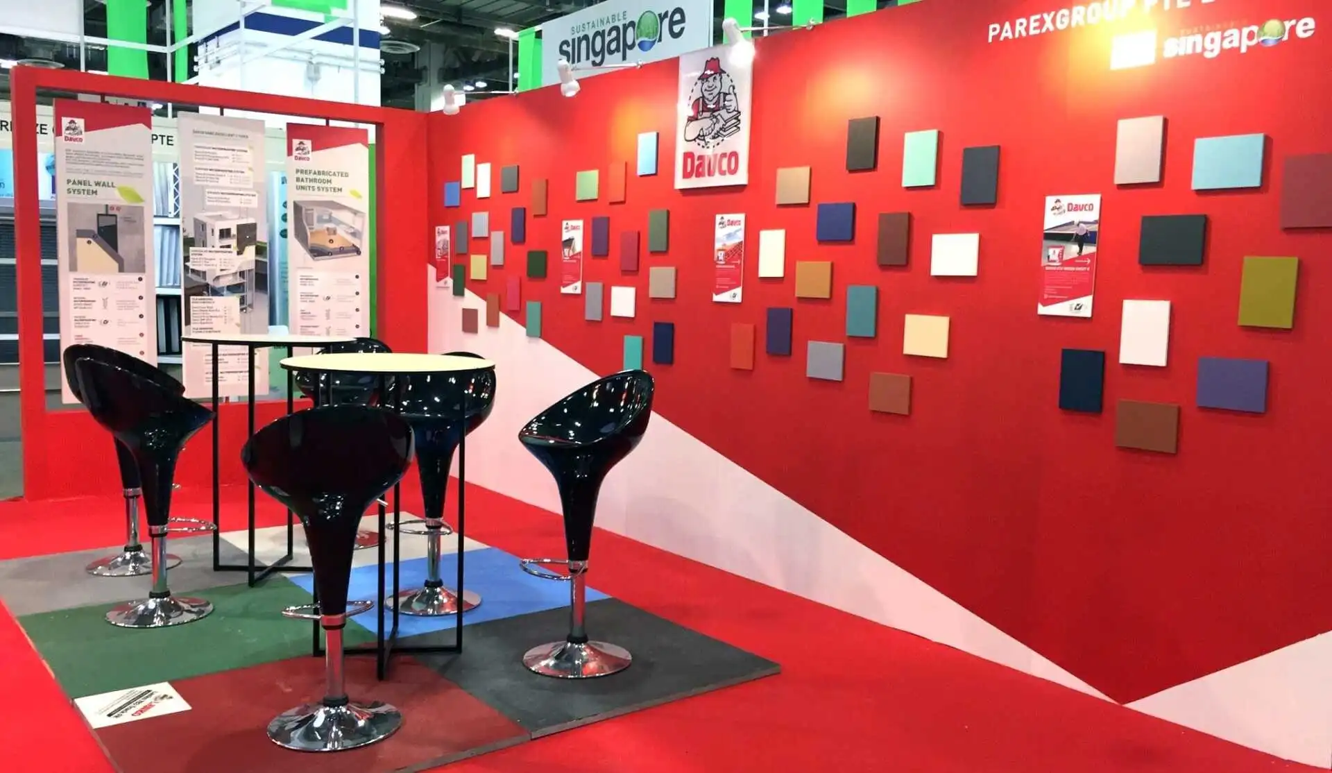
This cohesive rollout also extended to exhibition stands and video content, helping Davco maintain a strong and unified presence across both physical and digital platforms. The result is a more consistent brand experience that differentiates Davco while supporting its diverse communication needs.


“We are impressed with Creativeans’ systematic approach towards identifying the gaps in our brand image, the active listening to our branding needs and the creative energy that was poured into crafting your designs. We also appreciate the excellent post project service and assistance rendered to our in-house marketing team in the implementation phase.”