From Tradition to Innovation:
Farmer Brand's Iconic Branding Evolution
{ Project Overview }
Farmer Brand has been a trusted food producer for over 50 years under Mei Heong Yuen Food Industries Pte Ltd, serving both B2B and B2C customers in Singapore and beyond. The rebranding strengthened its relevance for today’s market by building on its functional strengths while elevating it into a more symbolic brand rooted in trust, familiarity, and belonging.
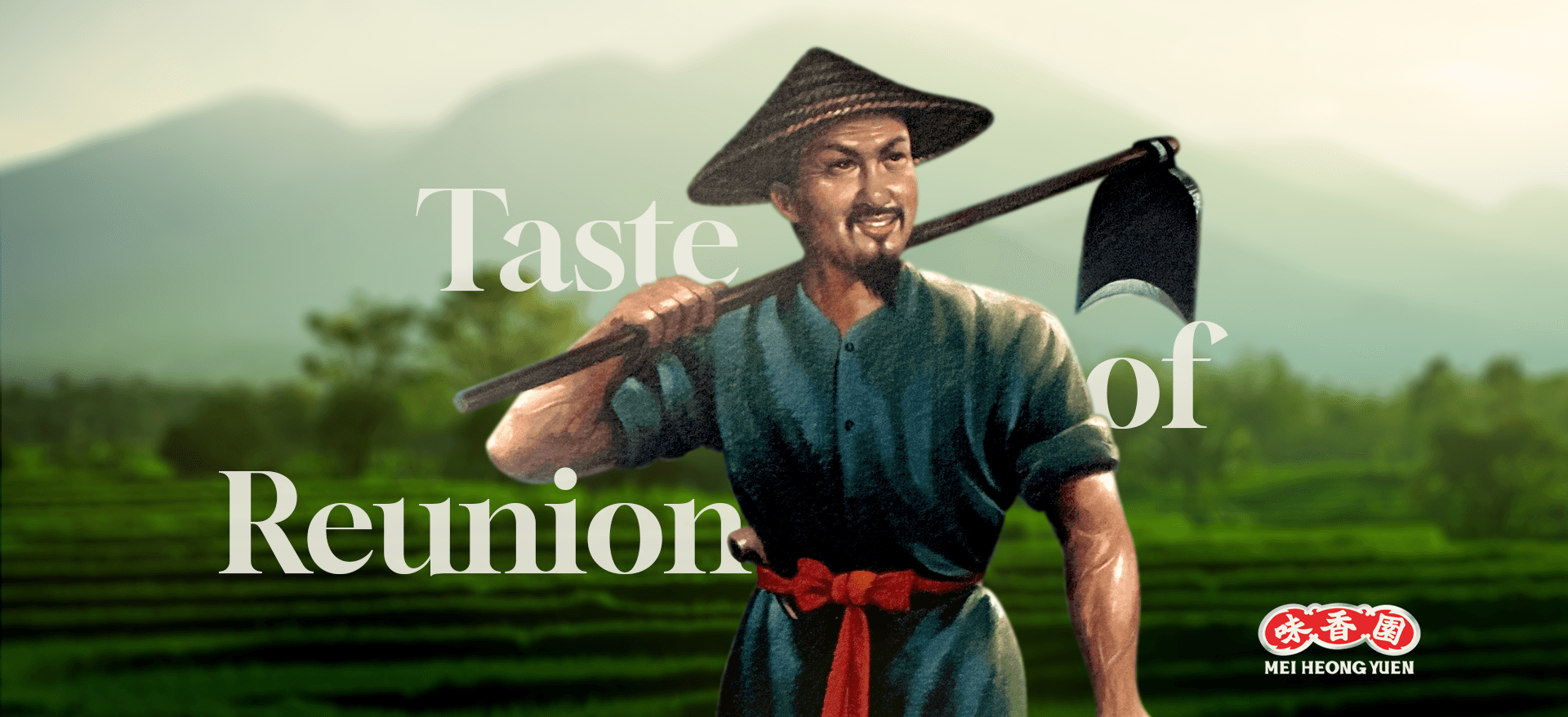
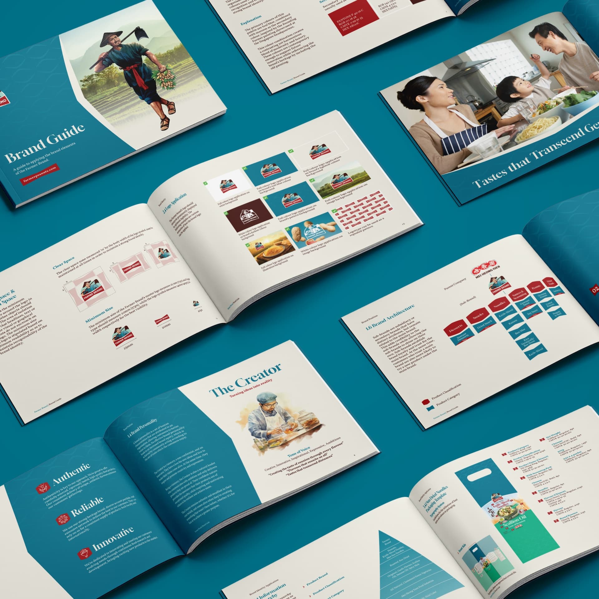
The logo reflects Farmer Brand’s heritage and story, featuring the founder as a mascot to create a more personal and meaningful identity. Its refined execution gives the brand a more modern and globally recognisable presence, further affirmed by its Indigo Design Award 2024 wins in Branding and Packaging Design.

{ Creative Challenge }
- 01
Farmer Brand lacked a clear brand positioning, diminishing its ability to optimise customer experience and increase loyalty for all its brands.
- 02
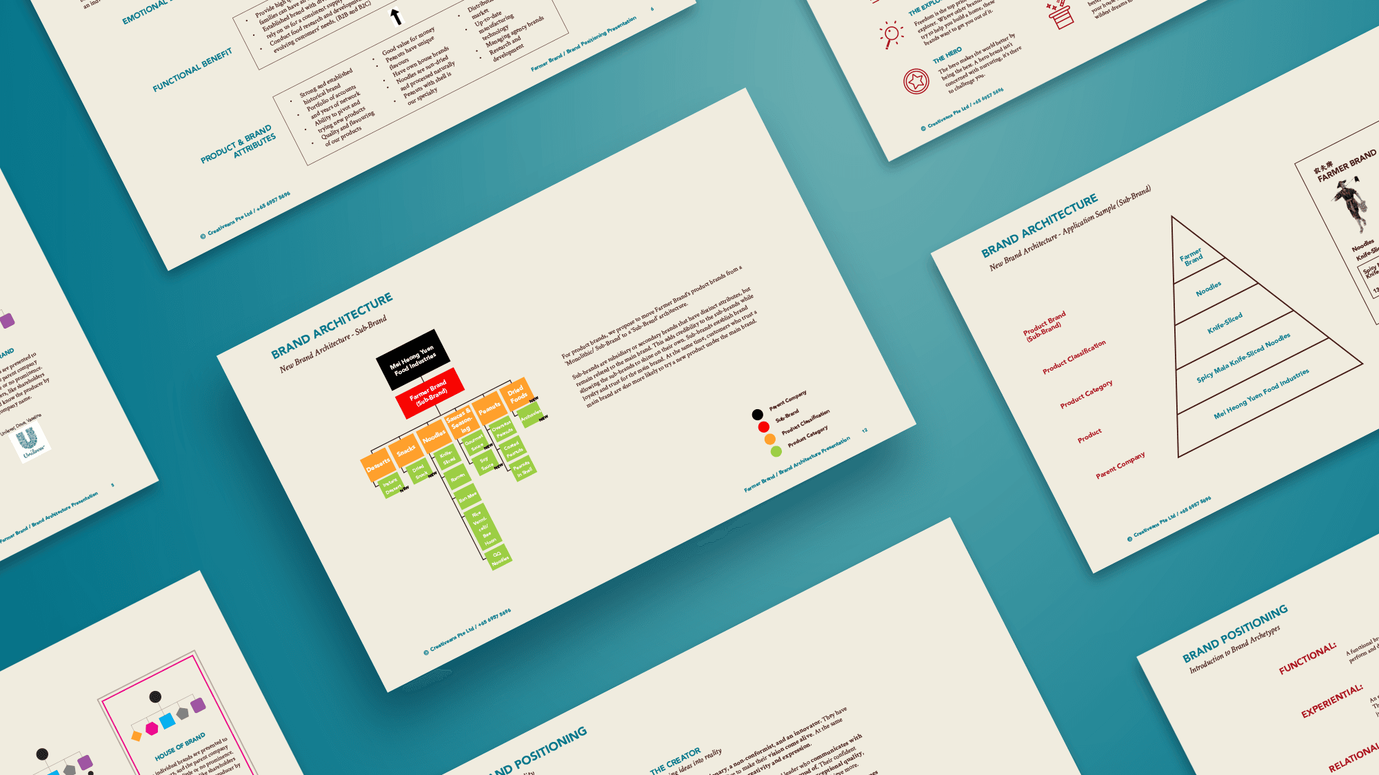
Farmer Brand has a complex and ambiguous brand architecture, challenging the brand to maintain its unique identity while contributing to its overall heritage and strength.
- 03
Farmer Brands’ brand identity is irrelevant to the target audience, especially young customers, and lacks consistency to enhance brand image, recognition and international credibility.
{ The Solution }
Farmer Brand’s new brand positioning resonates better with the current needs of its customers and communicates its services.
Changing Farmer Brand’s product brands to a ‘Sub-Brand’ architecture. By associating the various product brands under the Farmer Brand, the product brands can leverage Farmer Brand’s established brand awareness and identity.
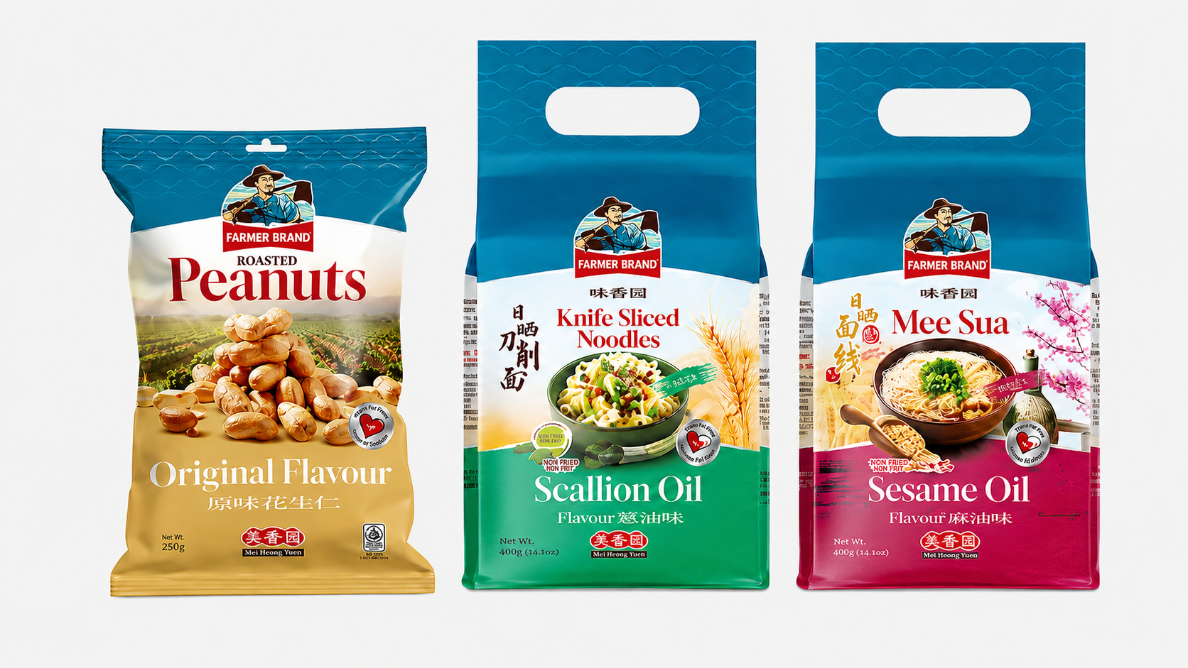
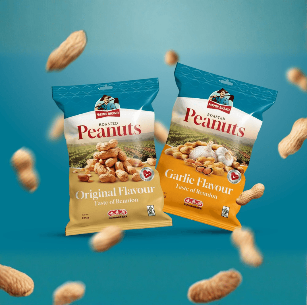
The new logo and brand identity make Farmer Brand stand out as a modern brand with a consistent graphic style that communicates the brand’s story and professionalism more effectively.

{ THE DIFFERENCE }
{ Brand Positioning }
{ Brand Identity }

{ Brand Touchpoints }
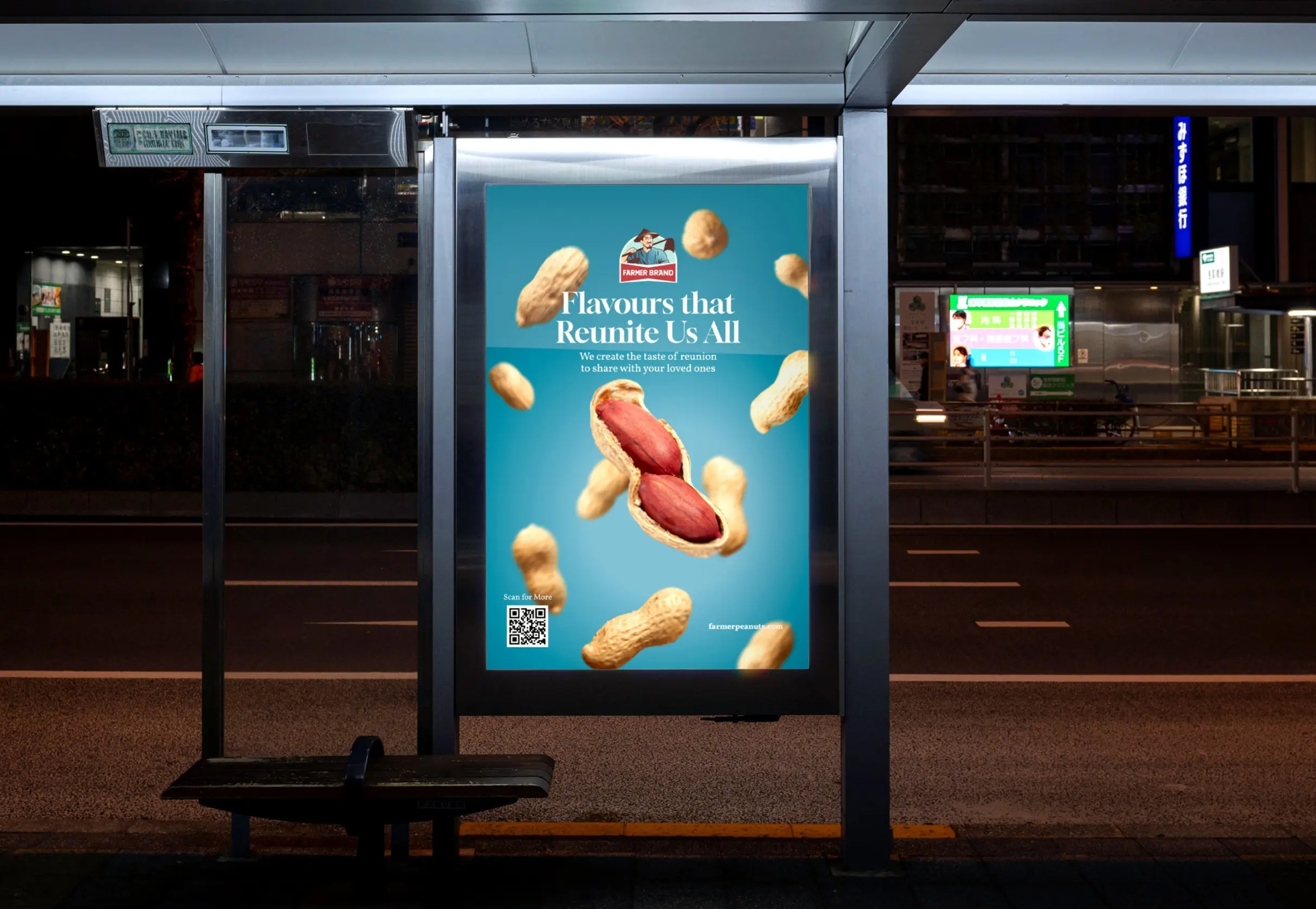
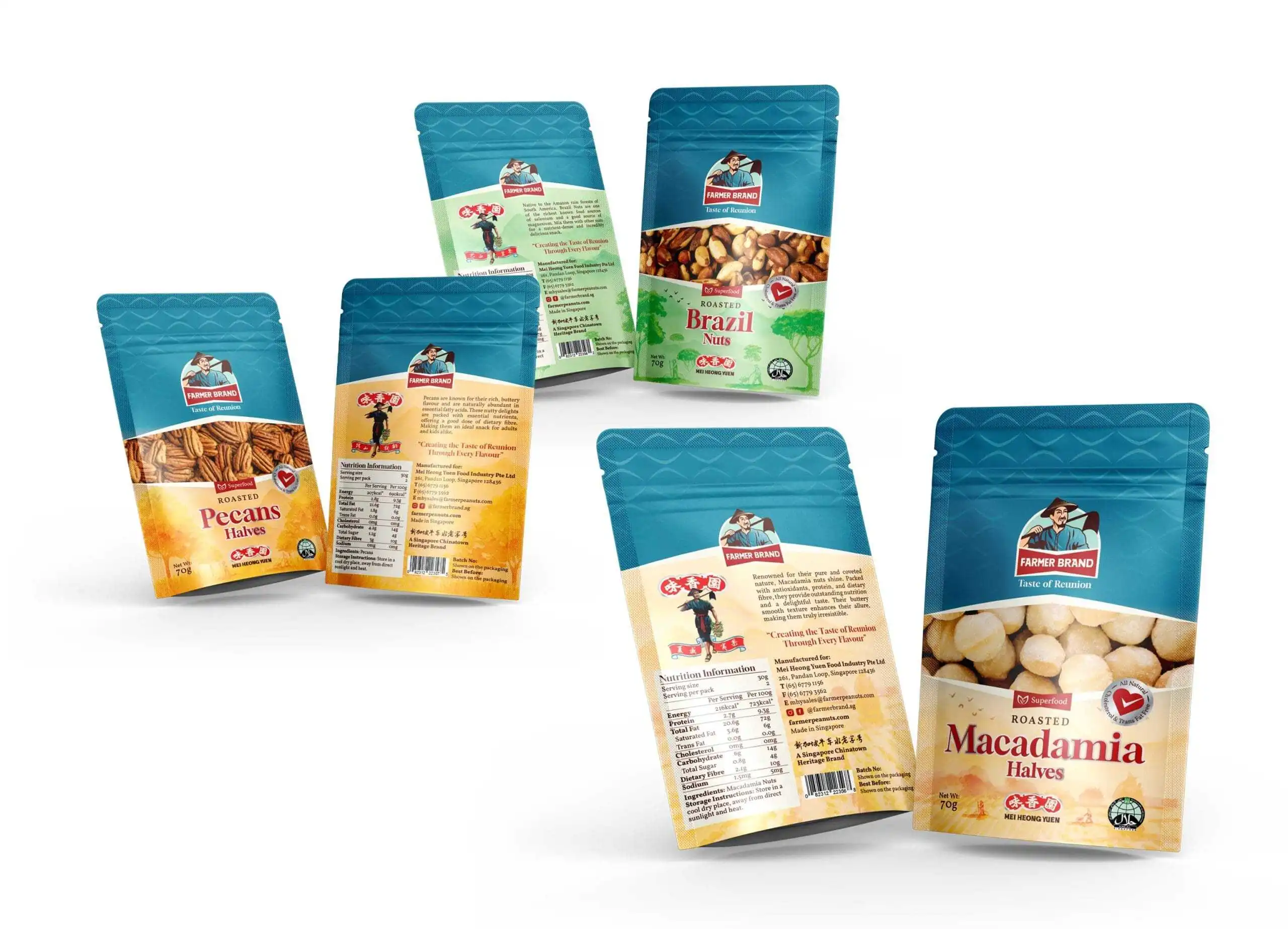
Creating cohesive brand touchpoints that bring Farmer Brand’s refreshed identity to life across every customer interaction.
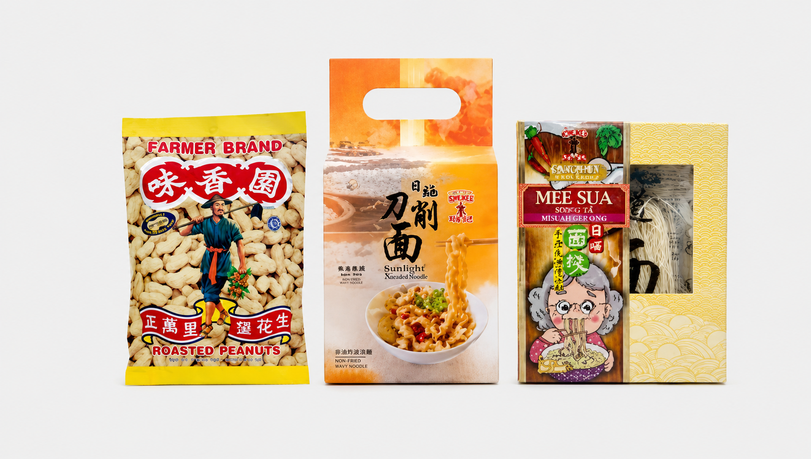
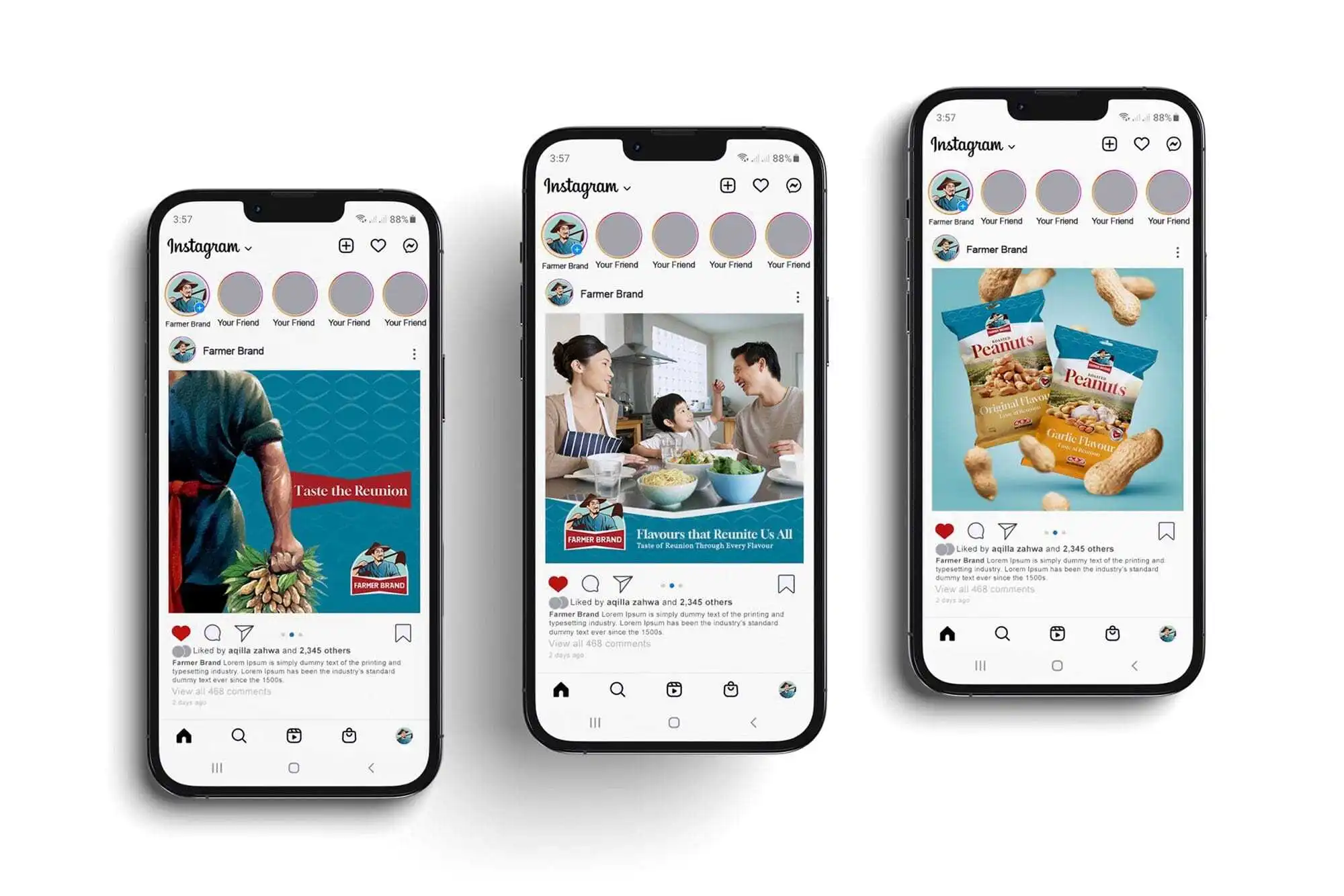
We developed a range of brand touchpoints to engage Farmer Brand’s customers while consistently expressing its updated positioning and identity. From packaging and posters to Instagram content, each touchpoint was designed to create a more cohesive, memorable, and recognisable brand experience across different platforms.
Together, these applications showcase the flexibility of Farmer Brand’s updated colour palette and graphic style, allowing the brand message to be communicated clearly across various mediums. This approach strengthens brand consistency and helps Farmer Brand connect more effectively with its diverse audience.


“The rebranding of Farmer Brand and their packaging has positioned this beloved heritage brand strategically for global markets. The new brand identity effectively communicates the value proposition of their products, and has generated stronger emotional appeal with younger and new customers.”
