Revitalising Pek Sin Choon:
Innovative Chinese Tea
Packaging Design

{ Project Overview }

Established in 1925, Pek Sin Choon is one of Singapore’s oldest tea merchants, recognised for its “Shepherd Boy on Buffalo” trademark and long-standing reputation for quality Chinese tea. As one of the few merchants in Singapore that still blends its own tea leaves using traditional methods, the brand carries a strong cultural legacy.

{ Creative Challenge }
- 01
Pek Sin Choon, one of Singapore’s oldest tea merchants (founded in 1925), needed to transition from being seen as purely functional to becoming an experiential cultural symbol
- 02
Though rich in history and known for its “Shepherd Boy on Buffalo” trademark, the brand needed a visual system that could emotionally connect with today’s consumers
- 03
Existing packaging lacked modern appeal while preserving heritage, needing a balance between nostalgia and contemporary sensibility
- 04
There was limited cohesion across touchpoints such as packaging, merchandising, and experience design, which diluted the brand’s presence and impact
{ The Solution }
Conducted a brand audit and repositioned Pek Sin Choon from a functional tea merchant to a symbolic, emotionally resonant brand rooted in tea heritage and quality experiences
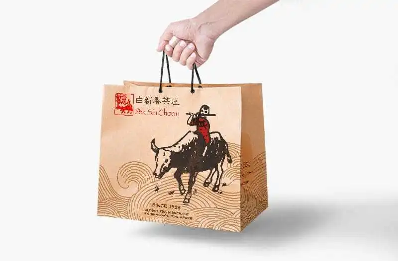
Created a visual identity featuring a series of mascots and nostalgic graphic elements derived from the brand’s legacy, reshaped into a cohesive, modern look that appeals to both heritage lovers and modern audience
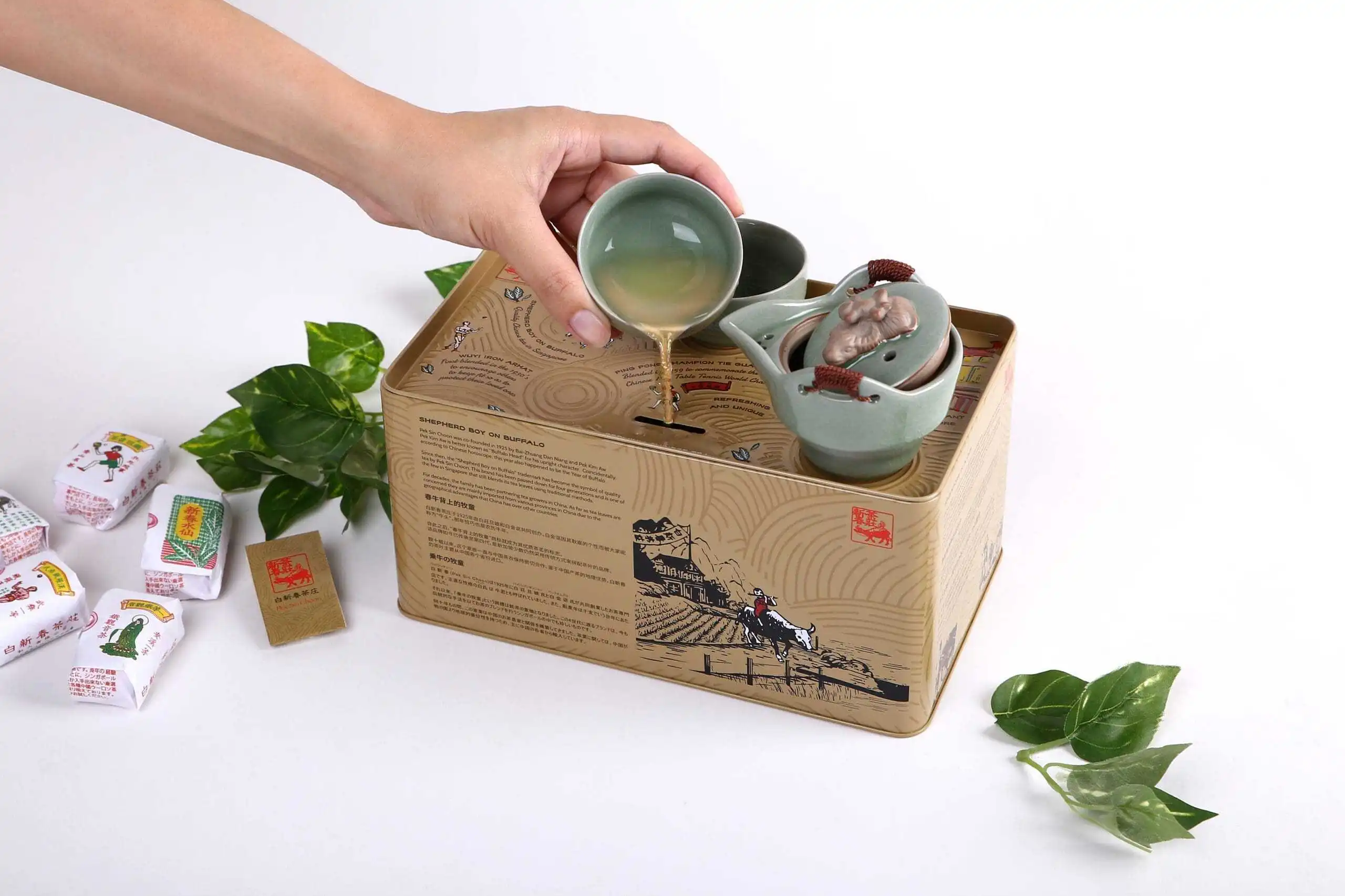
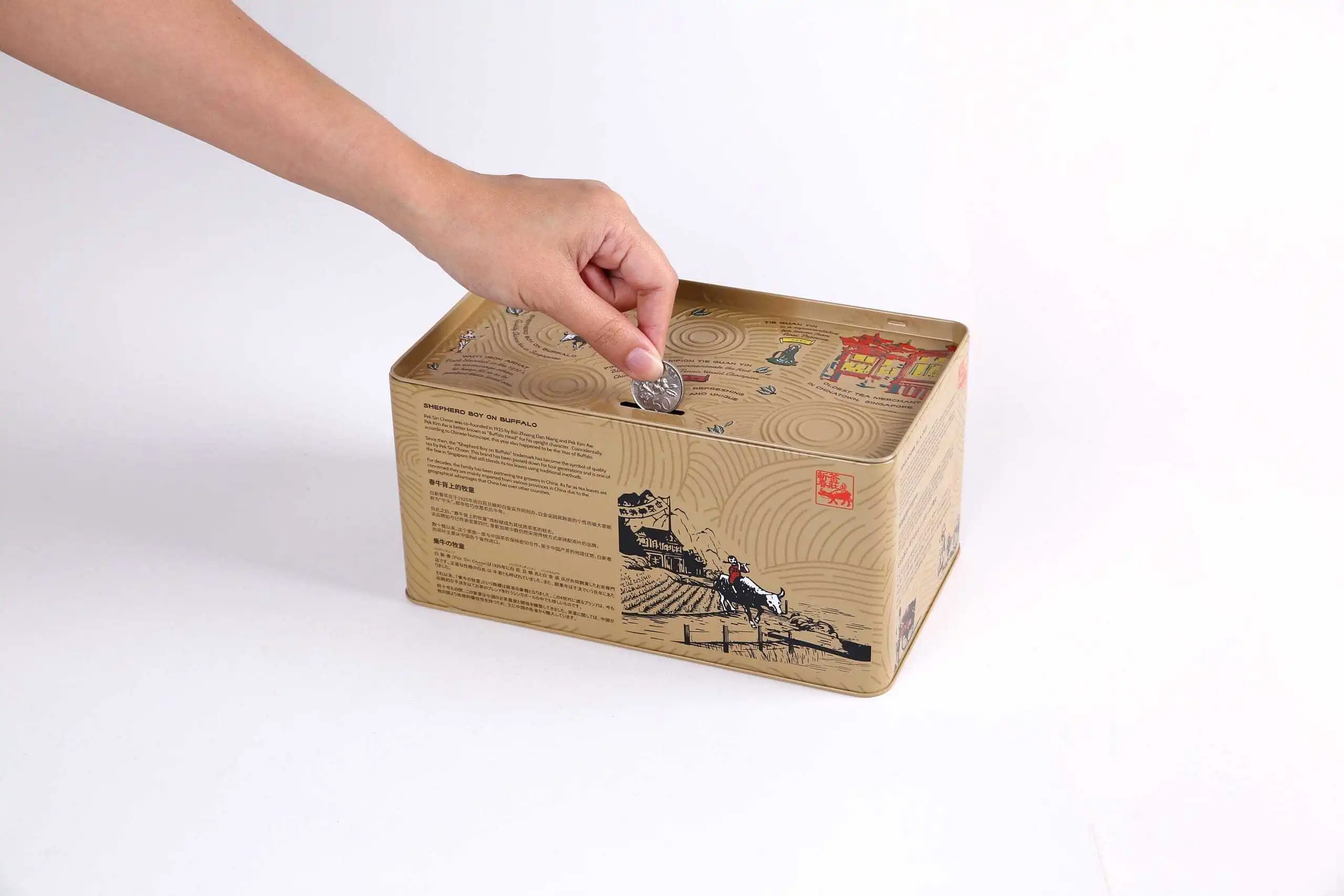
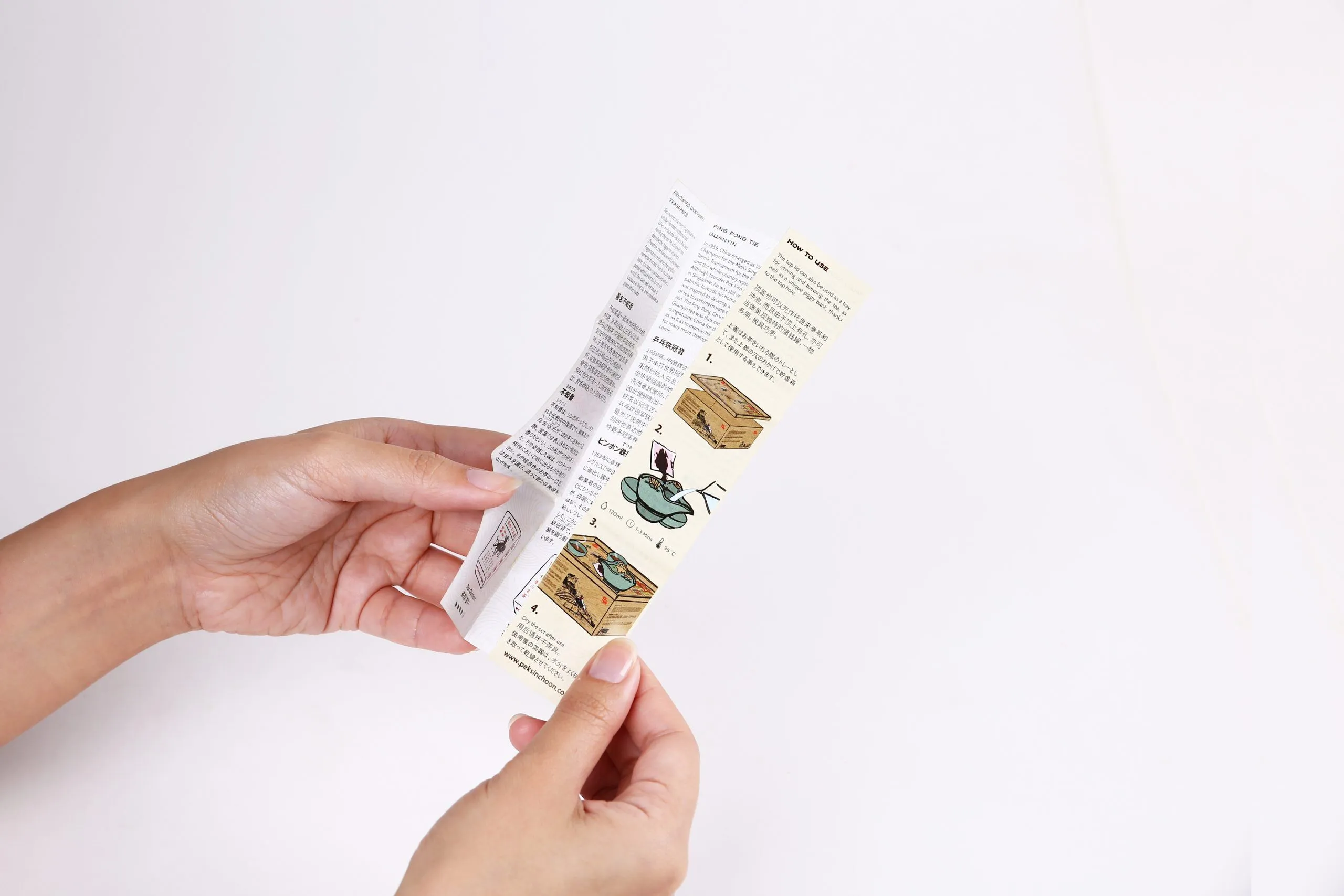
Designed packaging for products like the award-winning Heritage Portable Tea Brewing Set—simplifying usage through intuitive instructions and reinforcing ritualistic engagement with tea preparation
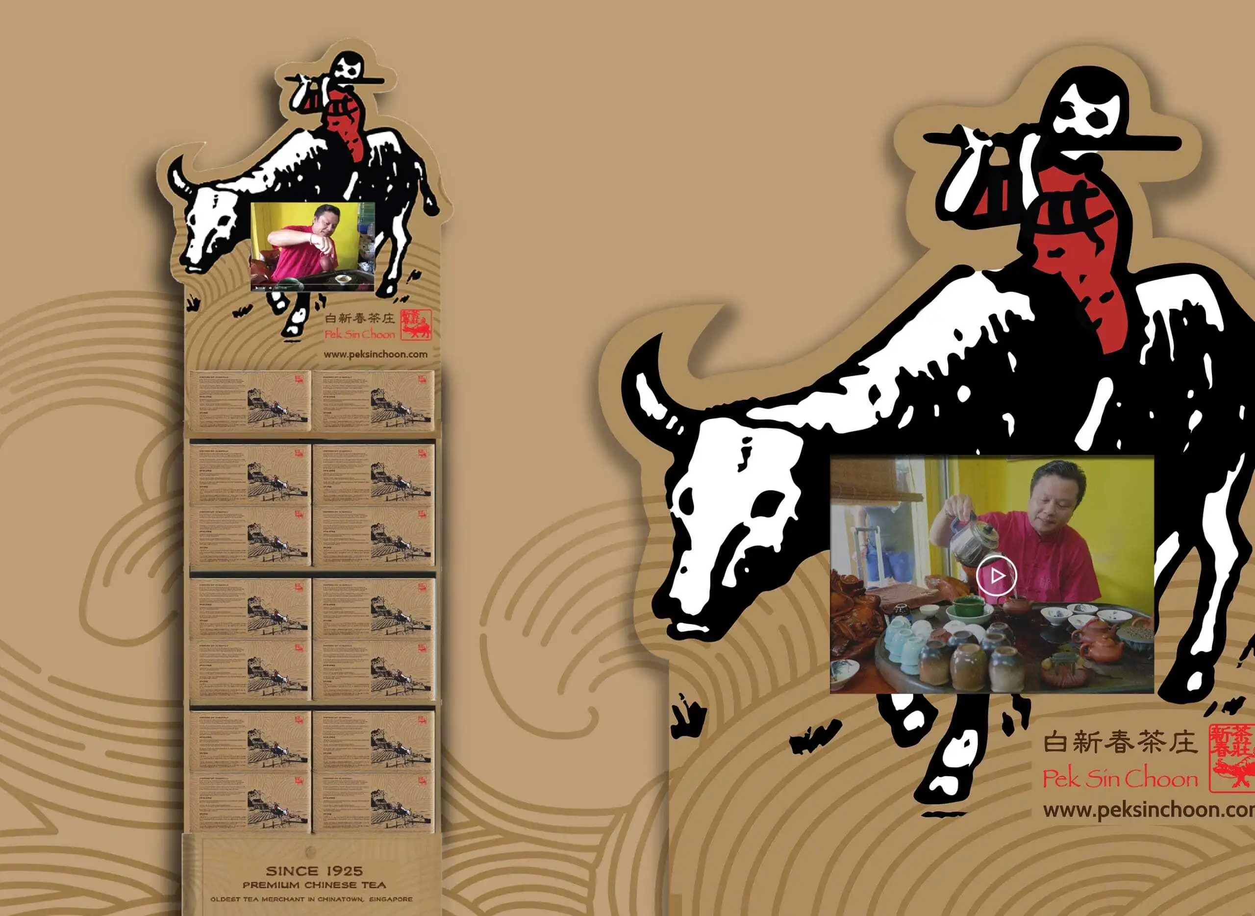
Expanded the visual system across key brand touchpoints including brochures, point-of-sale displays, broc

{ THE DIFFERENCE }


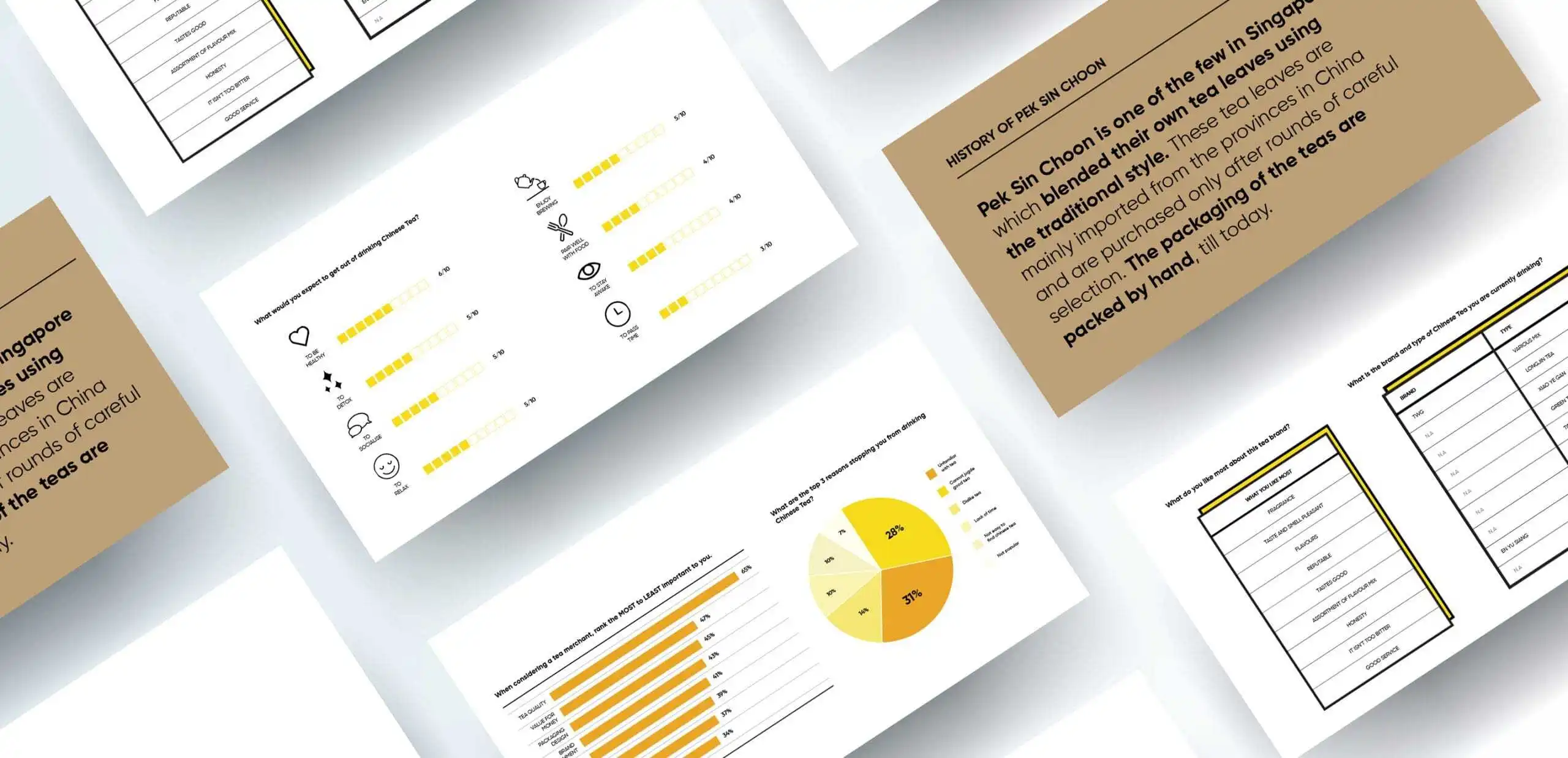
{ Brand Audit & Positioning }

{ Brand Identity }

{ Brand Touchpoints }
We extended Pek Sin Choon’s refreshed identity across meaningful brand touchpoints, turning Chinese tea preparation into a more accessible and experiential ritual.
The Heritage Portable Tea Brewing Set focuses on the symbolic and experiential side of the Pek Sin Choon brand. It simplifies the process of preparing Chinese tea, making the experience more straightforward, approachable, and trouble-free for modern users.
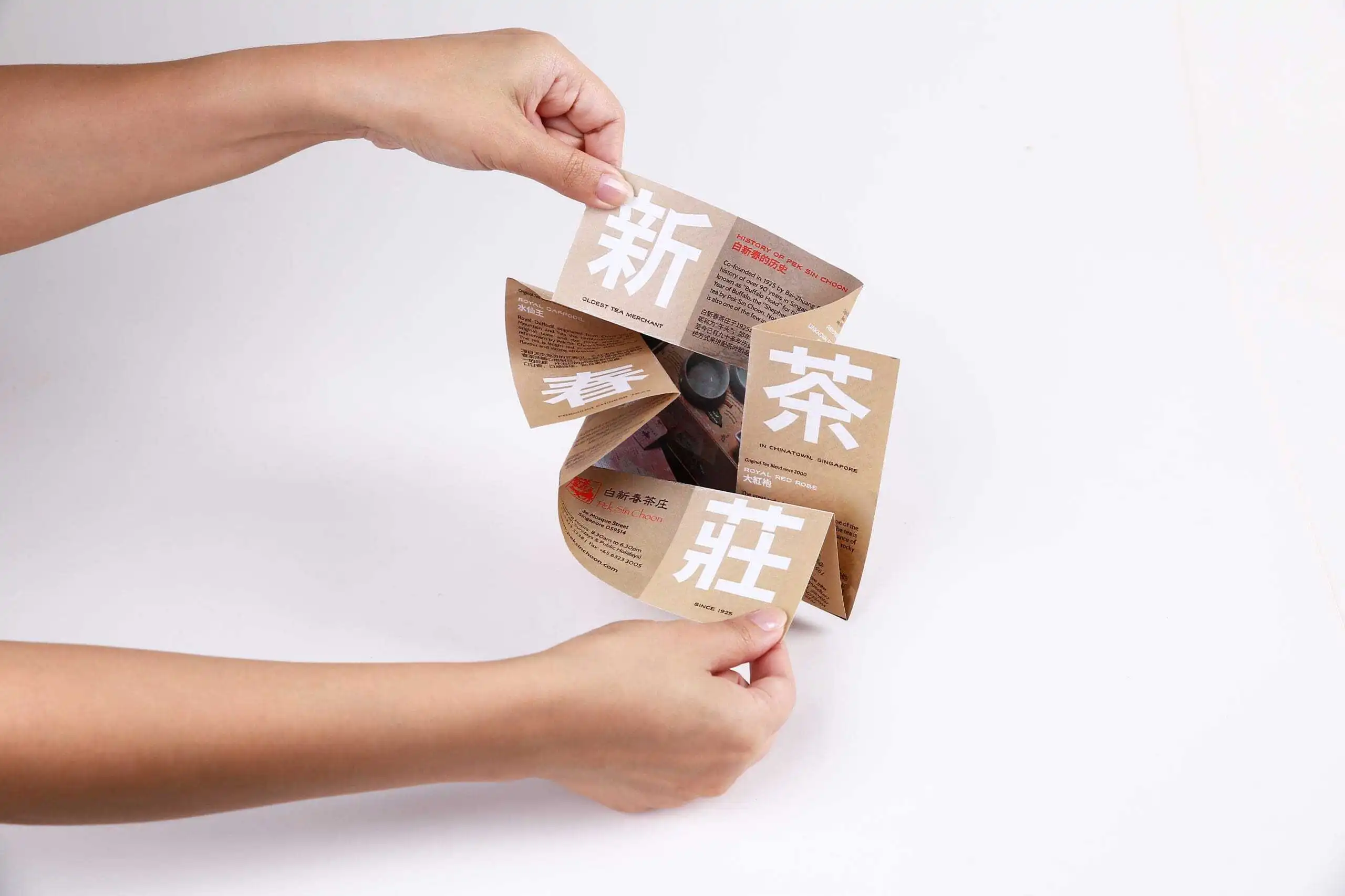
To support the user experience, we designed an in-box instruction manual with clear step-by-step guidance on how to use the product. Pek Sin Choon’s product brochure, point-of-sale display, and vehicle decal were also redesigned to reflect the new identity consistently across customer touchpoints.


这次白新春的创新包装不只是成功的,也是感人的,因为它让买家看到一个老牌对传统的坚持和未来的展望。