Brand Transformation for Businesses Growing Across Asia • Get Up to $100K EDGE Grant Support for International Branding. Learn More • For packaging design for overseas markets, see our DTDi page.


Creativeans C LogoCreativeans

Redefining Visual Communication
for A*STAR’s Research and Innovation Programme

ASTAR

{ Project Overview }

Creativeans redefined the visual communication for A*STAR’s T-Up programme, transforming complex research and innovation information into a clear, engaging presentation and cohesive outreach materials.

A*STAR’s Technology for Enterprise Capability Upgrading (T-Up) programme helps Singapore enterprises access research expertise to strengthen their R&D capabilities and drive innovation. With extensive information covering programme benefits, funding eligibility and application processes, the challenge was to communicate these details in a way that was accessible, engaging and easy to understand.

Creativeans restructured the content hierarchy and presentation flow to create a more intuitive storytelling experience for both presenters and audiences. Through modern layouts, engaging infographics and a cohesive visual design aligned with ASTAR’s brand identity, the refreshed presentation and outreach materials communicate complex information more effectively while reinforcing ASTAR’s credibility as a leader in research and innovation.

Complex information and un clear presentation flow limiting effective communication

{ Creative Challenge }

Complex information and un clear presentation flow limiting effective communication
  1. 01

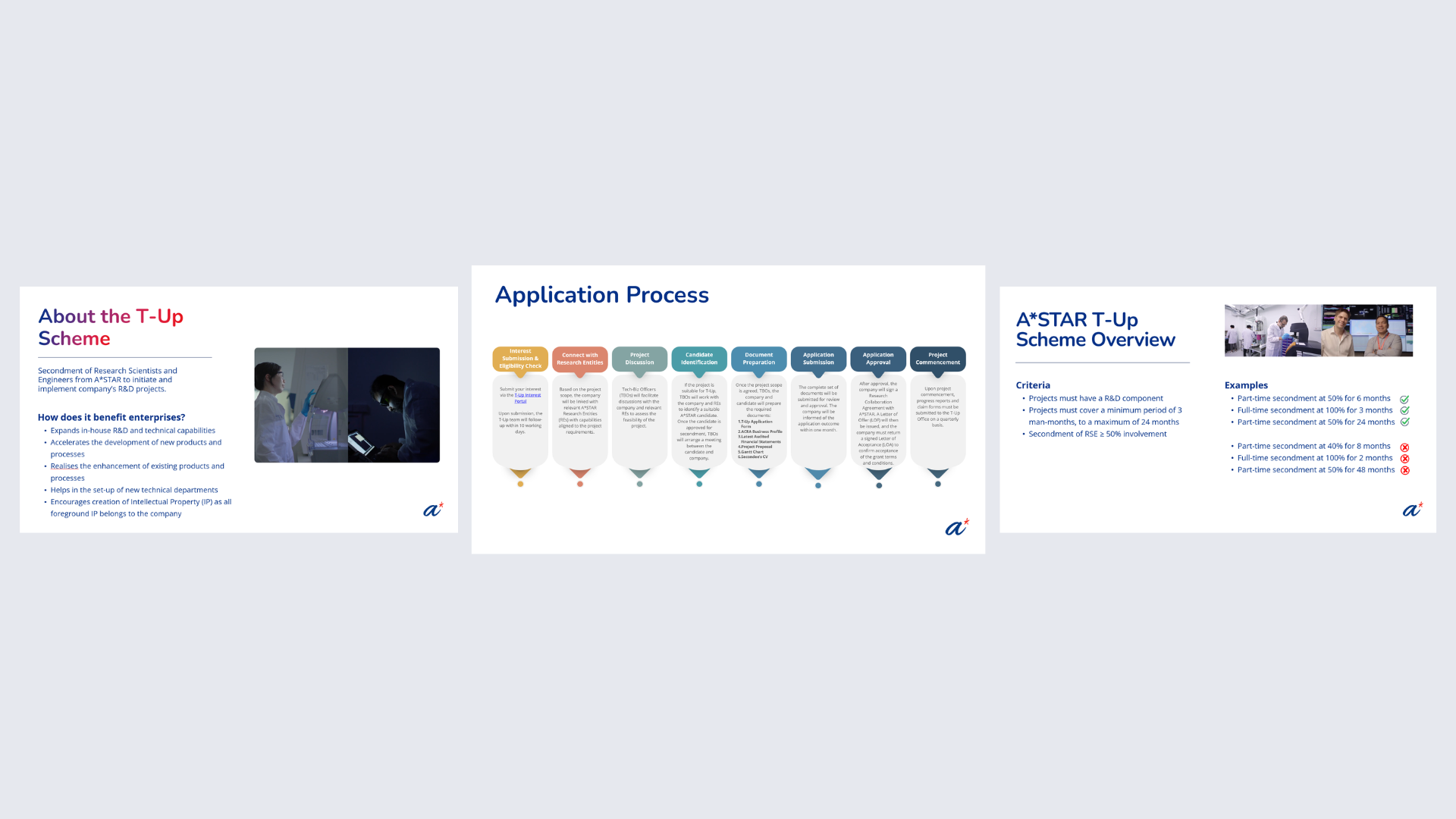
    The existing A*STAR T-Up presentation lacked a clear information hierarchy, making it difficult for audiences to identify key messages and understand the programme's value.

  2. 02

    Dense, text-heavy slides presented extensive technical information, funding details and eligibility requirements, making the content challenging to digest and retain.

  3. 03

    The presentation lacked a structured narrative flow, making it challenging for presenters to communicate effectively and for audiences to follow the information independently.

  4. 04

    The existing visual treatment did not fully reflect A*STAR's credibility and innovation-driven identity, limiting the presentation's visual impact and engagement.

{ The Solution }

Transformed complex information into a clear, engaging and cohesive visual communication experience
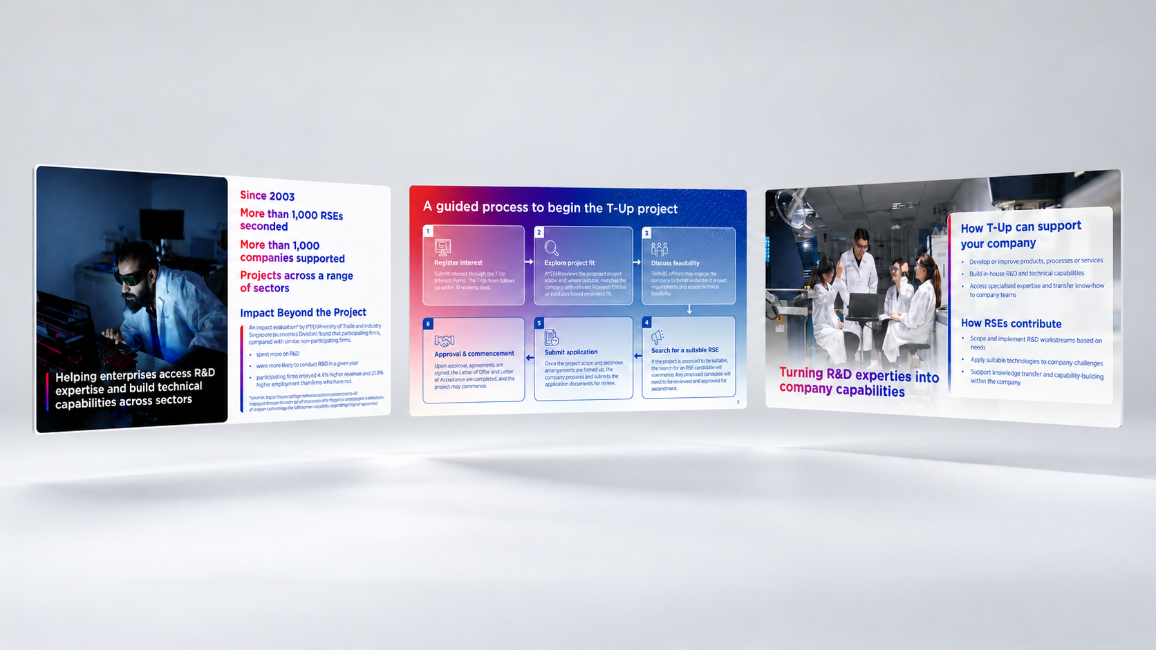
  1. Restructured the information hierarchy to prioritise key messages, allowing audiences to quickly understand the T-Up programme, its benefits and essential requirements.

  2. Simplified complex content through intuitive layouts, infographics and visual storytelling, making technical information more accessible, engaging and easier to retain.

  3. Established a logical content flow, guiding audiences from understanding the programme to exploring its benefits, eligibility and application process. This creates a seamless experience for both presenters and audiences.

  4. Elevated the visual identity with a modern, professional and cohesive design system aligned with A*STAR's brand, strengthening visual impact, credibility and consistency across presentations and outreach materials.

Transformed complex information into a clear, engaging and cohesive visual communication experience

{ THE DIFFERENCE }

ASTAR before
ASTAR after
{ BEFORE }{ AFTER }
Loading video...

{ Our Objectives }

A Purposeful Design System That Guides, Engages and Connects

Building on the restructured content, Creativeans introduced a modular layout that organises information into four distinct stages: Understand, Value, Qualify and Act. Each stage follows a logical progression, allowing presenters to deliver key messages confidently while helping audiences follow the programme with ease. A*STAR’s signature blue, purple and red palette was applied purposefully to distinguish content sections, establish visual hierarchy and evoke trust, innovation and progress. Complex information was translated into intuitive infographics, diagrams and concise visual callouts to improve readability and
retention. Human-centric imagery featuring researchers and industry professionals adds warmth and relatability, connecting technical expertise with real-world applications. The result is a consistent, engaging visual language that balances professional credibility with accessibility across the presentation and supporting collaterals.

{ Brand Touchpoints Design }

Creativeans transformed A*STAR’s existing visual language into a flexible presentation system, ensuring consistency and adaptability across communication touchpoints.

Building upon ASTAR’s established brand guidelines, we translated the refined design approach into an editable PowerPoint master template. With reusable layouts, structured content sections and flexible design components, the system empowers ASTAR’s team to independently create, update and expand presentations while maintaining a consistent and professional visual experience.

Beyond the presentation, we extended the same design approach to a digital poster, adapting the visual hierarchy and layout to communicate key information effectively at a glance. This ensures a cohesive experience across different outreach settings, from corporate presentations to industry events and digital communications. More than a one-off design, Creativeans delivered a practical, scalable framework that supports A*STAR’s evolving communication needs while preserving its established brand identity.

Brand Touchpoints Design
Brand Touchpoints Design image 1

The team was responsive throughout the project and remained open to discussions on scope refinements
and revisions. Andin was responsive, proactive, and communicative, helping to keep the project moving smoothly and ensuring that requests and updates were addressed in a timely manner.

Rachel Chua logo
Rachel Chua
A*STAR Representative