Brand Transformation for Businesses Growing Across Asia • Get Up to S$100K EDGE Grant Support for International Branding. Learn More


Creativeans C LogoCreativeans

AETHER
Securing Singapore’s SME Digital Ecosystem

Branding
Communication Design
AETHER Cybersecurity Branding for SMEs | Creativeans

{ Project Overview }

Creativeans created a new brand, AETHER, a cybersecurity specialist dedicated to helping Singapore SMEs strengthen their defenses against evolving cyber threats.

AETHER delivers accessible, tailored cybersecurity solutions designed for SMEs. Recognising that smaller businesses often lack the resources and visibility to manage increasingly sophisticated cyber risks, the brand bridges the gap between enterprise-grade cybersecurity and the practical needs of SMEs.

By expanding its focus to the underserved SMEs segment, AETHER makes advanced cybersecurity more approachable and relevant. Through its range of solutions, including managed threat detection and response, AETHER empowers businesses to build resilience, safeguard their operations and stay future-ready in an evolving digital landscape.

Creating a distinctive cybersecurity brand that communicates protection, trust, and innovation to SMEs.

{ Creative Challenge }

Creating a distinctive cybersecurity brand that communicates protection, trust, and innovation to SMEs.
  1. 01

    AETHER needed a strong and recognisable brand identity that communicates its cybersecurity expertise while establishing a distinctive presence in the SME market.

  2. 02

    Cybersecurity can feel complex and highly technical, creating a challenge in communicating digital protection in a clear, approachable, and trustworthy way.

  3. 03

    The brand needed to convey security, stability, and innovation through a distinctive visual identity without relying on conventional cybersecurity imagery.

  4. 04

    AETHER required a flexible and cohesive brand language that could communicate its commitment to safeguarding SMEs across different touchpoints.

{ The Solution }

Created a distinctive brand identity that brings together protection, trust, and innovation through meaningful visual symbolism.
  1. Developed a brand identity rooted in cybersecurity and digital protection, positioning AETHER as a reliable and forward-thinking cybersecurity brand for SMEs.

  2. Designed a meaningful logo that integrates a shield, a house-inspired letter “A”, and an enclosed letter “E” to symbolise defence, business protection, and security.

  3. Combined strong geometric forms with structured typography to communicate trust, stability, and innovation while establishing a confident and recognisable presence.

  4. Established a cohesive visual system and brand guidelines to ensure consistency across digital and communication touchpoints, strengthening AETHER’s brand recognition.

Created a distinctive brand identity that brings together protection, trust, and innovation through meaningful visual symbolism.

{ THE DIFFERENCE }

AETHER Cybersecurity Branding for SMEs | Creativeans before
AETHER Cybersecurity Branding for SMEs | Creativeans after
{ BEFORE }{ AFTER }

{ Logo Design }

Translating AETHER’s purpose into a distinctive visual identity.

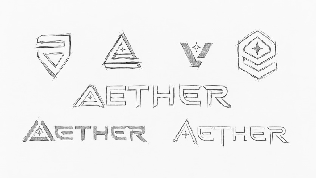
We explored different logo concepts through initial sketches, experimenting with geometric forms and letterforms to represent security, protection, and reliability. These explorations led to a symbol that combines the shape of a shield with a stylised letter “A,” reinforcing AETHER’s role in protecting businesses.

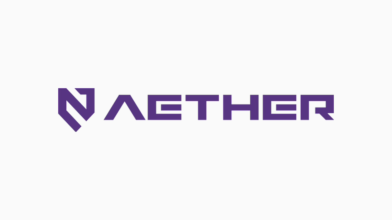
The final logo combines this symbol with custom typography to create a strong, recognisable identity that reflects the brand’s technical expertise and forward-looking approach.

{ Brand Naming }

Creating a name that reflects AETHER’s role in cybersecurity and digital protection.

We developed the name AETHER to establish a distinctive identity for a cybersecurity brand focused on small and medium-sized enterprises (SMEs). The naming direction reflects the brand’s purpose of helping businesses protect their digital environments and build cyber resilience.

The name forms the foundation of AETHER’s brand story, positioning it around protection, trust, and a safer digital future.

Brand Naming

{ Brand Identity }

A distinctive visual identity that transforms cybersecurity and digital protection into a clear, trustworthy, and future-ready brand.

We developed AETHER’s visual identity around the core ideas of protection, stability, and innovation. Strong geometric forms and structured typography establish a confident and recognisable brand, reflecting AETHER’s commitment to safeguarding SMEs’ digital environments.

The logo incorporates meaningful security symbolism, merging a shield with a house-inspired letter “A” to represent defense and protection for businesses. An enclosed structure within the letter “E” further reinforces the idea of safeguarding what lies within, creating a cohesive identity that communicates trust, reliability, and innovation.

Brand Identity
Brand Identity image 1
Brand Identity image 2
Brand Identity image 3

{ Brand Touchpoints }

The AETHER identity is translated across digital and communication touchpoints to create a clear and consistent customer experience.

We applied the visual system across key brand touchpoints, using structured layouts, graphic elements, typography, and information hierarchy to make AETHER’s cybersecurity proposition easier to understand and navigate.

From digital experiences to marketing and communication materials, each application reinforces AETHER’s positioning as a trusted cyber resilience partner while creating a consistent experience for SMEs across their journey with the brand.

Brand Touchpoints
Brand Touchpoints image 1
Brand Touchpoints image 2
Brand Touchpoints image 3
Brand Touchpoints image 4
Brand Touchpoints image 5

{ Brand Rollout }

A flexible brand system that enables AETHER to communicate with consistency as its cybersecurity ecosystem continues to grow.

We established clear guidelines for the logo, colour palette, typography, graphic elements, imagery, and overall visual expression. This provides a practical framework for maintaining a cohesive AETHER presence across its products, services, digital platforms, and communication materials.

Through this structured rollout system, AETHER can extend its identity across different offerings while maintaining a recognisable and credible brand presence. Each application reinforces its role in helping SMEs build stronger cyber resilience and navigate an increasingly complex digital landscape.

Brand Rollout

Our work with AETHER began with an opportunity to build a cybersecurity brand from the ground up. From developing the brand name and story to shaping its visual identity, we brought together strategy and design to create a distinctive, future-ready brand that communicates protection and builds trust with SMEs.

A three-dimensional, metallic letter "C" rendered in a dark glass or chrome material that reflects a vibrant, iridescent gradient of rainbow colors along its curved edges.
Kimming Yap
Managing Director, Creativeans