Brand Transformation for Businesses Growing Across Asia • Get Up to $100K EDGE Grant Support for International Branding. Learn More • For packaging design for overseas markets, see our DTDi page.


Creativeans C LogoCreativeans

Advancing Dementia Care
Through Brand Transformation for Apex Harmony Lodge

Branding
Business Design
Communication Design
Experience Design
UI/UX Design
Older man watching butterflies in a garden, featured in Creativeans’ branding for Apex Harmony’s dementia care services.

{ Branding Dementia Care }

Apex Harmony Lodge is a Singapore non-profit organisation dedicated to enabling persons with dementia to live well. Its person-centred approach recognises each individual’s history, preferences and abilities, creating opportunities for meaningful participation throughout their dementia journey. Through personalised care and engaging everyday experiences, the organisation seeks to preserve dignity and help each person realise their potential.

As its ambitions extended beyond residential care into community programmes, caregiver support and future training and consultancy services, Apex Harmony needed a brand that could communicate the breadth of its work. Its existing identity remained closely associated with the Lodge, while inconsistencies across communications made it difficult to present its different offerings as parts of one organisation.

We worked with Apex Harmony to establish a shared strategic direction and translate it into a cohesive brand system. The engagement covered brand research, positioning and identity development, alongside service blueprinting and rollout guidelines. Together, these provided a foundation for expressing its care philosophy consistently and introducing new services under a recognisable master brand.

apex harmony brand architecture

{ Creative Challenge }

Growing Organisation Needed a Clearer Brand Foundation
  1. 01

    Inconsistent graphics, colours and typography made it difficult to present a cohesive brand across communications and the physical environment.

  2. 02

    The existing brand did not fully communicate Apex Harmony’s distinctive approach or its broader role beyond residential care.

  3. 03

    Expansion into different services called for a clear structure that could build recognition under one master brand.

  4. 04

    Different interpretations of the organisation’s purpose highlighted the need for a shared direction across teams.

{ The Solution }

A Unified Brand for Expanding Services
  1. Established a research foundation through stakeholder interviews, competitor analysis and customer journey mapping.

  2. Defined the brand essence, Advancing Dementia Care, and a master brand structure for its services.

  3. Created a distinctive identity system with consistent rules for visual communication and brand applications.

  4. Mapped service interactions and the internal processes supporting residents and caregivers.

  5. Documented the strategy and design standards in a comprehensive brand manual to guide roll out.

Apex Harmony butterfly brand system by Creativeans branding dementia care concept

{ THE DIFFERENCE }

APEX HARMONY LODGE before
APEX HARMONY LODGE after
{ BEFORE }{ AFTER }

{ Brand Audit }

Uncovering What Makes Apex Harmony Different

Our brand audit revealed an opportunity to make Apex Harmony’s expertise and person-centred care more visible. We identified how the brand could better communicate its distinctive approach and its growing role beyond residential care.

These insights gave the rebrand a clear direction, connecting the organisation’s strengths with what families and partners value. They laid the foundation for a distinctive brand positioning and a cohesive identity that could grow with its services.

Learn More About Brand Audit
brand audit by Creativeans for Apex Harmony Lodge

{ Brand Positioning }

We repositioned Apex Harmony around Advancing Dementia Care, bringing its specialised expertise and the experience of living well into one distinctive brand direction.

The strategy highlights its personalised care and engaging, resort-style environment, helping families understand what makes its approach different. The positioning connects these strengths with three emotional benefits: assurance, preparedness and comfort. It expresses a positive outlook on dementia care, centred on dignity and meaningful participation, while recognising each person’s abilities and individual needs.

Together, these elements give the organisation a shared direction and a consistent way to communicate its value. They provide a foundation for building recognition and extending the Apex Harmony brand across residential care, community programmes and future knowledge-sharing services.

Apex Harmony brand essence brand positioning by Creativeans rsz
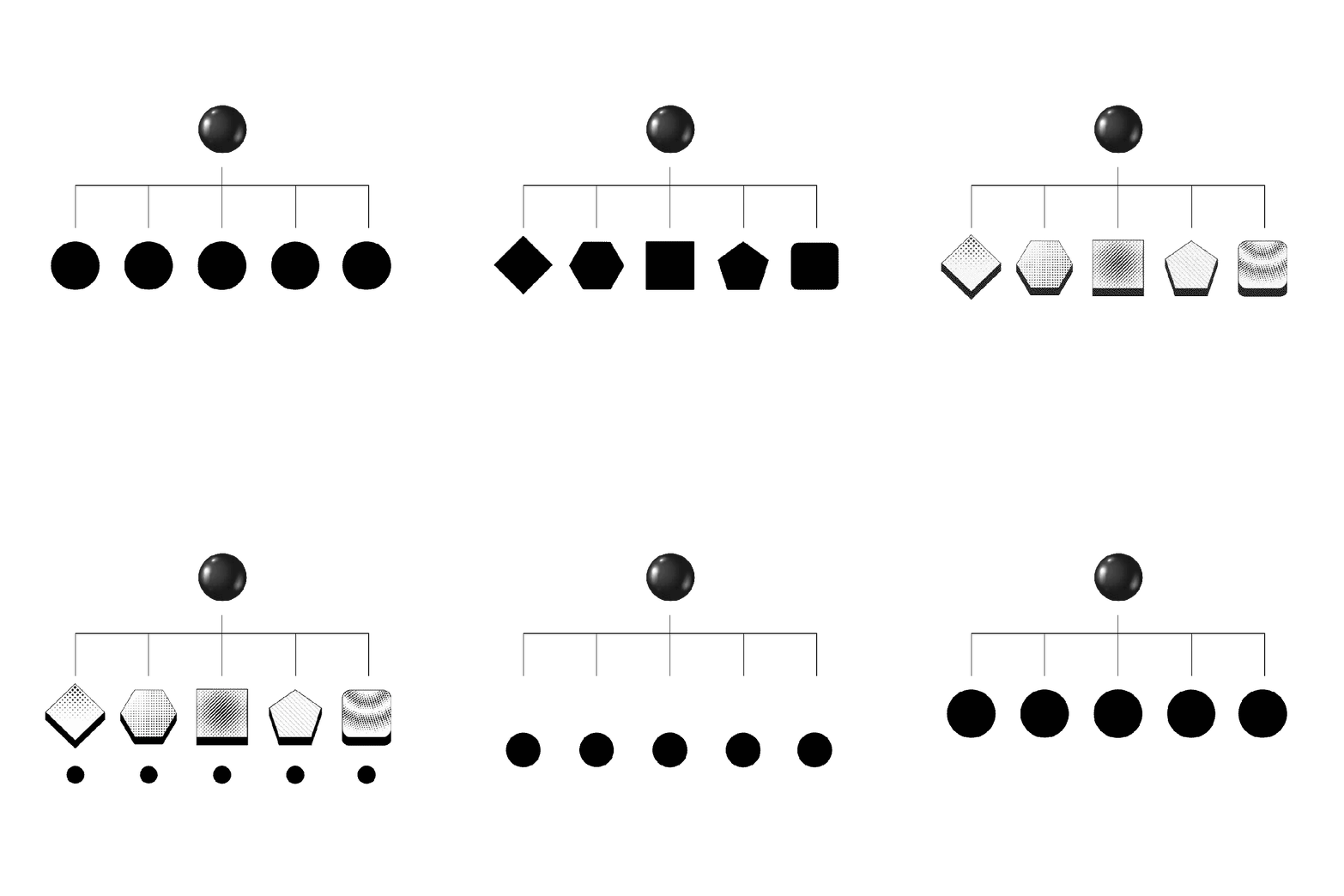
Brand Architecture Recommendation

Brand Architecture Recommendation

We recommended a monolithic brand architecture, establishing Apex Harmony as the master brand and using descriptive names to distinguish its offerings. This structure gives its different offerings a recognisable relationship and a consistent way to present themselves.

By retaining the same leading name and visual identity, the different offerings can contribute to a shared brand presence. Audiences can recognise their relationship without having to learn an entirely separate identity for each service.

The architecture also provides a framework for growth. New offerings can follow an established naming and presentation system, helping the organisation maintain clarity as its services develop. This monolithic structure provides Apex Harmony a consistent structure for communicating its existing expertise and future ambitions.

{ Brand Identity }

The refreshed identity gives visual expression to Apex Harmony’s commitment to personalised care and the possibilities within each person.

We retained the butterfly’s association with transformation and reinterpreted it through a simplified mark formed by two intertwined hearts. The hearts express compassion and enduring support, while the butterfly introduces growth and renewal into the brand’s visual story. Inspired by the Common Mime butterfly, the mark uses a continuous stroke to convey ongoing care. Its forward tilt adds a sense of movement, reflecting the organisation’s commitment to advancing dementia care.

The accompanying sans-serif logotype provides a clear, welcoming signature. We extended the identity into a coordinated system of colours, typography and imagery. Butterfly and floral illustrations create a recognisable visual language, reflecting the care and personal growth at the heart of Apex Harmony.

APEX HARMONY butterfly brand IDENTITY BRANDING DEMENTIA CARE BY CREATIVEANS
APEX HARMONY BRAND COLOUR IDENTITY BRANDING DEMENTIA CARE BY CREATIVEANS
APEX HARMONY LOGO COLOUR IDENTITY BRANDING DEMENTIA CARE BY CREATIVEANS

{ Brand Touchpoints }

We translated the new identity into stationery, presentation templates and staff uniforms, alongside digital communication designs. Each application carries the same visual language, giving teams a consistent way to represent Apex Harmony across everyday interactions.

The system defines how these elements work together across different formats. Clear application rules maintain consistency, while distinct guidance for marketing and on-site communication allows the identity to respond to different audiences and settings.

Brand Touchpoints
Brand Touchpoints touchpoint 1
Brand Touchpoints touchpoint 2
Brand Touchpoints touchpoint 3
Brand Touchpoints touchpoint 4
APEX HARMONY UNIFORM DESIGN CREATIVEANS BRANDING
Brand Touchpoints image 1
Brand Touchpoints image 2
Brand Touchpoints image 3
Brand Touchpoints image 4

{ Customer Journey and Service Blue Print }

Apex Harmony’s brand promise needed a clear connection to its service experience. We understand that finding dementia care involves practical decisions and emotional uncertainty.

We explored what families need at each stage of their journey, then mapped the people and processes supporting those interactions. Together, these frameworks provide a foundation for clearer communication and more coordinated service delivery. Firstly, we mapped Apex Harmony’s customer journey to understand how caregivers and families encounter its services, from initial awareness and enquiry through assessment, admission and ongoing engagement.

By examining their questions and emotions at each stage, we identified moments where clearer information and reassurance could better support their experience. Then we developed a service blueprint linking the caregiver’s journey with the people and processes behind each interaction. It maps enquiry and admission through to ongoing communication and visits, giving a comprehensive view of how the service works.

Customer Journey and Service Blue Print

{ Brand Rollout }

We brought Apex Harmony’s brand strategy and identity together in a comprehensive brand manual. It explains the brand’s purpose and positioning, then sets clear standards for the logo, visual language and application designs.

The comprehensive brand manual consolidates the positioning, values and personality, alongside the master brand architecture and visual identity standards. Guidelines and application examples show how these principles translate across communications, staff uniforms and the physical environment, giving internal teams and external partners a consistent reference.

Alongside the manual, the customer journey and service blueprint connect the brand with the experience of caregivers and families. Together, these deliverables give Apex Harmony guidance on both how the brand is expressed and how its service experience is supported. They provide a common foundation for maintaining consistency, developing future touchpoints and introducing new services under one recognisable Apex Harmony brand.

Brand Rollout

“I’m proud of the care and thought our team invested in Apex Harmony’s branding. Understanding its approach to dementia care helped us give ‘Advancing Dementia Care’ a clear expression through the brand concept. We considered the organisation’s ambitions alongside the everyday needs of persons with dementia, shaping an identity and proposed experiences grounded in its person-centred philosophy. This project reflects our belief that good branding should have a clear purpose and a meaningful relationship with the people it serves.”

A three-dimensional, metallic letter "C" rendered in a dark glass or chrome material that reflects a vibrant, iridescent gradient of rainbow colors along its curved edges.
Kimming Yap
Managing Director of Creativeans