{ Project Overview }
{ Creative Challenge }
- 01
Brand identity lacked coherence and failed to articulate core values
- 02
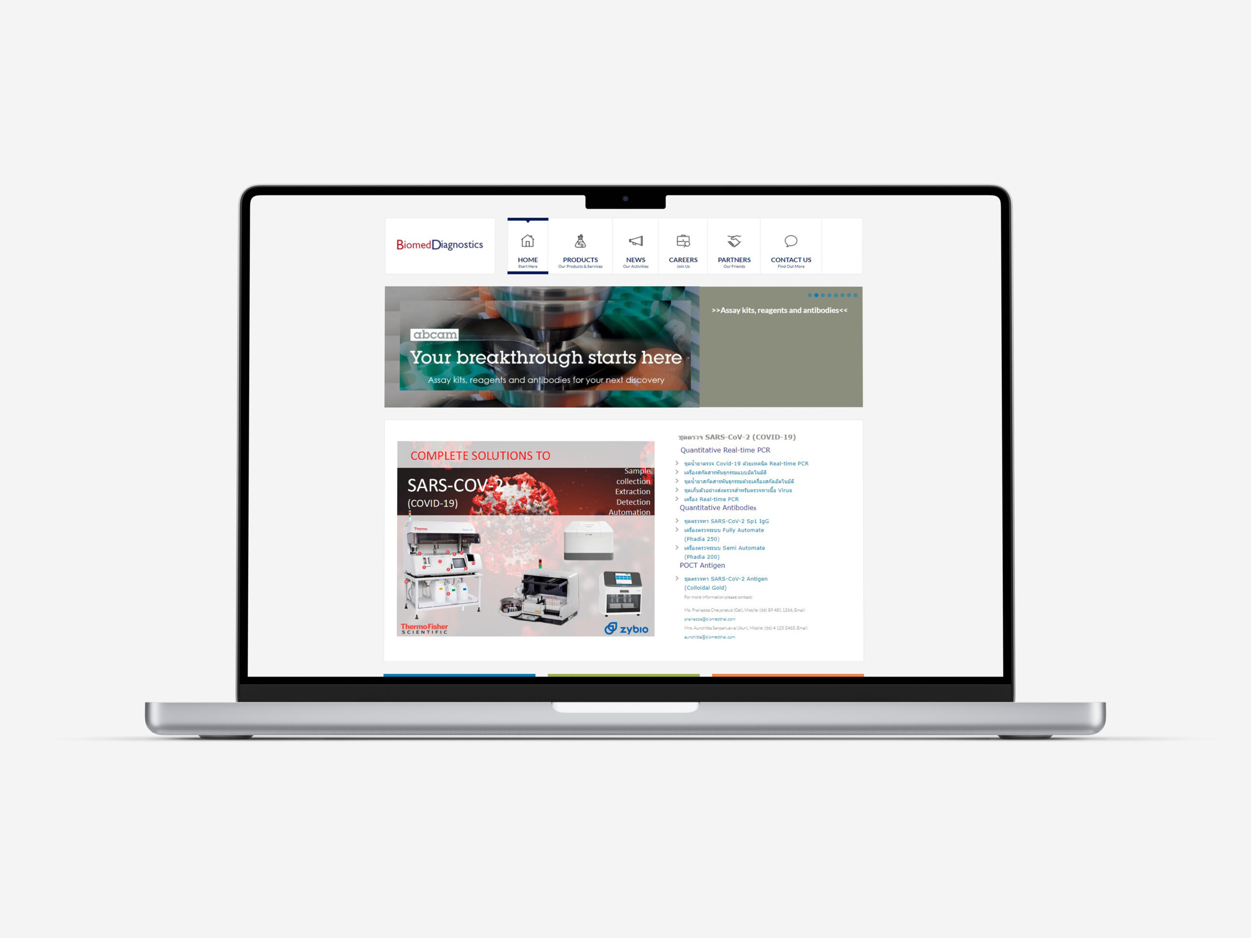
Website structure was confusing, leading to poor user experience
- 03
Users struggled to find key information, contributing to high bounce rates
- 04
Design looked dated and undermined Biomed’s standing in the biomedical field
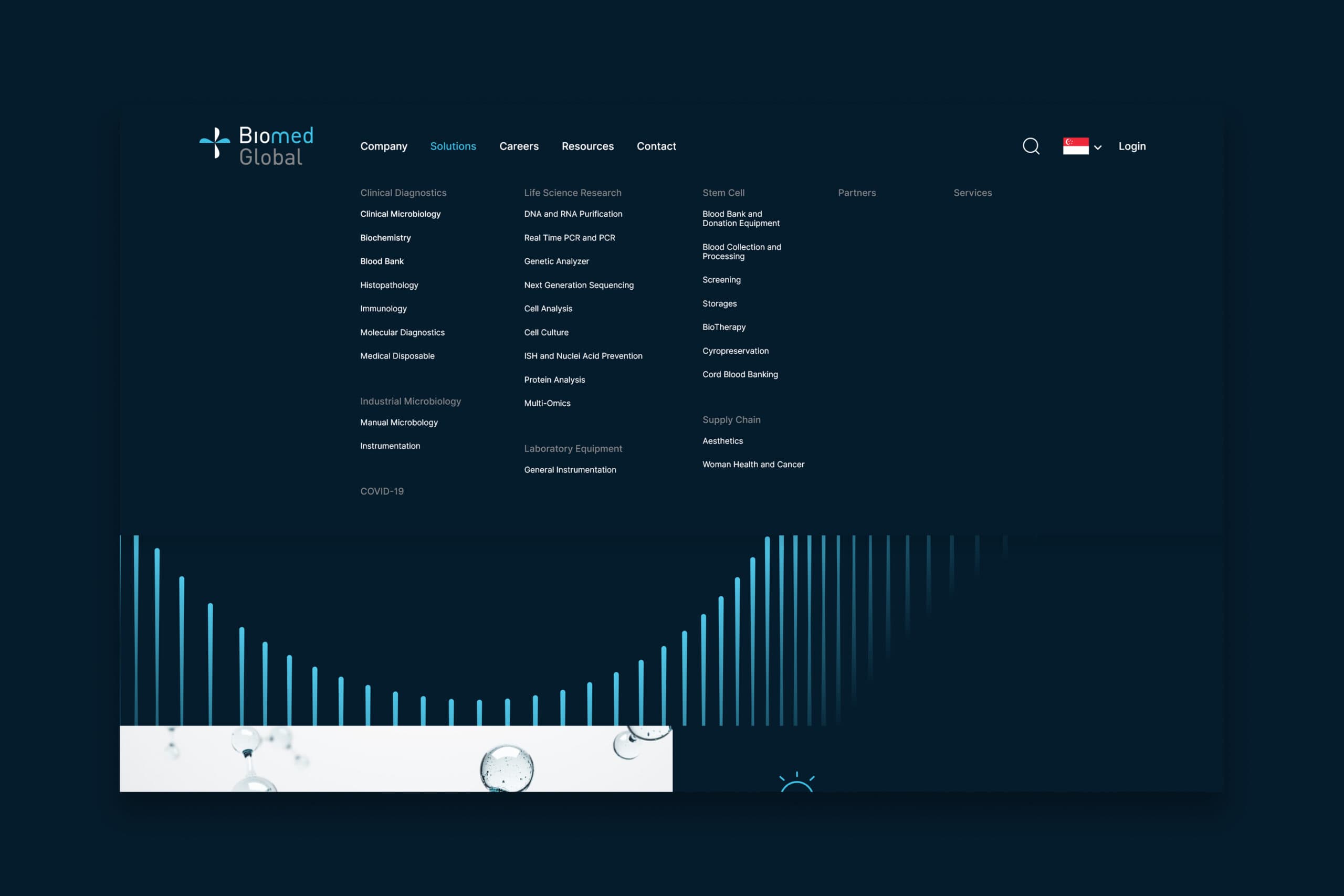
{ The Solution }
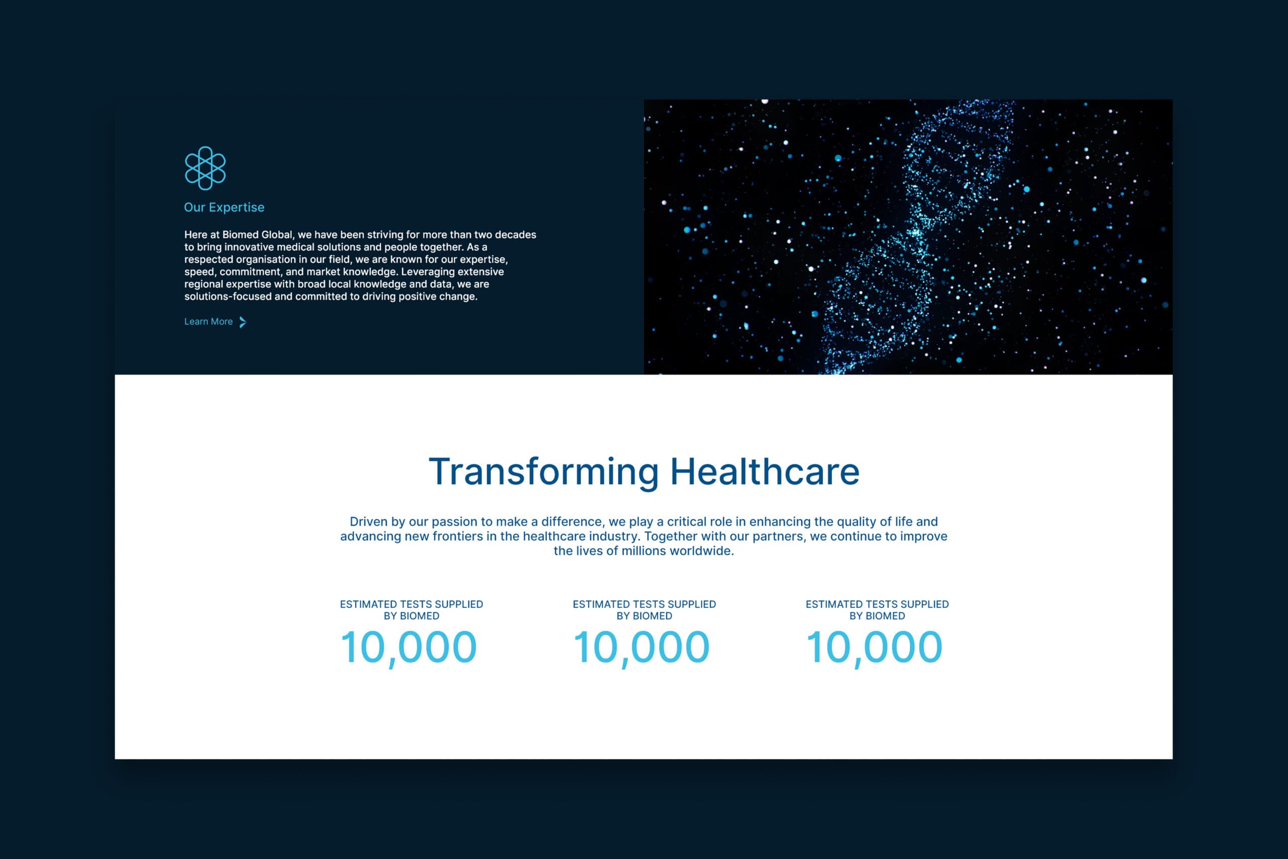
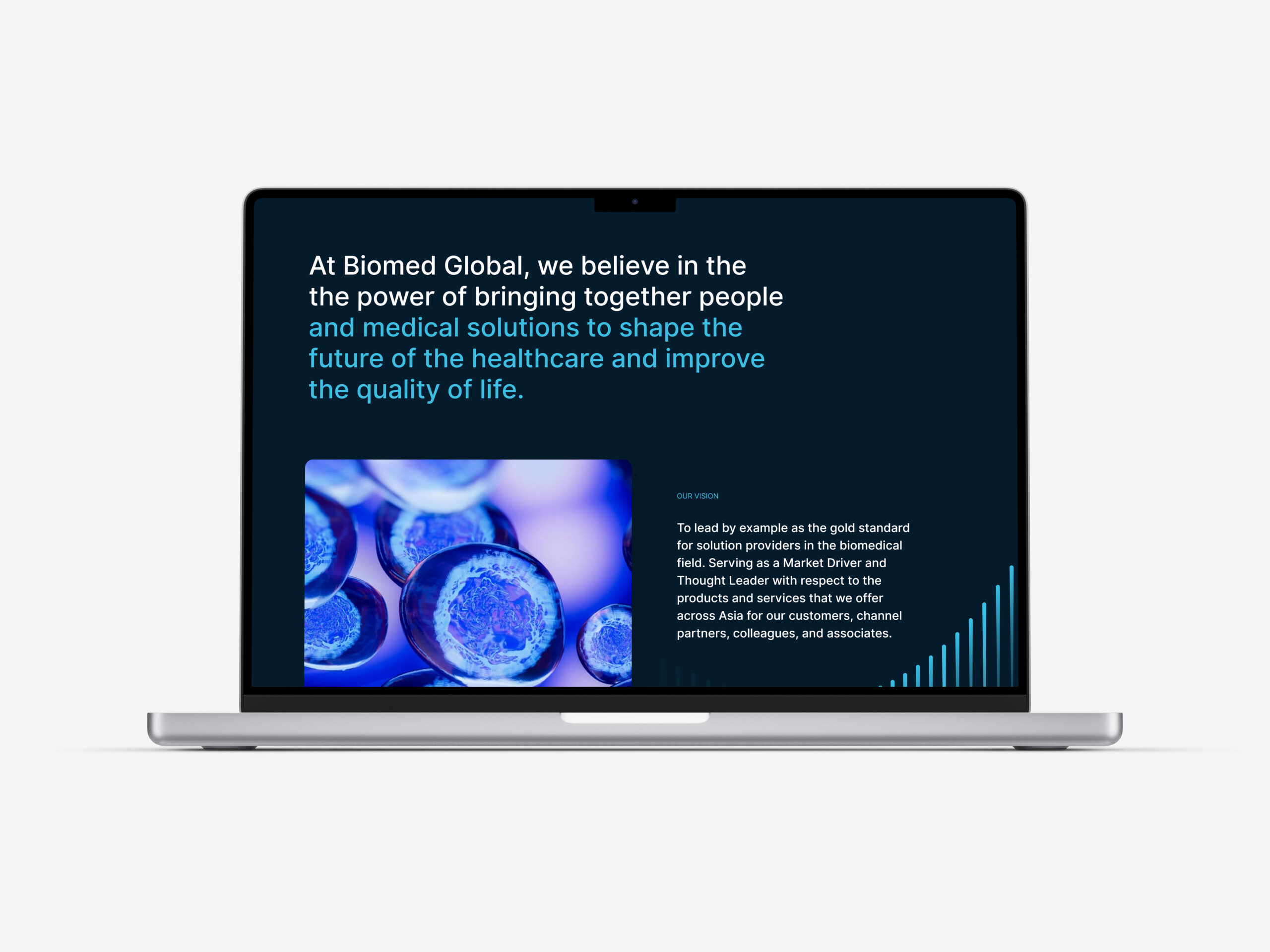
Created a focused brand narrative to express Biomed’s vision and value
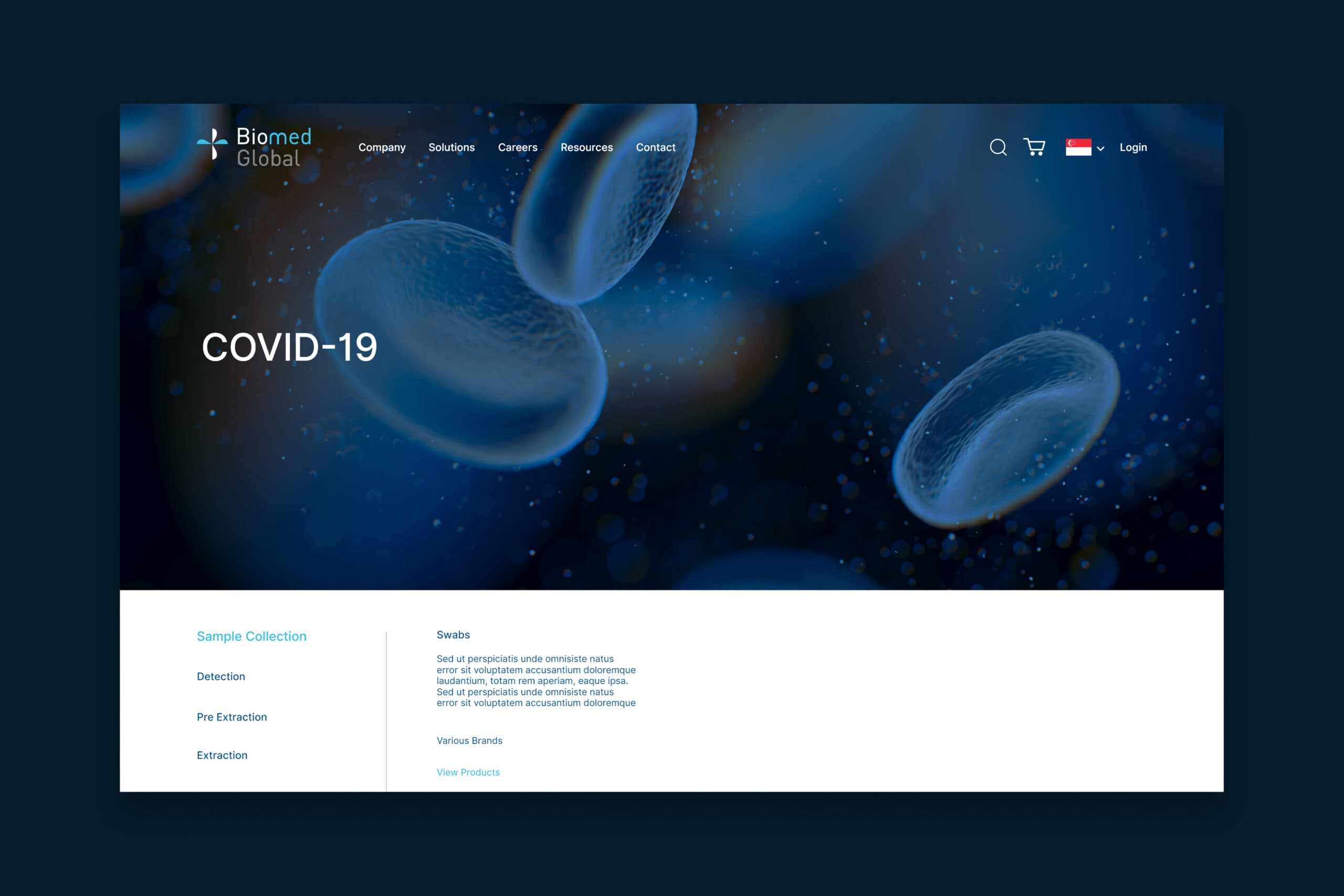
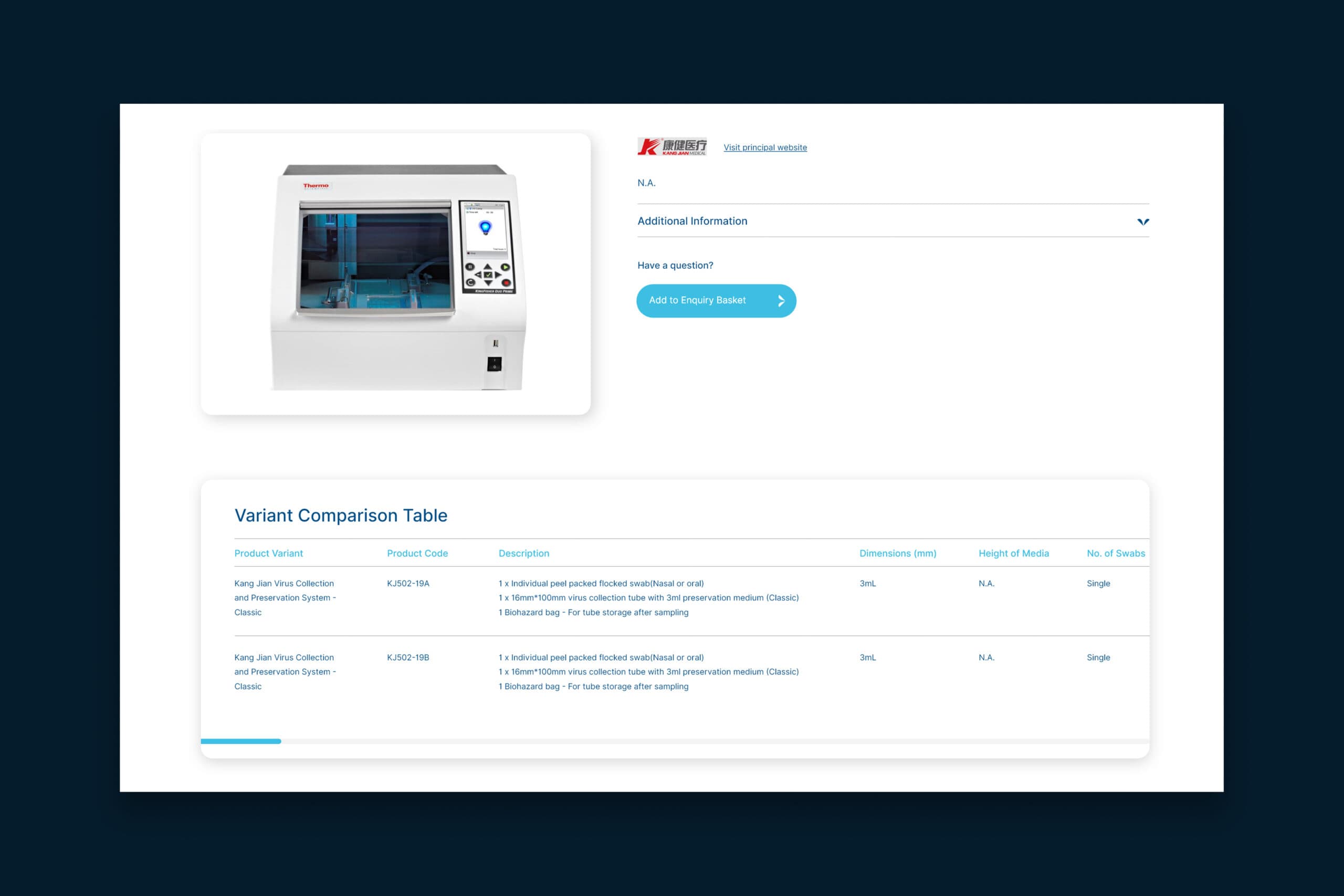
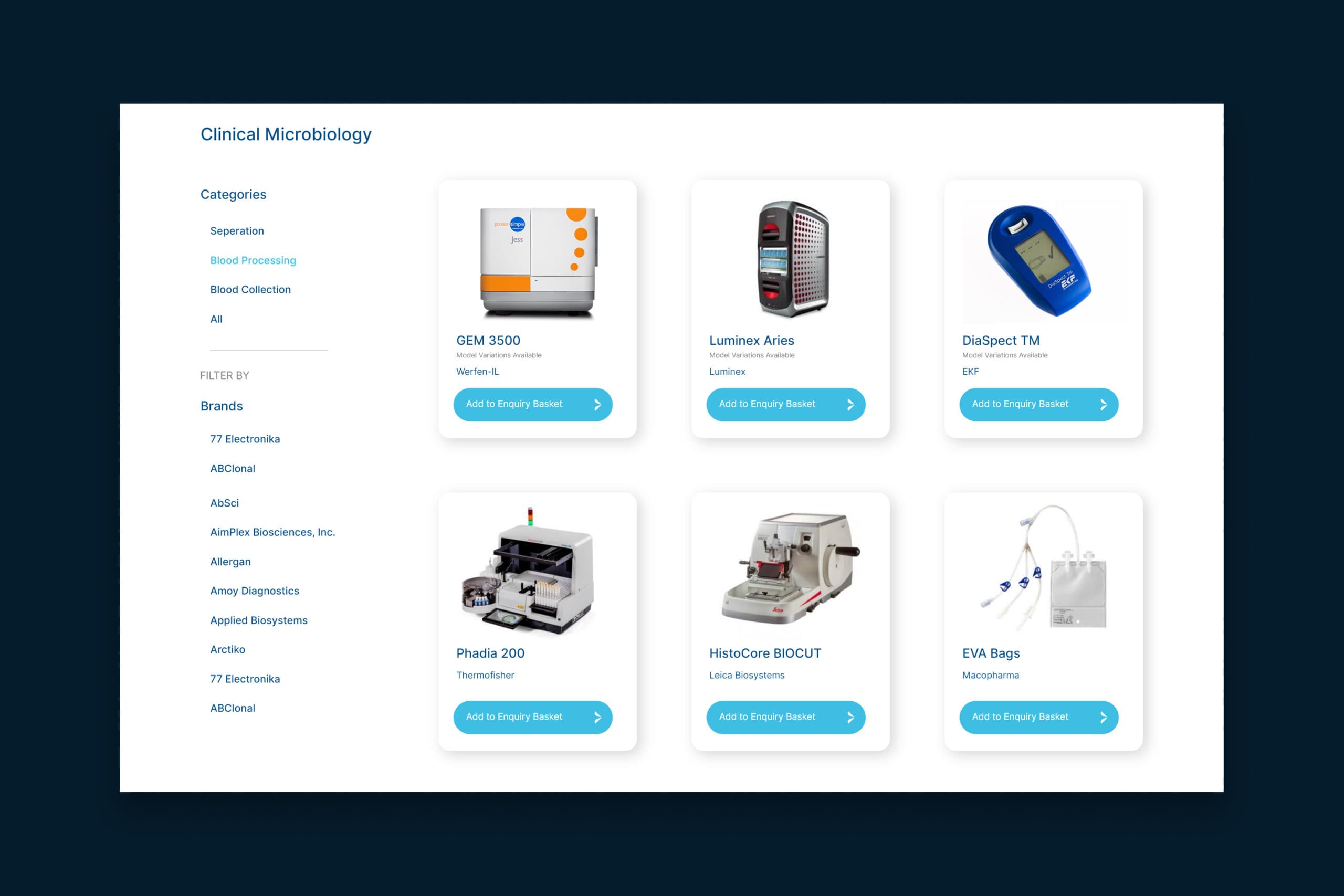
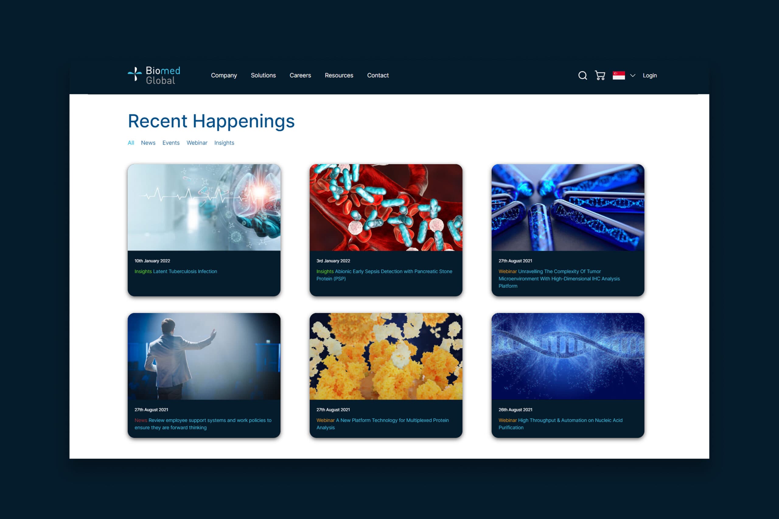
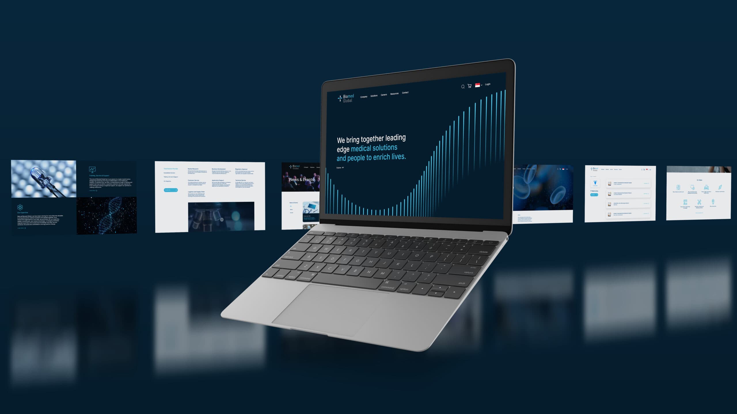
Restructured site architecture for intuitive navigation and usability
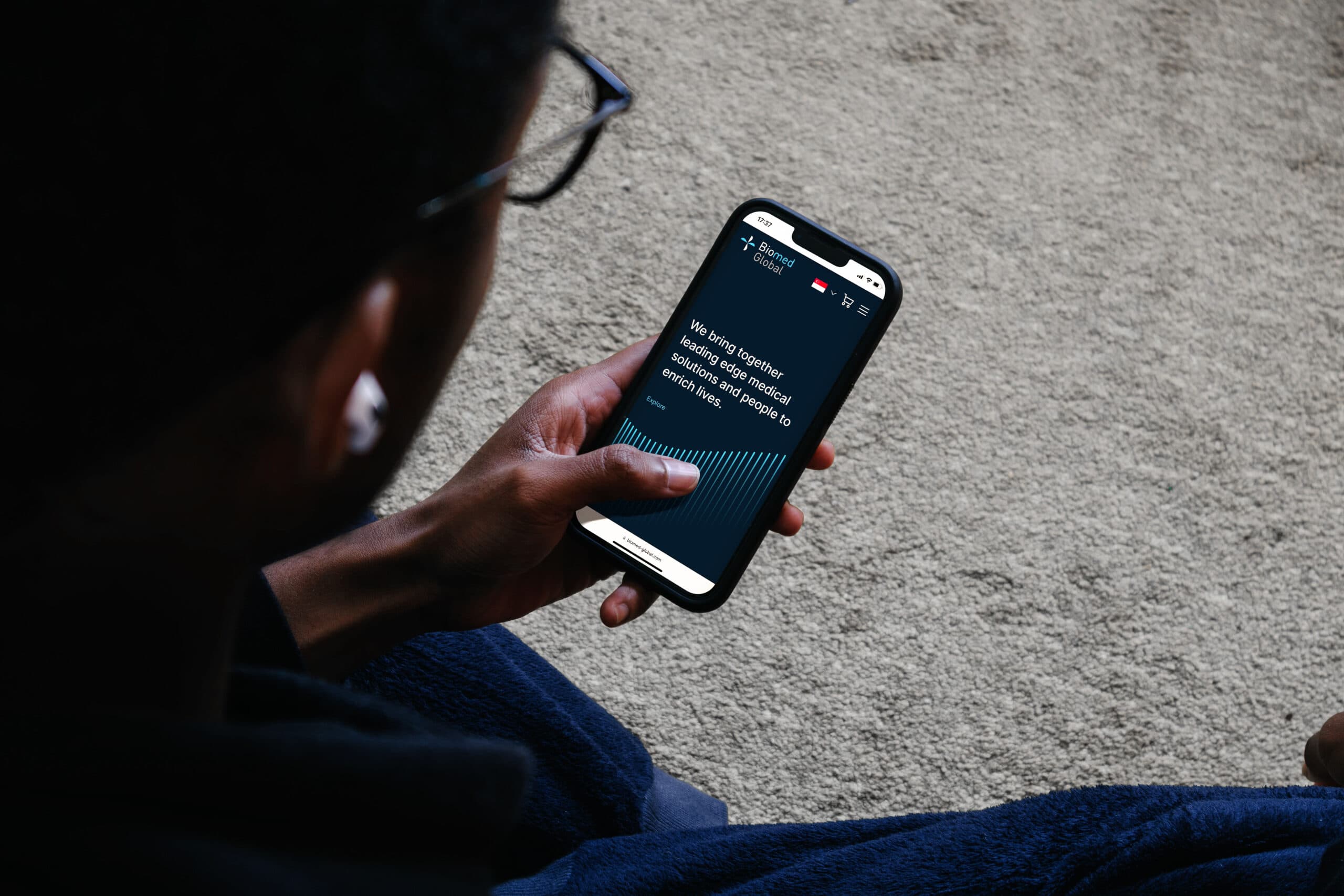
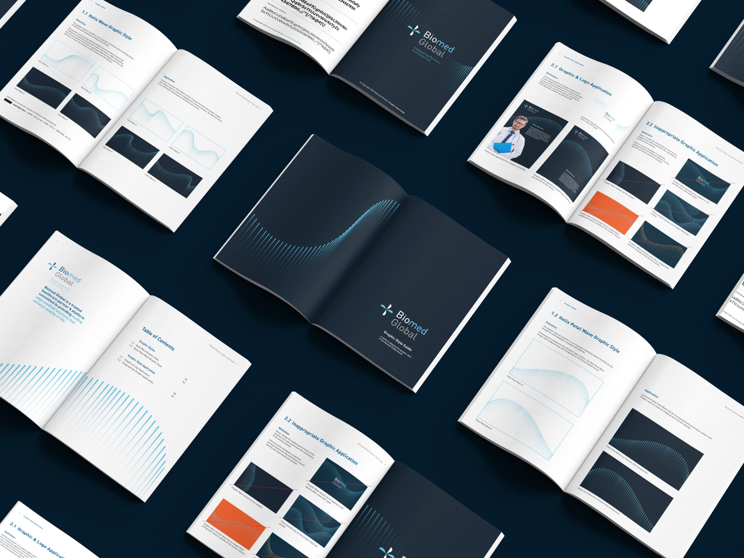
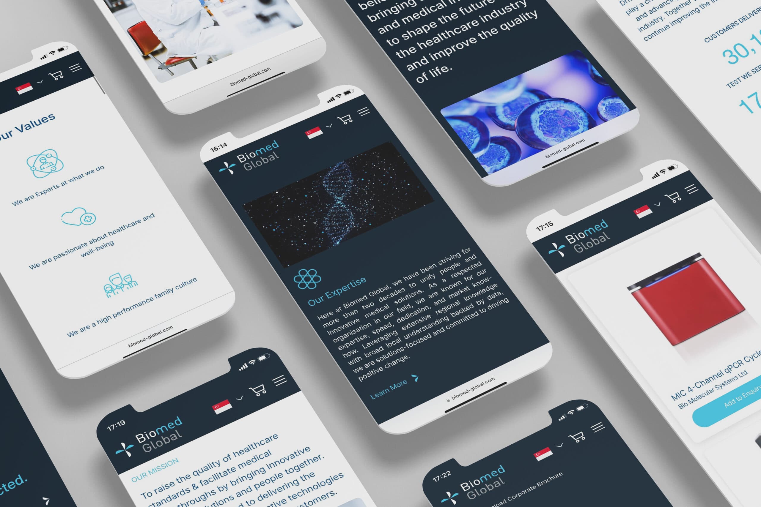
Refined UI design with bold blue tones, clean typography, and abstract visuals to signal modernity and expertise
Positioned Biomed as a confident, modern player—the new “gold standard” in biomedical communications
{ THE DIFFERENCE }
{ Conduct UX Research }
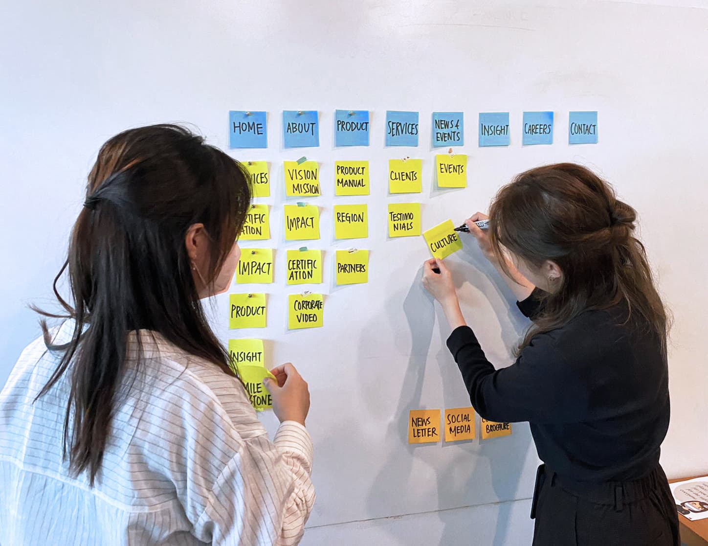
Organising The Information Architecture
The next step in the process, after we’ve gained clarity on user needs and identified issues with the old website, is re-organising the Information Architecture (IA) of the website. A well thought-out IA focuses on organising, structuring, and labelling content in an effective and sustainable way; this ensures that the new website will help users find information and complete their respective tasks more easily. A site map is then created after conducting a card sorting session with the user.
{ The User Interface (UI) Design }