Revitalizing Wellness:
Core Concepts' Transformative Rebrand

{ Project Overview }
Core Concepts is a physiotherapy group with expertise in body movement and function. They deliver personalised physiotherapy care plans that effectively relieve pain, restore strength and mobility while preventing further injuries. In pursuit of continued excellence and uncompromising quality, the team at Core Concepts strives to unlock the fullest potential of each and everyone who walks through their doors.
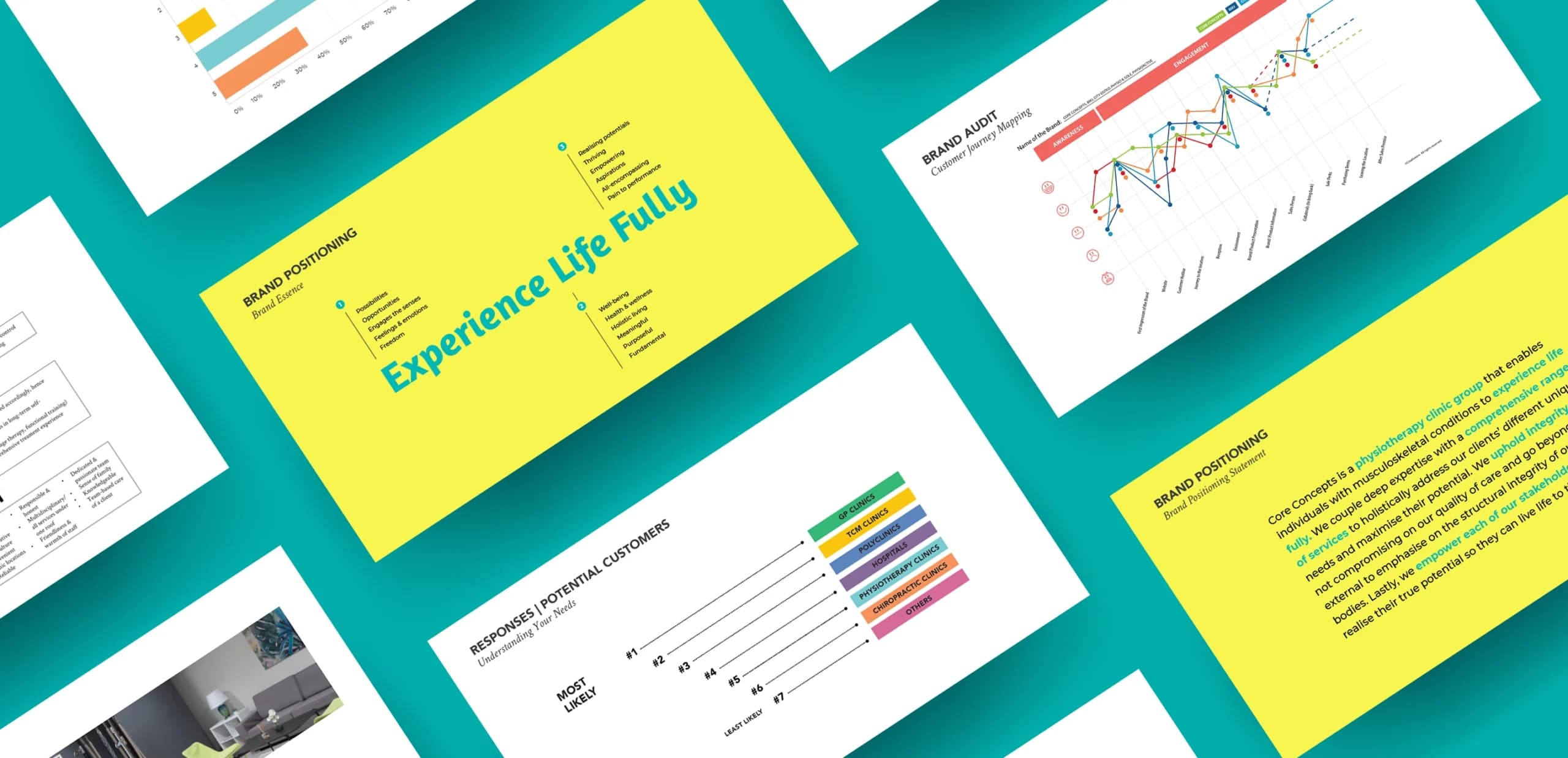
The brand audit consists of an in-depth look into Core Concept’s existing brand, the Physiotherapy landscape, key competitors, and qualitative customer interviews. The result is an impactful, friendly, and empowering brand that stands out amongst competitors.

{ Creative Challenge }
- 01
Core Concepts lacked brand awareness among the general audience as they perceived physiotherapy as a specialised service for specific medical conditions.
- 02
Core Concepts did not have a coherent brand story and identity, hence unable to communicate the value of their services to customers.
- 03
Core Concepts’ existing brand identity was not unique enough to stand out among competitors and was often confused with other brands due to its generic logo design.
{ The Solution }
With a distinctive brand position, customers have a higher top-of-mind recall of Core Concepts and a better understanding of the treatments and services that the brand can provide.
Core Concepts communicates more effectively with new and existing customers, as there is a greater understanding of the values the brand represents, resulting in higher resonance among target audiences.
A brand-new identity and logo from Core Concepts’ distinctive brand position help cement the brand experience as uniquely different from other physiotherapy clinics.

{ THE DIFFERENCE }


{ Brand Positioning }
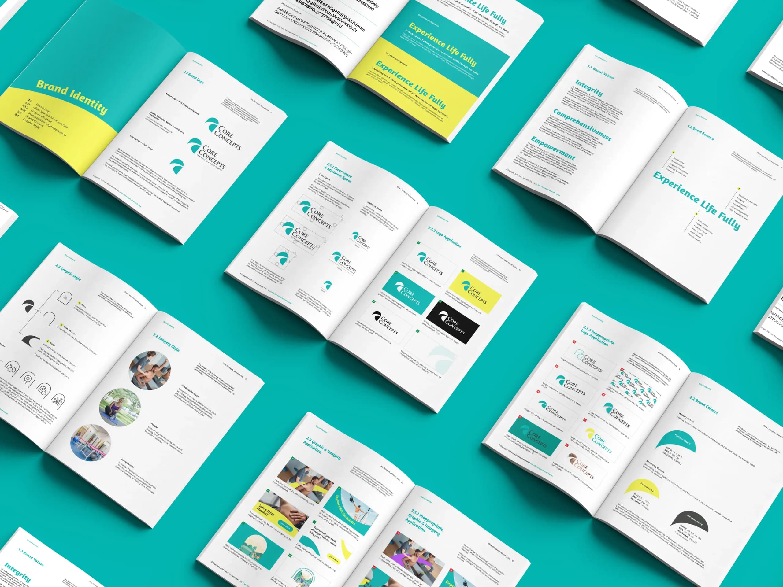
{ Brand Identity }
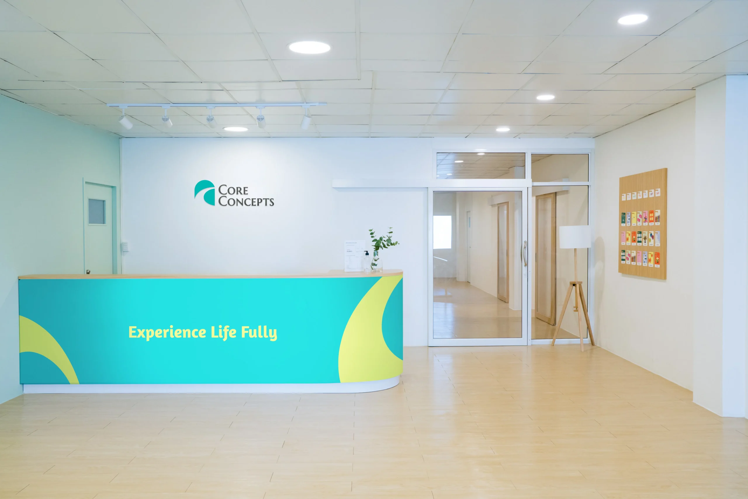
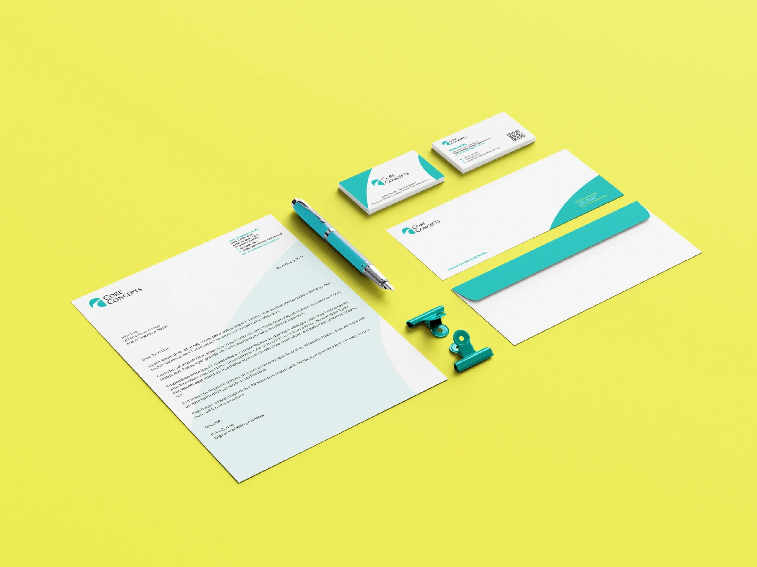
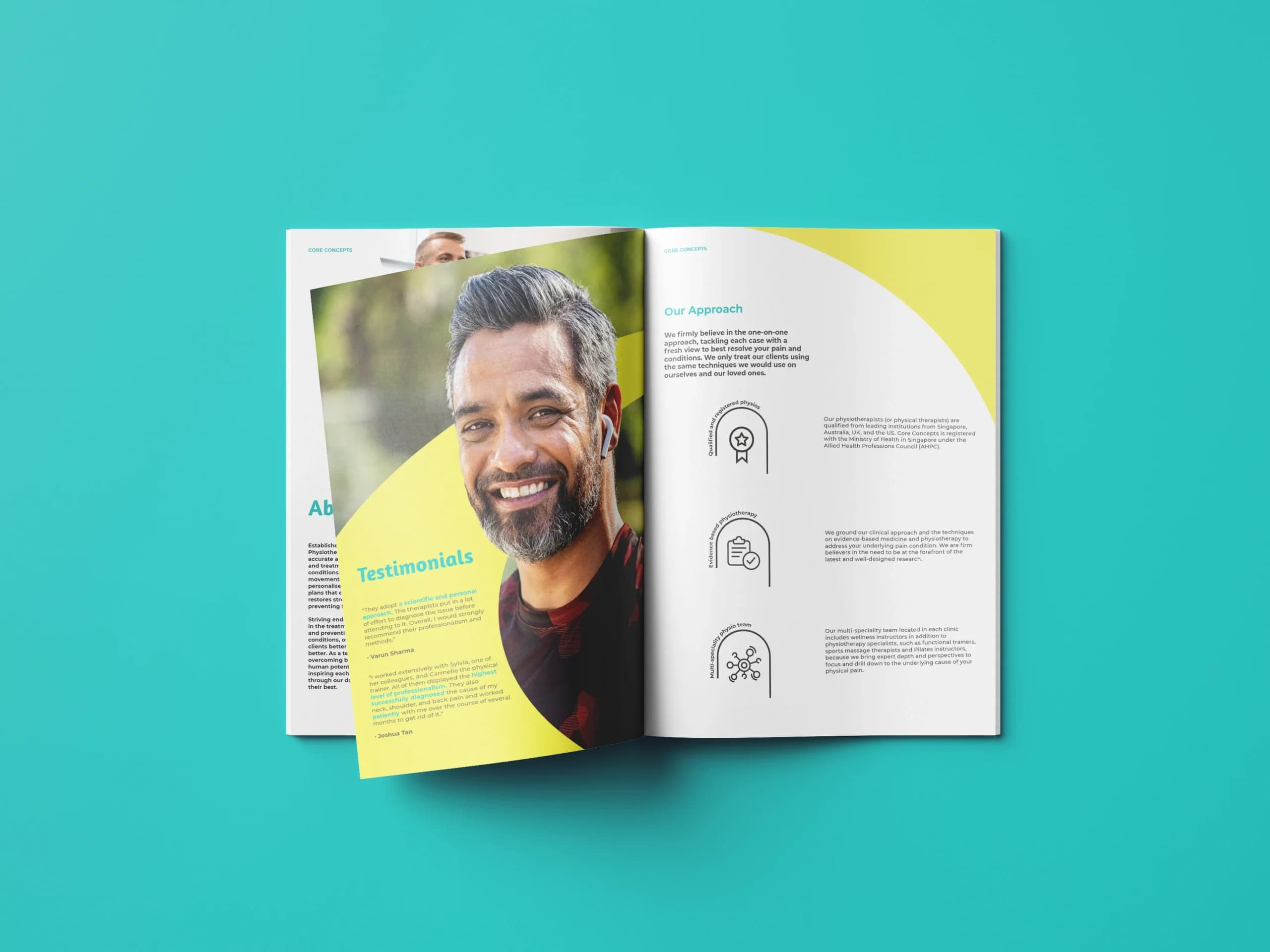
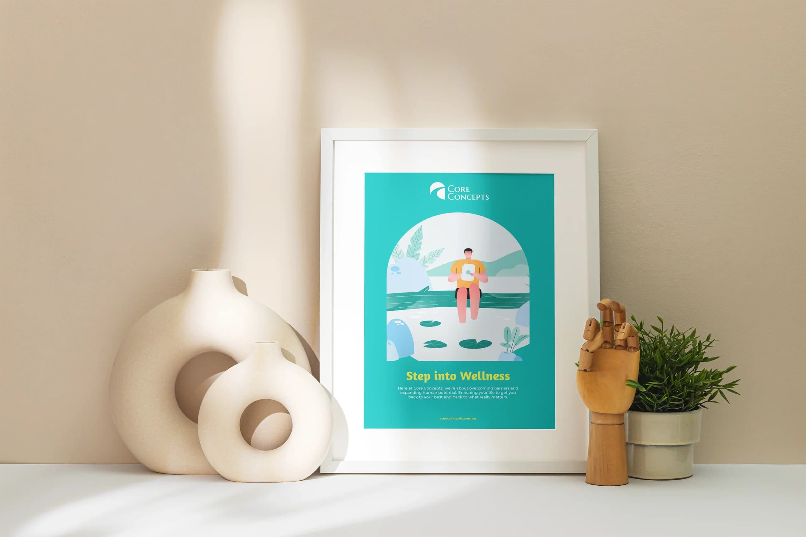
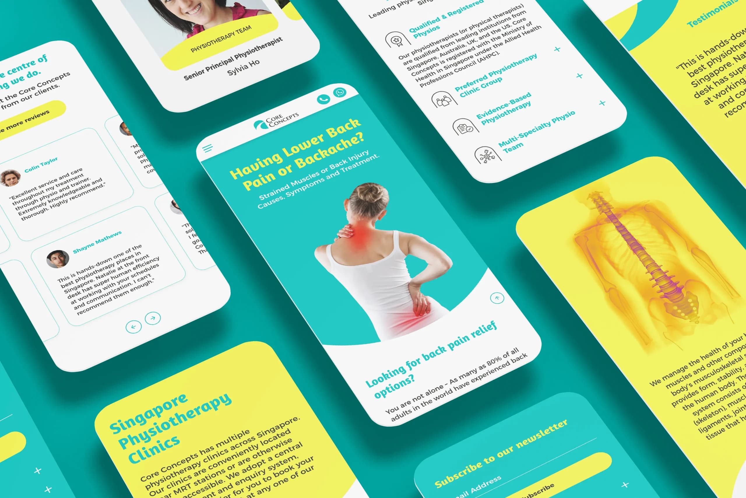
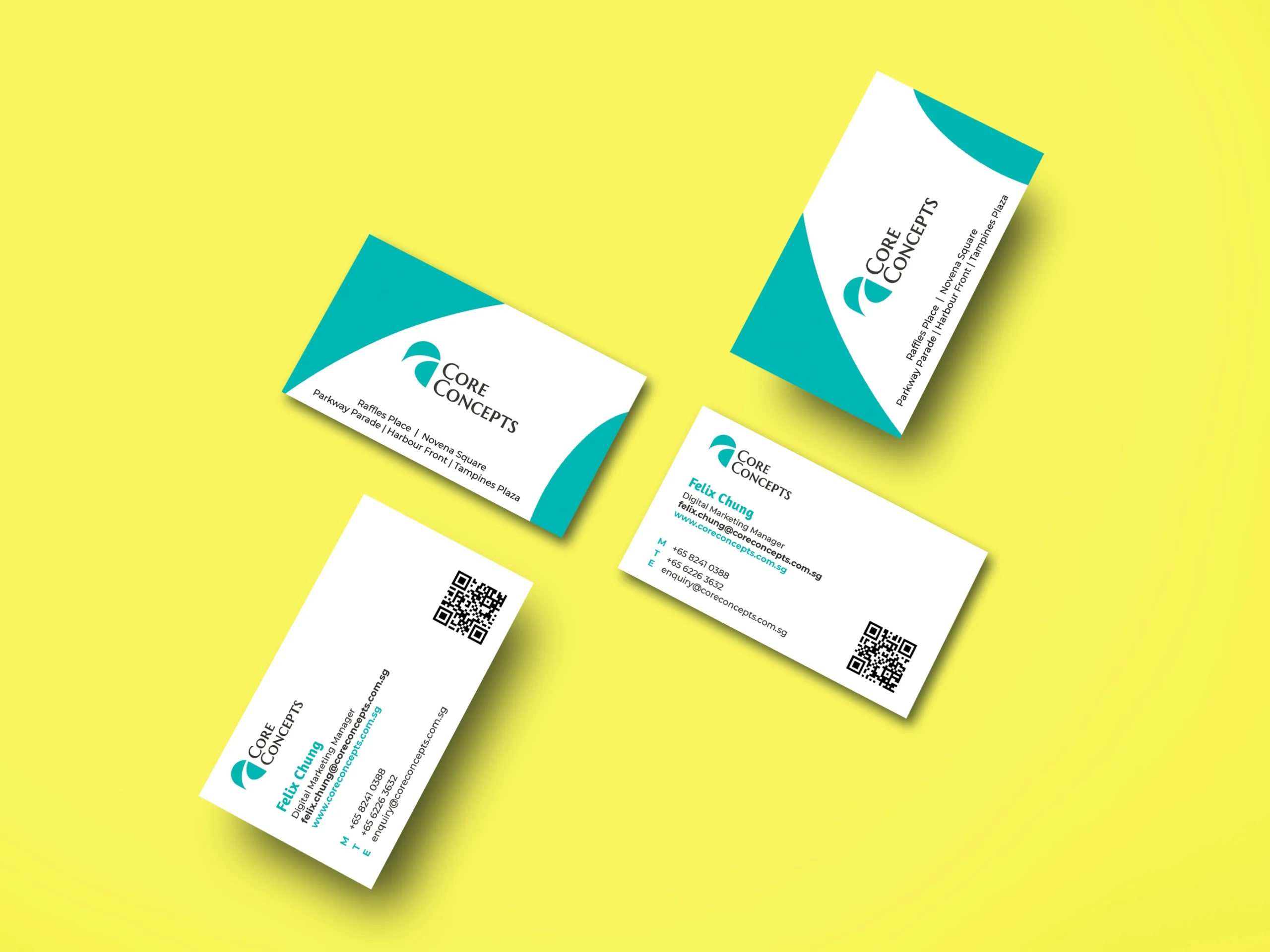
{ Brand Touchpoints }
With Core Concepts’ transition to a functional-experiential brand, we developed a wide range of touchpoints that seamlessly incorporate Core Concepts’ new brand positioning and identity to reach their customers effectively.
Brand touchpoints include corporate stationery, brochure, presentation deck, tote bag, poster, website and more. These touchpoints are essential in creating a unified and consistent brand experience for Core Concepts’ clients.
Combined with Core Concepts’ new colour palette and graphic identity, the wide range of touchpoints demonstrates the versatility of the brand identity in conveying the brand’s message effectively.