• Award-Winning Brand and Design Consultancy • Claim Up to 50% EDG Grant for Your Brand. Limited Time only• Award-Winning Brand and Design Consultancy • Claim Up to 50% EDG Grant for Your Brand. Limited Time only• Award-Winning Brand and Design Consultancy • Claim Up to 50% EDG Grant for Your Brand. Limited Time only• Award-Winning Brand and Design Consultancy • Claim Up to 50% EDG Grant for Your Brand. Limited Time only• Award-Winning Brand and Design Consultancy • Claim Up to 50% EDG Grant for Your Brand. Limited Time only• Award-Winning Brand and Design Consultancy • Claim Up to 50% EDG Grant for Your Brand. Limited Time only• Award-Winning Brand and Design Consultancy • Claim Up to 50% EDG Grant for Your Brand. Limited Time only• Award-Winning Brand and Design Consultancy • Claim Up to 50% EDG Grant for Your Brand. Limited Time only• Award-Winning Brand and Design Consultancy • Claim Up to 50% EDG Grant for Your Brand. Limited Time only• Award-Winning Brand and Design Consultancy • Claim Up to 50% EDG Grant for Your Brand. Limited Time only• Award-Winning Brand and Design Consultancy • Claim Up to 50% EDG Grant for Your Brand. Limited Time only• Award-Winning Brand and Design Consultancy • Claim Up to 50% EDG Grant for Your Brand. Limited Time only• Award-Winning Brand and Design Consultancy • Claim Up to 50% EDG Grant for Your Brand. Limited Time only• Award-Winning Brand and Design Consultancy • Claim Up to 50% EDG Grant for Your Brand. Limited Time only• Award-Winning Brand and Design Consultancy • Claim Up to 50% EDG Grant for Your Brand. Limited Time only
Creativeans C LogoCreativeans

Elevate Your Senses
with Iryasa's New
Packaging Design

Communication Design
Packaging Design
IRYASA

{ Project Overview }

We redesigned Iryasa’s packaging to express natural strength, healing, and wellness through a clearer, more authentic brand experience.

Founded in 2018, Iryasa operates in the realm of skin health and nutrition, offering remedial skincare items, health supplements, and essential oils. Rooted in language symbolism, “Irya” signifies strength in Sanskrit, while “Asa” translates to healer in Hebrew.

To reflect this positioning, the packaging uses nature-inspired colours that convey authenticity, care, and product trust. The organisation of information and visual elements was redesigned to simplify the consumer experience, making each product easier to understand, navigate, and connect with.

{ Creative Challenge }

An ineffective packaging design that failed to express brand values and engage customers
  1. 01

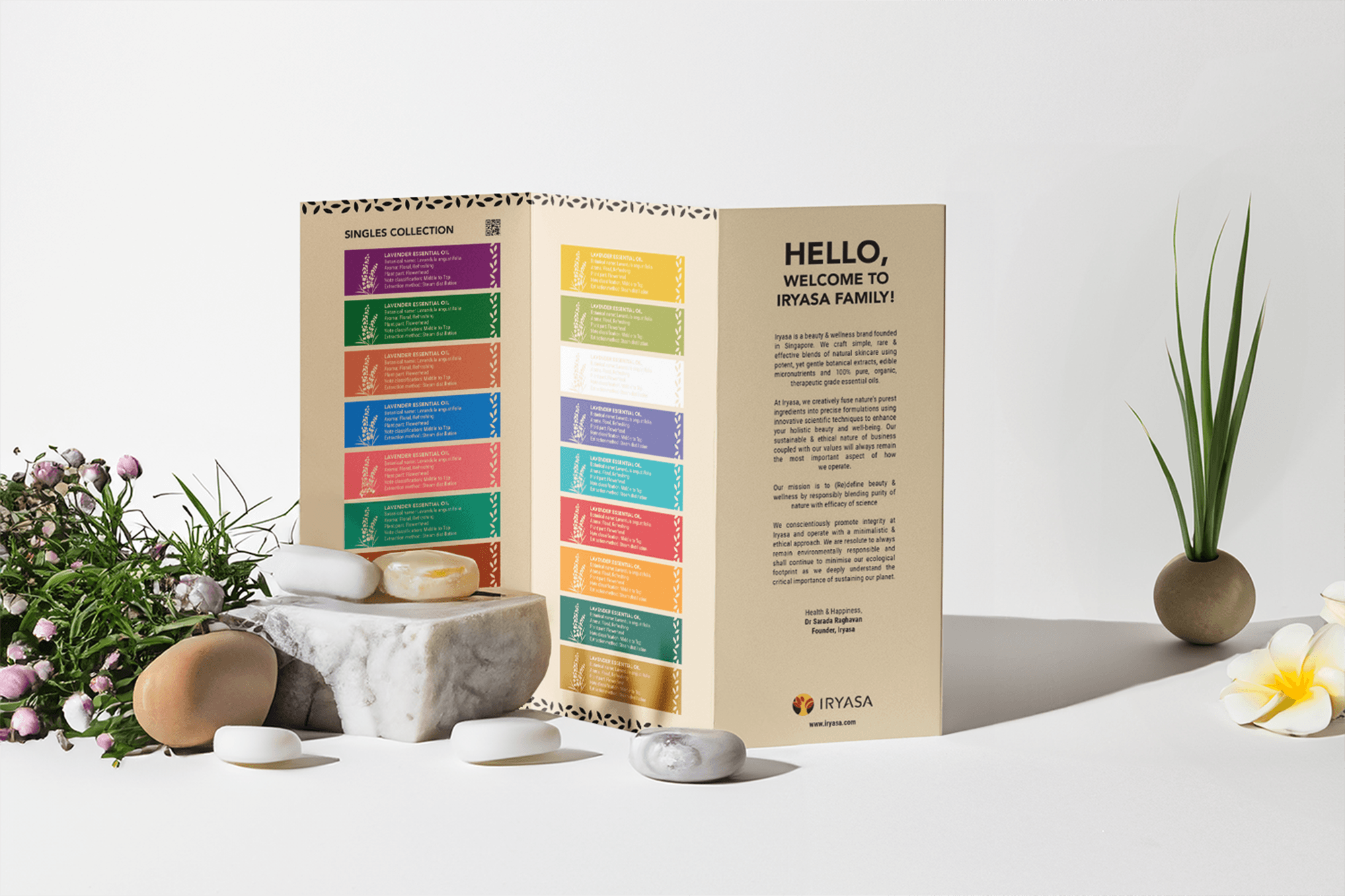
    Iryasa’s packaging falls short in conveying the brand’s narrative of “natural” and the essence of “purity of nature,” thus missing the opportunity to establish a meaningful connection with potential customers.

  2. 02

    The packaging lacks clear readability and a well-defined information hierarchy, making it ineffective in efficiently communicating essential product details to customers.

  3. 03

    The overall packaging fails to guide customers through an experiential journey, making it challenging for the brand to distinguish itself from competitors.

{ The Solution }

Created a packaging system that embodies purity, builds trust, and elevates customer experience
  1. Redesigned packaging effectively conveys Iryasa’s commitment to “natural” and the “purity of nature,” fostering a stronger emotional bond with customers.

  2. Improved packaging ensures easy access to essential product information, enhancing customer understanding and trust in the Iryasa brand.

  3. Redesigned packaging provides a captivating experiential journey, distinguishing Iryasa from competitors and leaving a memorable impression on consumers.

{ THE DIFFERENCE }

Before
After
{ BEFORE }{ AFTER }

{ Unearthing Opportunities }

We conducted a systematic market analysis to uncover opportunities that would help Iryasa stand out within the skin health and wellness category.

Our team reviewed the product offerings, branding strategies, and packaging aesthetics of key competitors in the market. This involved studying competitor packaging designs, identifying prevailing trends, and understanding consumer preferences within the category.

Through this research, we gained valuable insights into market gaps, competitor strengths, and areas where Iryasa could differentiate itself. These findings helped shape the redesign direction, ensuring the packaging not only meets industry standards but also creates a stronger, more distinctive brand presence.

IRYASA
brand architecture

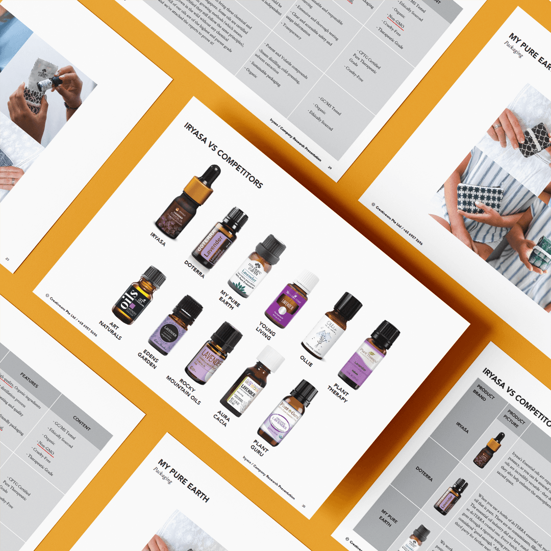
Information Hierarchy

We structured the design with a systematic arrangement of elements, incorporating logos, icons, text, and patterns for easy product categorisation. The thoughtfully crafted text not only communicates vital product details but also narrates Iryasa’s brand story and values, captivating consumers and emphasising distinctive selling points. This well-defined information hierarchy successfully conveys the product’s message to its target audience.

“We designed Iryasa’s essential oils packaging to convey the brand’s commitment to sustainability and the purity of nature, fostering a stronger emotional bond with their loyal customers.”

Kimming Yap
Managing Director, Creativeans
Yulia Saksen

Your brand might look great.
But is it working?

Discover what's missing in your brand strategy and
how a few changes can grow your business

Book a Free Brand Consultation with Yulia Now.

Contact Us Now
IRYASA