{ Project Overview }
{ Creative Challenge }
- 01
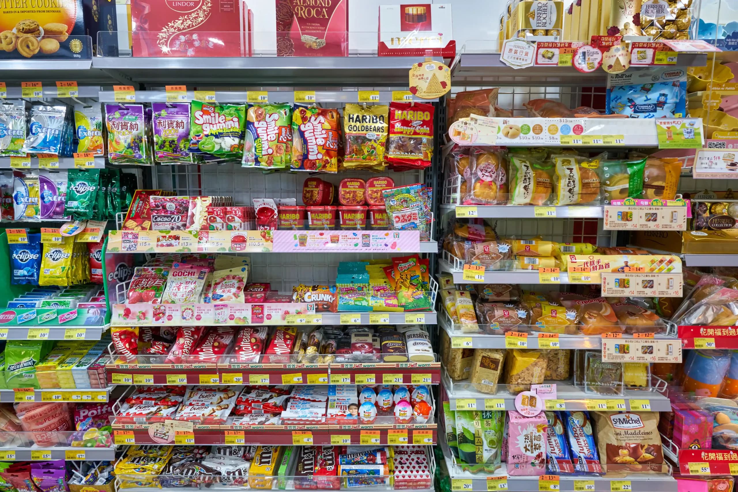
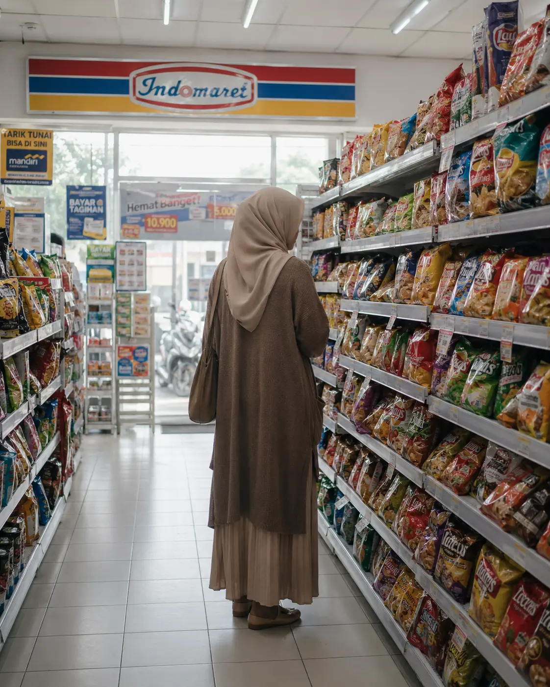
Dalezz needed packaging that could stand out in Indonesia’s crowded snack market while feeling locally relevant, clearly communicated, and more international
- 02
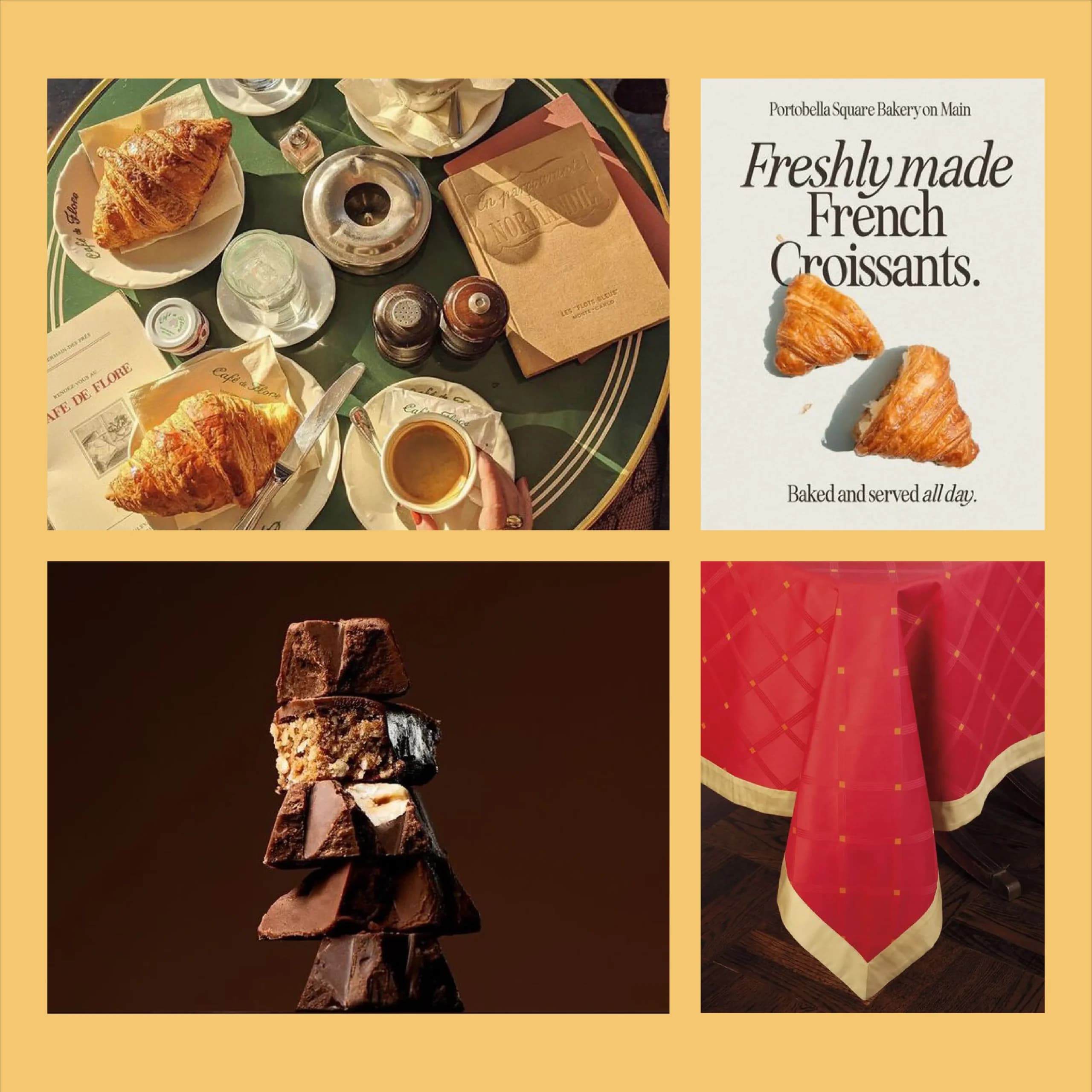
The brand entered competitive categories where familiar colours, bold naming, and indulgent imagery were already common, making differentiation challenging
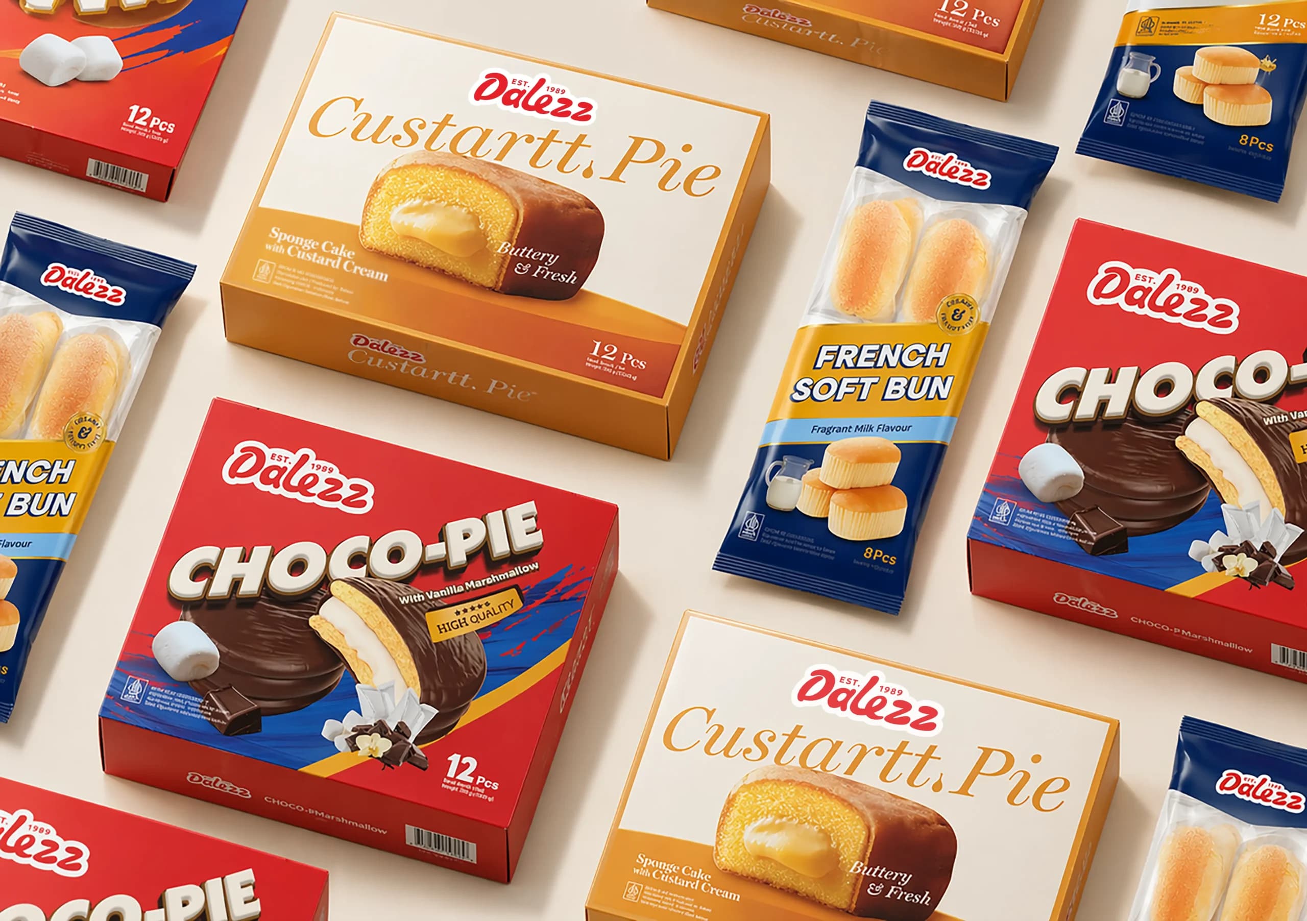
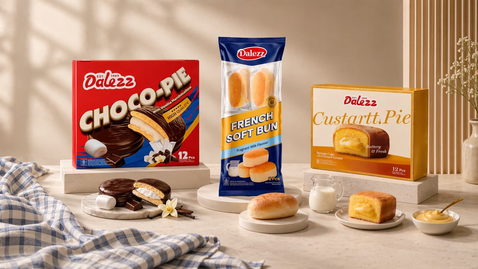
- 03
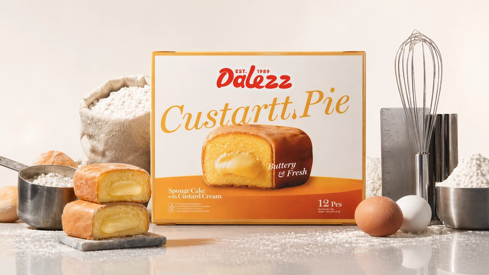
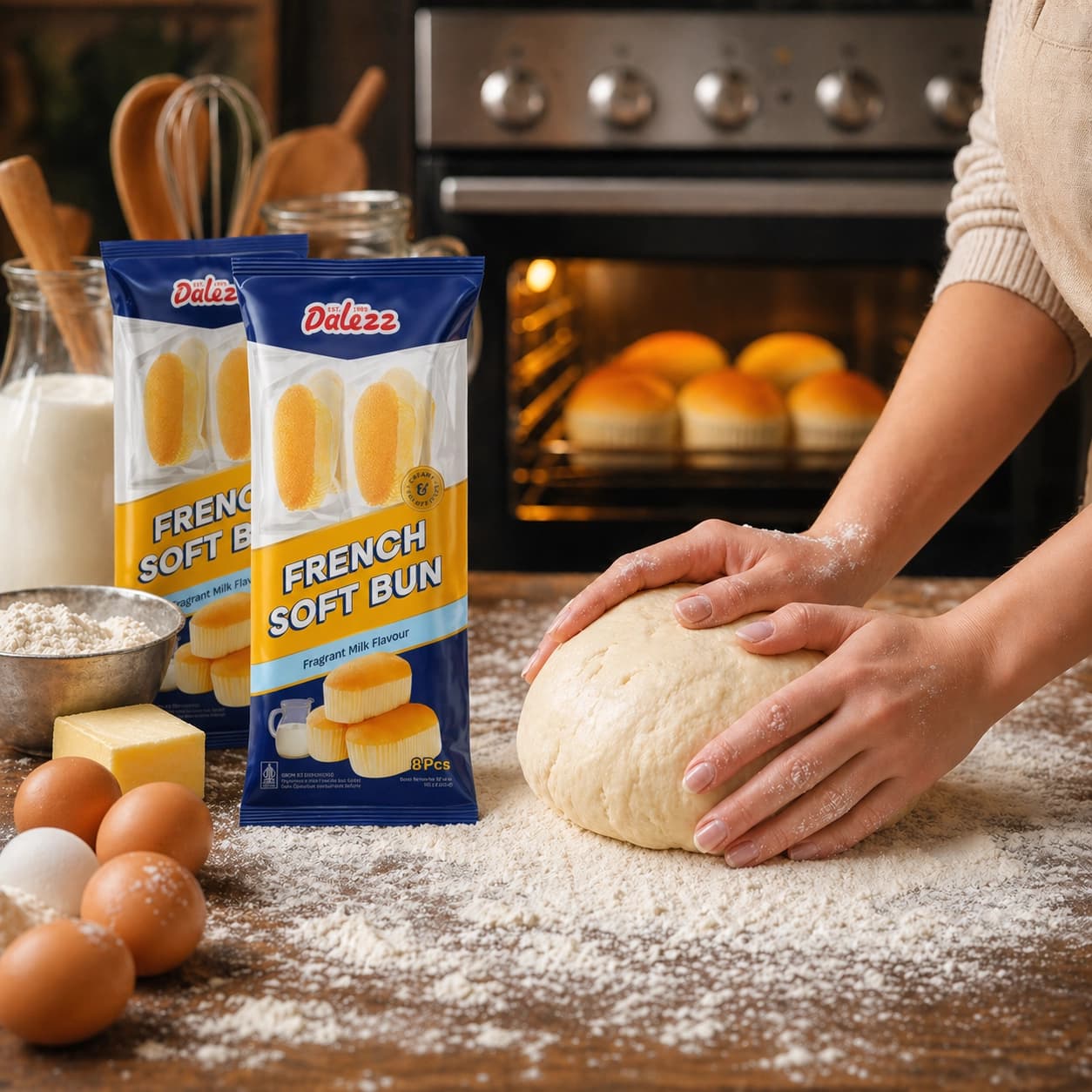
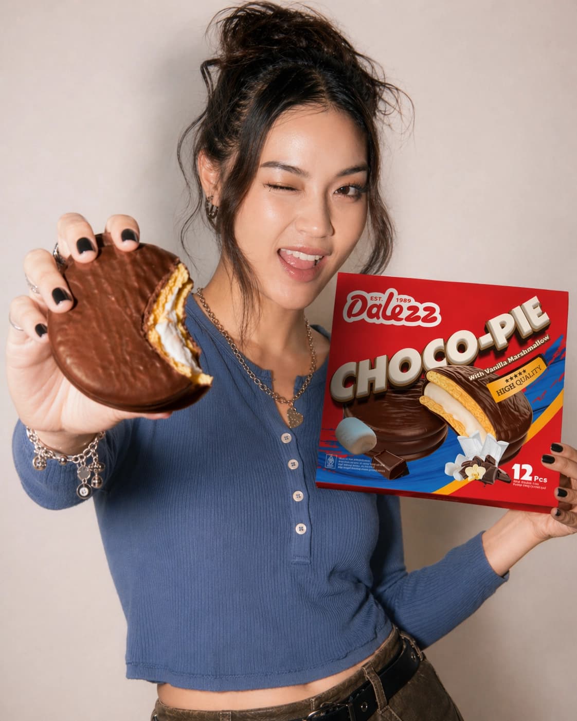
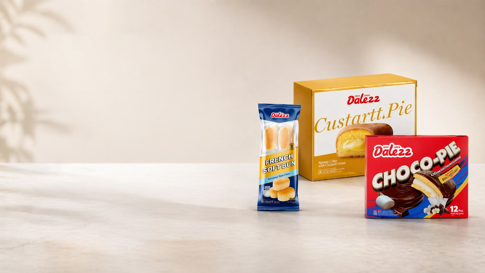
The packaging needed to feel cohesive across French Soft Bun, Custartt Pie, and Choco Pie, while allowing each product to show its own character
- 04
The design had to balance mass-market familiarity with stronger positioning, avoiding both a generic look and overly common category cues
{ The Solution }
Creativeans developed a concept-led glocalisation approach for Dalezz, balancing local familiarity with stronger shelf impact and a more polished international image.
Grounded in competitor analysis and perceptual mapping, the exploration identified market whitespace and translated it into differentiated packaging directions.
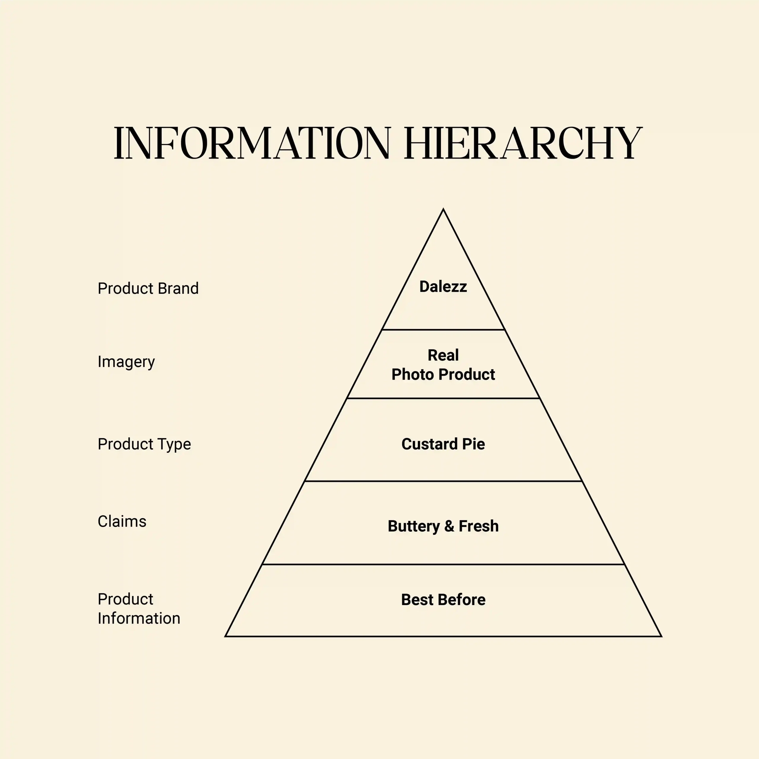
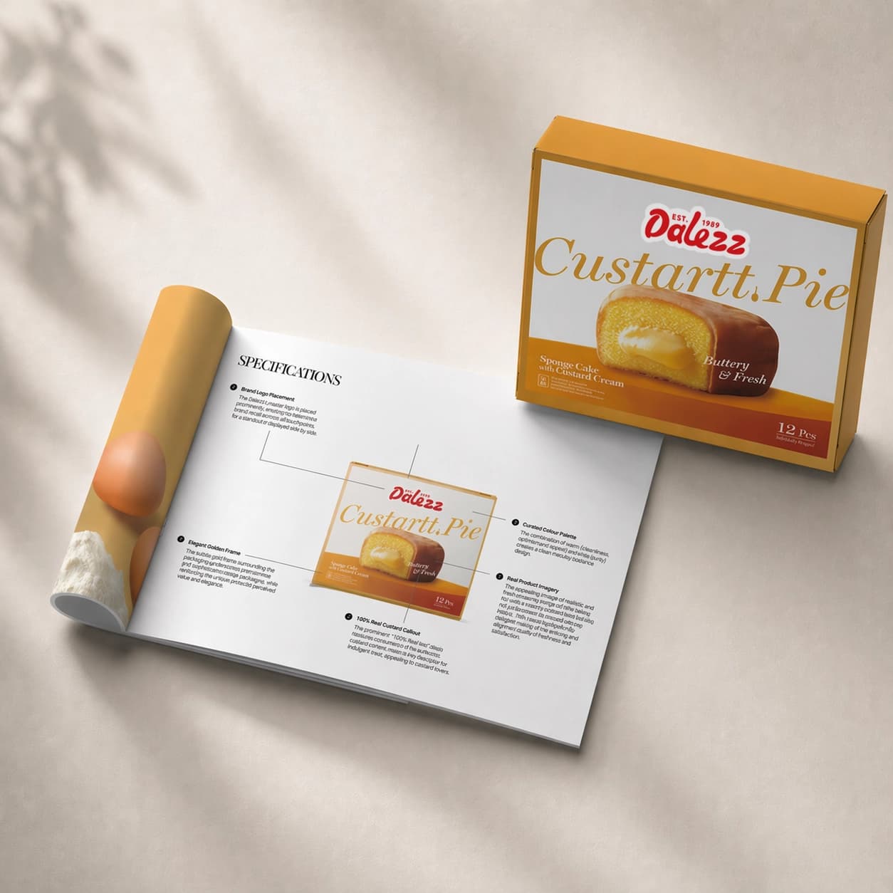
Across the range, the concepts strengthened Dalezz through clearer product naming, stronger brand visibility, appetising visuals, flavour emphasis, and trust-building quality cues.
{ THE DIFFERENCE }

{ Packaging Design }