{ Designing Hi Chef Packaging }
{ Creative Challenge }
- 01
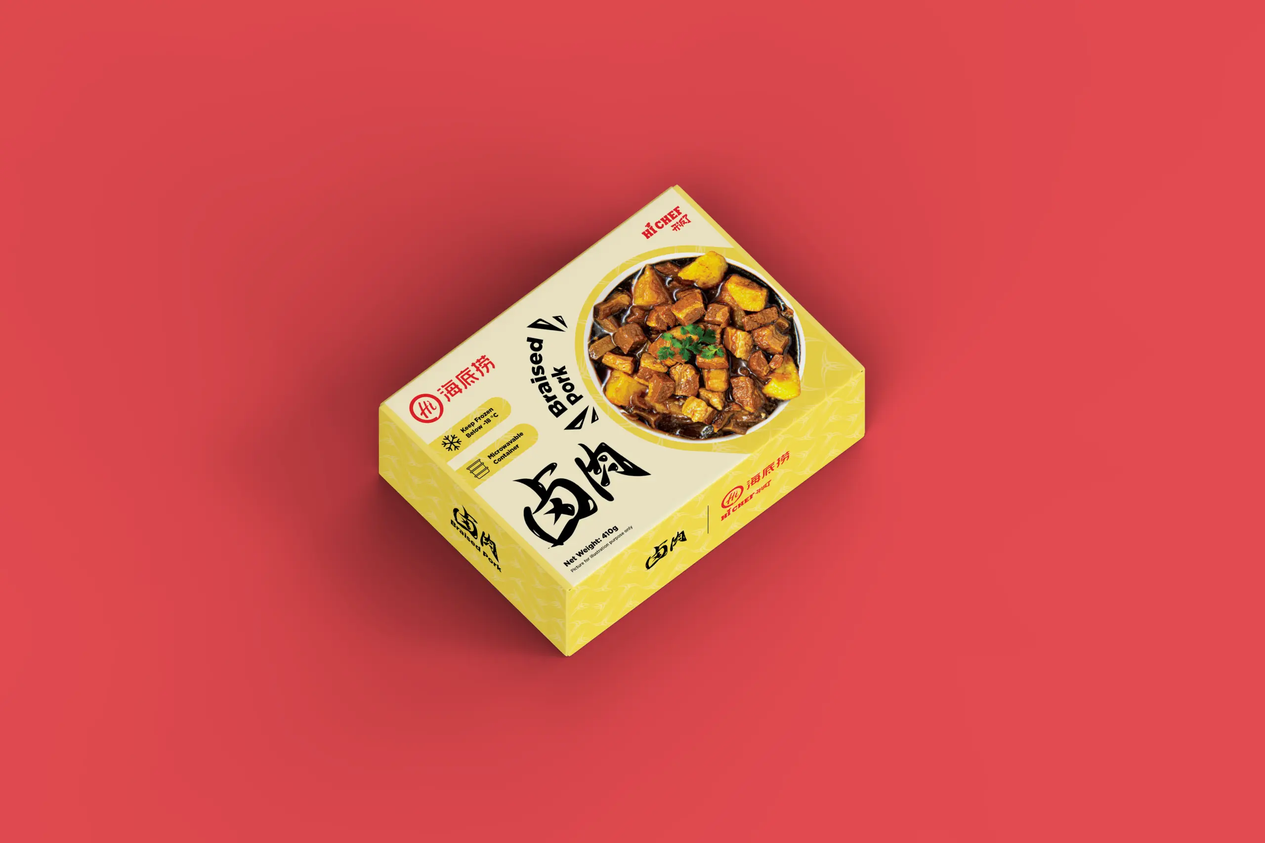
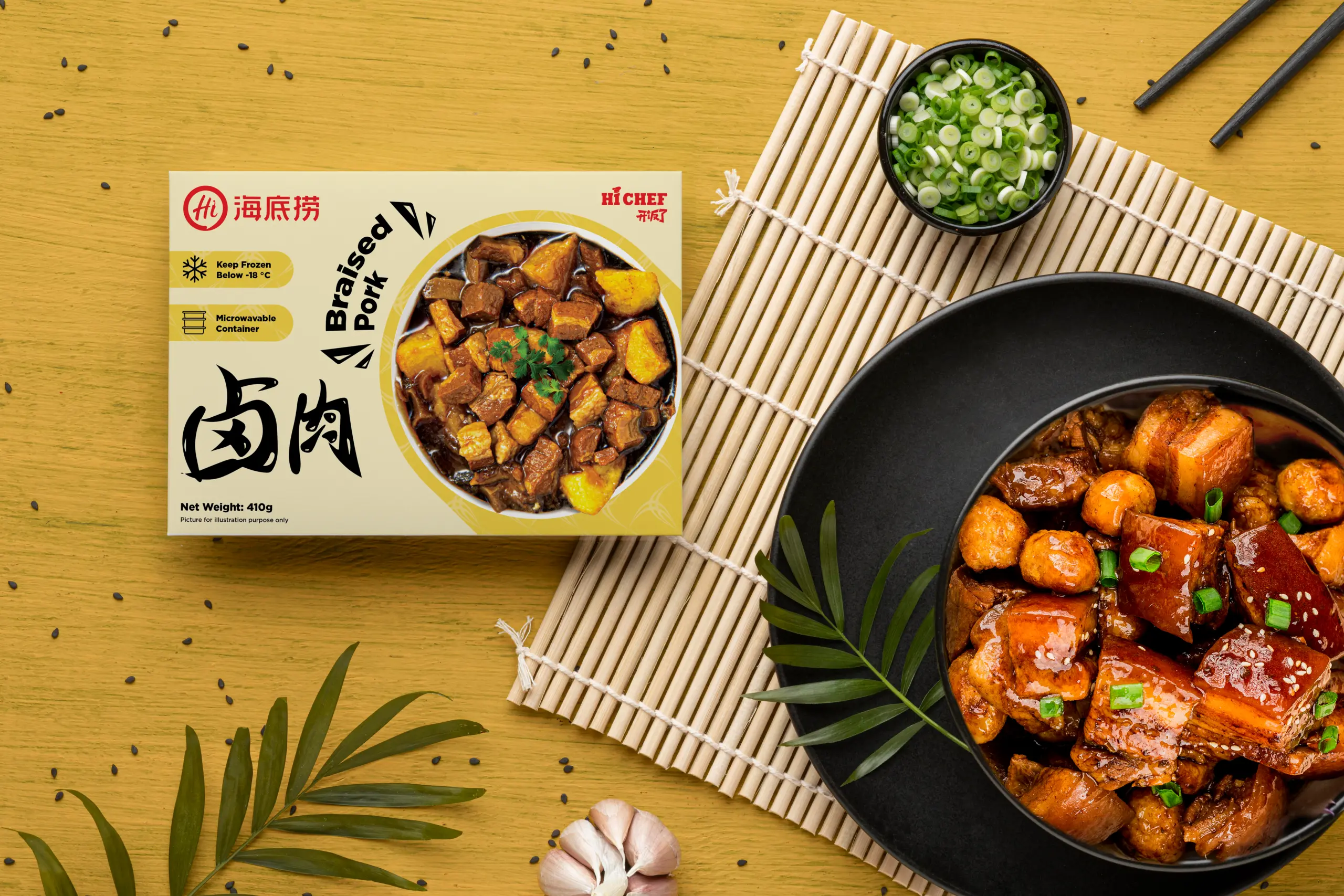
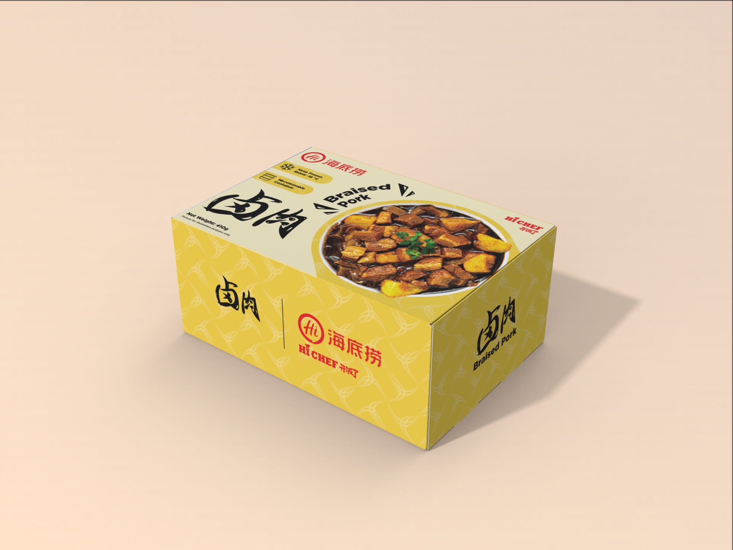
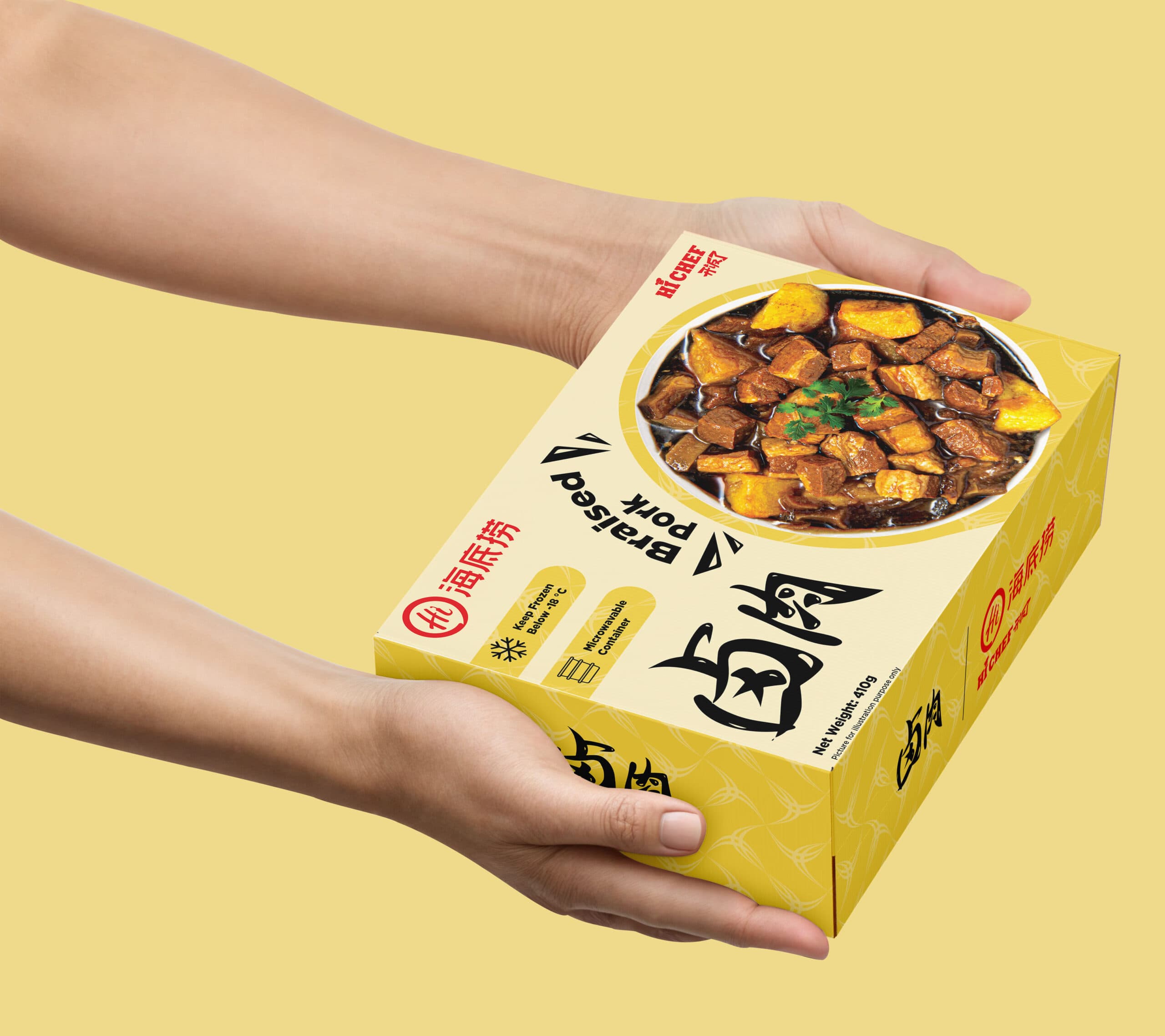
Hi Chef’s existing packaging lacked visual consistency and clear differentiation across its product range. The challenge was to design packaging that not only communicates rich flavour and authenticity, but also enhances visibility and recognition in the competitive frozen food category. Each pack needed to convey quality, warmth, and freshness, while adhering to Haidilao’s strong brand identity.
{ The Solution }
We developed a modern and appetising packaging system anchored by Haidilao’s signature red and yellow palette, paired with clean layouts and authentic food photography. The refreshed design highlights each product’s hero dish with clarity and appetite appeal, supported by an intuitive information hierarchy for quick recognition. The result is a cohesive, premium-looking range that communicates both culinary excellence and everyday convenience, strengthening Hi Chef’s position as a trusted household brand in the frozen food market.
{ How we design packaging }
{ Brand Identity }
{ Brand Touchpoints }