• Award-Winning Brand and Design Consultancy • Claim Up to 50% EDG Grant for Your Brand. Limited Time only• Award-Winning Brand and Design Consultancy • Claim Up to 50% EDG Grant for Your Brand. Limited Time only• Award-Winning Brand and Design Consultancy • Claim Up to 50% EDG Grant for Your Brand. Limited Time only• Award-Winning Brand and Design Consultancy • Claim Up to 50% EDG Grant for Your Brand. Limited Time only• Award-Winning Brand and Design Consultancy • Claim Up to 50% EDG Grant for Your Brand. Limited Time only• Award-Winning Brand and Design Consultancy • Claim Up to 50% EDG Grant for Your Brand. Limited Time only• Award-Winning Brand and Design Consultancy • Claim Up to 50% EDG Grant for Your Brand. Limited Time only• Award-Winning Brand and Design Consultancy • Claim Up to 50% EDG Grant for Your Brand. Limited Time only• Award-Winning Brand and Design Consultancy • Claim Up to 50% EDG Grant for Your Brand. Limited Time only• Award-Winning Brand and Design Consultancy • Claim Up to 50% EDG Grant for Your Brand. Limited Time only• Award-Winning Brand and Design Consultancy • Claim Up to 50% EDG Grant for Your Brand. Limited Time only• Award-Winning Brand and Design Consultancy • Claim Up to 50% EDG Grant for Your Brand. Limited Time only• Award-Winning Brand and Design Consultancy • Claim Up to 50% EDG Grant for Your Brand. Limited Time only• Award-Winning Brand and Design Consultancy • Claim Up to 50% EDG Grant for Your Brand. Limited Time only• Award-Winning Brand and Design Consultancy • Claim Up to 50% EDG Grant for Your Brand. Limited Time only
Creativeans C LogoCreativeans

Building a Joyful Canned Kombucha Brand for Southeast Asia:
MiCha by RAWsome

Branding
Communication Design
Creative Investment
Packaging Design
UI/UX Design
MiCha

{ Project Overview }

We collaborated with RAWsome Asia Beverages to transform a niche kombucha offering into a retail-ready brand built for scale, establishing MiCha as a new standard for accessible, everyday kombucha across Southeast Asia.

In a market where kombucha is often perceived as niche, premium, or unfamiliar, MiCha stands out by bringing health-conscious innovation into a more inclusive and approachable format. The challenge was both strategic and commercial: RAWsome needed to evolve from a single-brand focus into a clearer house of brands, while giving MiCha its own distinctive identity that could remain cohesive under the RAWsome umbrella.

From brand strategy and packaging to digital experience, MiCha was built to perform across crowded retail shelves, diverse consumer preferences, and regional market environments. Its website was recognised by Awwwards with an Honours award, reflecting the strength of its visual storytelling, design craft, and digital execution. True to its ambition, MiCha makes kombucha for everyone.

{ Creative Challenge }

Crafting a Mass-Market Kombucha Brand from Scratch
  1. 01

    RAWsome want to shift from a niche kombucha producer into a broader “house of brands” portfolio without losing trust with stakeholders, retailers, and consumers.

  2. 02

    The new brand had to stand clearly on its own for mainstream audiences, while still aligning under RAWsome’s corporate identity and ethos

  3. 03

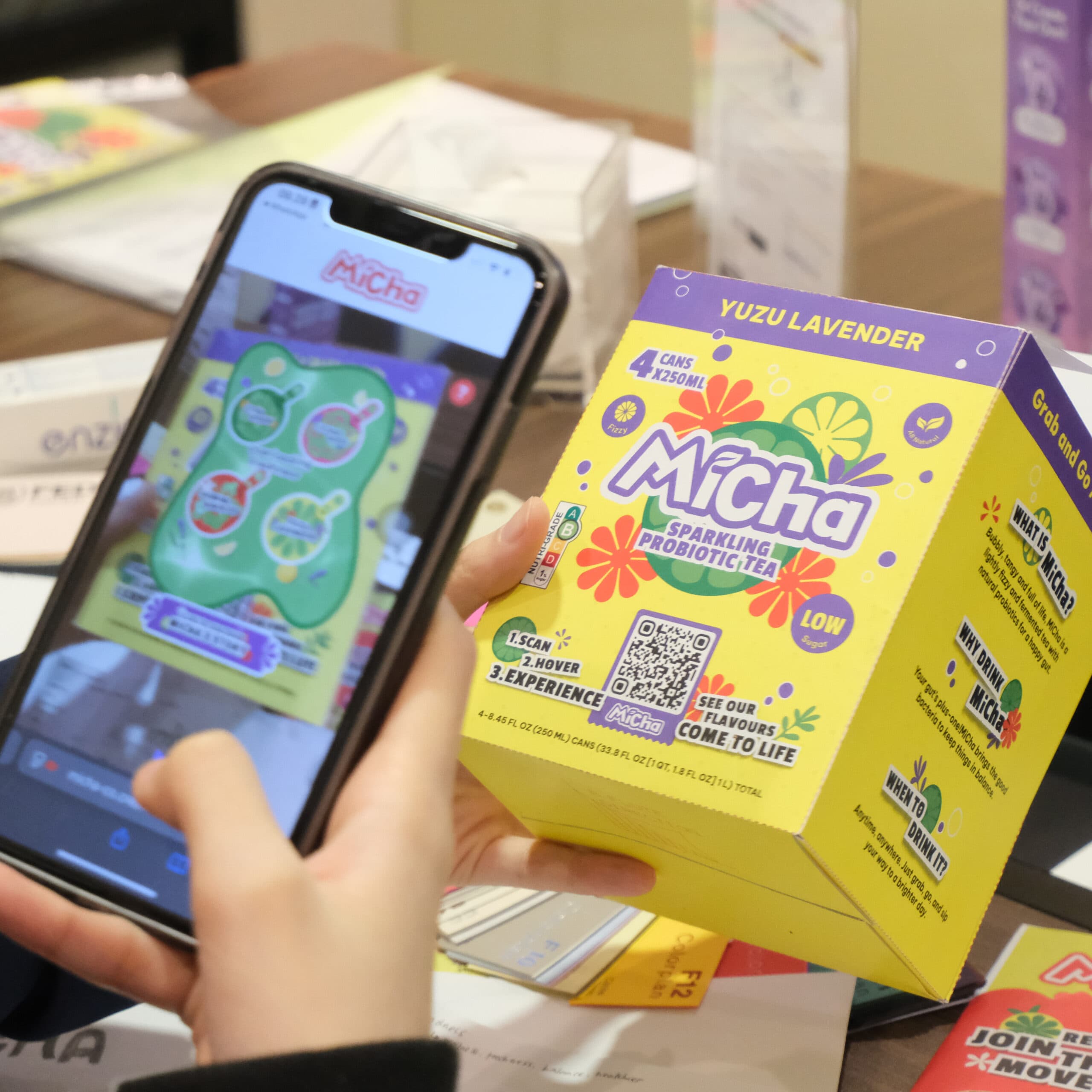
    This new brand’s packaging and messaging needed to look modern, convenient, and shelf-stopping across diverse SEA markets while also remaining adaptable to different market preferences and regulatory expectations.

{ The Solution }

Delivering a complete identity system built for retail growth for MiCha
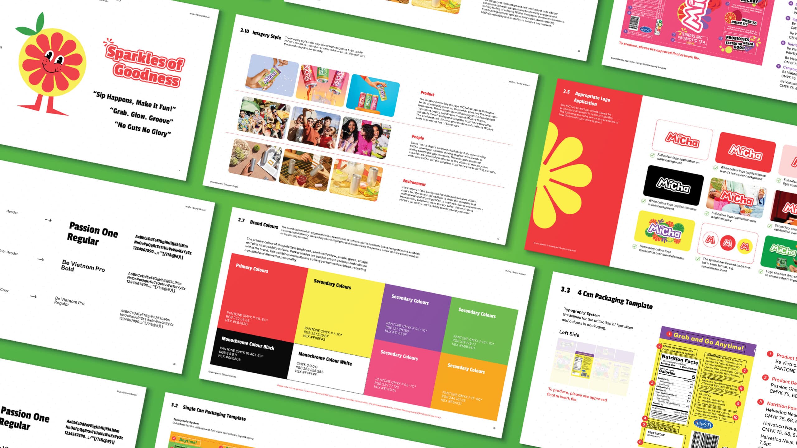
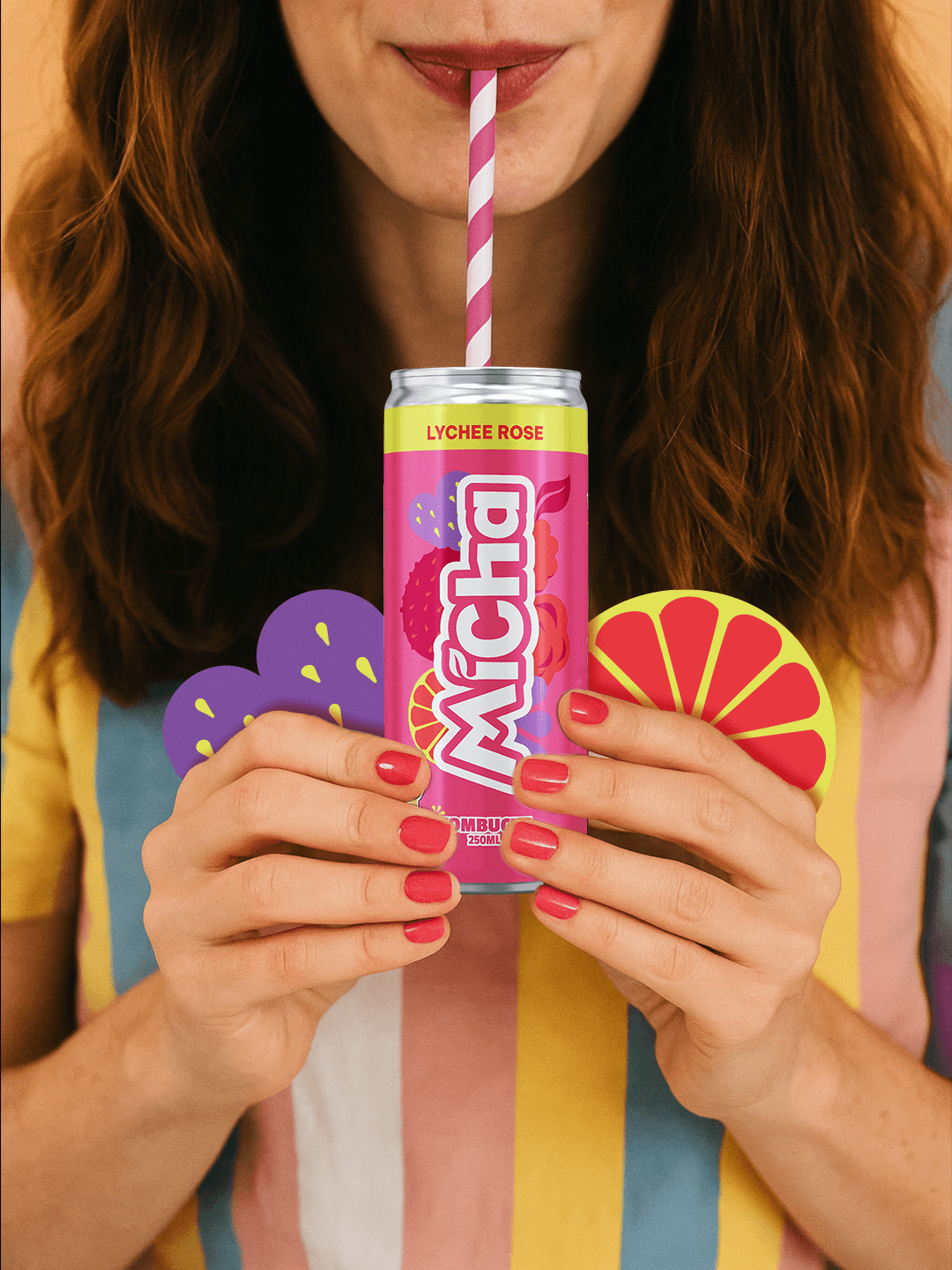
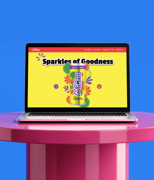
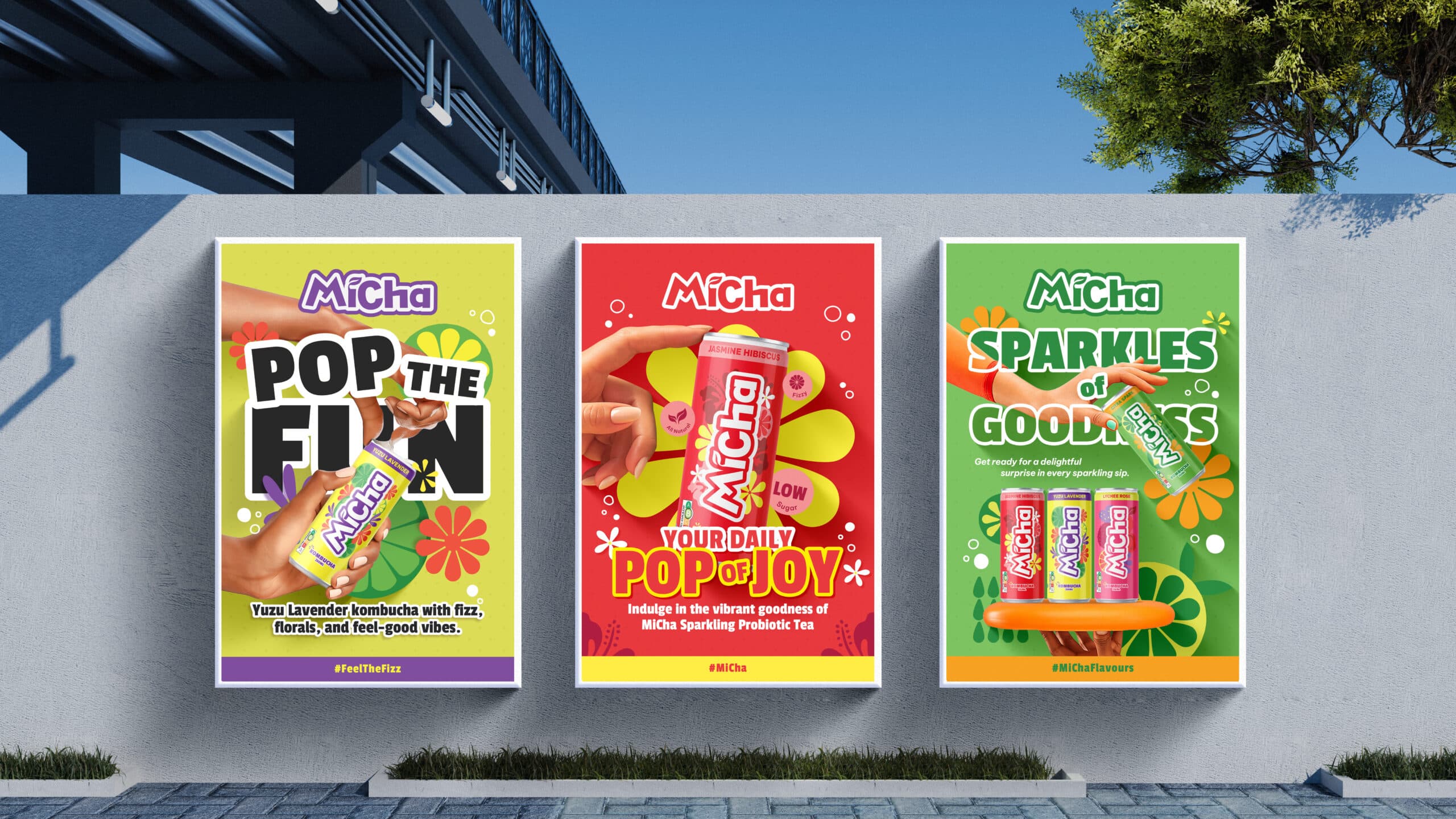
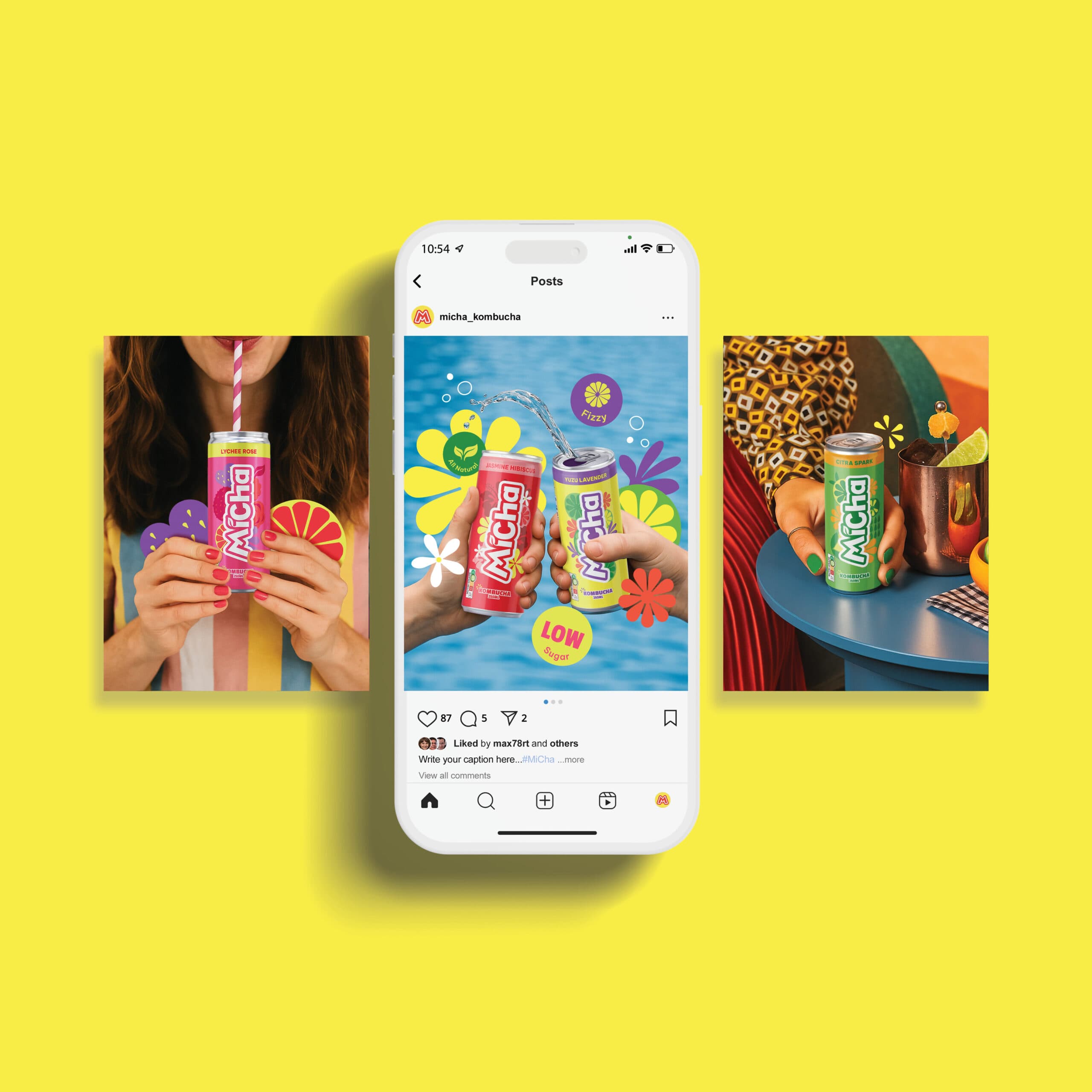
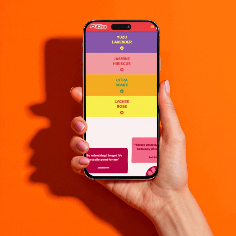
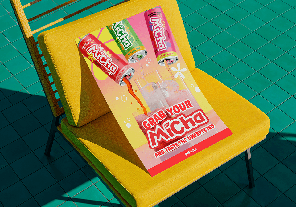
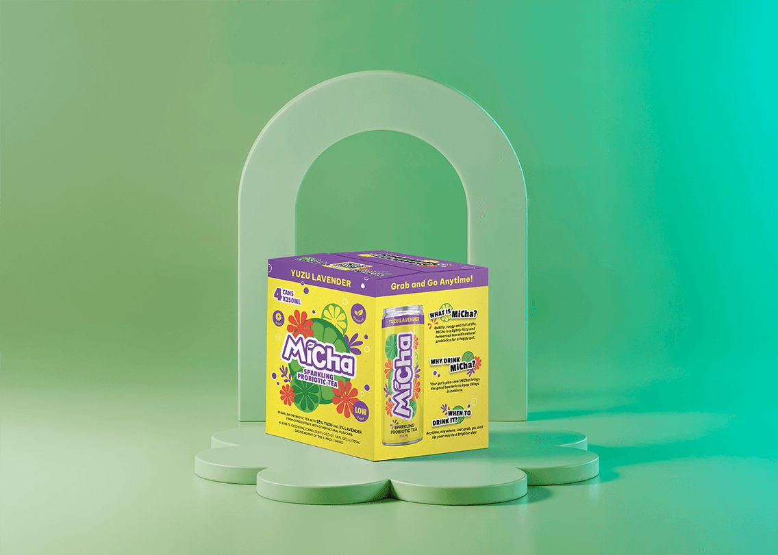
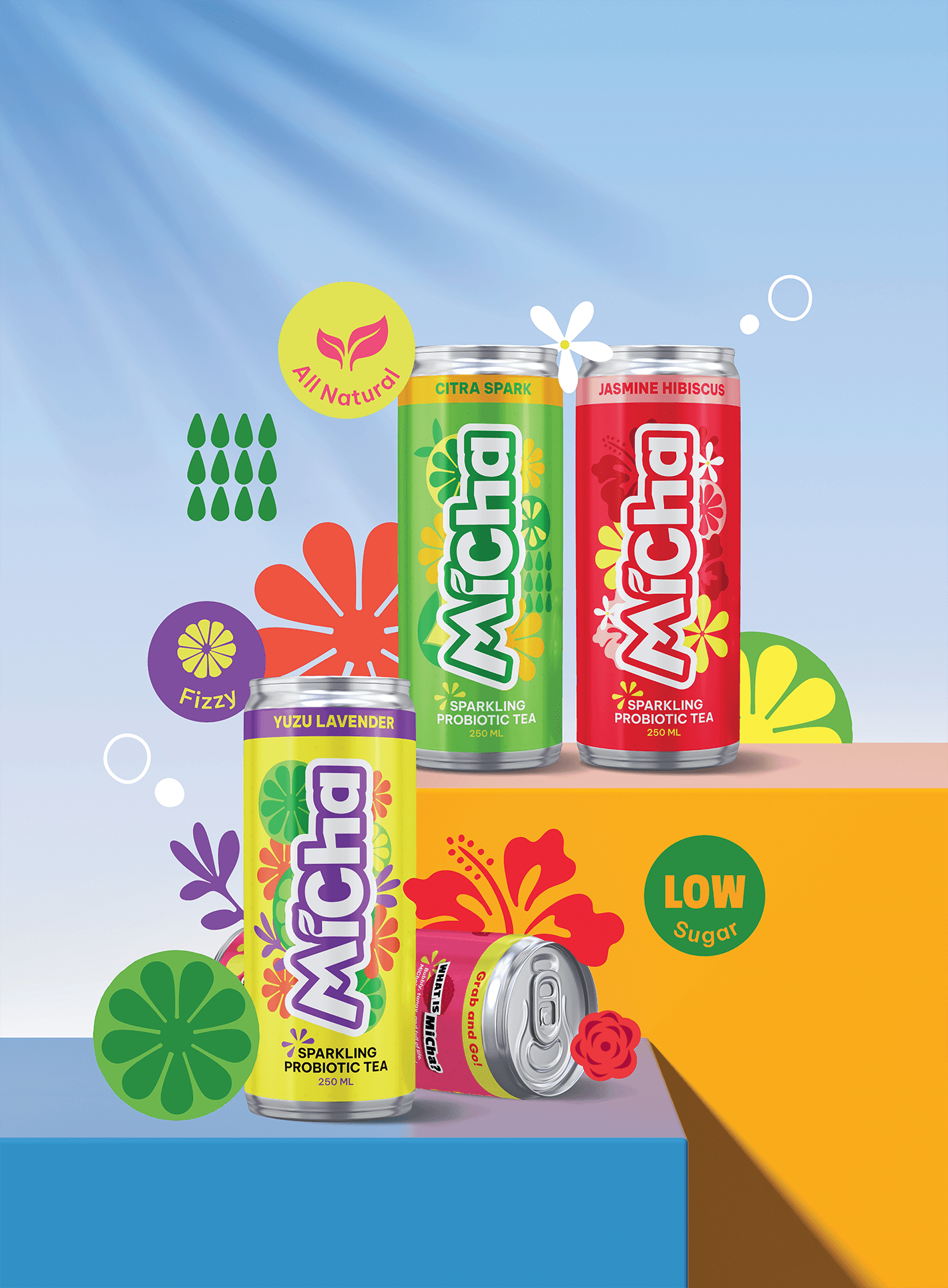
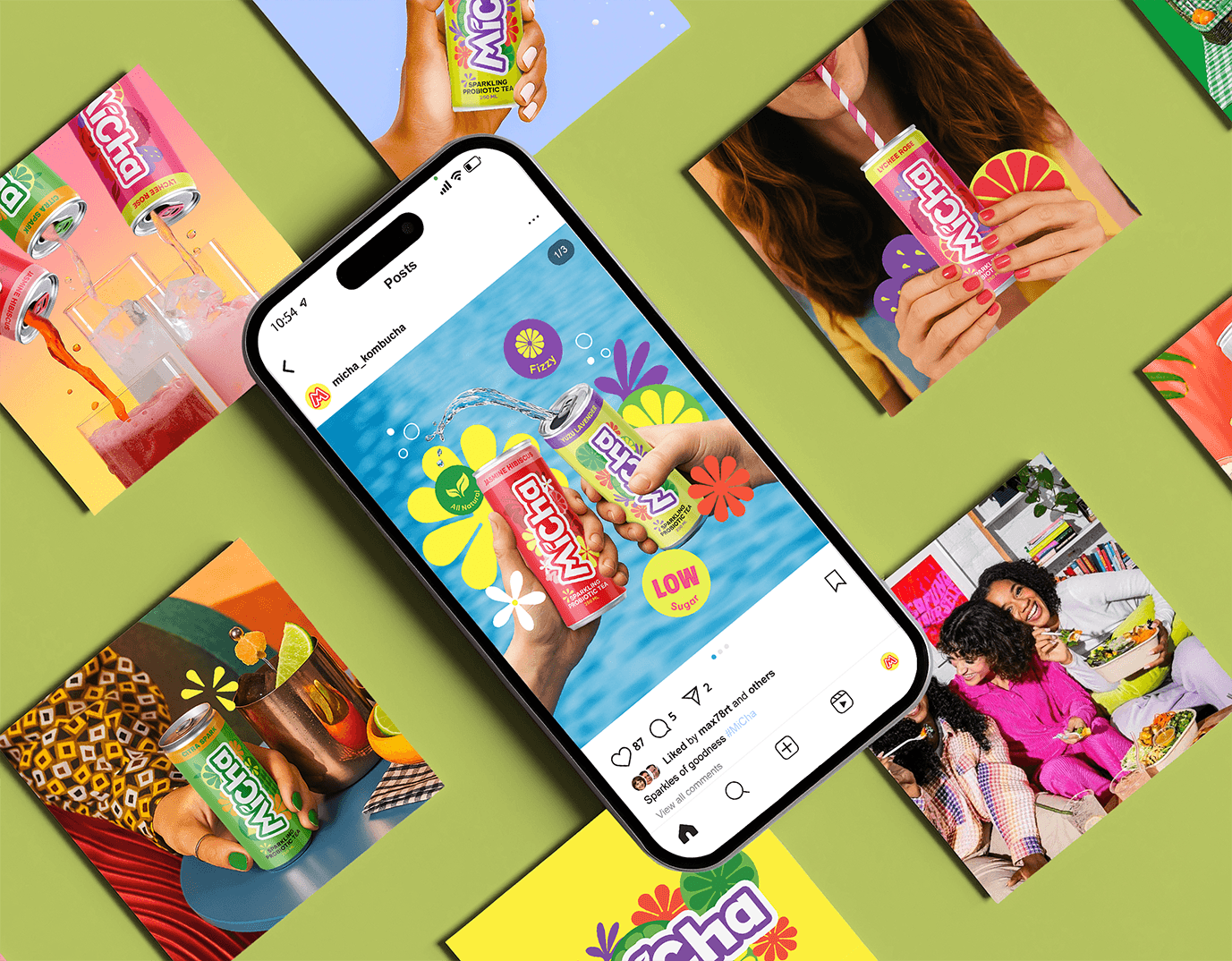
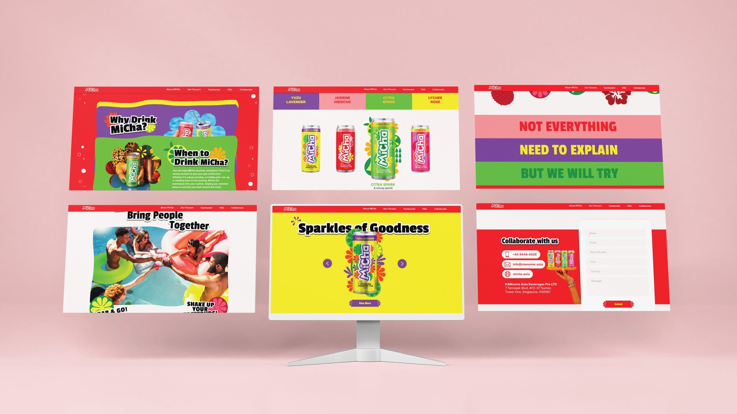
  1. MiCha was built with a differentiated positioning and a Jester-inspired personality playful, uplifting, and inclusive, designed to resonate with everyday drinkers across markets.

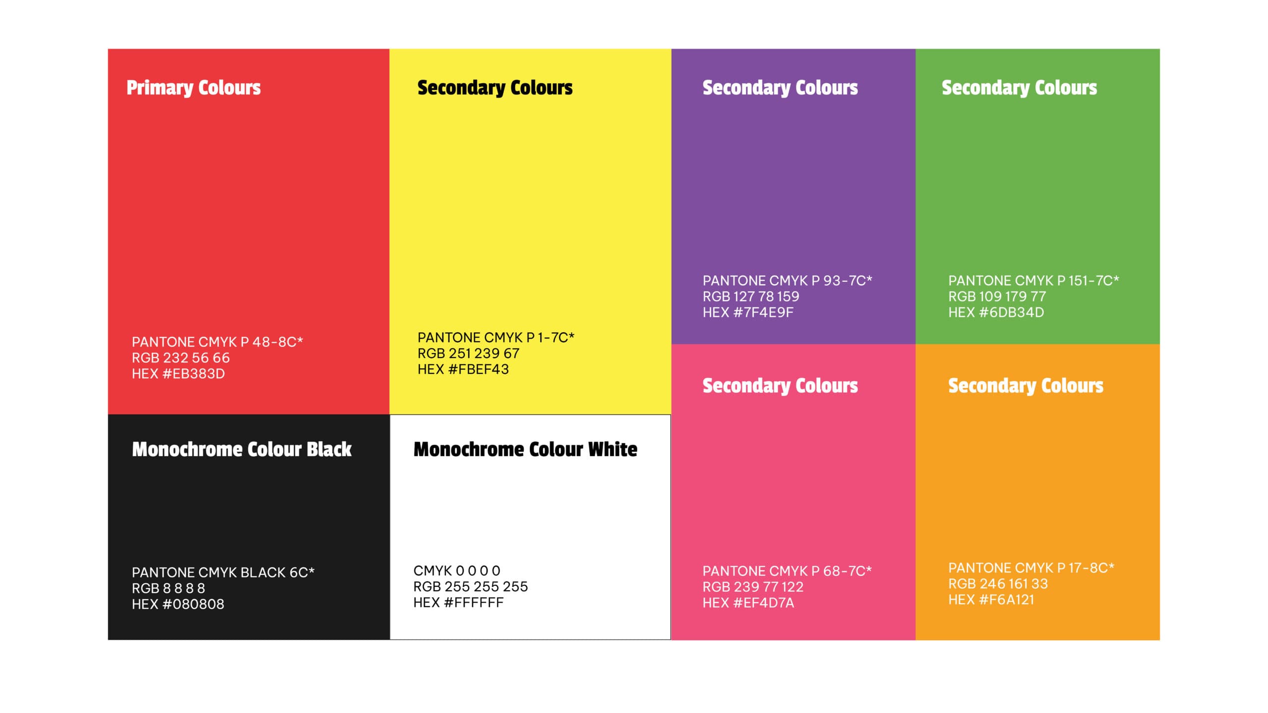
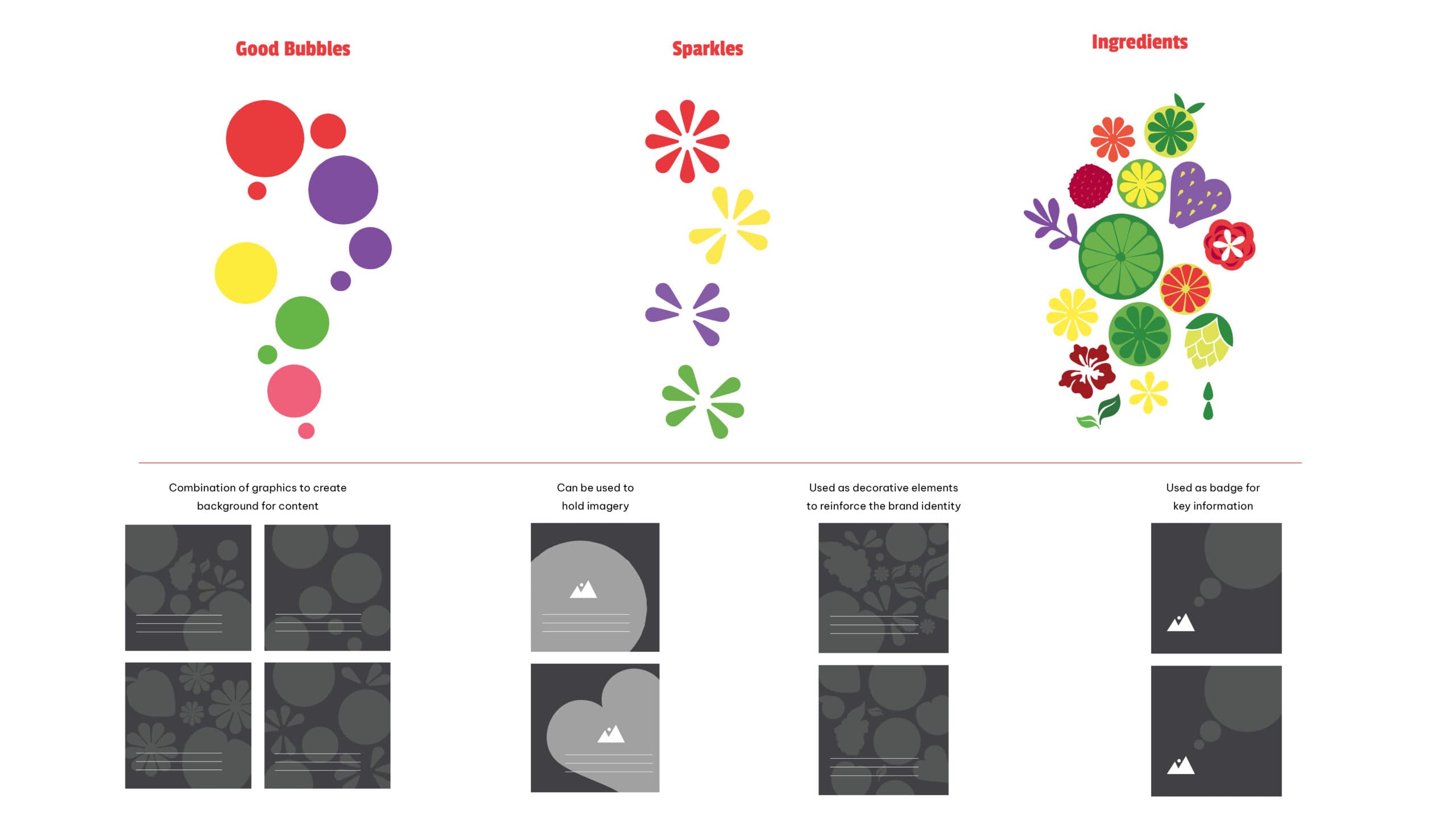
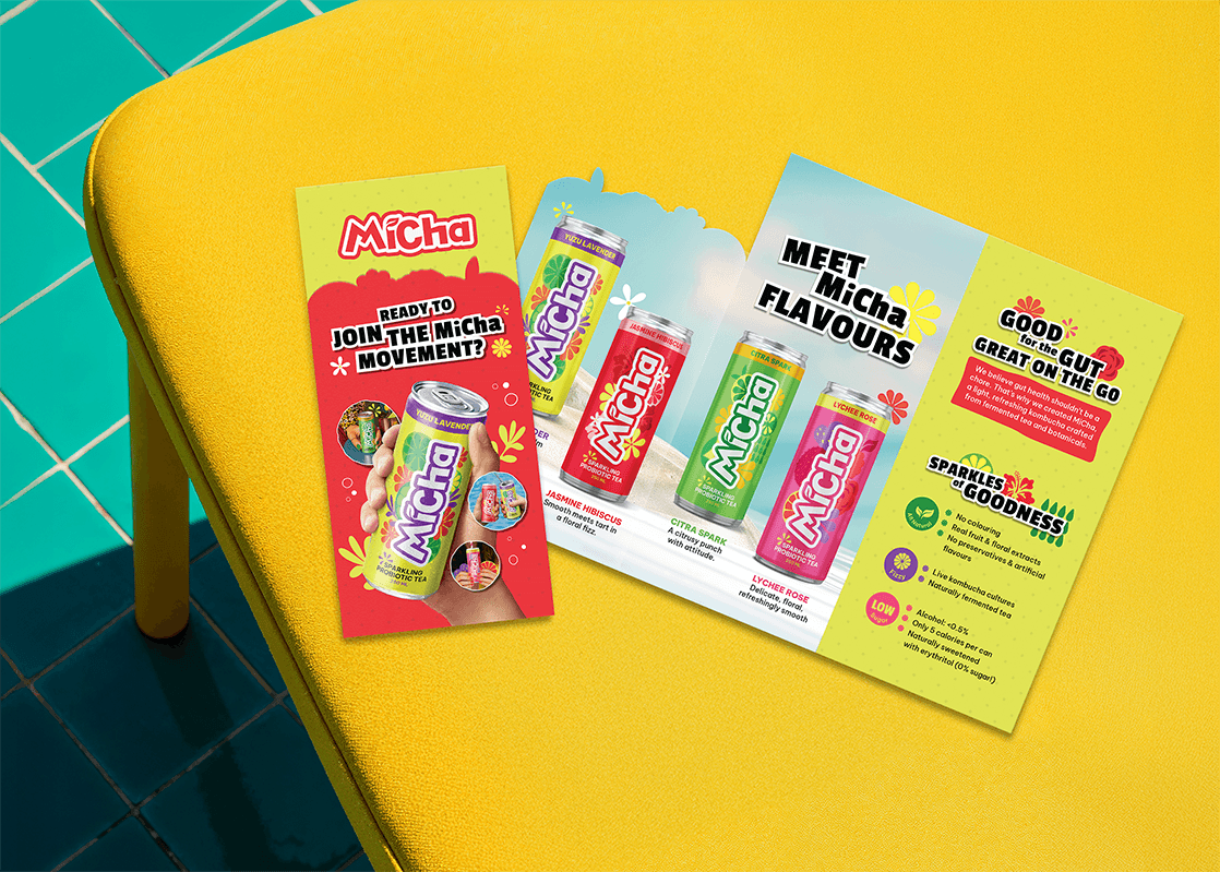
  2. Creativeans delivered the visual identity, tone of voice, packaging designs, key applications, and a full brand manual to guide consistent rollout.

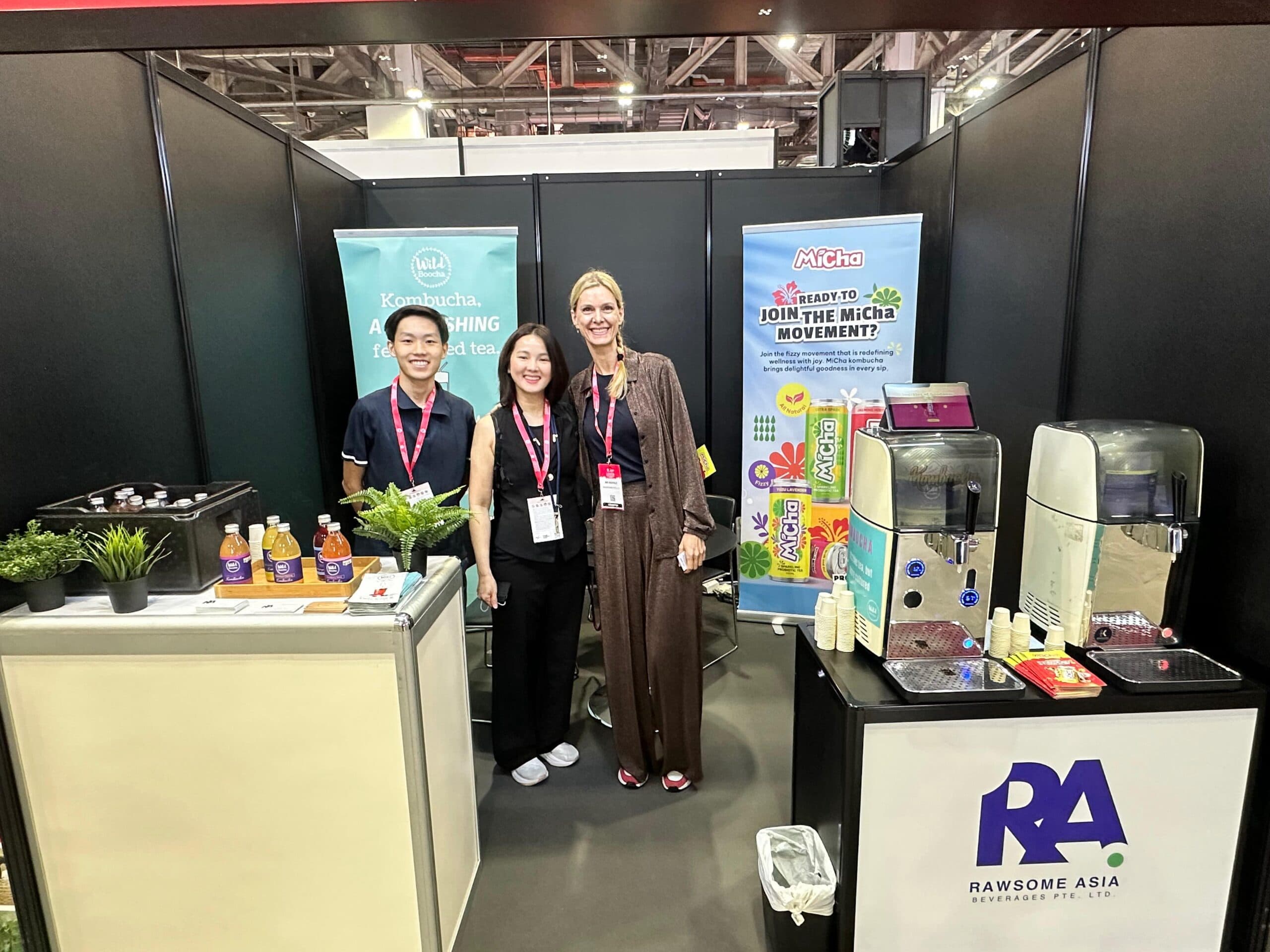
  3. The outcome enabled internal alignment and equipped the team to expand confidently into retail, F&B, and travel outlet, supporting MiCha’s soft launch at SIGEP Asia & Restaurant Asia 2025 and next-step rollout.

{ THE DIFFERENCE }

Before
After
{ BEFORE }{ AFTER }
Loading video...

{ Brand Audit }

We help you understand yourself, your customers and competitors.

A brand audit is a complete health check for your business that evaluates how customers and stakeholders perceive your identity. It involves reviewing your mission, marketing materials, and overall customer experience to measure your brand’s overall strength and effectiveness.

Conducting a regular brand audit is crucial because it ensures you are clearly communicating your core message. By examining every touchpoint where customers interact with your business, you can quickly spot branding inconsistencies, align your values with your audience, and strengthen your marketing efforts to build long-lasting customer trust.

Loading video...

{ Brand Positioning }

To bring Sparkles of Goodness to everyday life, we positioned MiCha as a relational, joyful canned kombucha that makes healthier refreshment feel effortless and shareable. By pairing a playful, uplifting personality with credible wellness cues, light fizz, gut-friendly benefits, and low-to-zero sugar, MiCha turns kombucha into a feel-good ritual people reach for any time they want to refresh, reset, and enjoy the moment with others.

The brand balances a playful personality with credible wellness cues, combining light fizz, gut-friendly benefits, and low-to-zero sugar into a drink that feels both fun and trustworthy. This allows MiCha to speak to a wider audience beyond existing kombucha drinkers, including everyday consumers who are looking for a better-for-you alternative without feeling overwhelmed by overly technical health messaging.

As part of RAWsome Asia Beverages’ move towards a clearer house of brands, MiCha was built to stand confidently on its own while remaining connected to the company’s larger vision for innovative, health-conscious beverages. Its positioning supports retail readiness, regional scalability, and stronger shelf appeal, turning kombucha into a feel-good choice made for modern Southeast Asian lifestyles.

MiCha

{ Brand Identity }

The brand identity for MiCha was developed to position canned kombucha as joyful, modern, and wellness-driven. Built around the idea of Sparkles of Goodness, the identity brings together freshness, optimism, and everyday approachability, helping MiCha feel less niche and more relatable to a wider retail audience.

Visually, MiCha combines a bold and friendly logo, vibrant colour palette, and expressive typography to create strong shelf presence. These elements communicate the brand’s playful personality while still supporting credible wellness cues such as natural ingredients, light fizz, gut-friendly benefits, and low-to-zero sugar.

Across packaging, digital, and marketing applications, the identity system was designed to remain flexible, consistent, and easy to recognise. This balance of playful character and visual clarity allows MiCha to stand out in crowded beverage environments while staying accessible across different Southeast Asian markets.

MiCha
brand identity image

{ Brand Touchpoints }

As part of the branding for a canned kombucha, MiCha’s touchpoints were designed to create a cohesive and engaging consumer experience across both physical and digital environments. From canned packaging and multipack systems to promotional materials and retail displays, each element works together to build a consistent and recognisable brand presence.

Beyond the shelf, MiCha extends its identity through digital touchpoints such as social media content, landing pages, and its award-winning website. These platforms reinforce the brand’s joyful and approachable personality while clearly communicating its wellness benefits, helping consumers understand and connect with the product effortlessly.

Each touchpoint follows a clear information hierarchy and unified visual language, ensuring consistency across different markets and channels. This allows MiCha to maintain strong brand recognition while adapting to varied retail environments, supporting both everyday consumer engagement and long-term regional scalability.

MiCha
Brand touchpoint 1
Brand touchpoint 2
Brand touchpoint 3
Brand touchpoint 4
Brand touchpoint 5
Brand touchpoint 6
Brand touchpoint 7
brand touchpoints images

{ Brand Rollout }

The MiCha brand rollout is guided by a comprehensive brand manual to ensure consistency and scalability across every consumer touchpoint.

Designed for both retail and regional expansion, the rollout strategy applies MiCha’s core brand elements first through packaging as the primary consumer interaction, before extending across promotional materials, digital platforms, social media, and marketing campaigns. Each application follows a unified visual system, helping the brand maintain strong recognition while adapting across different retail environments and Southeast Asian markets.

From shelf presence to digital engagement, every touchpoint reinforces MiCha’s joyful and approachable personality while communicating its wellness-driven positioning with clarity. Guided by a detailed brand manual, the rollout supports MiCha’s growth as a modern canned kombucha brand built for consistency, accessibility, and long-term scalability.

“Creativeans was a thoughtful, strategic, and highly collaborative partner throughout the development of MiCha. They understood our vision well. They translated our vision into a vibrant, accessible brand we’re proud of. Their structured yet creative approach helped us distil our values into a brand that feels fresh, inclusive, and scalable, while equipping our team with the tools to grow with clarity and confidence.”

Michèle Vanlangenaeker
Founder, RAWsome Asia Beverages Pte Ltd
Yulia Saksen

Your brand might look great.
But is it working?

Discover what's missing in your brand strategy and
how a few changes can grow your business

Book a Free Brand Consultation with Yulia Now.

Contact Us Now