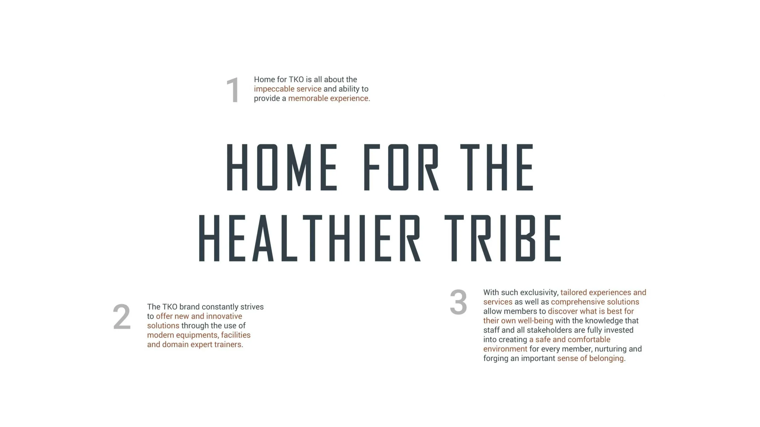
{ Project Overview }

{ Creative Challenge }
- 01
The gym’s identity lacked emotional connection and a compelling atmosphere beyond conventional boxing aesthetics
- 02
Visual branding failed to align across physical and digital touchpoints, resulting in a fragmented experience
- 03
The space did not fully convey the energy, strength, and community spirit that embody the gym’s ethos
- 04
Without a distinct brand narrative, TKO risked blending in with other fitness spaces rather than standing out as an immersive destination
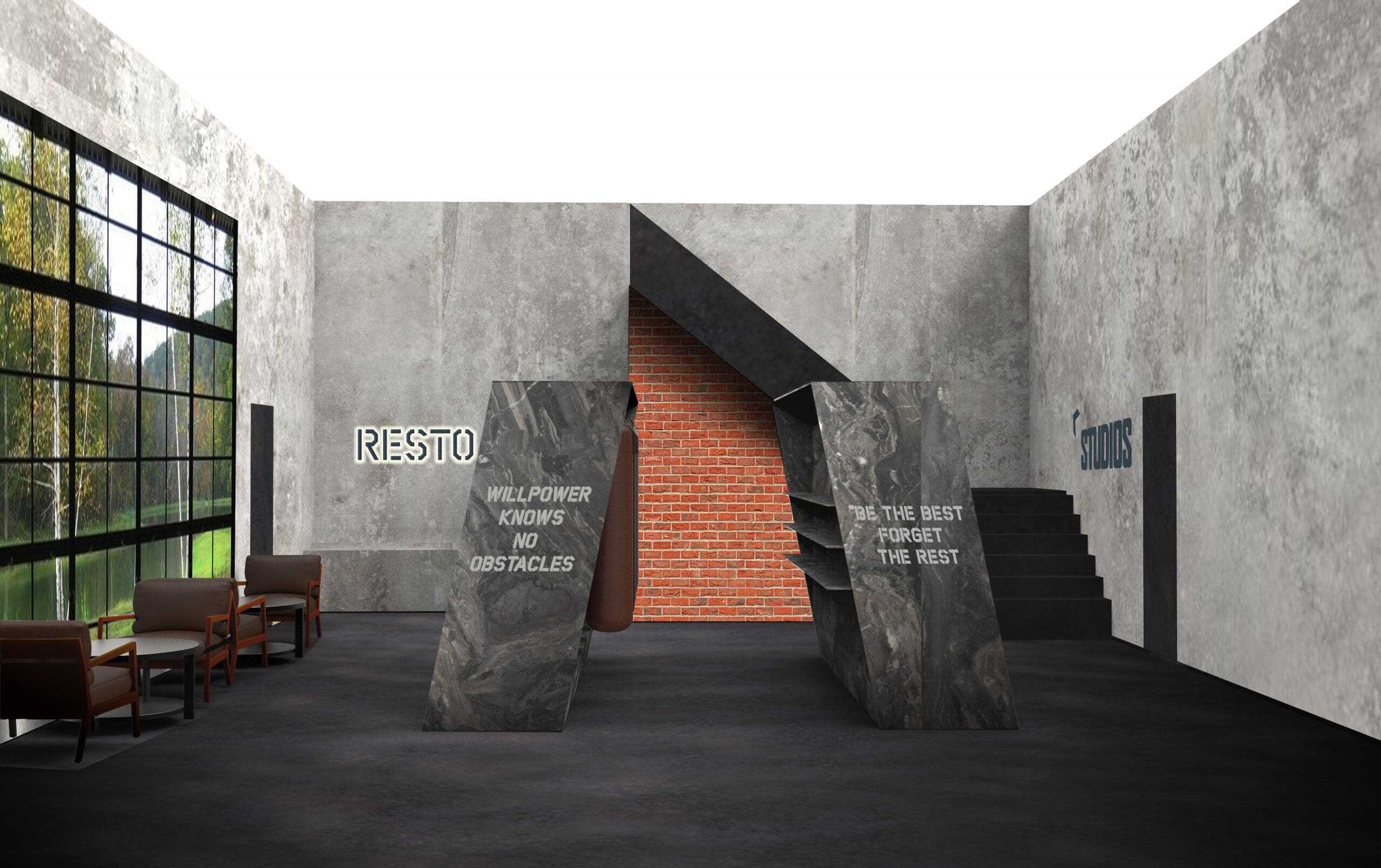
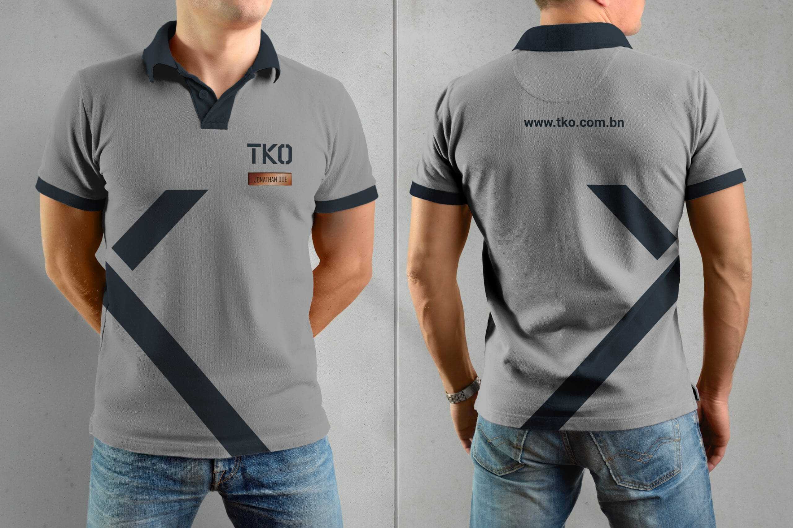
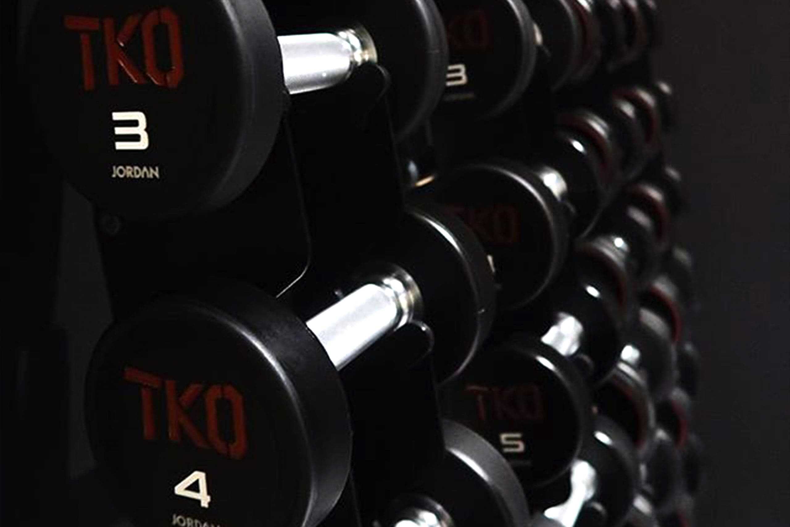
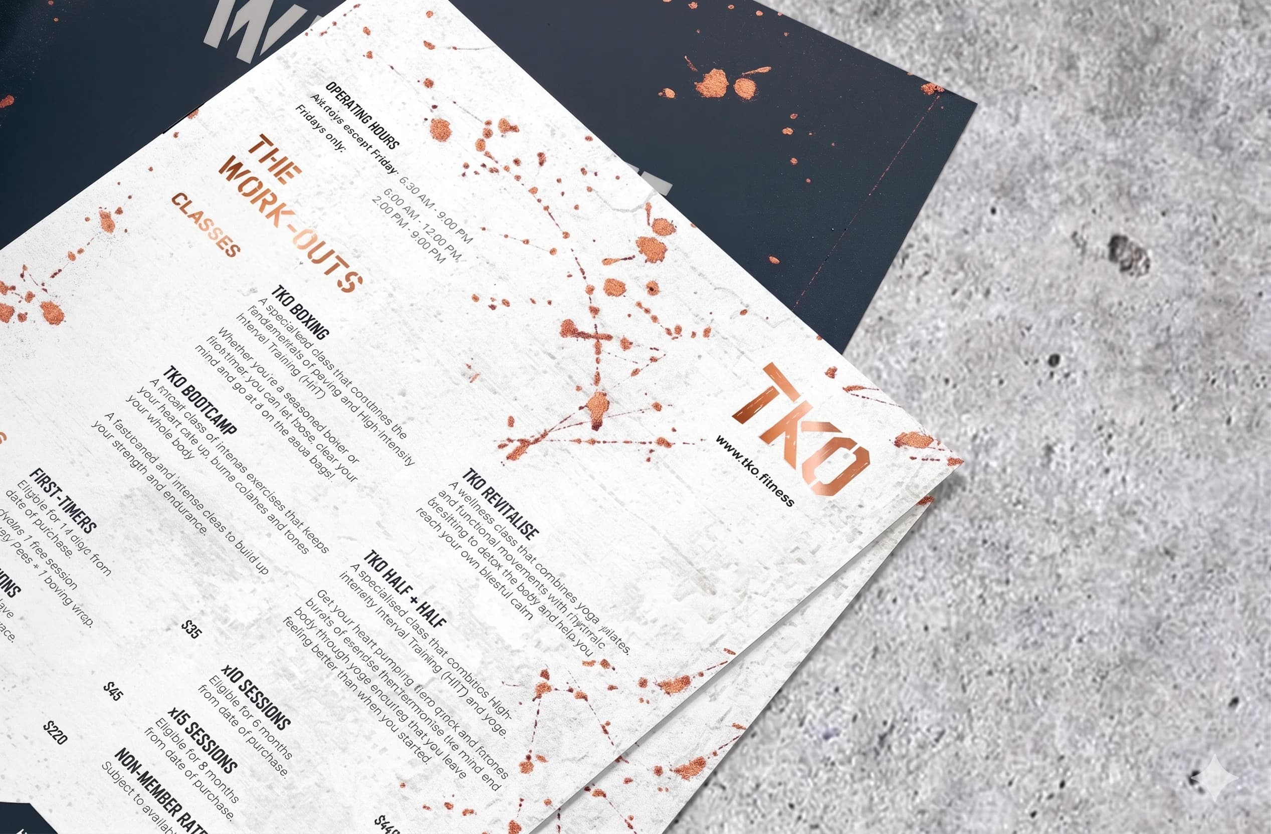
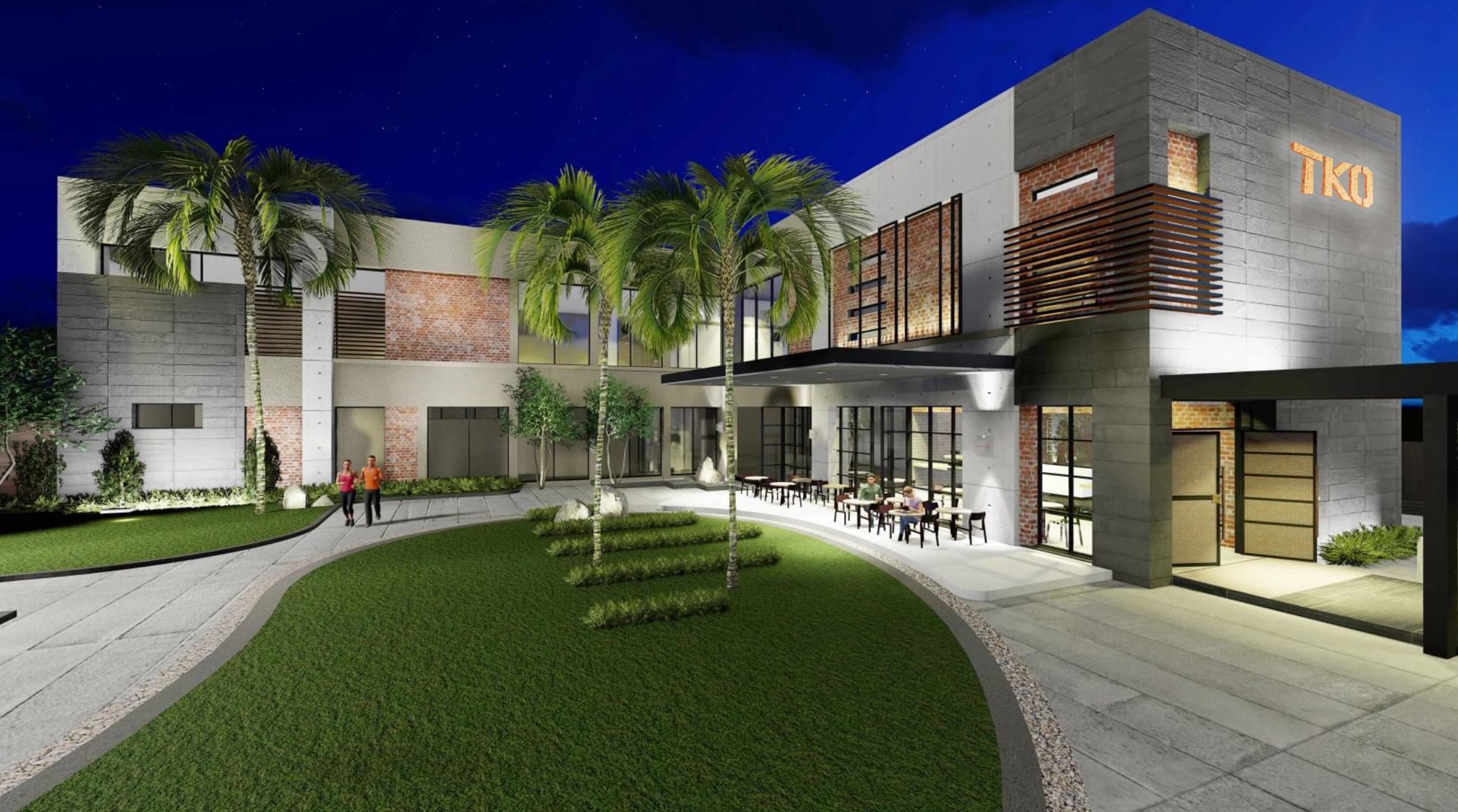
{ The Solution }
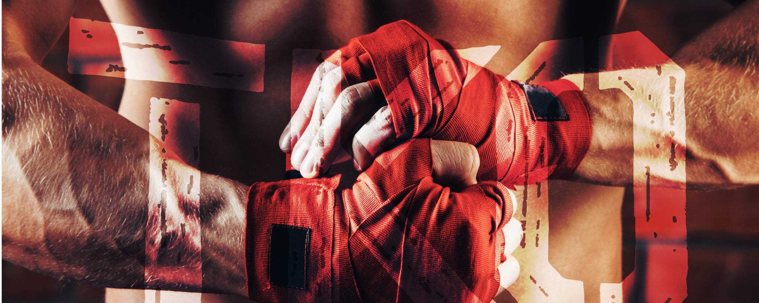
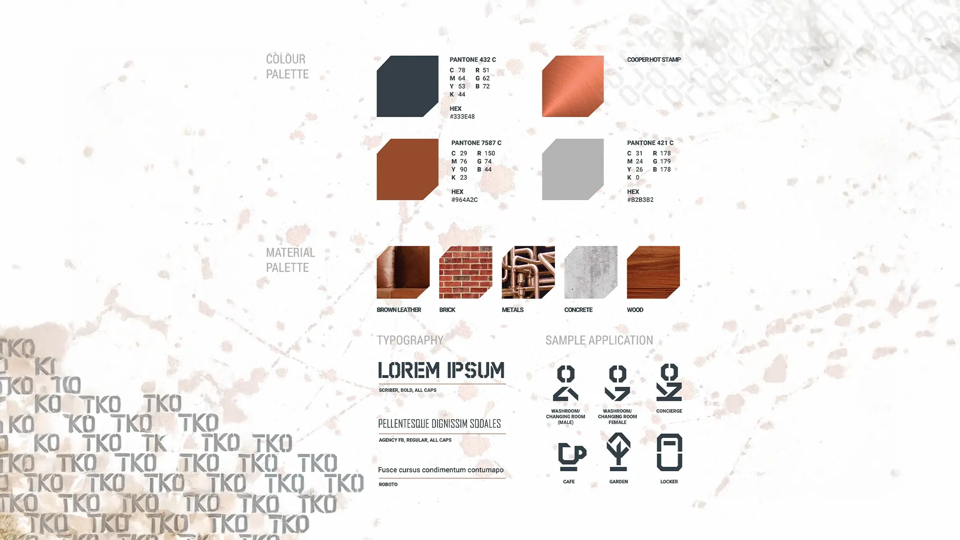
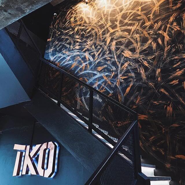
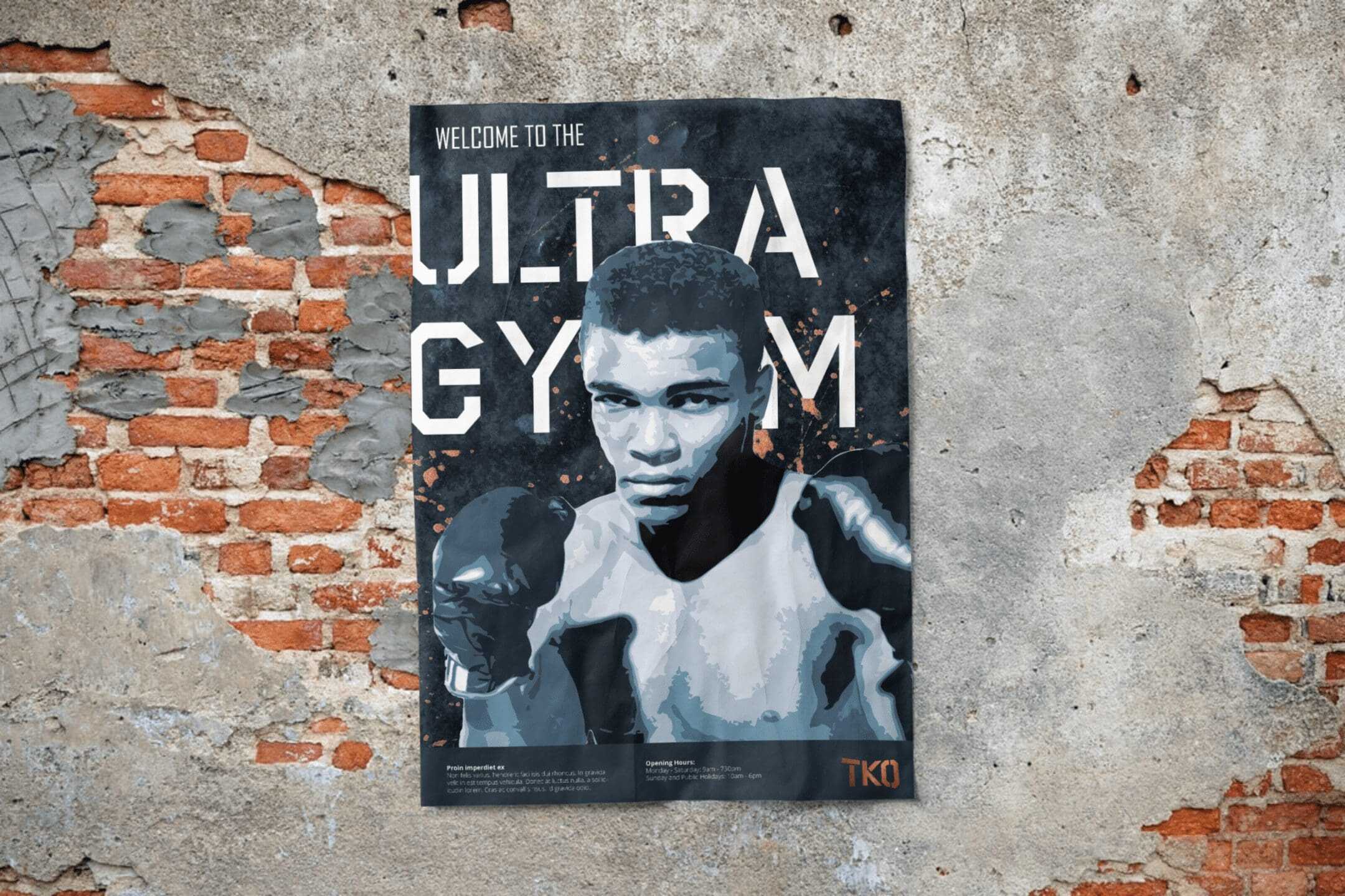
Introduced a weathered, industrial palette combining copper accents, dark tones, and rugged textures to evoke intensity and refinement
Designed experiential graphics and wayfinding that flow throughout the space, reinforcing gym culture and visual continuity
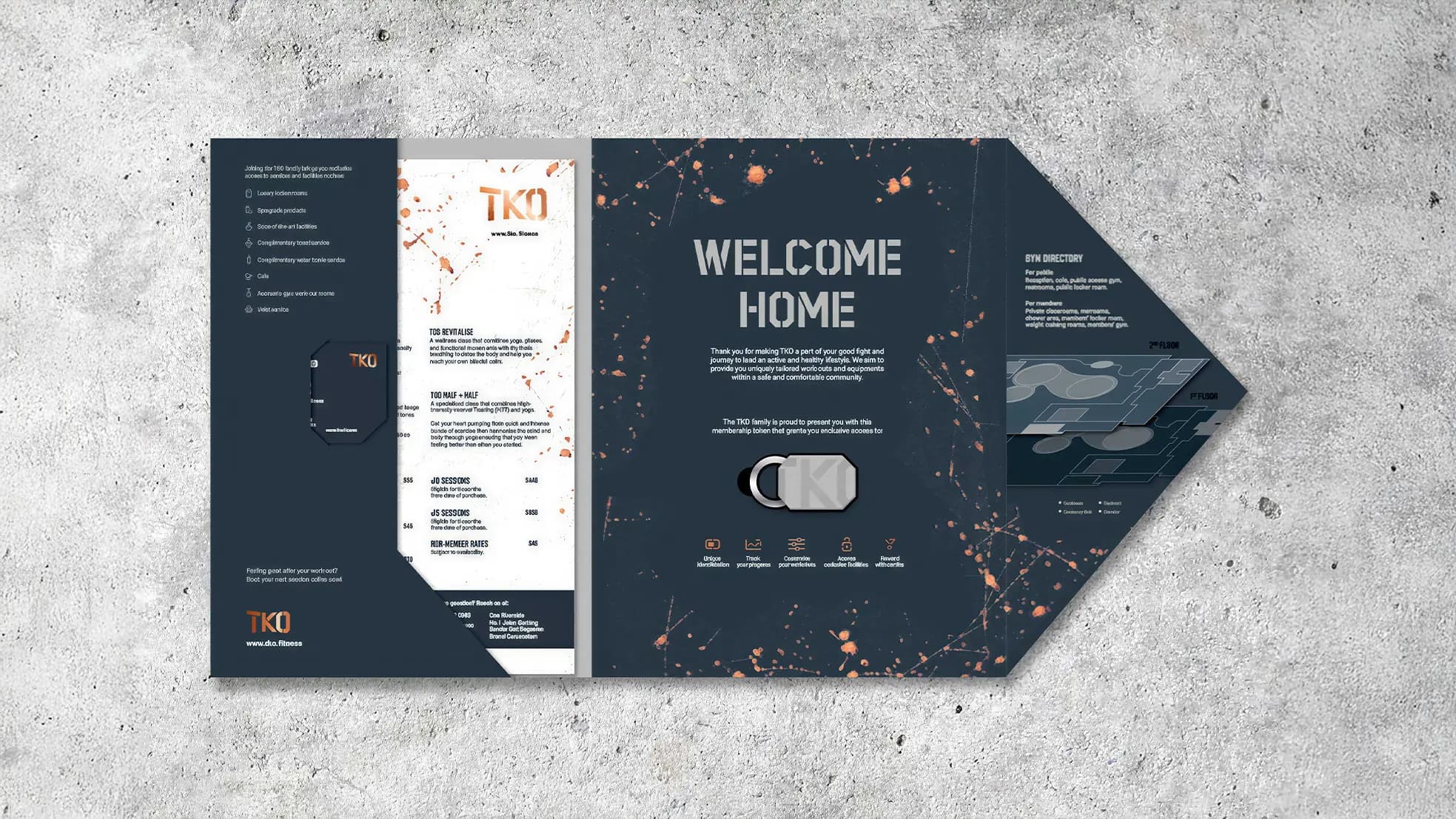
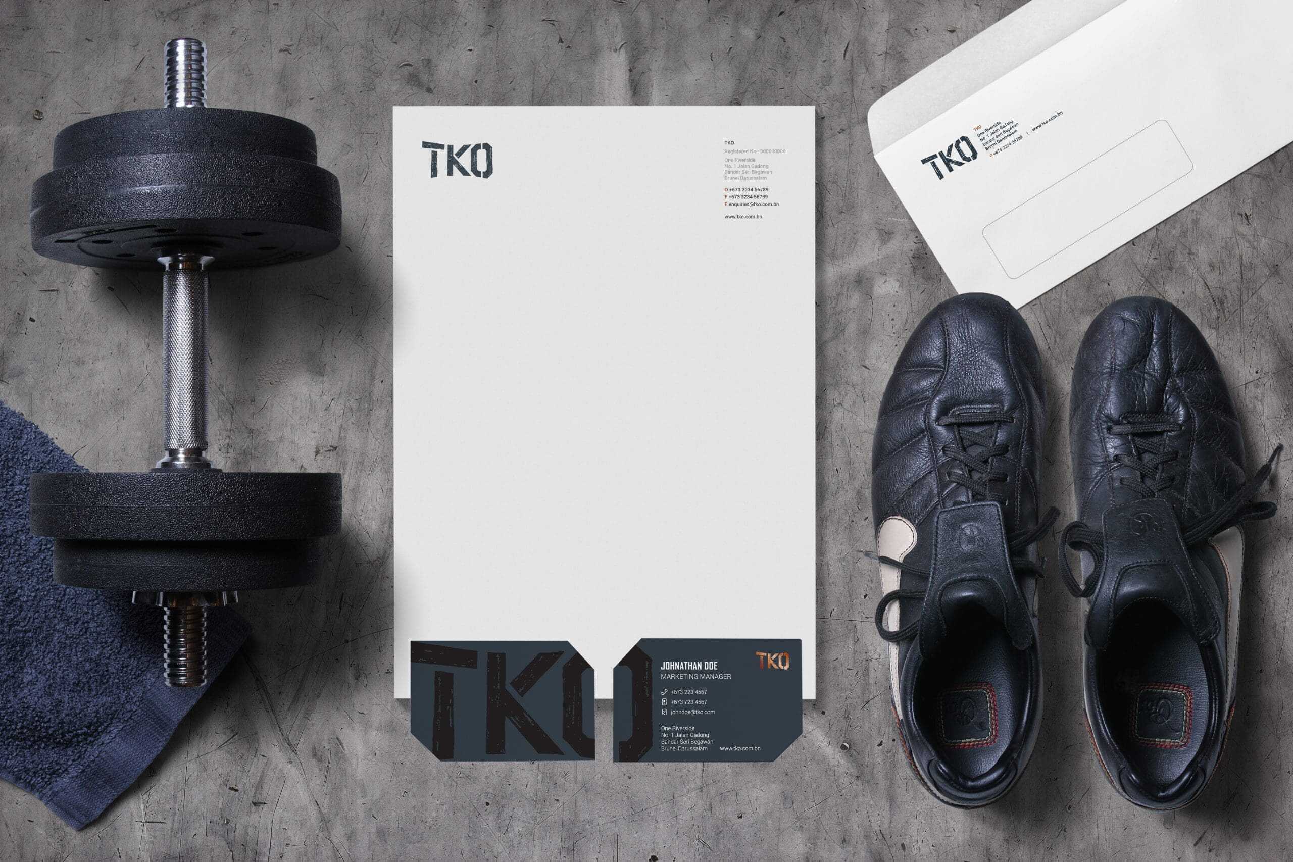
Created supporting materials: menus, membership cards, signage, with splatter motifs and layered typographic treatments to amplify urban energy
Ensured visual coherence across every touchpoint, resulting in a dynamic brand presence that immerses members in the culture and identity of TKO
{ THE DIFFERENCE }
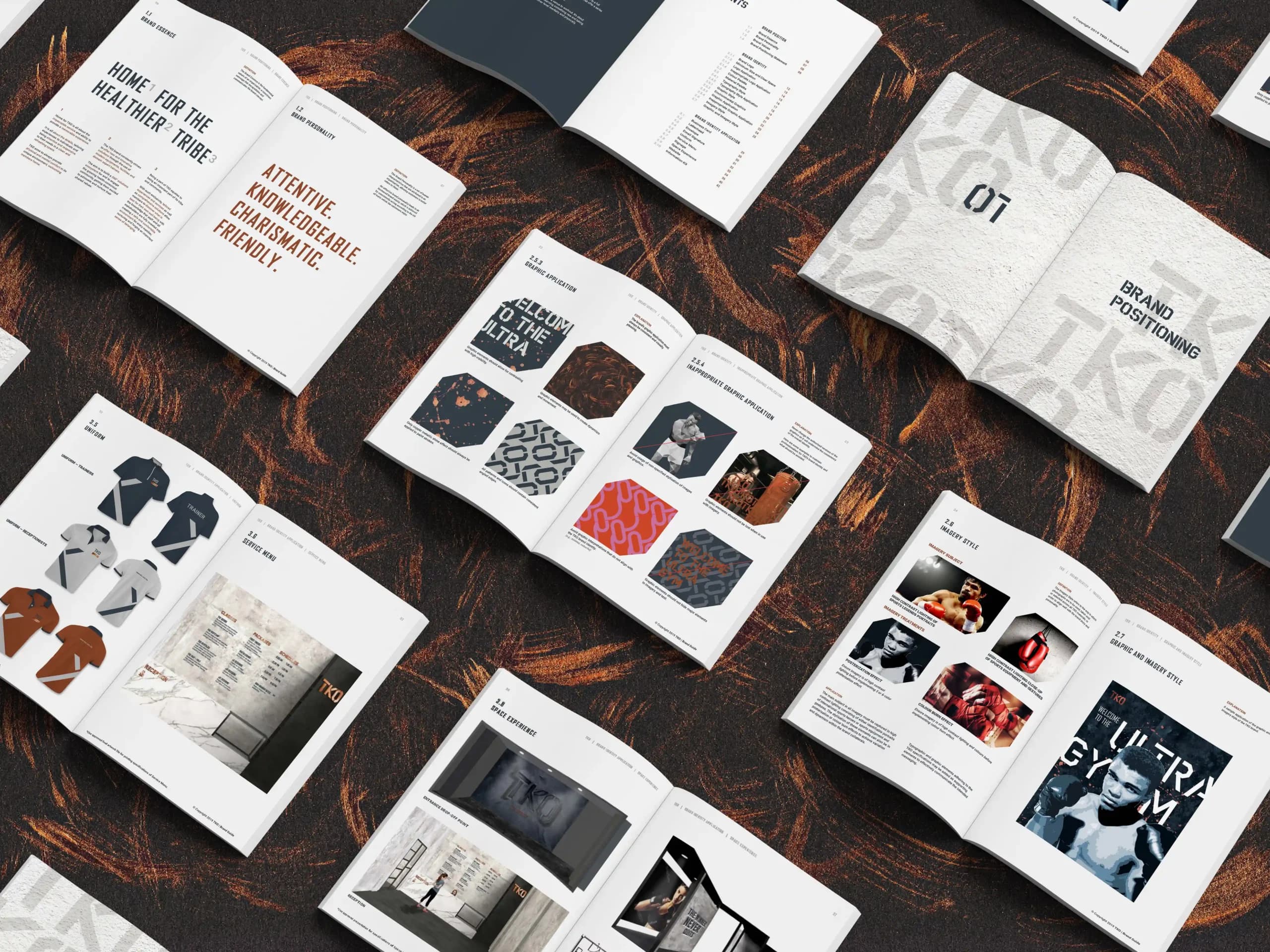
{ Brand Essence }
{ Brand Identity }
{ Brand Touchpoints }