Brand Transformation for Businesses Growing Across Asia • Up to 50% EDG Support for Eligible Projects. Limited Time Only
Brand Transformation for Businesses Growing Across Asia • Up to 50% EDG Support for Eligible Projects. Limited Time Only
Brand Transformation for Businesses Growing Across Asia • Up to 50% EDG Support for Eligible Projects. Limited Time Only
Brand Transformation for Businesses Growing Across Asia • Up to 50% EDG Support for Eligible Projects. Limited Time Only
Brand Transformation for Businesses Growing Across Asia • Up to 50% EDG Support for Eligible Projects. Limited Time Only
Brand Transformation for Businesses Growing Across Asia • Up to 50% EDG Support for Eligible Projects. Limited Time Only
Brand Transformation for Businesses Growing Across Asia • Up to 50% EDG Support for Eligible Projects. Limited Time Only
Brand Transformation for Businesses Growing Across Asia • Up to 50% EDG Support for Eligible Projects. Limited Time Only
Brand Transformation for Businesses Growing Across Asia • Up to 50% EDG Support for Eligible Projects. Limited Time Only
Brand Transformation for Businesses Growing Across Asia • Up to 50% EDG Support for Eligible Projects. Limited Time Only
Brand Transformation for Businesses Growing Across Asia • Up to 50% EDG Support for Eligible Projects. Limited Time Only
Brand Transformation for Businesses Growing Across Asia • Up to 50% EDG Support for Eligible Projects. Limited Time Only
Brand Transformation for Businesses Growing Across Asia • Up to 50% EDG Support for Eligible Projects. Limited Time Only
Brand Transformation for Businesses Growing Across Asia • Up to 50% EDG Support for Eligible Projects. Limited Time Only
Brand Transformation for Businesses Growing Across Asia • Up to 50% EDG Support for Eligible Projects. Limited Time Only
SPM: Transforming Electronics Manufacturing
Branding and Design

{ Project Overview }

{ Creative Challenge }
- 01
The SPM brand lacked coherence and distinctiveness, limiting awareness across their manufacturing and electronics markets
- 02
The existing brand name and visual identity failed to reflect the company’s reliability, adaptability, and bespoke solutions
- 03
Inconsistencies in visual elements and messaging weakened the brand’s credibility and global presence
- 04
A fragmented visual language made it challenging to align the brand experience across touchpoints, limiting recognition and resonance
{ The Solution }
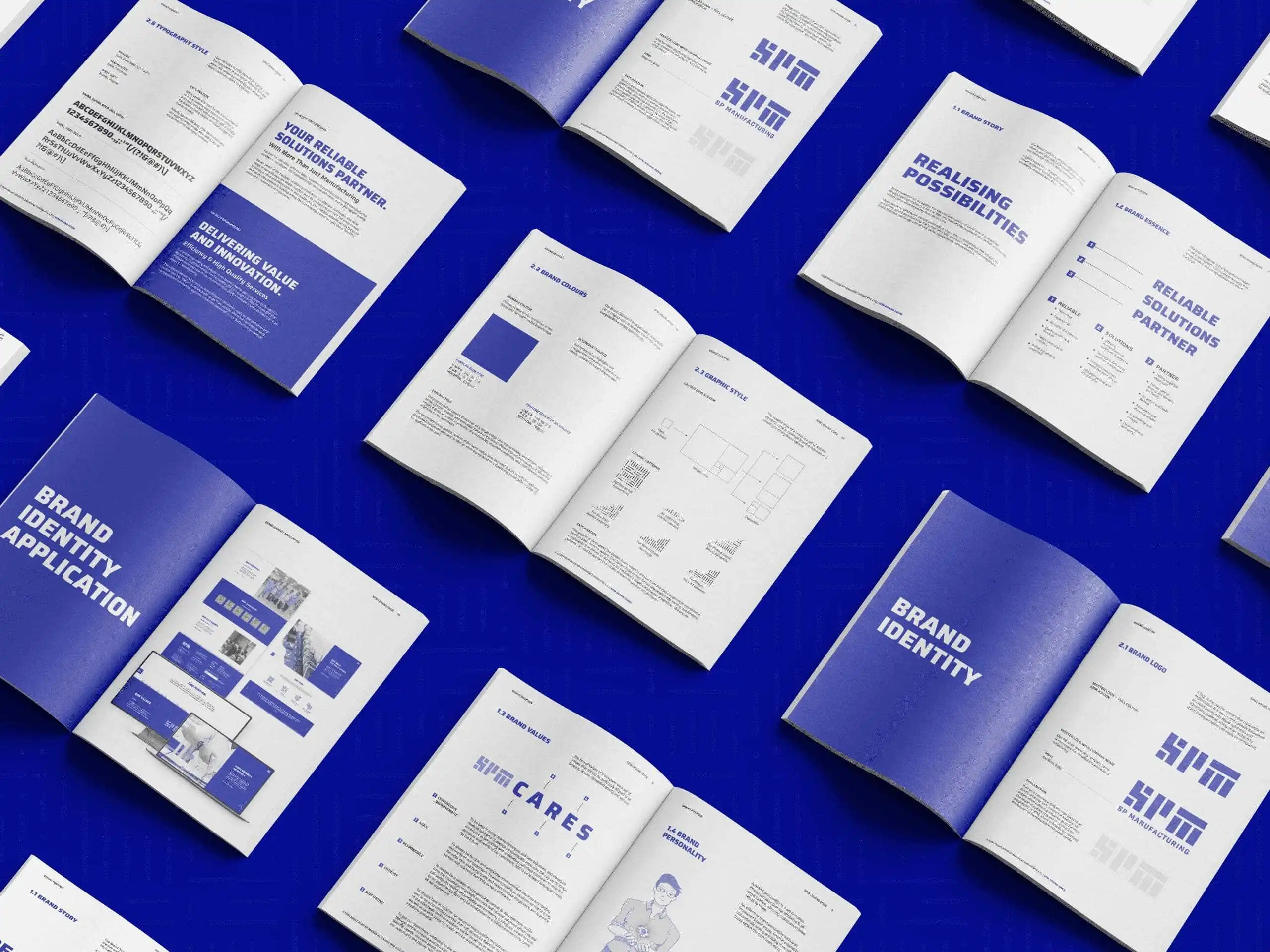
Rebranded to SPM, crafting a more prominent and memorable verbal identity that aligns with brand purpose and vision
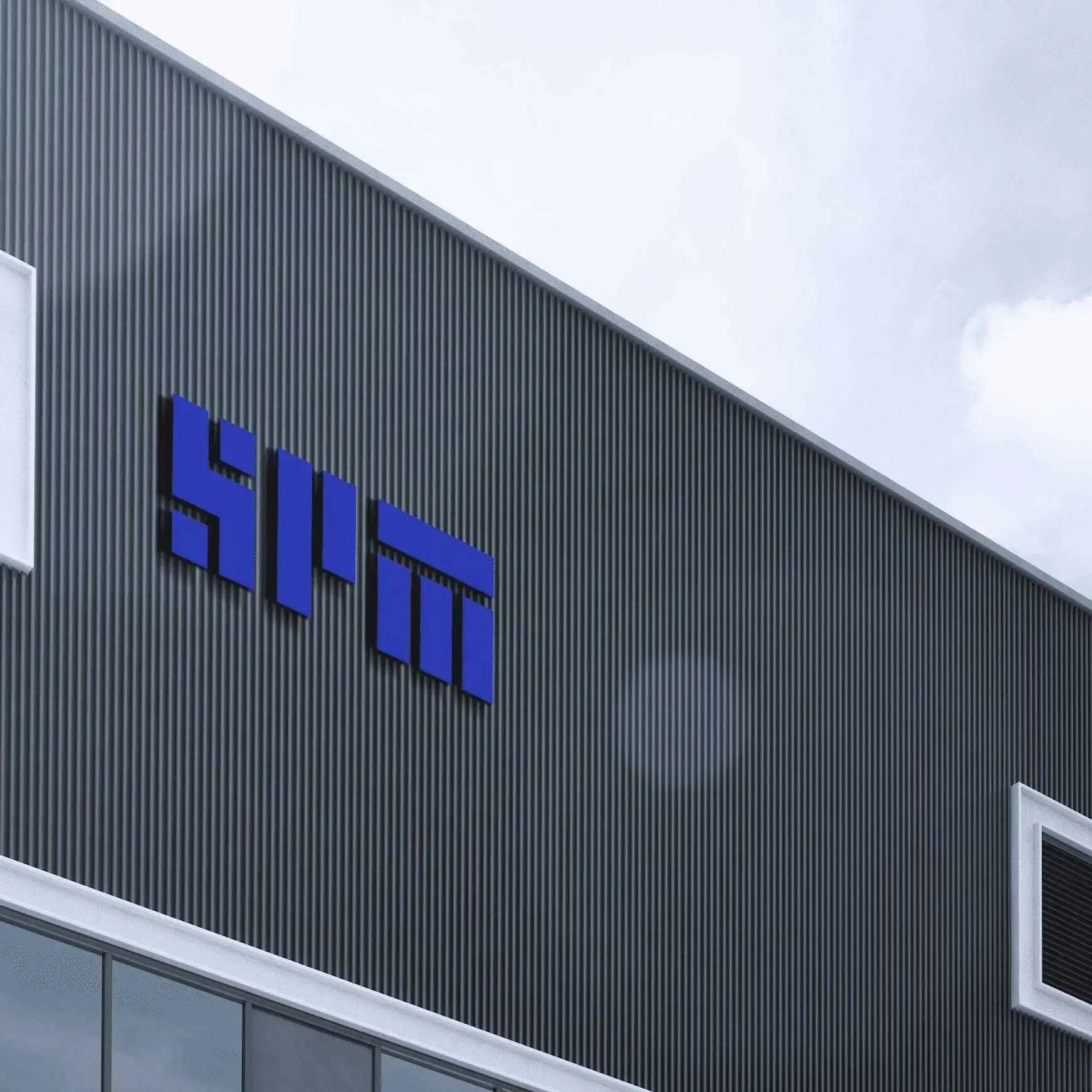
Developed a new logo built on a precise grid, where negative space within the letters “S” and “P” highlights adaptability and tailored solutions
Introduced a brand persona—the Creator—to embody the brand’s promise of realising possibilities and making ideas tangible
Applied the Golden Ratio to produce a flexible visual system rooted in simplicity and mathematical harmony, inspired by chip components’ geometry

{ THE DIFFERENCE }
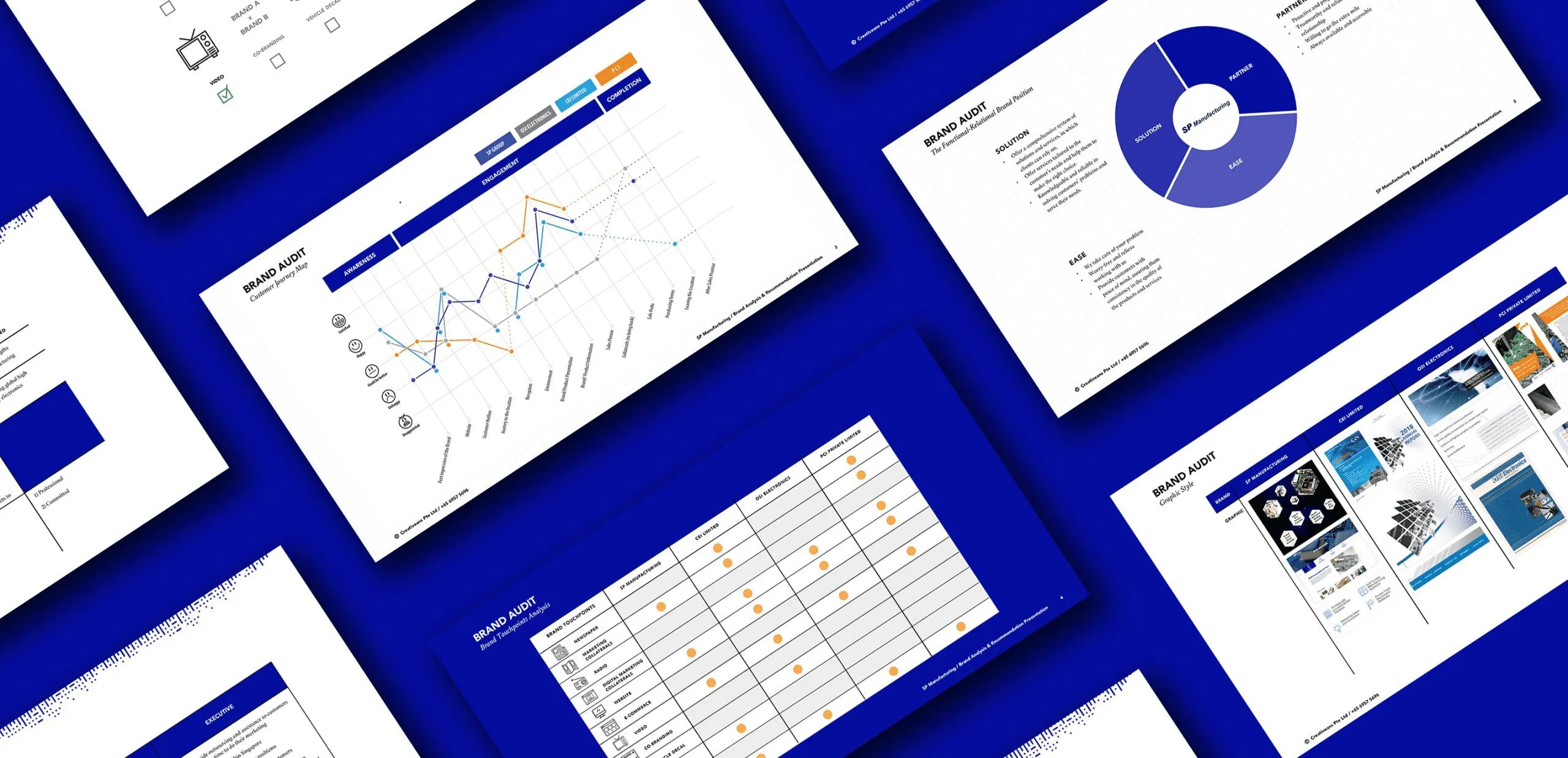
{ Brand Positioning }
{ Brand Identity }
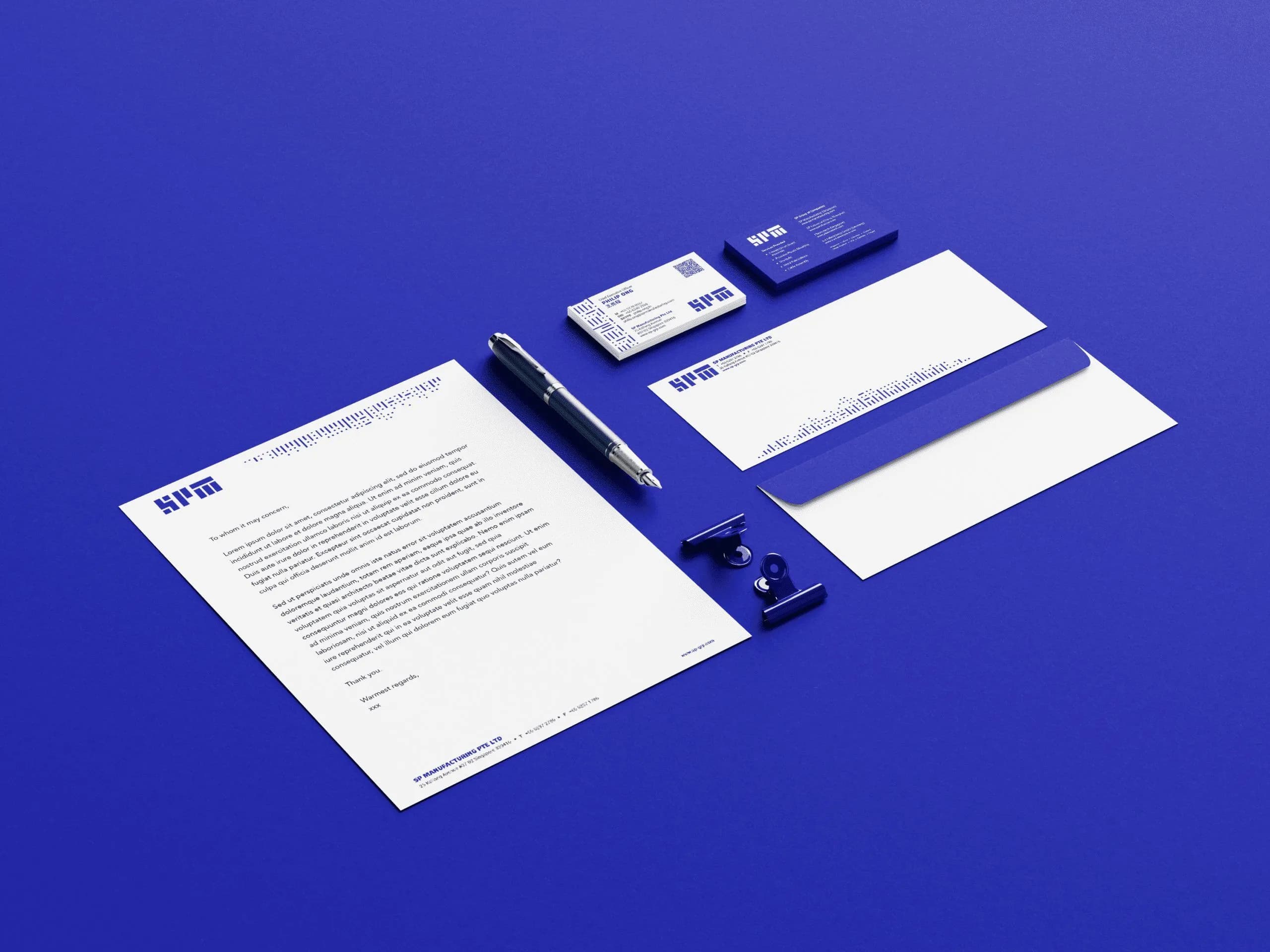
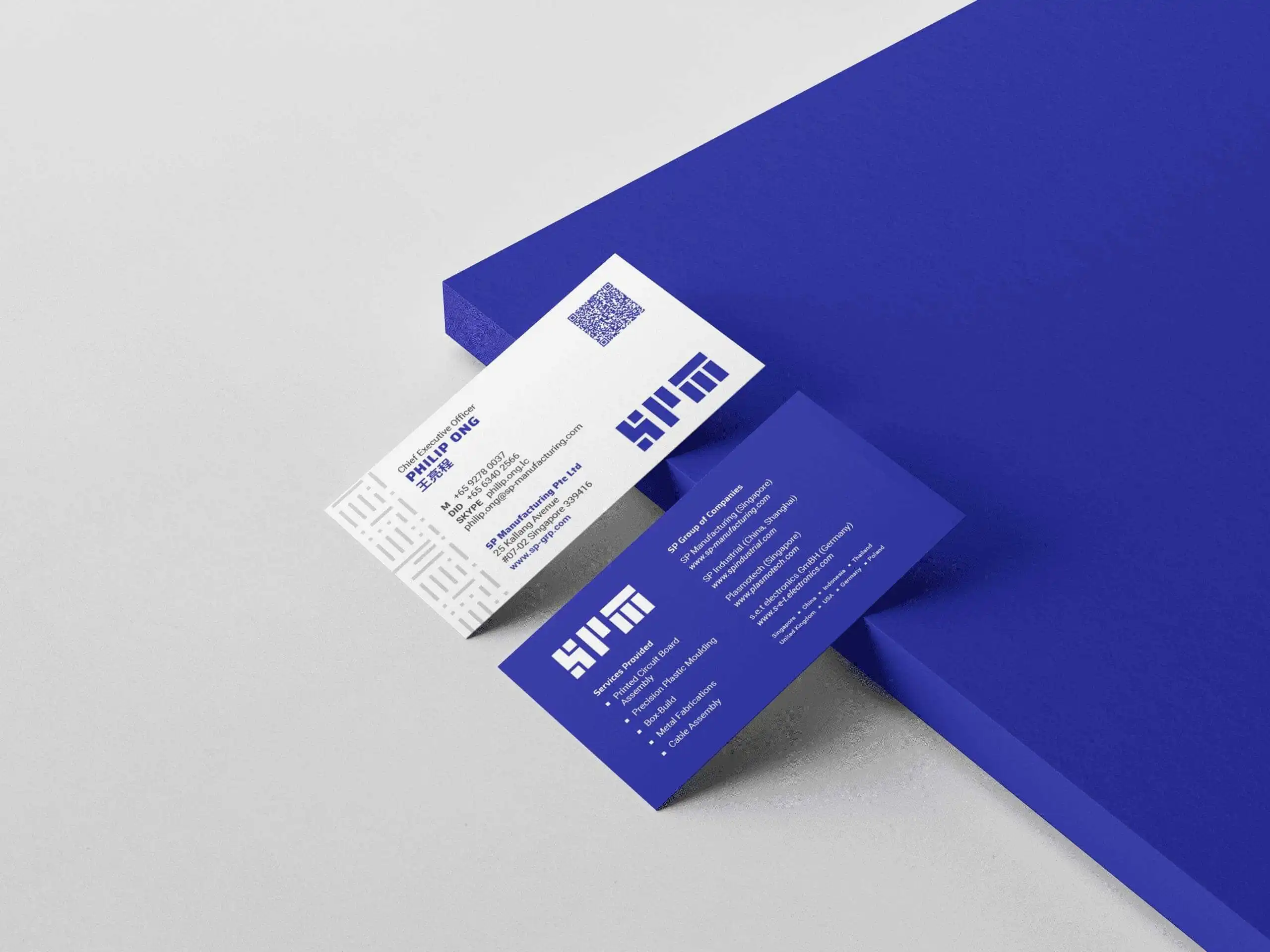
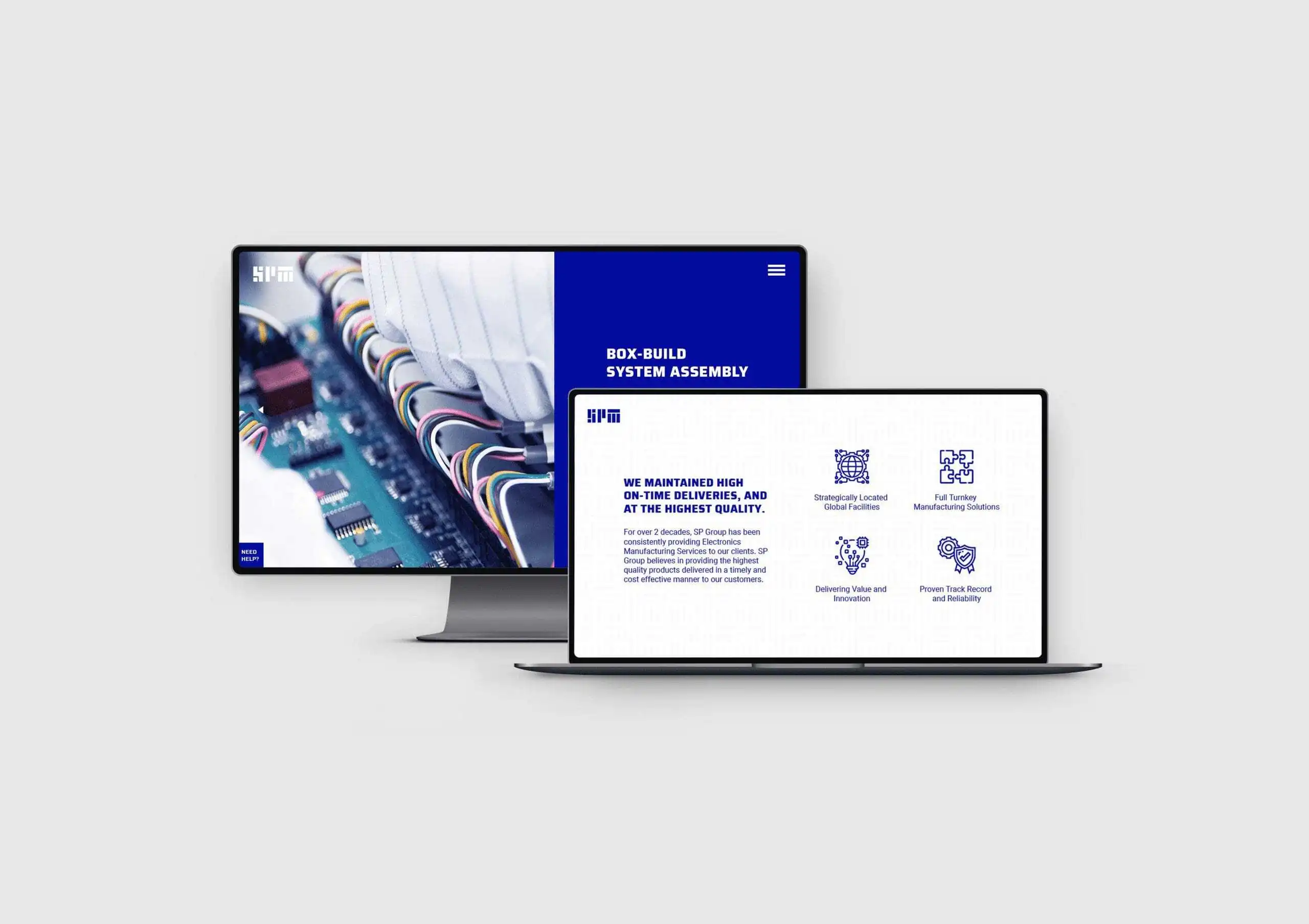
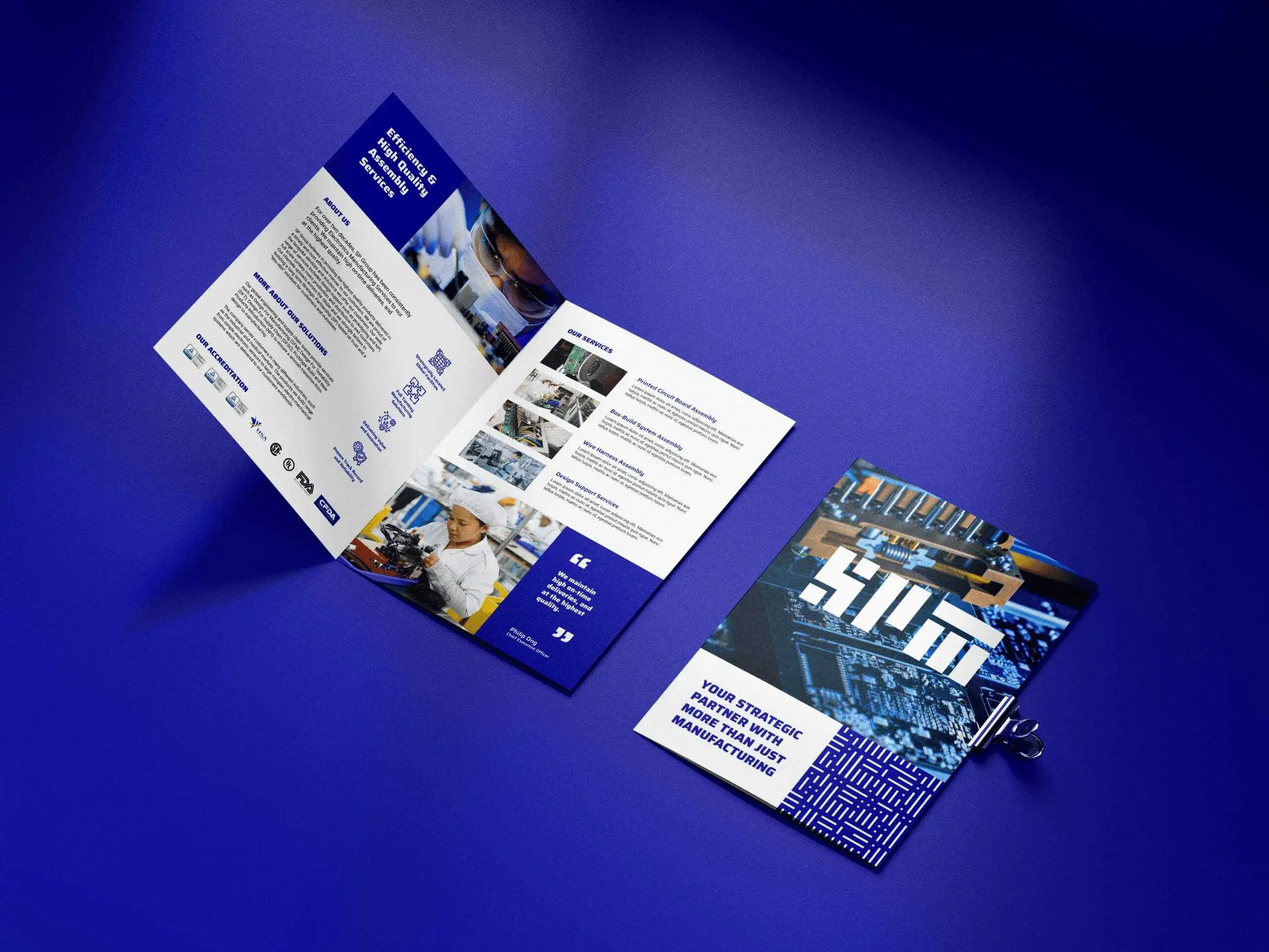
{ Brand Touchpoints }