Branding Design for a National Design Award:
Shaping the Seed Award by DBCS for Next Generation Designers
{ Project Overview }
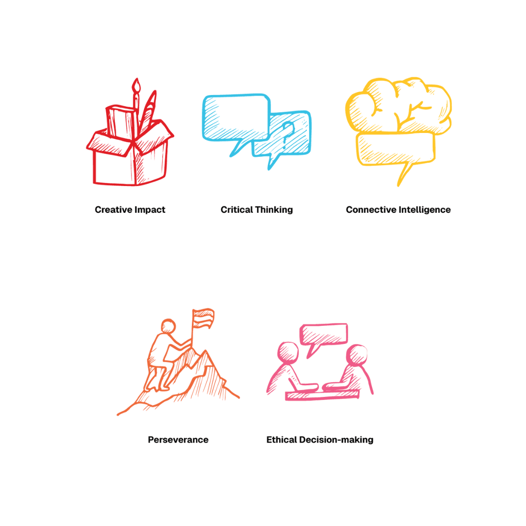
Guided by the tagline “Better Business by Design,” DBCS drives innovation and thought leadership through initiatives such as Singapore Good Design (SG Mark) and the Singapore Design Awards. The chamber also leads dialogues and capability-building programmes that champion design-led transformation for social good. With the support of Singapore’s Institutes of Higher Learning, DBCS launched the Seed Award, a future-focused initiative that recognises and nurtures emerging designers. The award evaluates students through five key designer qualities: Creative Impact, Critical Thinking, Connective Intelligence, Perseverance, and Ethical Decision-Making.
Rather than rewarding final deliverables, the Seed Award celebrates character, leadership, and the potential of design students who will shape the future. Creativeans partnered with DBCS to bring the Seed Award to life by building a cohesive branding, communication design, and UI/UX design system. We created the award’s logo and brand identity, then translated the system into key communication touchpoints and digital experiences. Our work expresses the Seed Award’s focus on growth, leadership, and the potential of emerging designers.
{ Creative Challenge }
- 01
Create a logo and brand identity that symbolises the 5 designer qualities and symbolise leadership, growth, and future readiness beyond finished design outcomes.
- 02
Design a scalable and enduring brand identity system, one that can remain relevant and adaptable across years, cohorts, and evolving contexts without losing its meaning.
- 03
The branding had to function across multiple physical and digital touchpoints, demanding a system that performs consistently at different sizes and formats.
- 04
Create an omnichannel award identity, as the Seed Award exists across real-life touchpoints and digital platforms, from submissions to ceremonies and public communications.
{ The Solution }
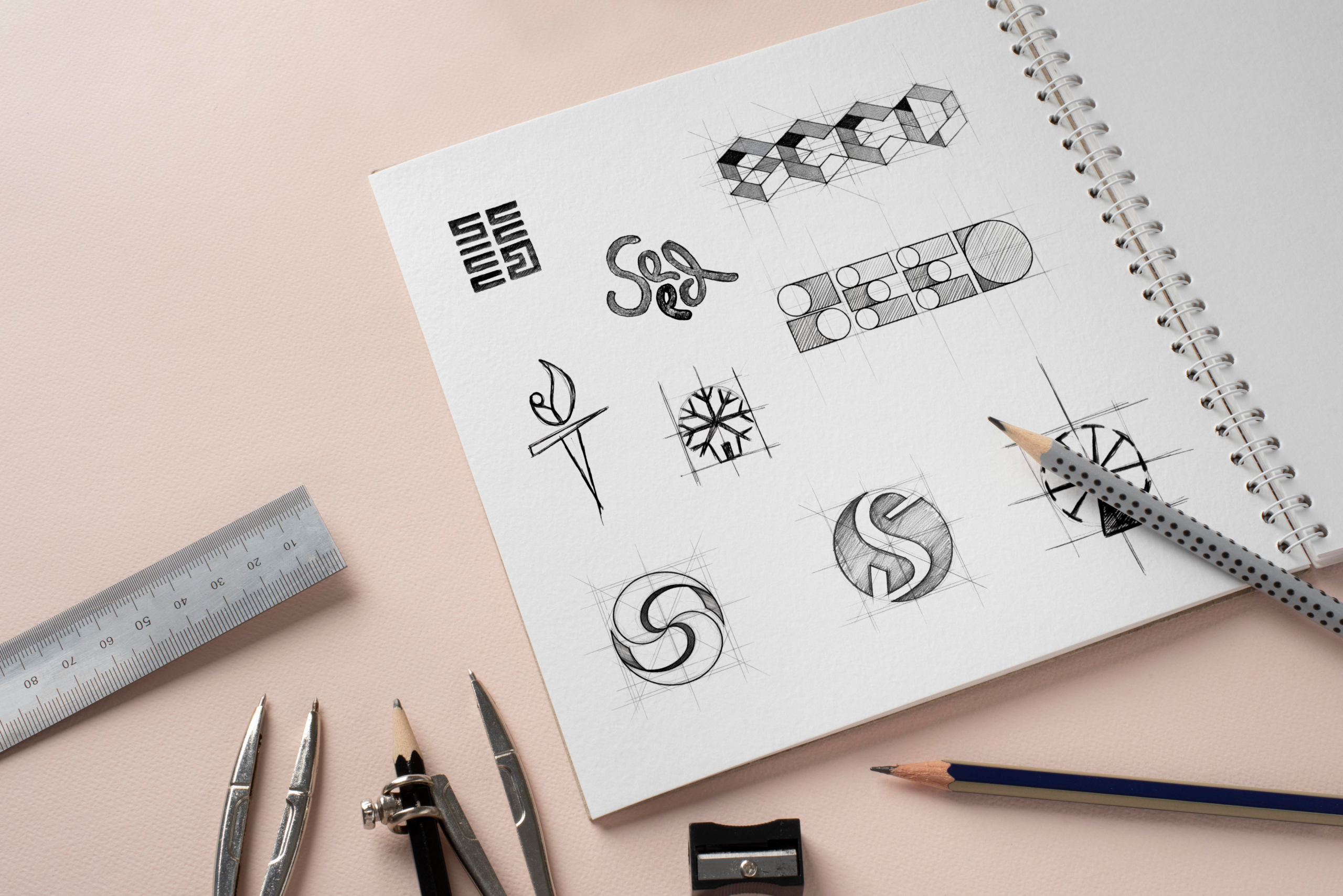
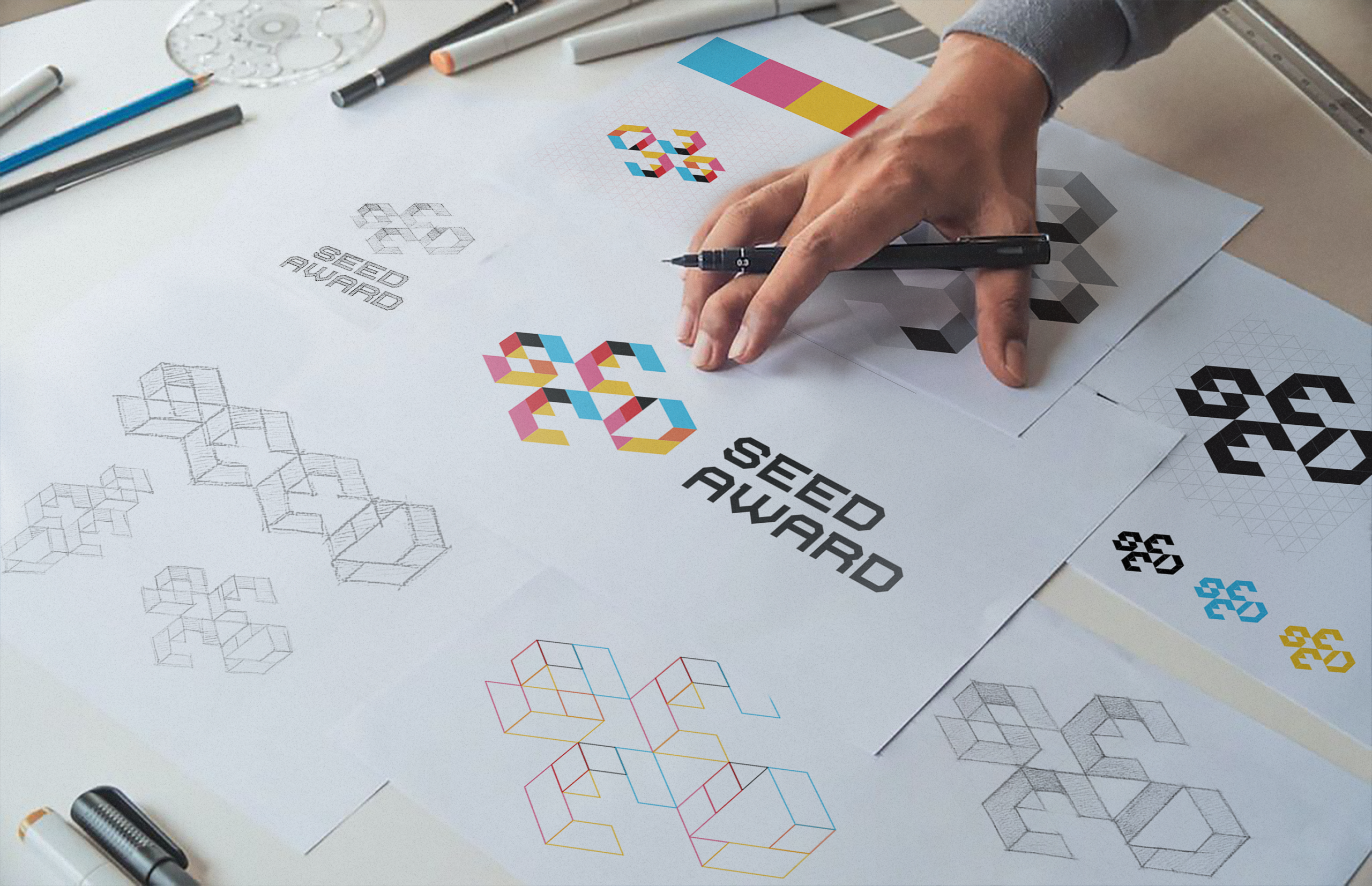
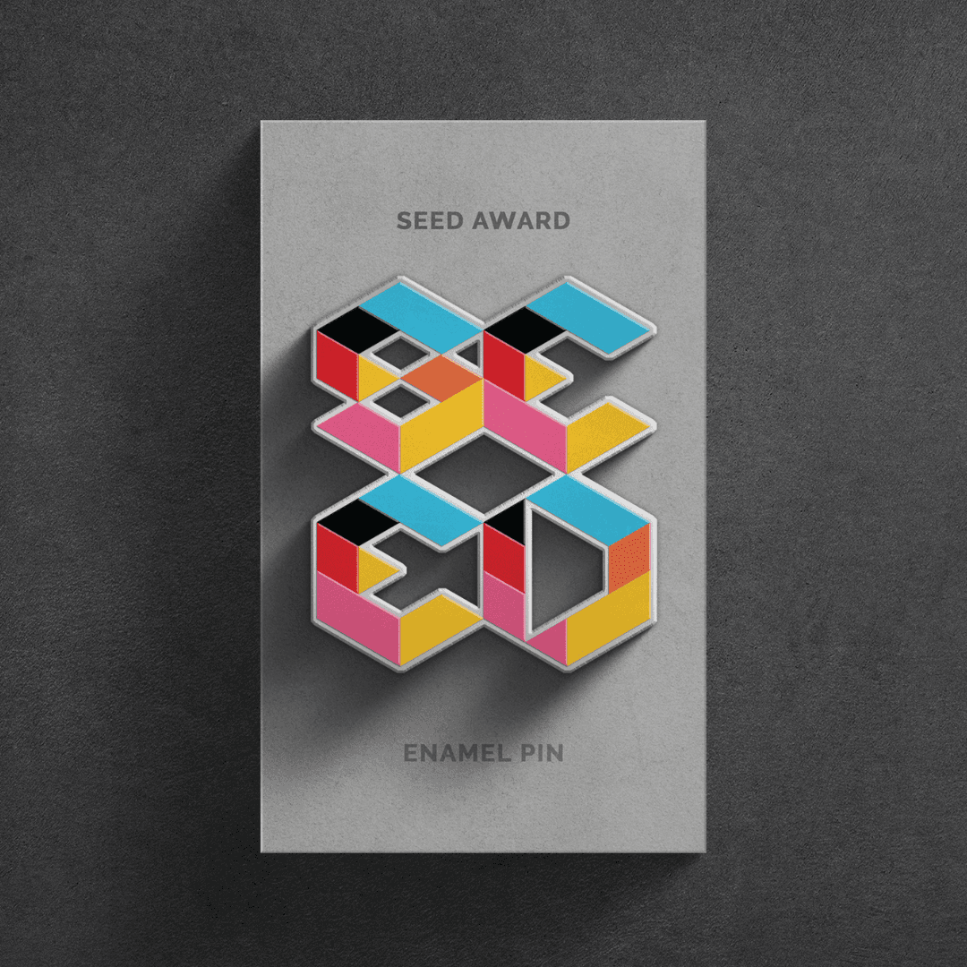
Built the brand identity around the metaphor of a growing seedling in pots, representing the growth and potential of emerging designers as future changemakers.
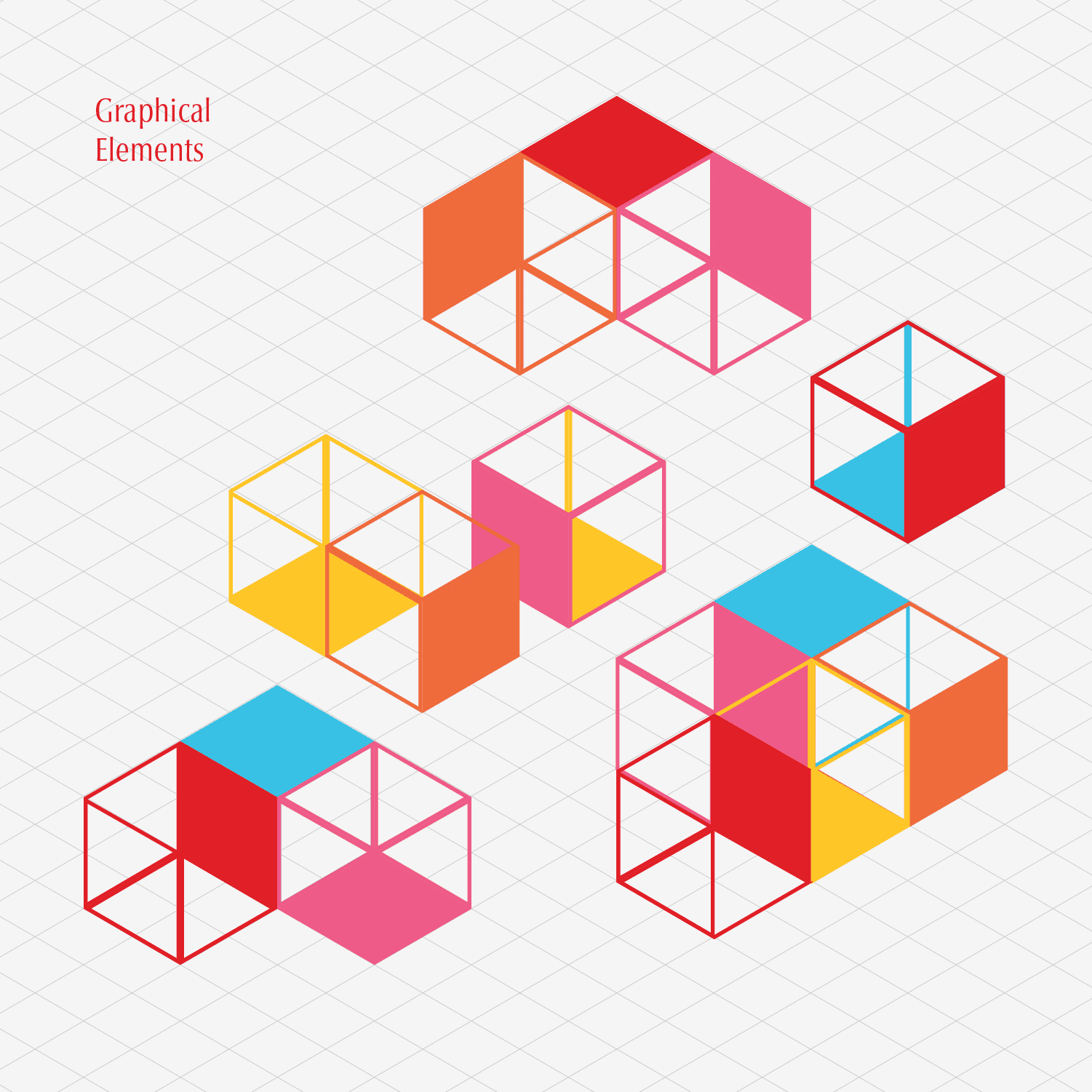
Designed a refined visual system using geometrical shapes in a modular structure, keeping the identity simple, timeless, and flexible to evolve over time.
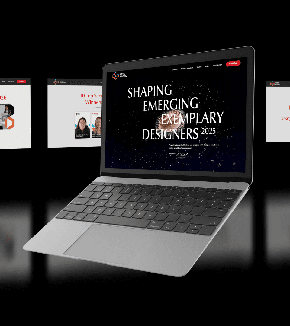
Scaled the identity across physical and digital formats, applying the same core modular structure from the logo to ensure consistency across different sizes and applications.
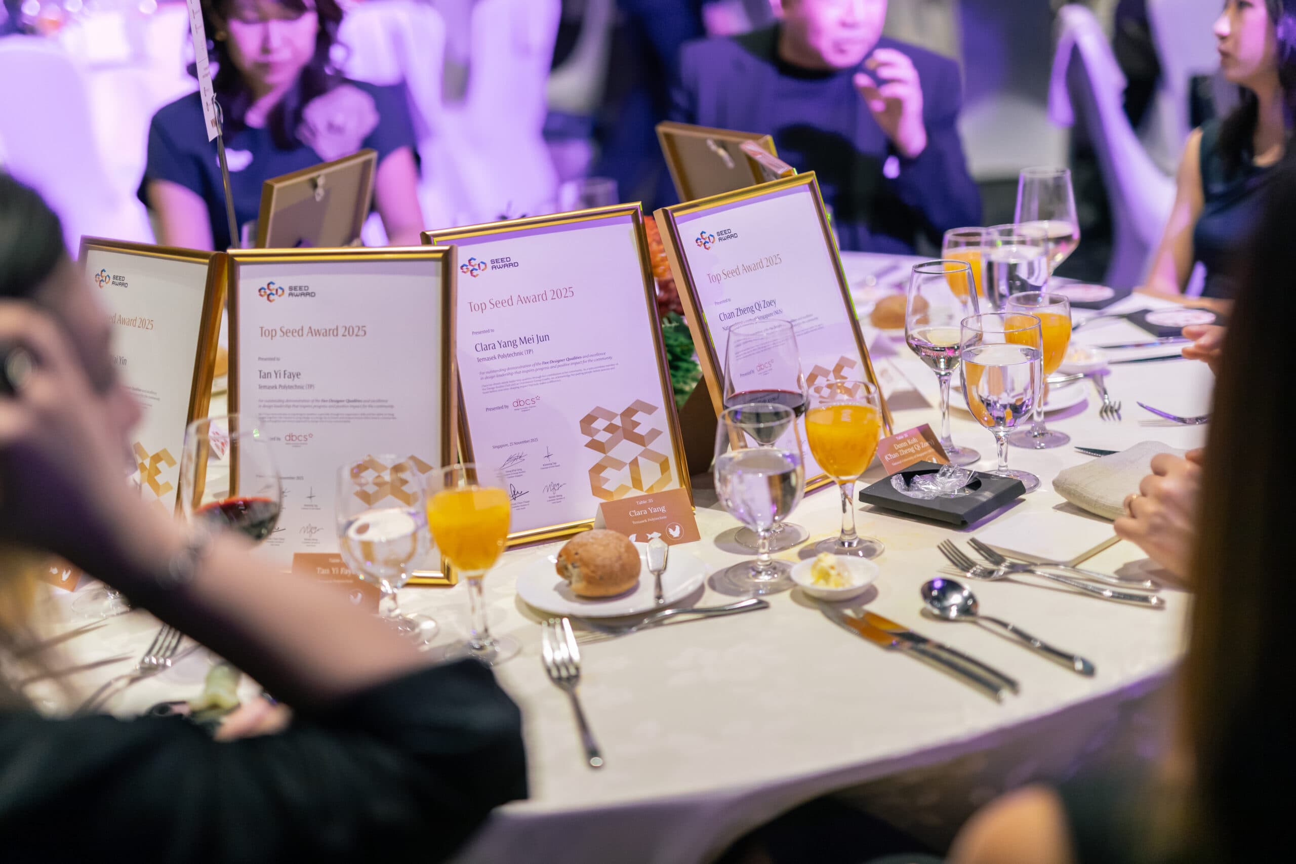
Extended the identity across an omnichannel award experience, from the website application journey to certificates, event moments, and post-event social media.
{ THE DIFFERENCE }
{ Brand Identity }


{ Brand Touchpoints }
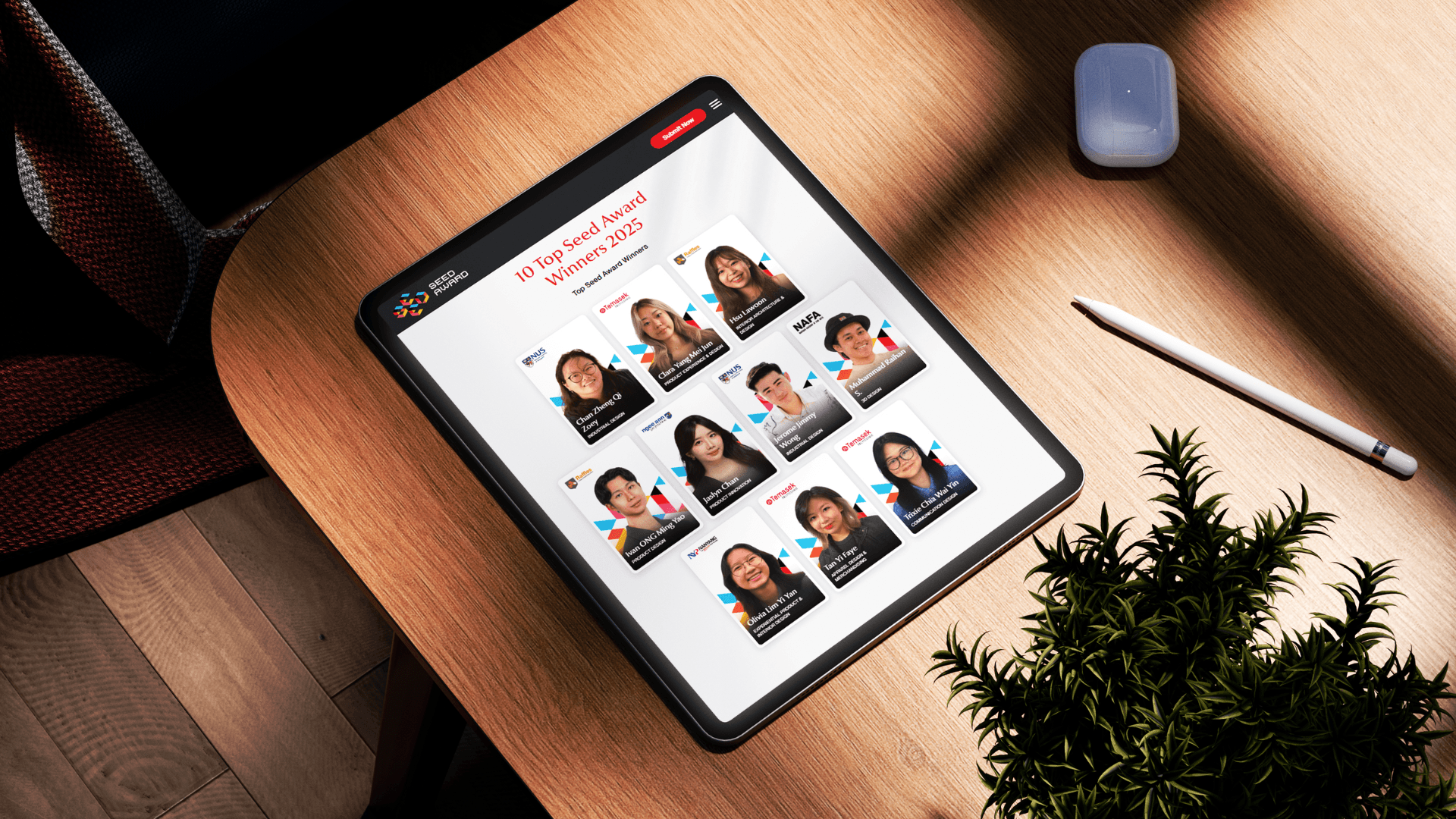
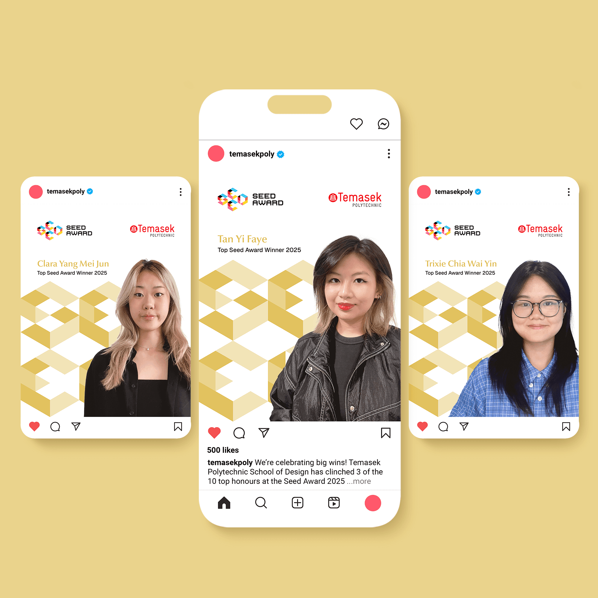
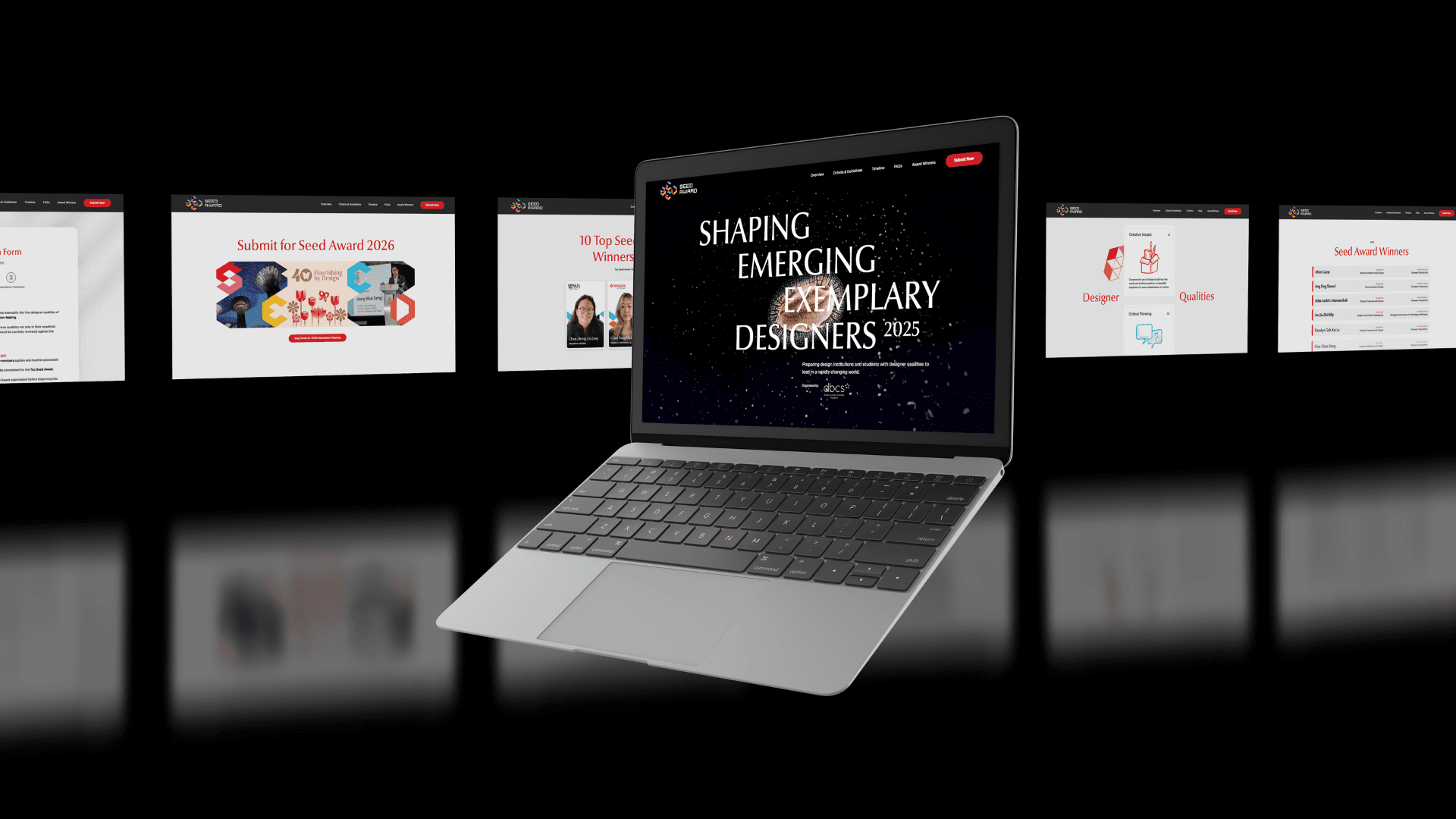
The Seed Award identity extends seamlessly across communication and digital touchpoints to create a coherent award experience.
Submission guidelines, certificates, social media templates, and event backdrops apply the same modular visual system, ensuring clarity and consistency across physical and digital formats. In parallel, the Seed Award website and submission platform present the award’s purpose, criteria, and process through a clear and intuitive digital experience for students and institutions.
Together, these touchpoints support participants at every stage of the award journey, from submission and evaluation to announcement and celebration.
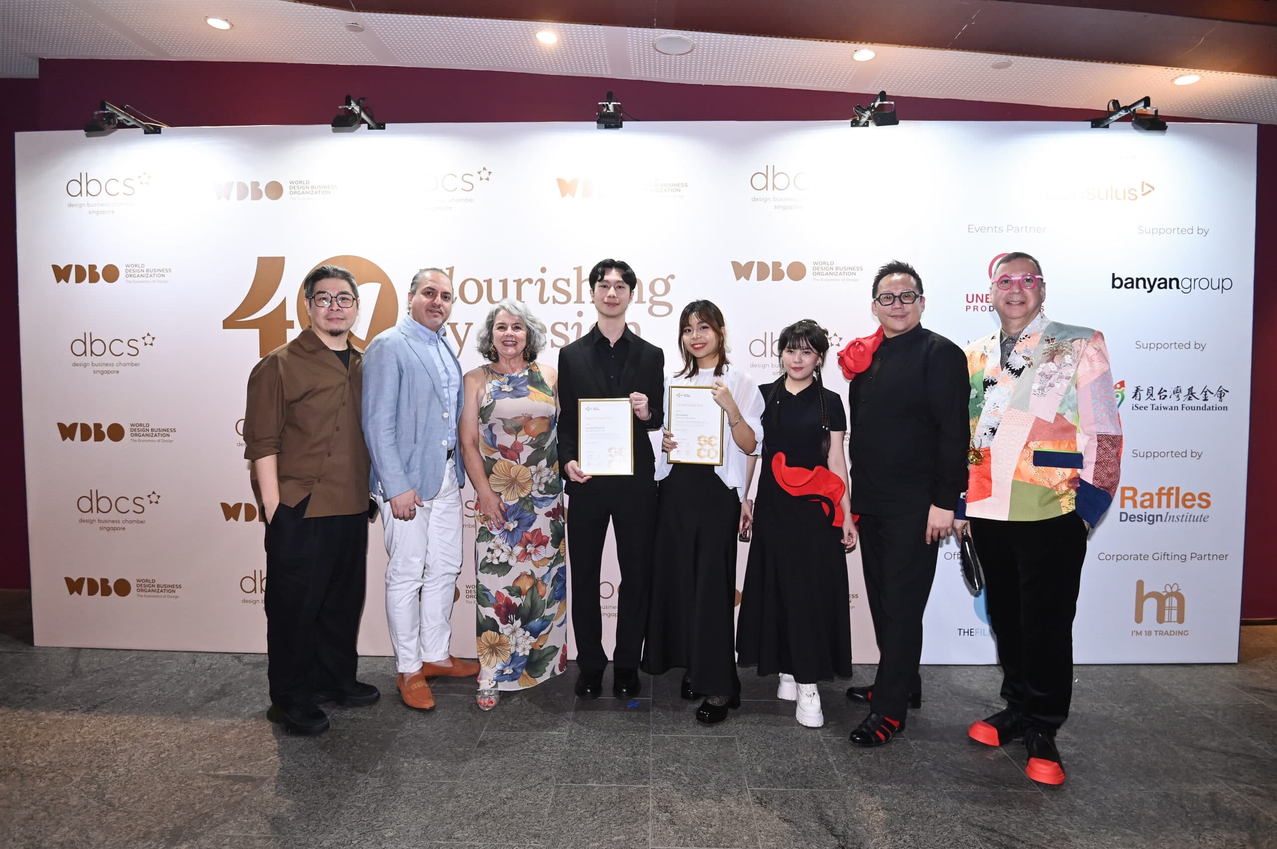
The branding and design of the Seed Award were very well received by stakeholders and the public. It marked an important milestone as the inaugural award officiated by Singapore President Tharman. Well done to the Creativeans team for executing this vision with clarity and impact.