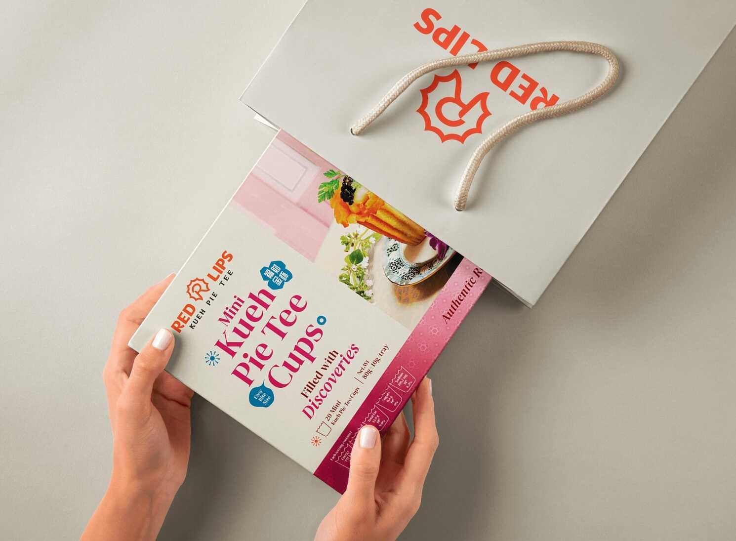
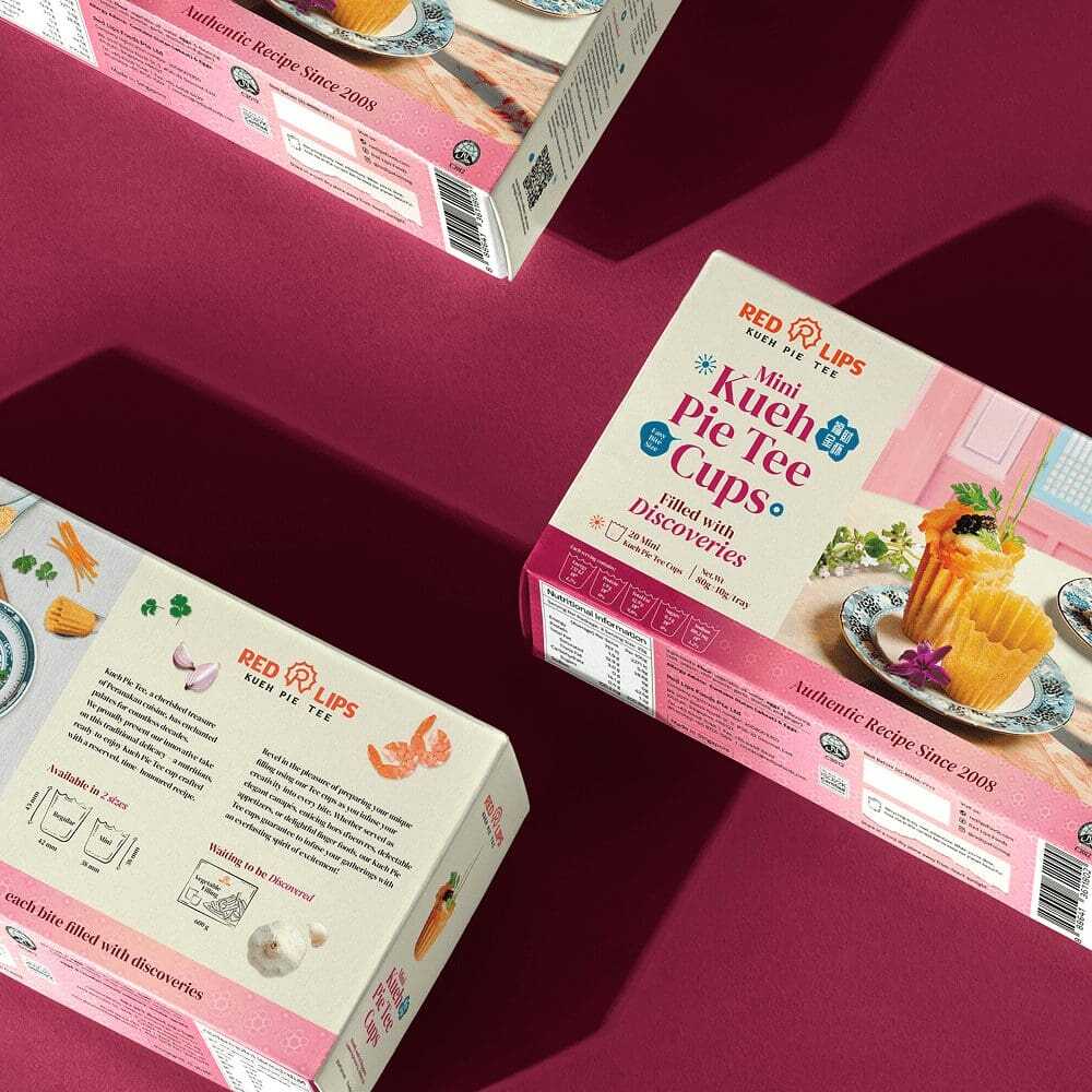
Filled with Discoveries
Red Lips turns tradition into bold flavour adventures

{ Project Overview }
Red Lips is a Singapore food manufacturer and supplier specialising in Peranakan Kueh Pie Tee and gourmet shells. Serving both B2B and B2C customers, the brand caters to Michelin-starred restaurants, award-winning hotels, resorts, caterers, supermarkets, and food-service establishments.
Built on premium ingredients and daily handcrafted production, Red Lips delivers freshness, taste, and crispiness while continuing to innovate through food research and development. The brand is also the proud recipient of the Indigo Design Award 2025 Gold Winner in Branding for Food. View the award here.

{ Creative Challenge }
- 01
Red Lips is known for premium Kueh Pie Tee cups grounded in Peranakan culinary traditions.
- 02
Despite its rich cultural roots, the previous brand identity did not fully convey that authenticity in a compelling manner.
- 03
It needed to express qualities like quality, versatility, and innovation in a way that appealed to design-aware younger audiences.
- 04
The lack of a unified visual system left Red Lips underrepresented across digital and physical channels.
- 05
Without a refreshed identity, the brand risked being overshadowed by less authentic but more visually engaging competitors.
{ The Solution }
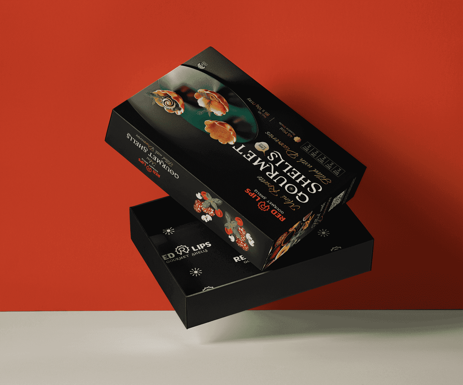
Crafted an R-shaped monogram logo, drawing direct inspiration from the iconic Kueh Pie Tee, to symbolise culinary creativity
Anchored the identity around the essence Filled with Discoveries, evoking a sense of exploration rooted in tradition
Employed bold, festive colours like tangerine red and lime green, paired with abstract graphic elements inspired by flavour profiles
Designed a dynamic visual language that bridges the traditional and the modern, capturing both heritage and energy
Produced a comprehensive brand guideline to ensure consistency across packaging, digital media, and trade communications
Elevated Red Lips’ position as Singapore’s trusted Peranakan food specialist by reinforcing cultural authenticity and audience engagement

{ THE DIFFERENCE }
{ Brand Audit }
We help you understand your brand, your customers, and your competitors through a clear and comprehensive brand audit.
A brand audit assesses how a company’s brand is perceived by its customers and stakeholders. It reviews key elements such as the company’s mission, values, branding, marketing materials, and overall customer experience.
By evaluating the touchpoints where customers interact with the brand, we can identify inconsistencies, weaknesses, and opportunities for improvement. This helps the brand communicate more clearly, consistently, and effectively.

{ Brand Positioning }

{ Brand Identity }


{ Brand Touchpoints }
We created a vibrant and cohesive brand experience for Red Lips, ensuring every physical and digital touchpoint reflects its flavour-filled personality.
From its engaging website and streamlined ordering process to its lively social media presence, each interaction was designed to feel dynamic, approachable, and consistent. The brand’s bold colours and playful visual identity flow across packaging, marketing materials, and retail environments.
Across online customer service, direct product delivery, and in-store experiences, Red Lips reinforces its commitment to quality, innovation, and customer satisfaction. This strengthens its position as a trusted provider of Peranakan delicacies with a fresh and expressive brand presence.


{ Brand Rollout }

{ Staff Alignment }
Red Lips’ rebranding journey has been an exciting fusion of tradition and innovation. By capturing the essence of Peranakan heritage and infusing it with modern design elements, we’ve helped Red Lips carve out a distinctive and dynamic identity. This transformation strengthens their position as a leader in the food industry, allowing the brand to connect with a wider audience while staying true to its roots of quality and authenticity.