Pulpit Rock:
Branding an Icon and Smoked Salmon Packaging

{ Project Overview }
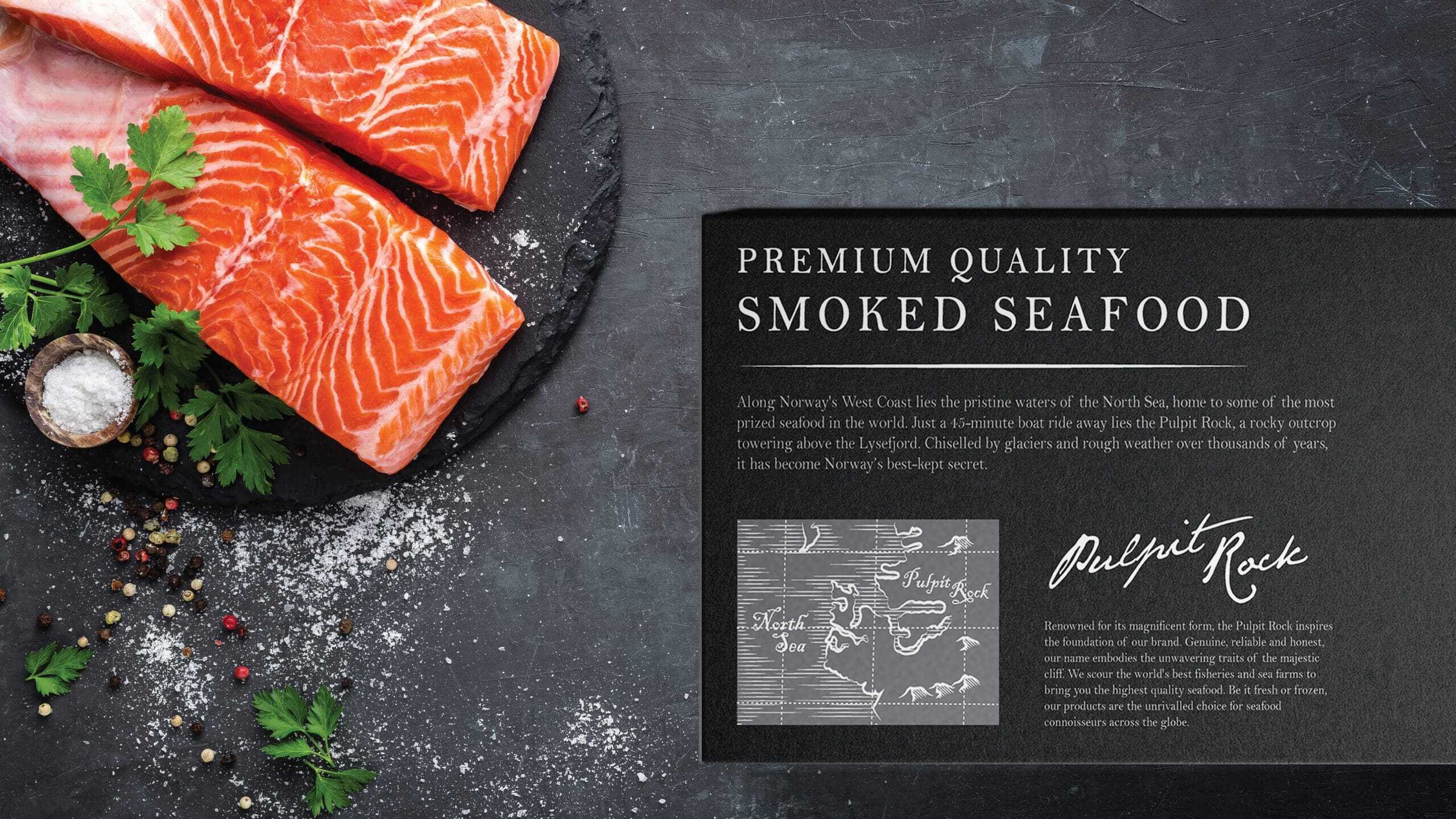
Snorre Food, a leading supplier of premium cold-water seafood, introduced a new in-house range of smoked salmon products under the sub-brand Pulpit Rock. The name is inspired by the region of Rogaland in Norway, where the famous mountain plateau, Pulpit Rock, is located.
Known for its clean and majestic fjords, Rogaland is home to a rich variety of fish and wildlife. By referencing this internationally recognised landmark, the brand connects the smoked salmon range to Norway’s natural purity, premium seafood heritage, and strong sense of place.

{ Creative Challenge }
- 01
Snorre Food introduced a smoked salmon sub-brand named Pulpit Rock but lacked an established brand identity in the premium seafood market
- 02
The origin story (Rogaland, Norway; Pulpit Rock) was not yet leveraged in branding to evoke trust, natural purity, or locality
- 03
Packaging designs had to appeal to a wide audience yet retain premium cues, without having a visual system yet that supported size / layout flexibility
- 04
Needed to communicate freshness, ocean-sourced quality, and adapt to chilled or fresh formats within consistent packaging
{ The Solution }
Designed a logo and packaging series built around the “Pulpit Rock” name, tying in imagery and values from the iconic location to strengthen origin credibility
Introduced design elements that reference nature, ocean tones, and clean aesthetics to communicate freshness and premium seafood identity
Ensured flexibility in packaging sizes and layouts, with adaptable labelling for fresh vs chilled versions of the product
Rolled out consistent communication design across touchpoints to help Pulpit Rock quickly gain credibility and differentiation in the competitive premium seafood industry
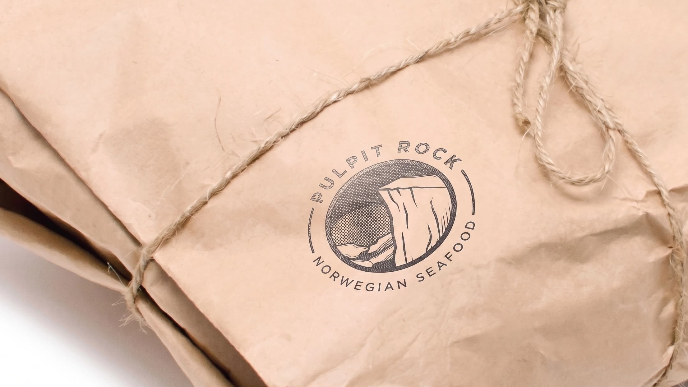
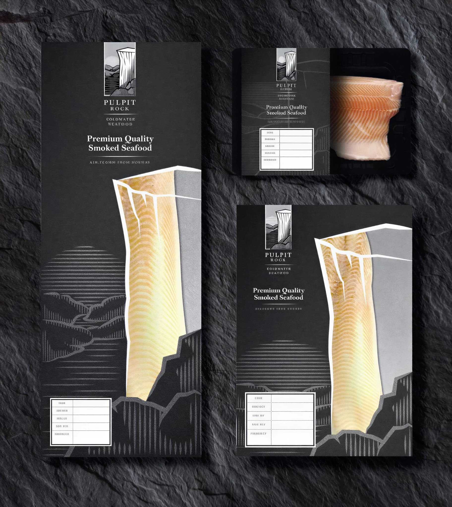
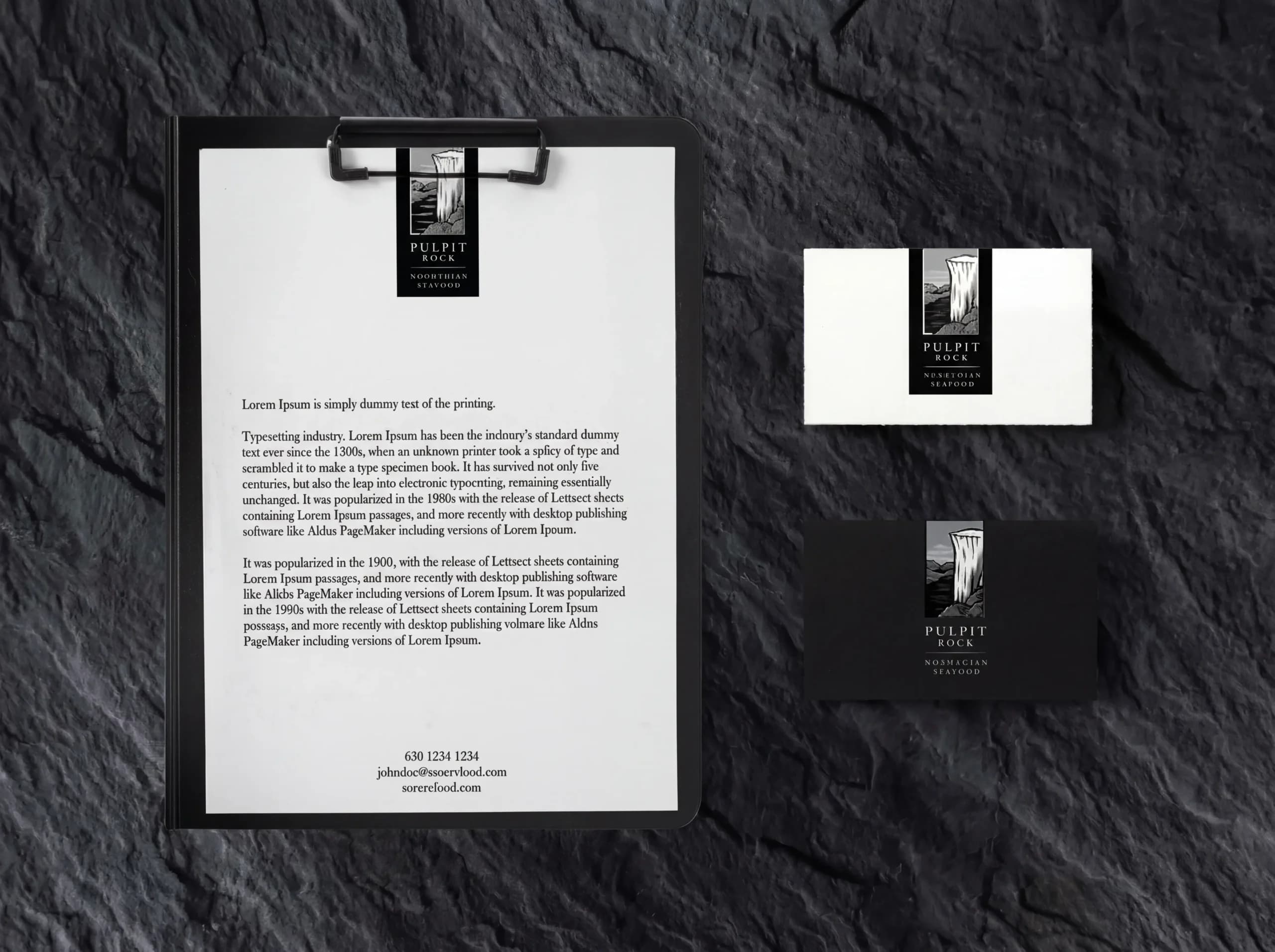
{ Brand Identity }
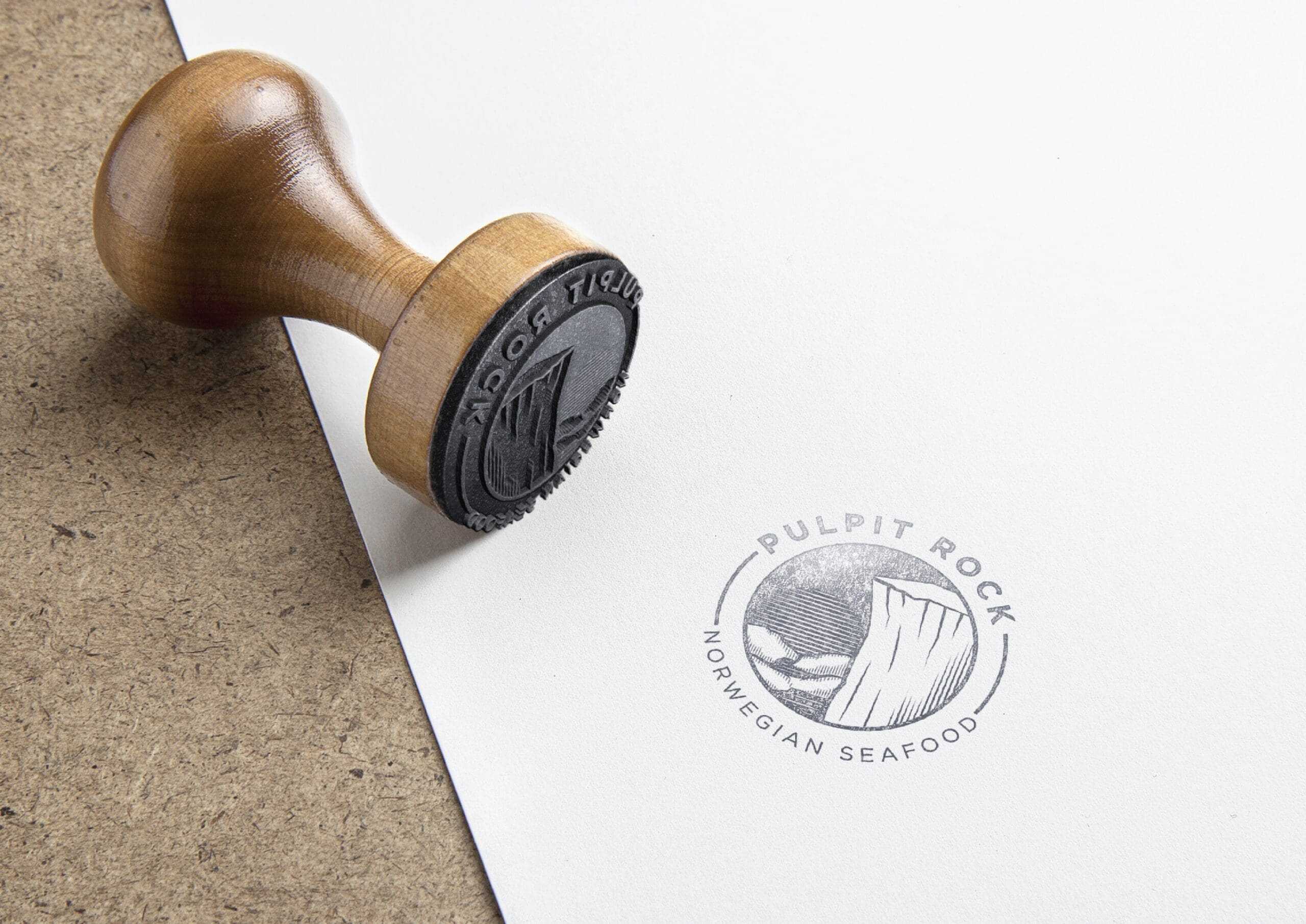
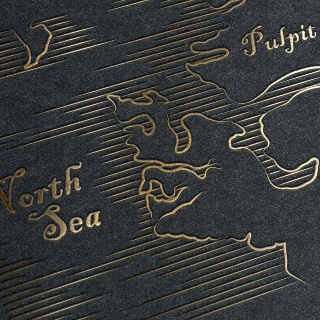

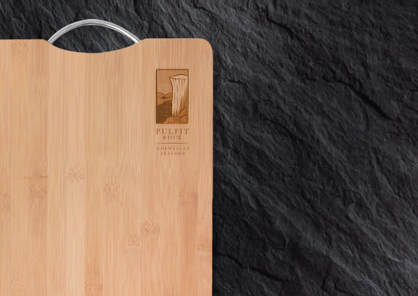

{ Brand Touchpoints }
We designed the Pulpit Rock packaging system to feel fresh, approachable, and adaptable for a wide range of smoked salmon customers.
The packaging uses cool and fresh colours to communicate qualities associated with nature, ocean, and seafood. This helps the brand feel clean, trusted, and appealing to the widest possible audience.
The system was also designed to work across different packaging sizes and layouts. With flexible labelling for fresh or chilled product types, the packaging can adapt to different customer groups while maintaining a consistent brand presence.
The new brand identity and packaging designs helped Pulpit Rock – a new brand to quickly gain credibility and differentiation in the competitive premium seafood industry.”