• Award-Winning Brand and Design Consultancy • Claim Up to 50% EDG Grant for Your Brand. Limited Time only• Award-Winning Brand and Design Consultancy • Claim Up to 50% EDG Grant for Your Brand. Limited Time only• Award-Winning Brand and Design Consultancy • Claim Up to 50% EDG Grant for Your Brand. Limited Time only• Award-Winning Brand and Design Consultancy • Claim Up to 50% EDG Grant for Your Brand. Limited Time only• Award-Winning Brand and Design Consultancy • Claim Up to 50% EDG Grant for Your Brand. Limited Time only• Award-Winning Brand and Design Consultancy • Claim Up to 50% EDG Grant for Your Brand. Limited Time only• Award-Winning Brand and Design Consultancy • Claim Up to 50% EDG Grant for Your Brand. Limited Time only• Award-Winning Brand and Design Consultancy • Claim Up to 50% EDG Grant for Your Brand. Limited Time only• Award-Winning Brand and Design Consultancy • Claim Up to 50% EDG Grant for Your Brand. Limited Time only• Award-Winning Brand and Design Consultancy • Claim Up to 50% EDG Grant for Your Brand. Limited Time only• Award-Winning Brand and Design Consultancy • Claim Up to 50% EDG Grant for Your Brand. Limited Time only• Award-Winning Brand and Design Consultancy • Claim Up to 50% EDG Grant for Your Brand. Limited Time only• Award-Winning Brand and Design Consultancy • Claim Up to 50% EDG Grant for Your Brand. Limited Time only• Award-Winning Brand and Design Consultancy • Claim Up to 50% EDG Grant for Your Brand. Limited Time only• Award-Winning Brand and Design Consultancy • Claim Up to 50% EDG Grant for Your Brand. Limited Time only
Creativeans C LogoCreativeans

Pigeon Protequa:
New Branding & Packaging for Baby Care

Packaging Design
PIGEON

{ Project Overview }

We developed a gentle and accessible skincare identity for Protequa, helping Pigeon offer specialised baby care with clarity, comfort, and trust.

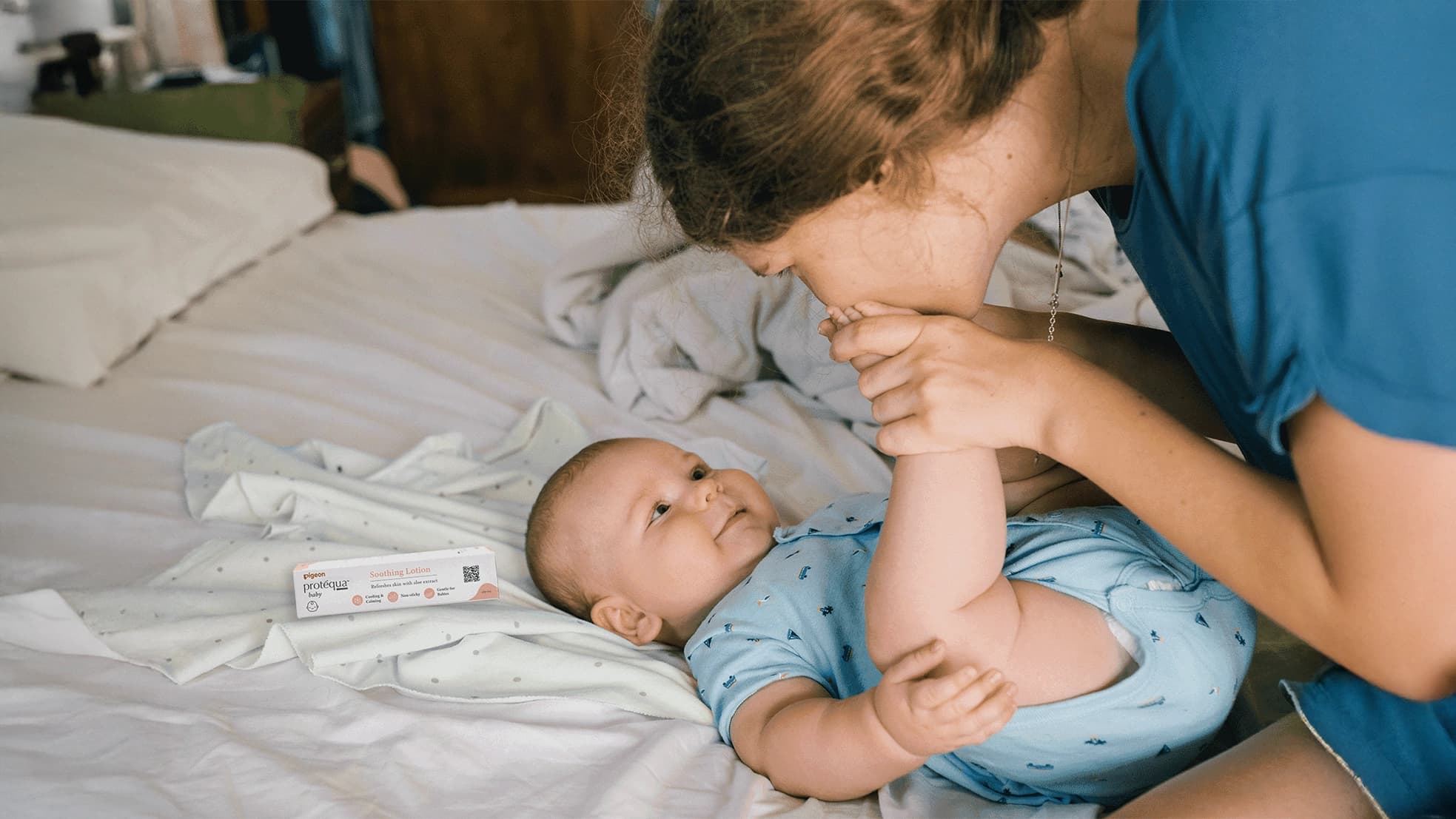
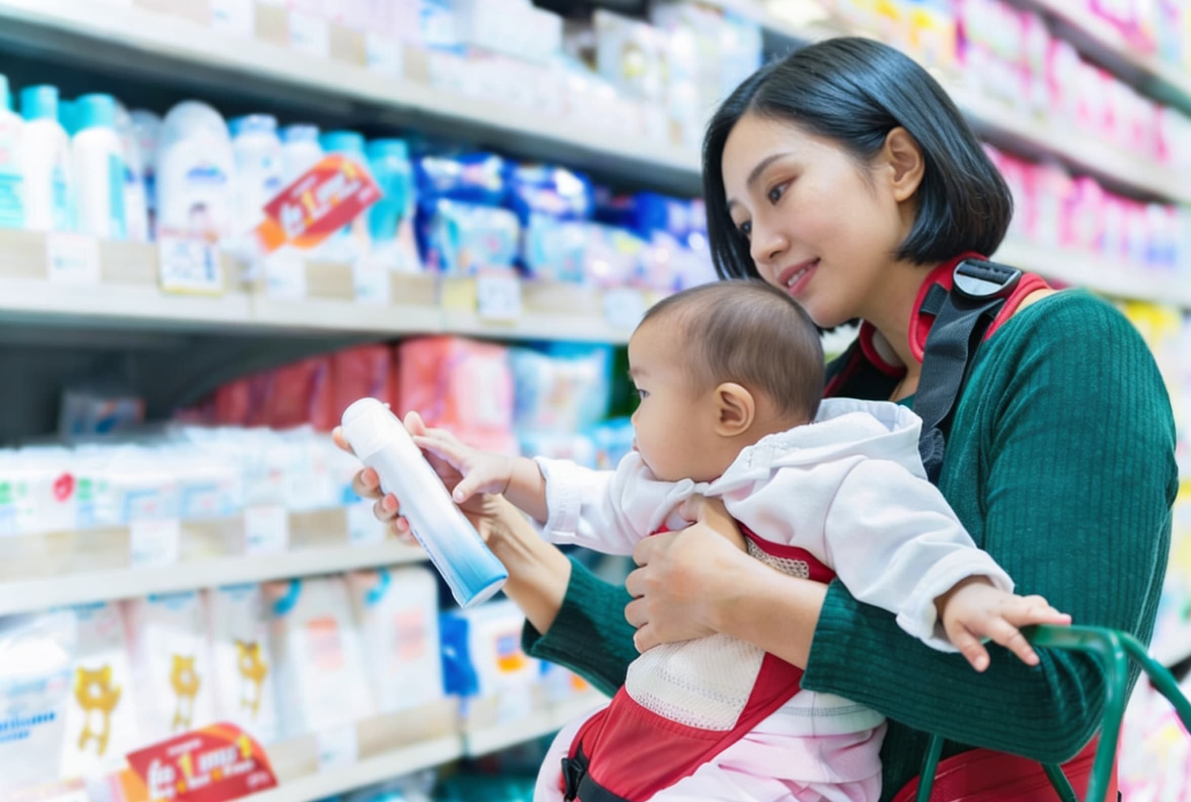
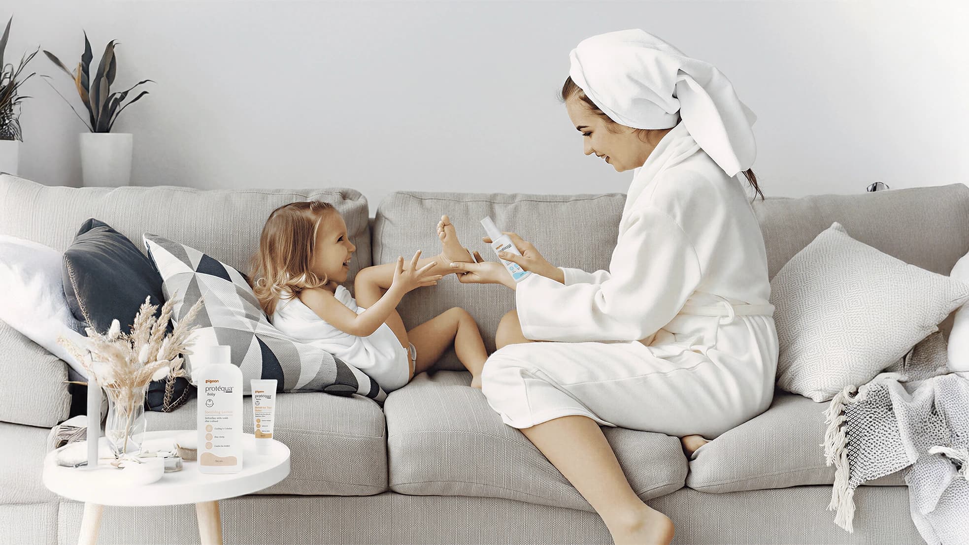
Baby skin is thinner and more delicate than adult skin, making it more vulnerable to external irritants. Protequa was created as Pigeon’s sub-brand to offer cost-effective specialised skincare for the masses, giving parents peace of mind that their babies remain comfortable and protected.

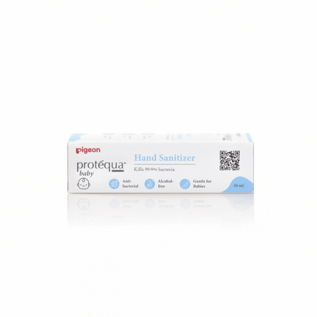
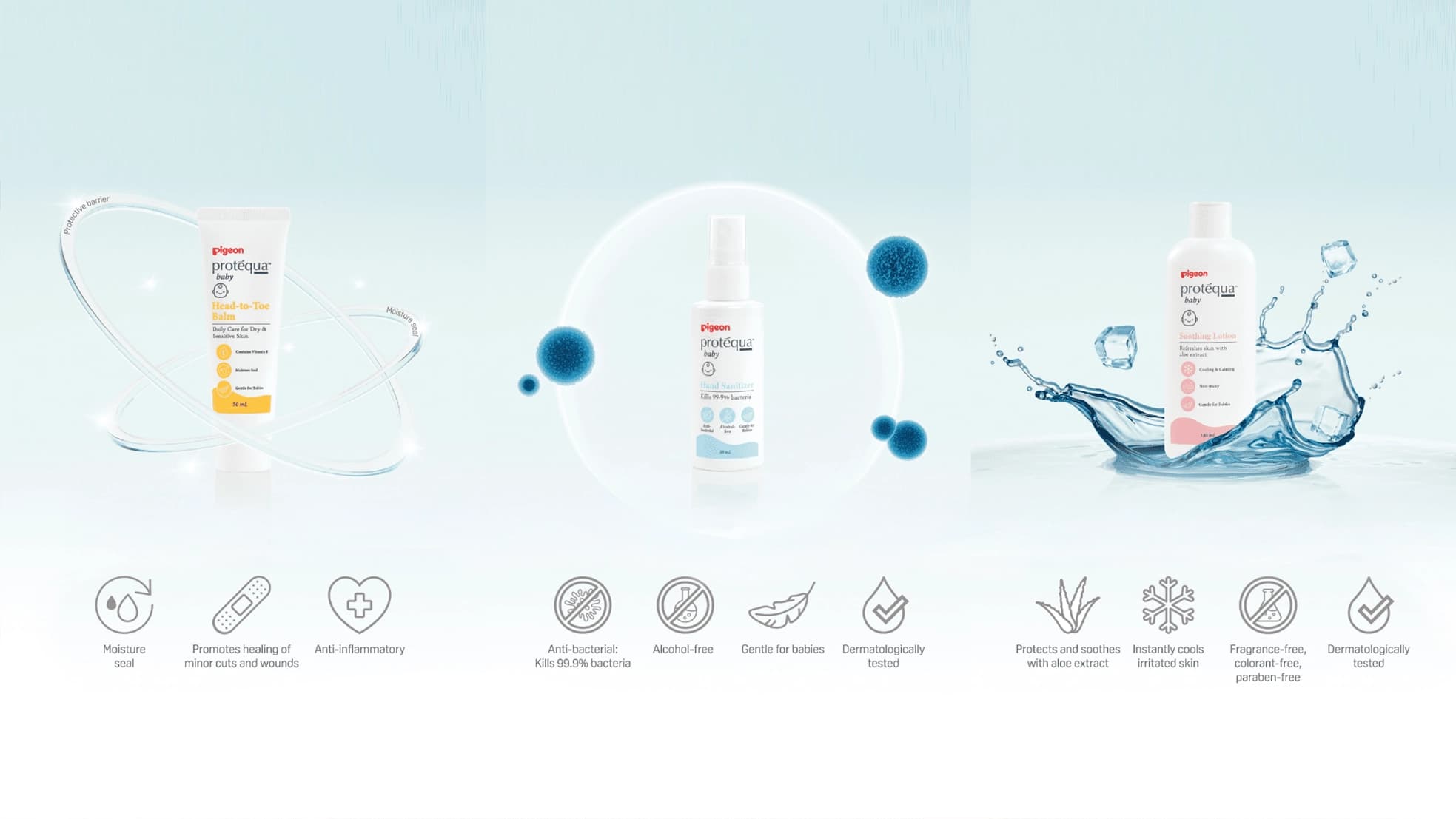
The packaging uses soft pastel colours to convey gentleness, care, and baby-friendly comfort. Simplified icons and a clean visual structure make the information easier to understand, supporting busy parents who need clear and reassuring product communication at a glance.

portfolio solution image

{ Creative Challenge }

Outdated and indistinct packaging that failed to resonate with modern parents
  1. 01

    Protequa’s packaging appear outdated resulting in a lack of resonance with its modern consumers.

  2. 02

    Lacking distinctiveness, it is difficult for consumers to differentiate Protequa’s products from competitors.

  3. 03

    Consumers are unaware about the unique selling points of the product as its packaging fails to effectively communicate the various benefits of it.

{ The Solution }

  1. The redesigned packaging had greater appeal and relevance to the young audience, consequently expanding its potential customer base

  2. The revamped packaging caught more consumers’ attention and successfully conveyed the product’s benefits to its audience

  3. Consumers were able to distinguish Protequa from its competitors, subsequently fostering a more extensive and loyal customer following.

portfolio image

{ THE DIFFERENCE }

Before
After
{ BEFORE }{ AFTER }

{ Packaging Development }

We developed Protequa’s packaging through a concept-led process, translating the brand’s gentle baby-care essence into a practical and reassuring design system.

The process began with brainstorming sessions to explore ideas that captured Protequa’s core message of celebrating babies just as they are. Once the design direction was defined, the concept was further developed to reflect softness, care, and everyday accessibility.

Physical mock-ups were then created to assess the practicality of the design across real packaging applications. During this phase, adjustments were made to colours, sizing, and layout details to ensure the final packaging felt clear, gentle, and suitable for busy parents.

PIGEON
brand identity image

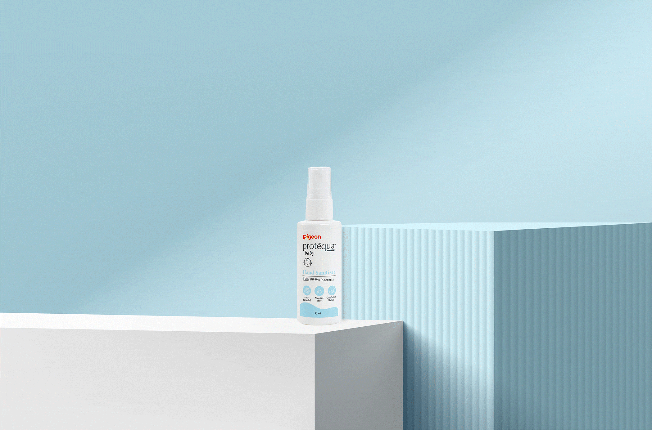
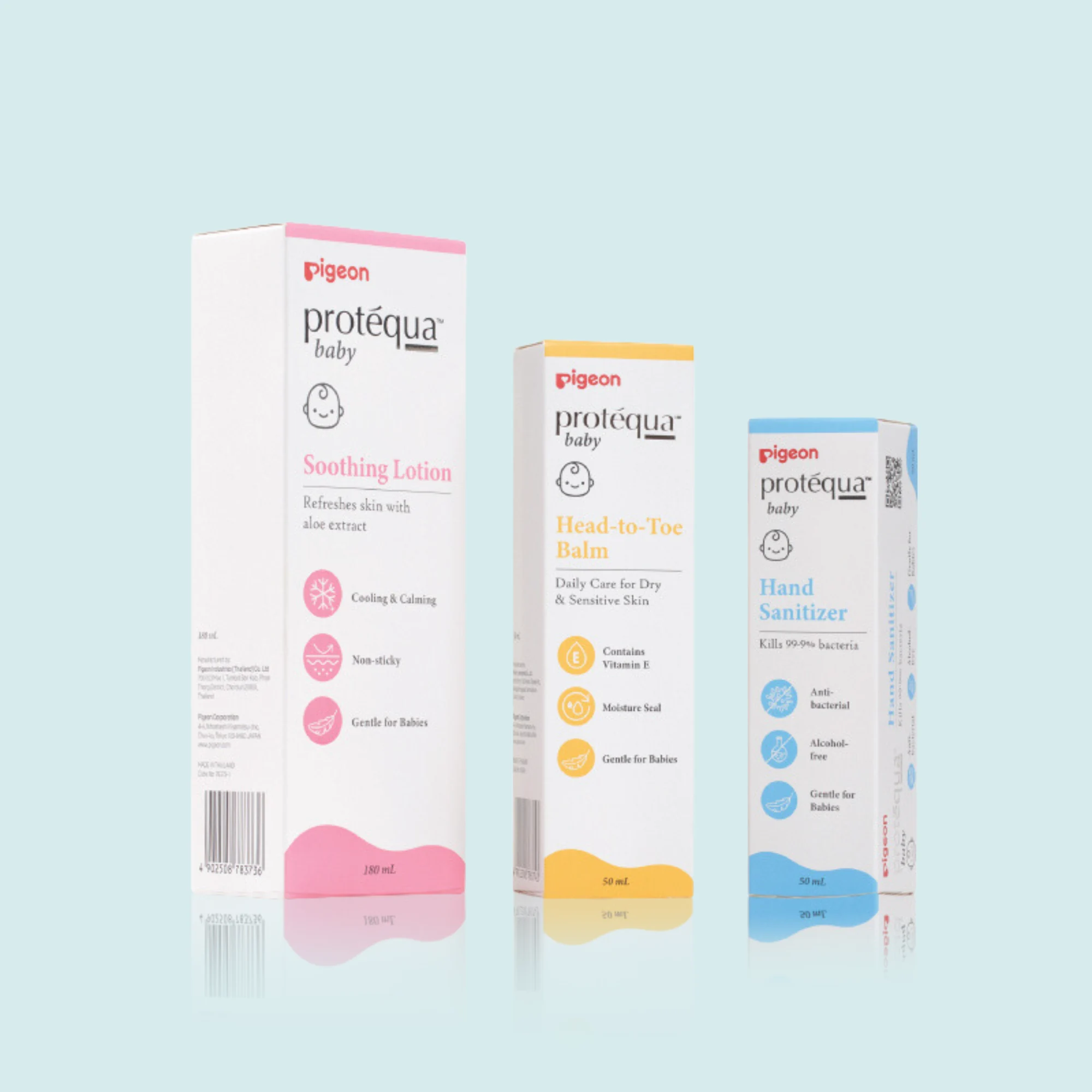
{ Packaging System }

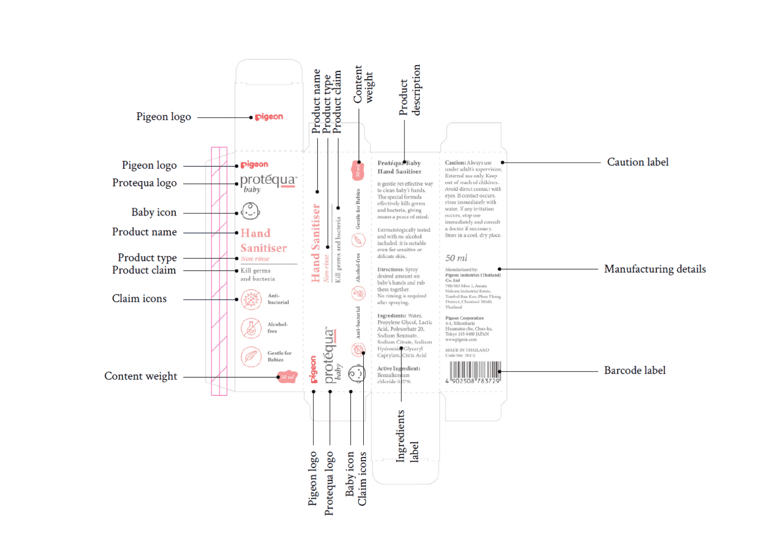
We organised Protequa’s packaging with a clear information hierarchy, making each product easier to understand, navigate, and recognise.

The design system was structured around logos, icons, text, and patterns to help categorise the product range clearly. This allowed busy parents to quickly identify key product information and understand each product’s purpose at a glance.

Beyond functional clarity, the curated copy also helps communicate Protequa’s story and unique selling points. Together, the visual and verbal hierarchy creates packaging that feels gentle, informative, and easy to engage with.

PIGEON
brand touchpoints images

The new Pigeon Protequa packaging clearly sets itself apart from the competition with a design that conveys quality and trust for mothers that care for their babies.

Kimming Yap
Managing Director, Creativeans

Our Featured Work

View All Projects
Yulia Saksen

Yulia Saksen

Co-Founder of Creativeans
International Brand Consultant

Your brand might look great.
But is it working?

Discover what's missing in your brand strategy and how a few changes can grow your business

Book a Free Brand Consultation with Yulia Now.

Contact Us Now