Brand Transformation for Businesses Growing Across Asia • Up to 50% EDG Support for Eligible Projects. Limited Time Only


Creativeans C LogoCreativeans

Esplanade Pesta Raya:
Celebrating Malay Heritage Through a Contemporary Visual Language

Branding
Communication Design
Pesta Raya

{ Project Overview }

We partnered with Esplanade, Theaters on the Bay to bring a vibrant festival identity that brings the richness of Malay arts, heritage and culture into the heart of Esplanade.

Pesta Raya: Malay Festival of Arts is Esplanade’s annual celebration of Malay arts and culture, bringing together music, dance and theatre from Singapore and the wider Nusantara. In 2016, the festival’s 15th edition took place from 4-7 August, presenting a diverse programme of performances and community activities around Hari Raya.

The visual identity was developed to give the festival a distinctive and recognisable presence across Esplanade’s physical and promotional environment. The design translated the cultural and a community marked by diversity and richness into a vibrant contemporary visual language, creating a system that could move seamlessly from the main campaign artwork to publications, environmental graphics and digital applications.

Bringing the richness of Malay heritage to life through one cohesive festival identity

{ Creative Challenge }

Bringing the richness of Malay heritage to life through one cohesive festival identity
  1. 01

    Pesta Raya brings together diverse expressions of Malay arts and culture, requiring a visual language broad enough to represent music, dance, theatre and community experiences.

  2. 02

    The identity needed to celebrate cultural heritage while feeling contemporary, vibrant and accessible, rather than relying solely on conventional representations of Malay culture.

  3. 03

    The campaign required a flexible visual system that could work across Esplanade's diverse physical and digital touchpoints, from publications and event graphics to large-scale environmental applications.

  4. 04

    The challenge was to create a recognisable festival presence that could capture the spirit of celebration while remaining rooted in the cultural identity of Pesta Raya.

{ The Solution }

Designed a vibrant and contemporary festival identity that celebrates Malay heritage and brings Pesta Raya to life
  1. Developed a distinctive visual language inspired by the Wau Bulan and its intricate traditional patterns.

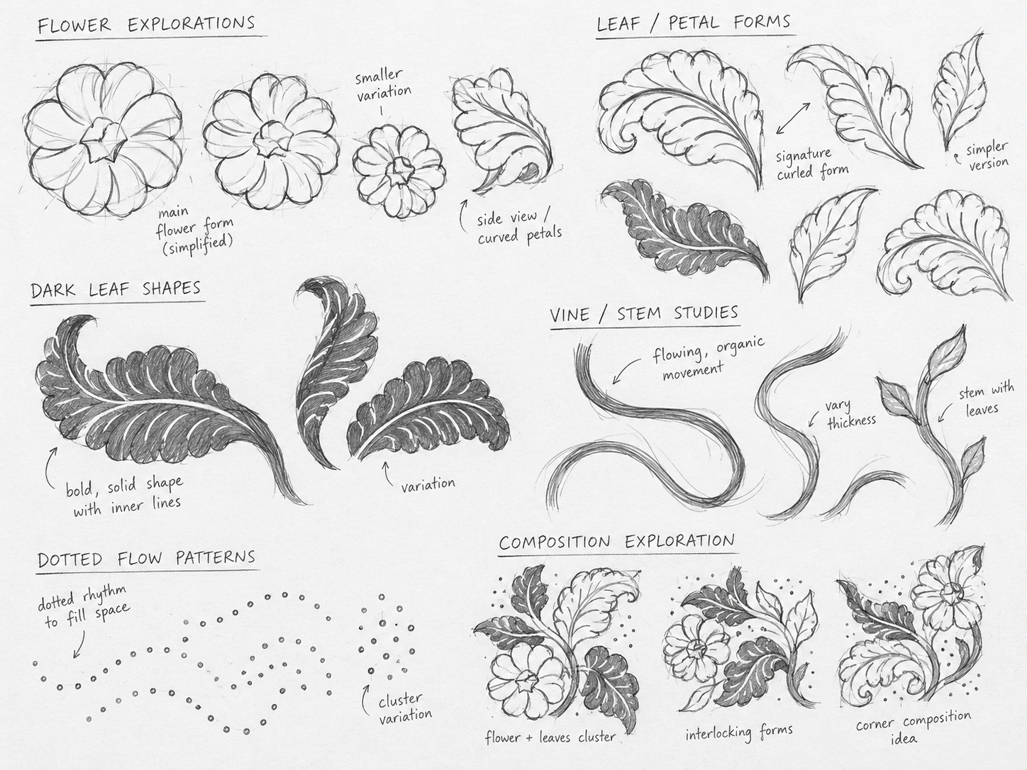
  2. Transformed floral and organic motifs into a contemporary graphic system that reflects the vibrancy of Malay arts and culture.

  3. Created engaging visual assets across publications, environmental graphics, digital screens, signage and event applications

  4. Applied a cohesive colour palette, graphic elements and layouts to strengthen recognition across festival touchpoints

  5. Extended the identity into an immersive festival experience that connects cultural heritage with contemporary audiences

Designed a vibrant and contemporary festival identity that celebrates Malay heritage and brings Pesta Raya to life

{ THE DIFFERENCE }

Pesta Raya before
Pesta Raya after
{ BEFORE }{ AFTER }

{ Key Visual Design }

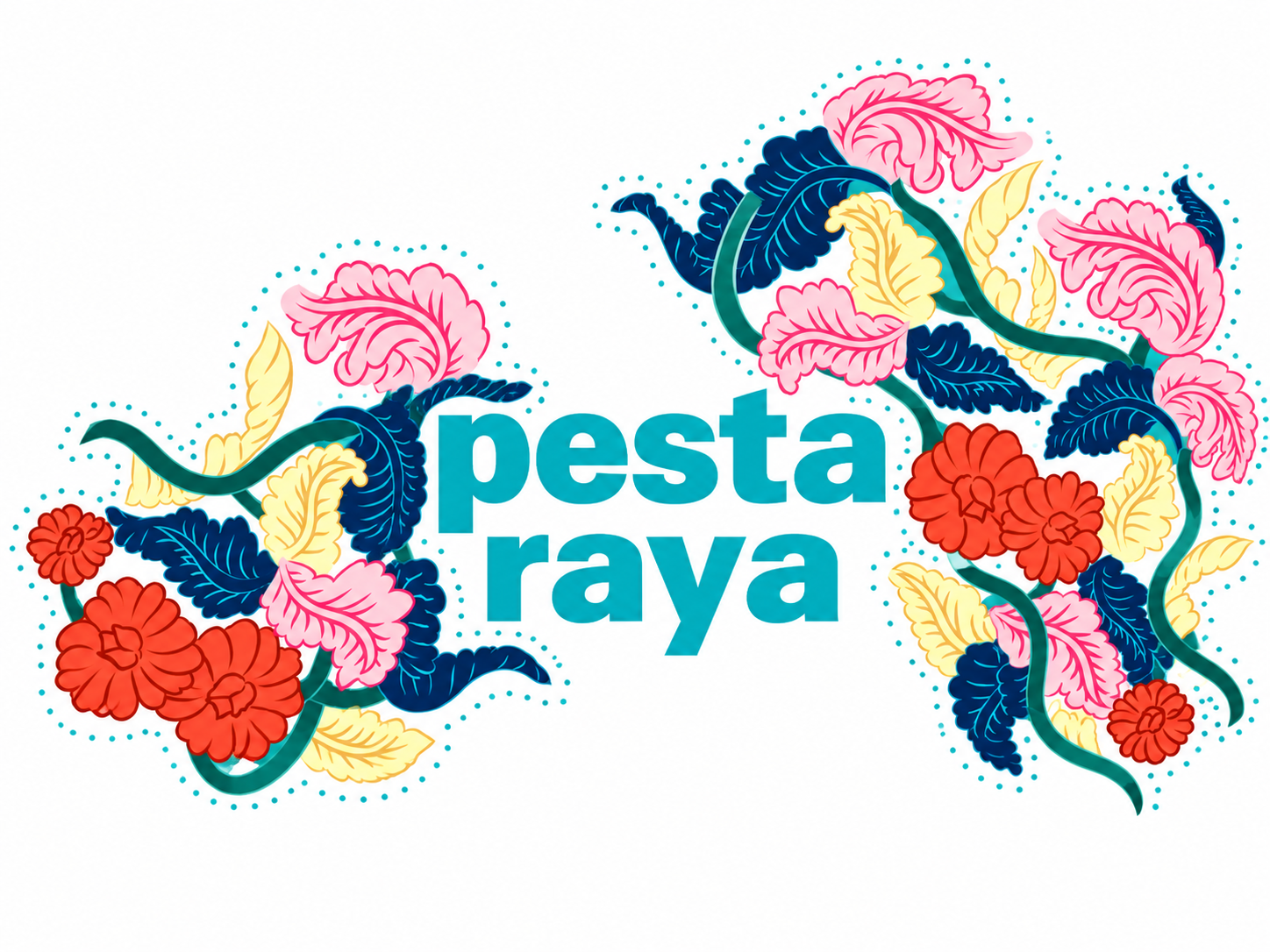
The key visual for Pesta Raya 2016 celebrates the richness of Malay arts and heritage, transforming traditional Wau Bulan-inspired motifs into a vibrant and contemporary visual language.

At the centre of the design is the Wau Bulan, whose distinctive form and intricate decorative patterns provide the foundation for the visual identity. Its floral and organic details are reinterpreted into expressive graphic elements that reflect the richness of Malay cultural heritage and the celebratory spirit of Pesta Raya.

The floral motifs extend across the composition to create a sense of movement, abundance, and celebration. Combined with bold typography and a vibrant colour palette, the visual system balances traditional cultural references with a contemporary aesthetic, creating a distinctive identity that can be adapted across the festival’s publications, environmental graphics, digital screens, and event materials.

{ Brand Touchpoints }

The Mother of Life (Ibu) features prominently in the mandala design, where the graphics ‘grow’ around it, much like in Wau Bulan designs.

Across digital and print applications, Ibu is placed at the heart of the visual system, with vines and flowers growing out from it. The vines symbolise the course of a man’s life, while the flowers represent women, the buds symbolising young women. The more meandering the vine, the more it reflects the twists and turns in life.

These elements work together to create a meaningful and distinctive visual identity for Pesta Raya, inspired by the decorative language of Wau Bulan.

From campaign key visuals and publications to digital screens, social media assets, environmental graphics, event materials and signage, the design was adapted across multiple touchpoints to ensure visual consistency and a seamless audience experience. The result is a cohesive and flexible communication system that brings the festival to life across all channels.

Brand Touchpoints
Esplanade pesta raya
Brand Touchpoints touchpoint 2
Brand Touchpoints touchpoint 3
Brand Touchpoints touchpoint 4
Brand Touchpoints touchpoint 5
Brand Touchpoints touchpoint 6

“The Pesta Raya identity was designed specifically for the festival, transforming traditional Malay visual references into a distinctive and contemporary festival experience. Inspired by the Wau Bulan, the visual language combines symbolic storytelling with vibrant floral graphics to create a flexible system that strengthens the festival’s cultural character and comes alive consistently across its many touchpoints.”


Kimming Yap logo
Kimming Yap
Managing Director, Creativeans

Our Featured Work

View All Projects
Pesta Raya - Creativeans