Designing OLOE’s Packaging and Digital Experience for Children’s Nutrition
{ Project Overview }
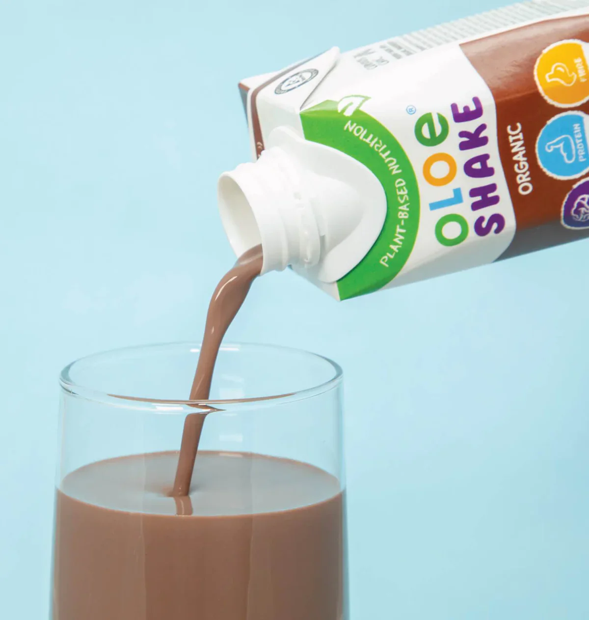
OLOE is a food and beverage brand created to improve the holistic well-being of children and adults while placing greater focus on ingredients and materials that benefit both people and the environment. As part of the OLOE Brands family, OLOE Shake is a premium plant-based ready-to-drink nutritional shake formulated for children aged 3 and above.
Through packaging design, label development, and e-commerce website design, we helped OLOE communicate its values in a way that feels youthful, clear, and memorable. The result is a series of communication touchpoints that supports healthy eating habits while sparking children’s innate curiosity and imagination.
{ Creative Challenge }
- 01
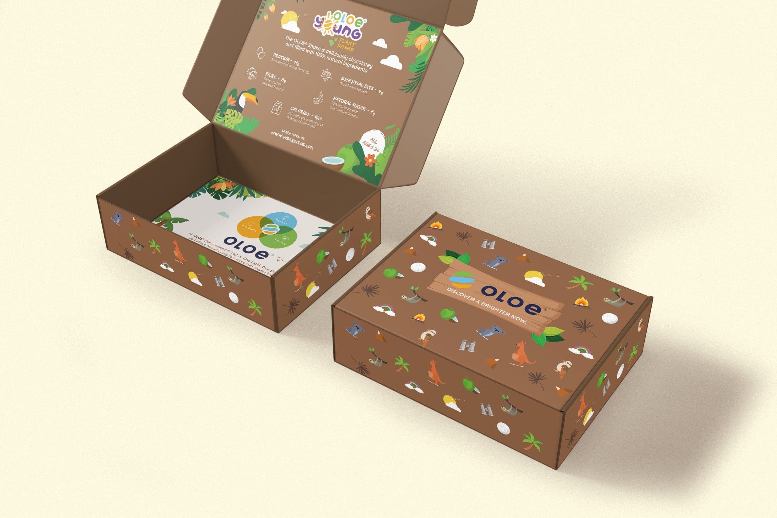
The packaging had limited space to communicate the brand story, product benefits, ingredients, and sustainability values clearly.
- 02
The brand also needed to move beyond static packaging, creating a more engaging experience that could make wellness feel more interactive and memorable.
- 03
At the same time, OLOE’s design had to balance credibility for parents with a playful, imaginative world that could appeal to children.
{ The Solution }
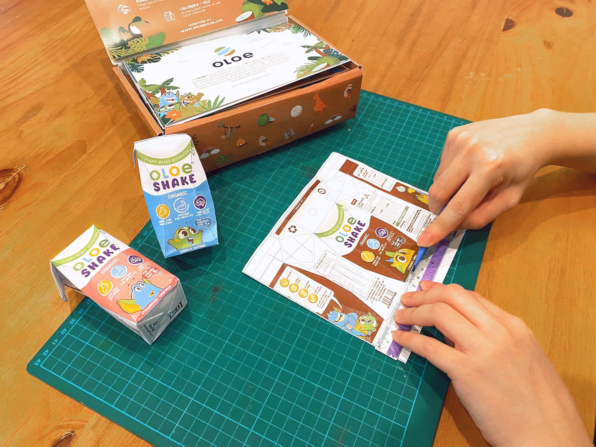
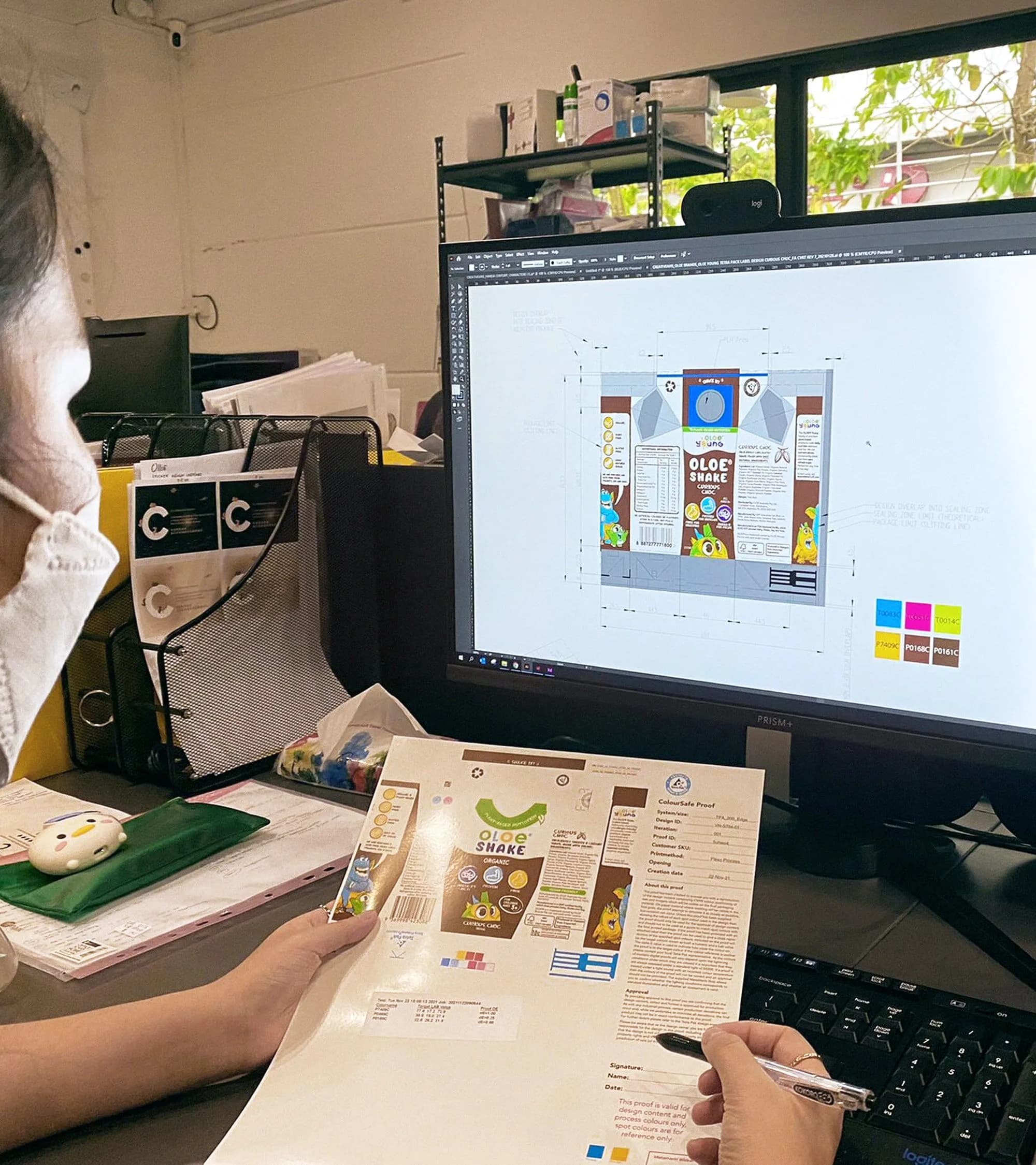
The packaging process began with design conceptualisation, exploring concepts that convey OLOE’s essence of inspiring people to make better choices and live consciously in a way that feels easy and fun.
Once the design direction was established, we tested the feasibility through physical mock-ups, refining the colours, sizing, and overall design to ensure the packaging worked effectively in real life.
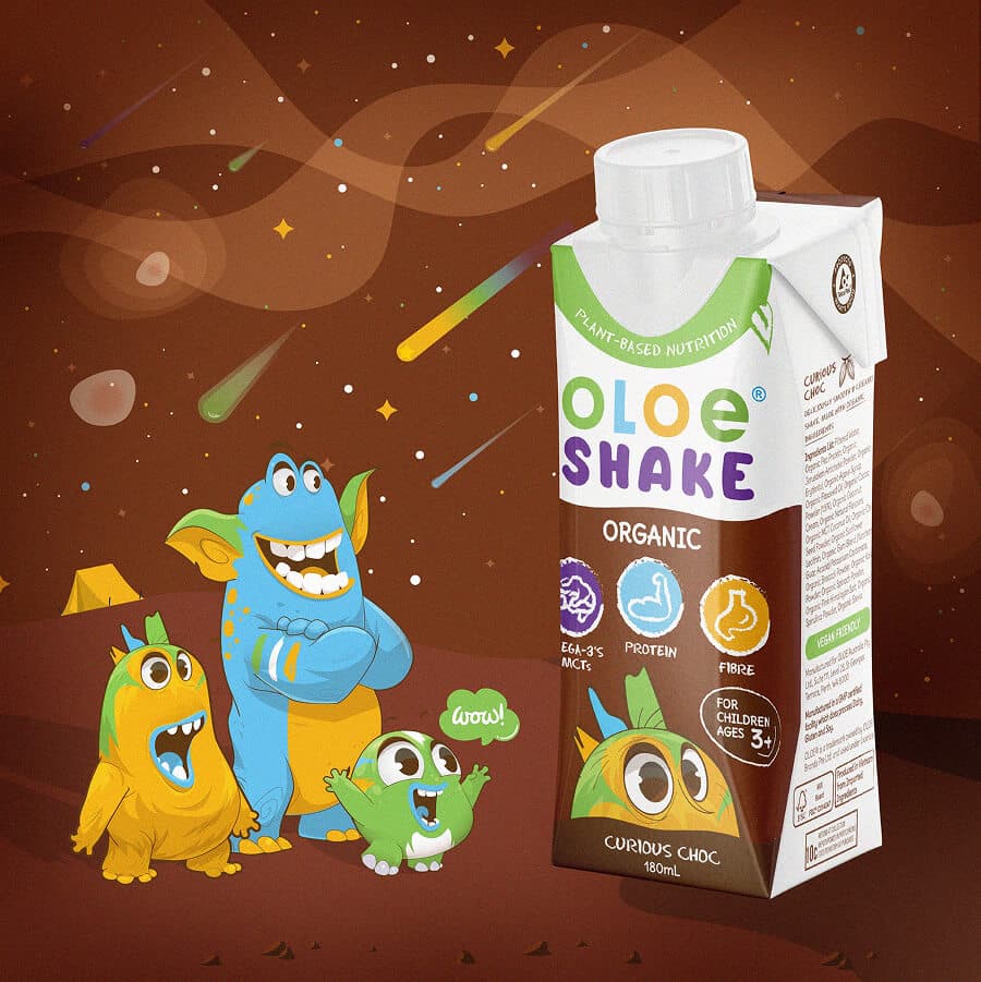
To extend the experience beyond the pack, we introduced AR-enabled storytelling and digital touchpoints that bring OLOE’s values, ingredients, and product details to life in a more interactive way.
{ THE DIFFERENCE }

{ HOW WE DESIGN PACKAGING }
{ PACKAGING DESIGN }
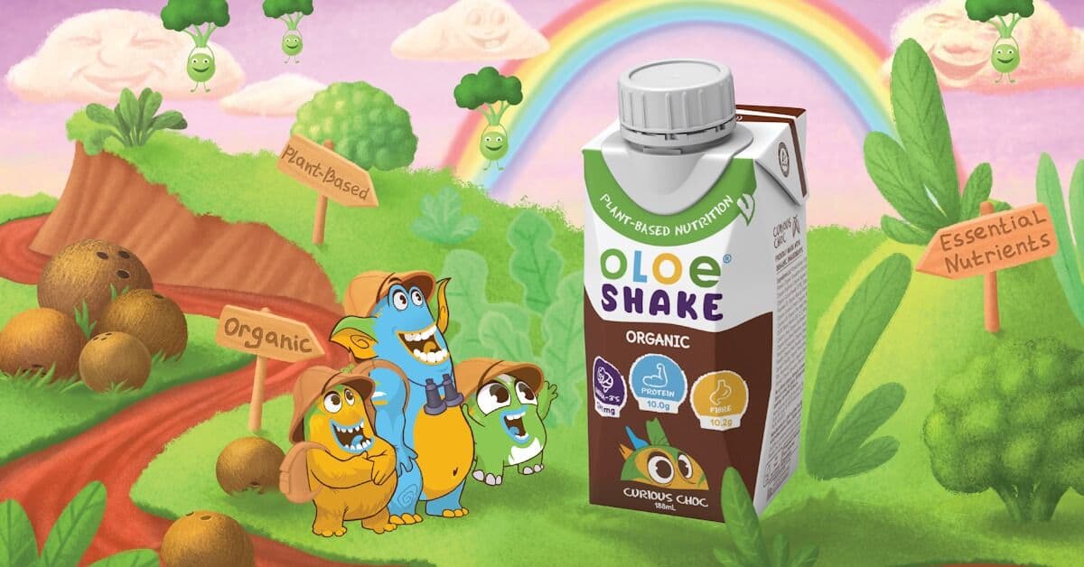
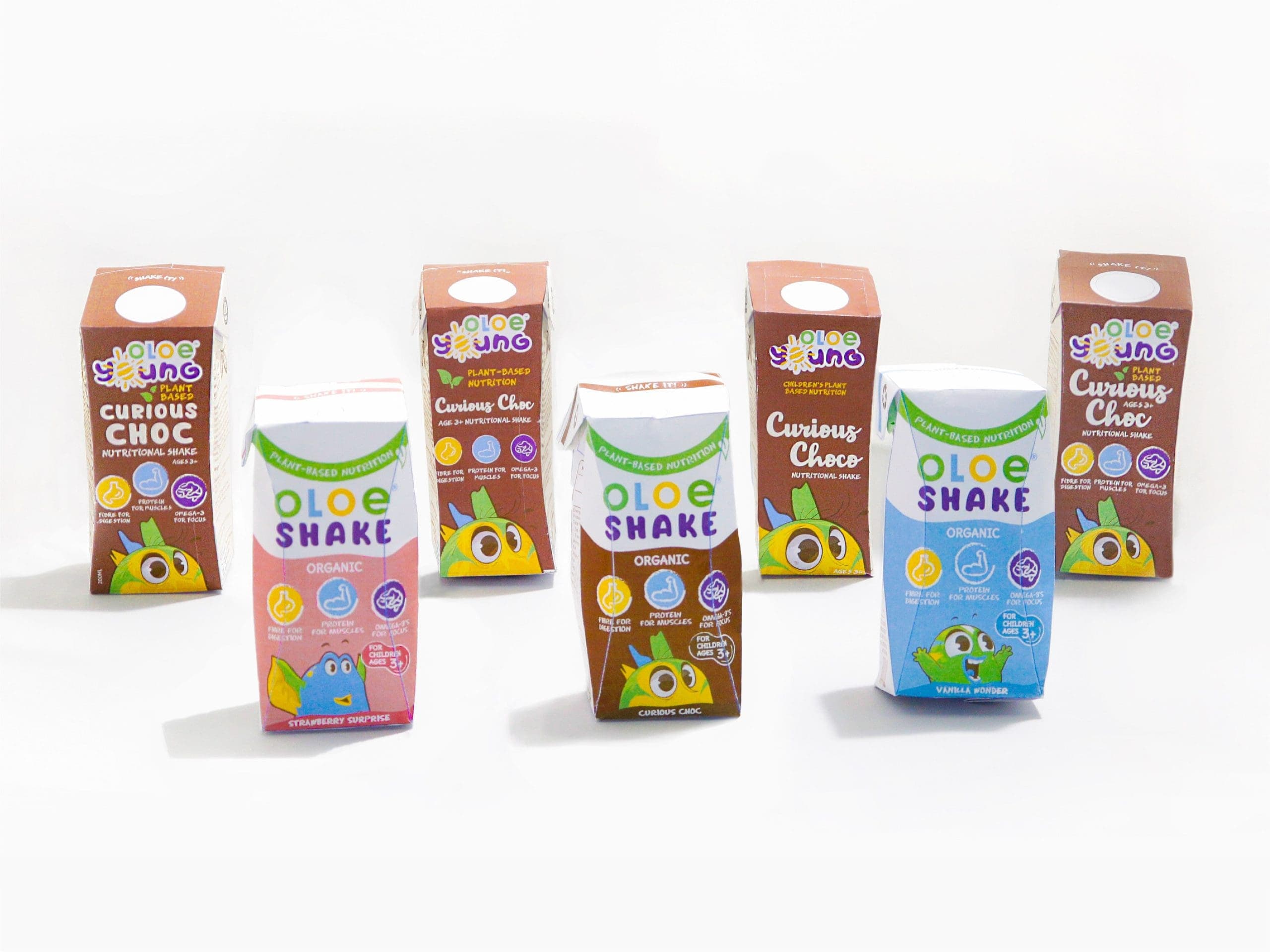
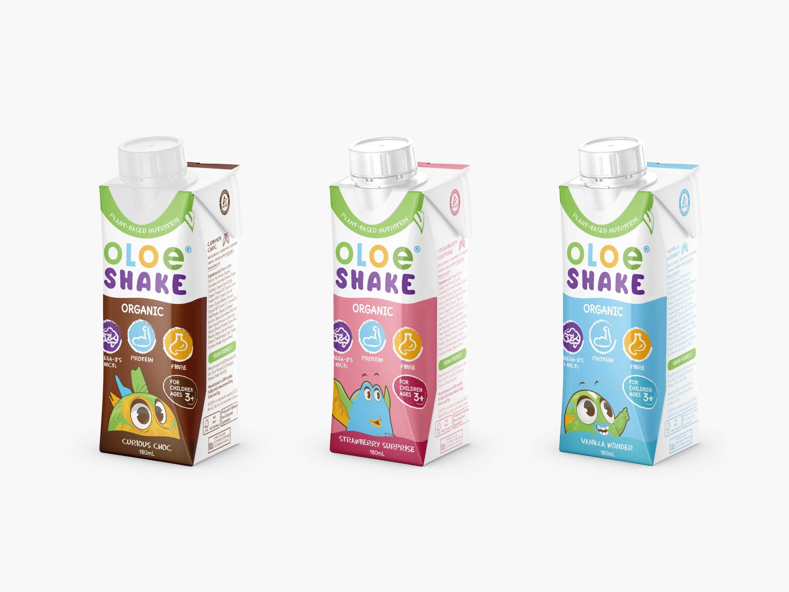
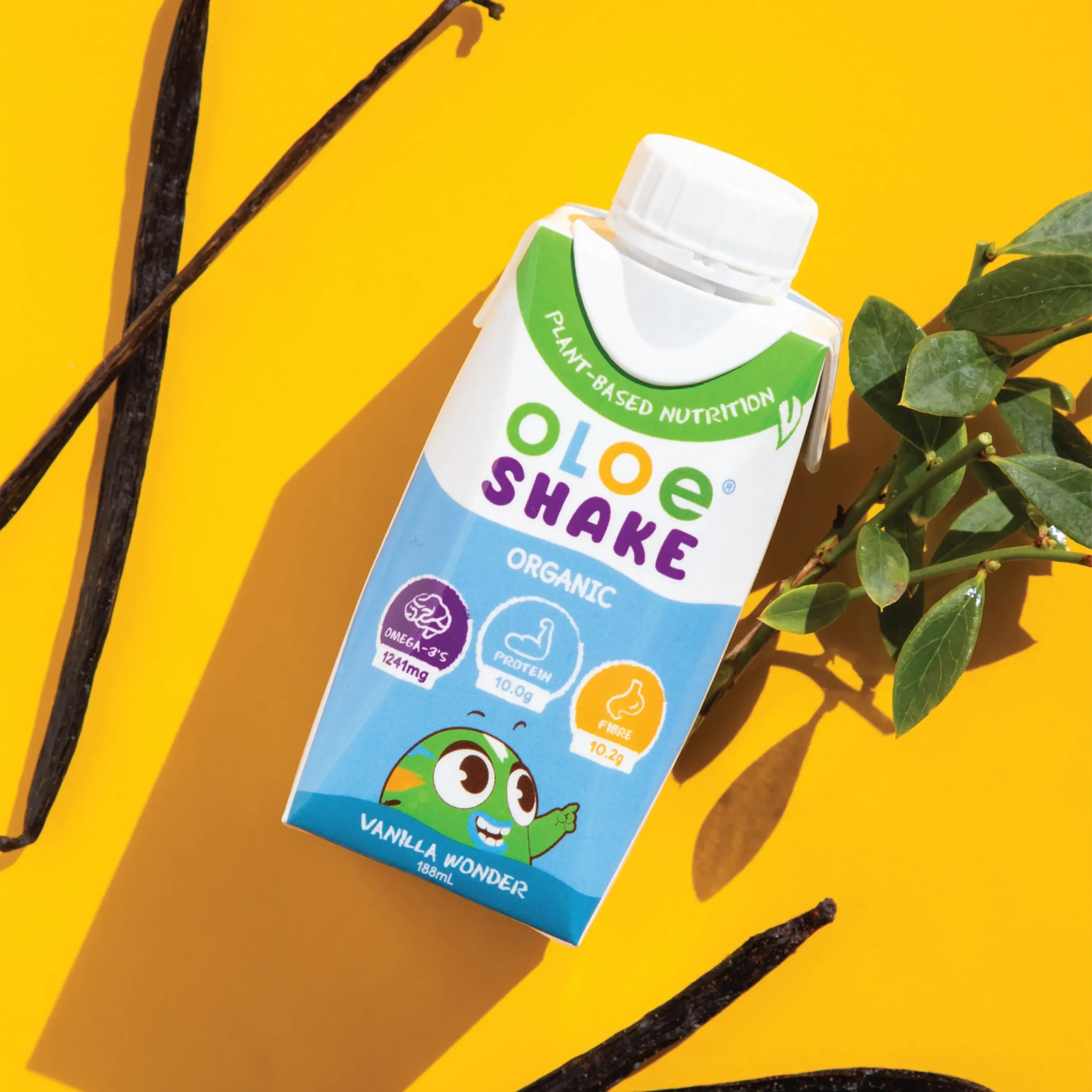
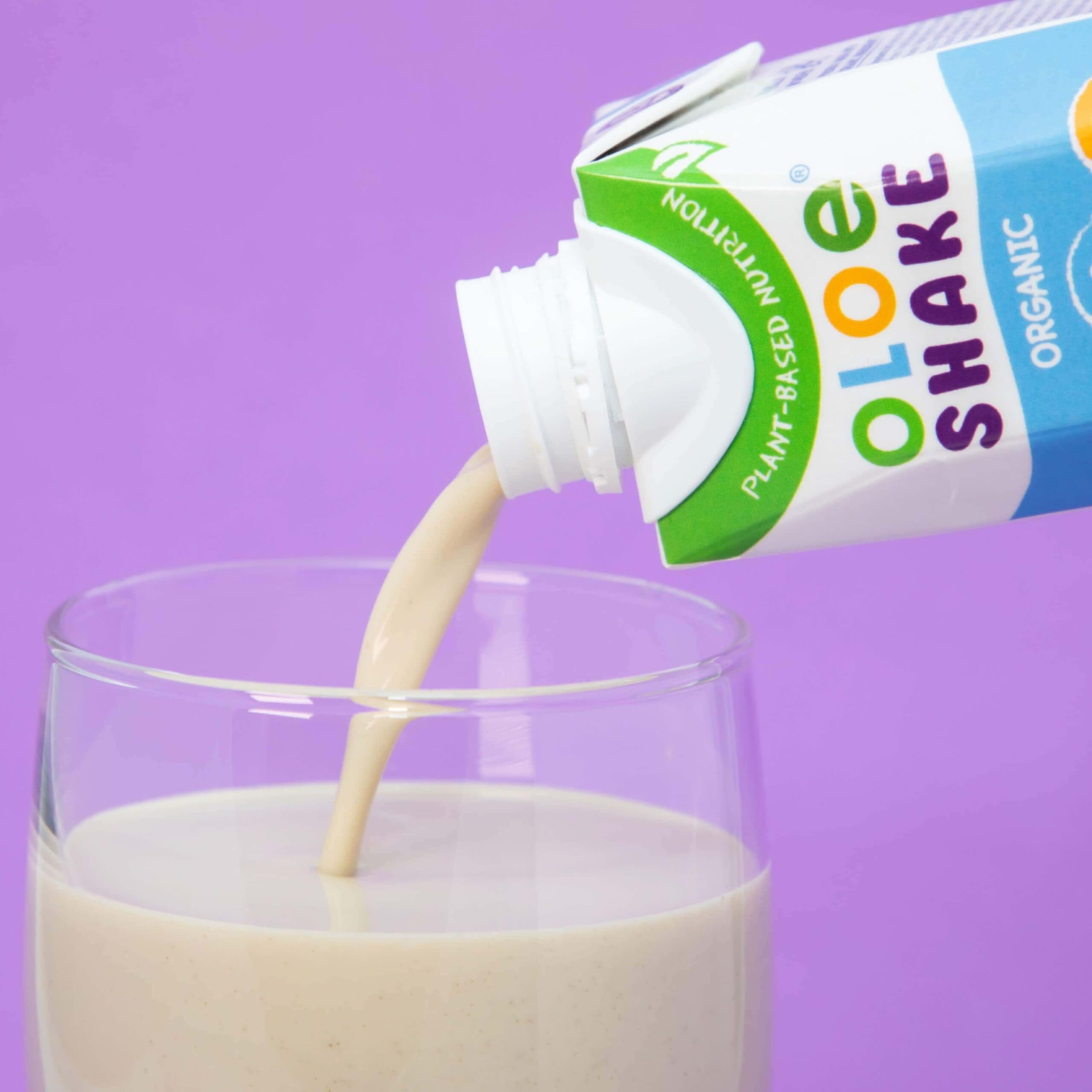
OLOE’s packaging concept was designed to turn children’s nutrition into a playful storytelling experience, making healthy choices feel imaginative, positive, and easy to enjoy.
The concept brings OLOE’s world to life through vibrant colours, friendly characters, and expressive illustrations that speak to children’s curiosity. Rather than presenting nutrition in a clinical or overly functional way, the packaging creates a sense of discovery, helping the product feel more approachable for both children and parents.
Each design element supports OLOE’s purpose of inspiring better choices through conscious living. From the visual hierarchy to the character-led graphics, the packaging communicates product benefits clearly while building an emotional connection with families, transforming the pack into a memorable part of the brand experience.
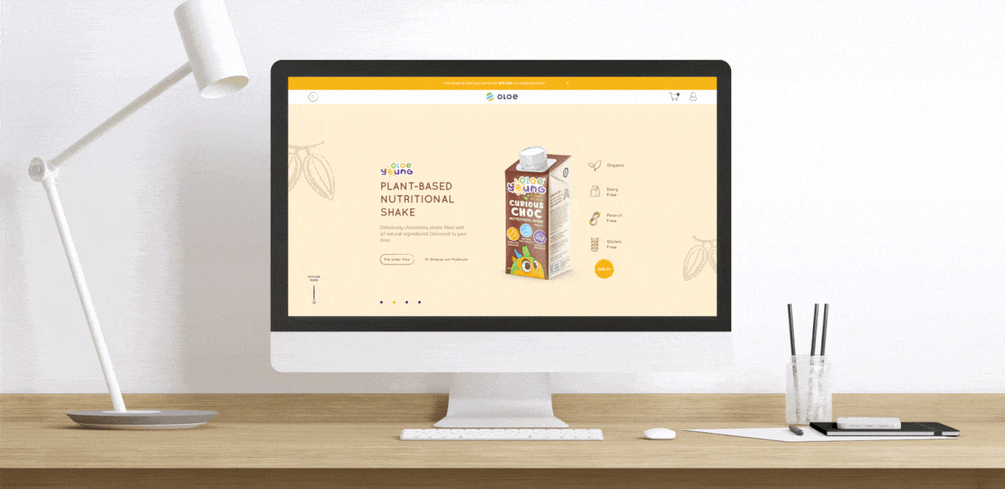
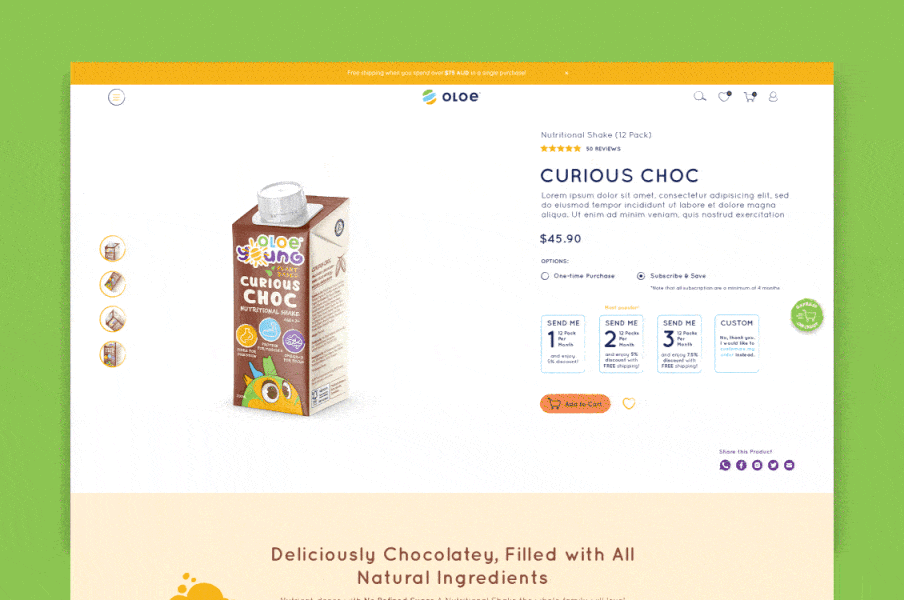
{ WEBSITE UI/UX DESIGN }