{ Project Overview }

{ Creative Challenge }
- 01
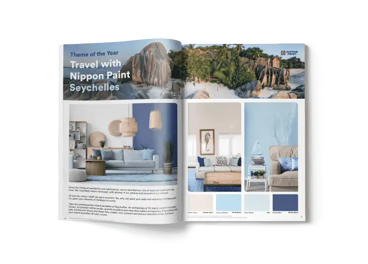
Nippon Paint lacked a compelling communication piece that could elevate its Colour of the Year (Sandcastle) through storytelling rooted in global travel
- 02
The challenge was to translate travel-inspired hues from destinations like Seychelles, Peru, Portugal, Italy, and Mexico into meaningful palettes
- 03
Existing communication formats risked appearing disconnected from the emotional stories behind the colours
- 04
Without an immersive visual narrative, the catalogue would fail to ignite inspiration and emotional engagement
- 05
The goal was to make colour selection not just informational, but an experiential journey
{ The Solution }
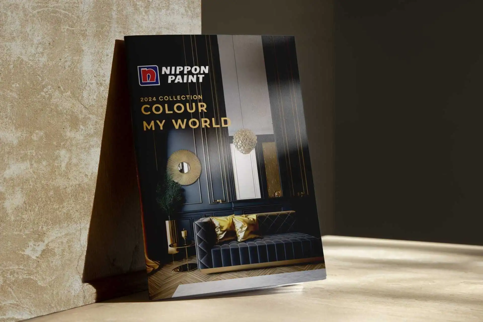
Designed the Colour My World 2024 catalogue under the theme Travel with Nippon Paint, marrying colour with wanderlust and discovery
Anchored the experience around Sandcastle—the Colour of the Year—and complemented it with trending palettes like White Elegance, Timeless Neutrals, and Global Inspirations
Crafted a visually compelling layout that immerses audiences in a world of boundless possibilities—making colour exploration evocative and memorable
Transformed the catalogue into more than just design reference—it became an emotional journey that strengthens the bond between Nippon Paint and its audience

{ Colour of The Year 2024 }