Rebranding Malt & Wine Asia: Crafting Memorable Experiences

REBRANDING BEVERAGE DISTRIBUTOR

Malt & Wine Asia is an importer and distributor of leading alcoholic beverages for B2C and B2B customers in Singapore and beyond. This rebranding highlights Malt & Wine Asia's expertise as an experiential brand that remains in the spotlight, and will hence be remembered as the expert provider and advisor of unique drinking experiences. This allows customers to remember the brand more deeply, thereby establishing greater brand recognition and loyalty.

Malt & Wine Asia's logo is a combination of ‘M’, ‘W’, and ‘A’ to form a crown to symbolise the brand's superiority and premium qualities. On top of that, it amplifies Malt & Wine Asia's expertise and dependability in providing a wide variety of only the best alcohol brands. At the same time, the logo is a combination of three mountain peaks, highlighting Malt & Wine Asia’s unending pursuit of greater heights.

Malt & Wine Asia is also the proud recipient of the Indigo Design Awards Gold in Branding for Alcoholic Beverages – Wine 2023 and  Branding for Alcoholic Beverages – Other 2023. View the award here.

Raising the Bar – A Brand That Makes Malt & Wine Feel Premium and Inviting

THE CREATIVE CHALLENGE
The beverage identity lacked distinction and felt disconnected from consumers
  • Brand perception seemed generic, failing to convey quality or uniqueness

  • Packaging blended into the crowded malt and wine market, lacking standout appeal

  • Consumers struggled to understand the brand’s character or product offerings

  • The visual identity didn’t reflect craftsmanship or elevate the category

color photo black and white
THE SOLUTION
Positioning Malt Wine as a sophisticated and approachable premium brand
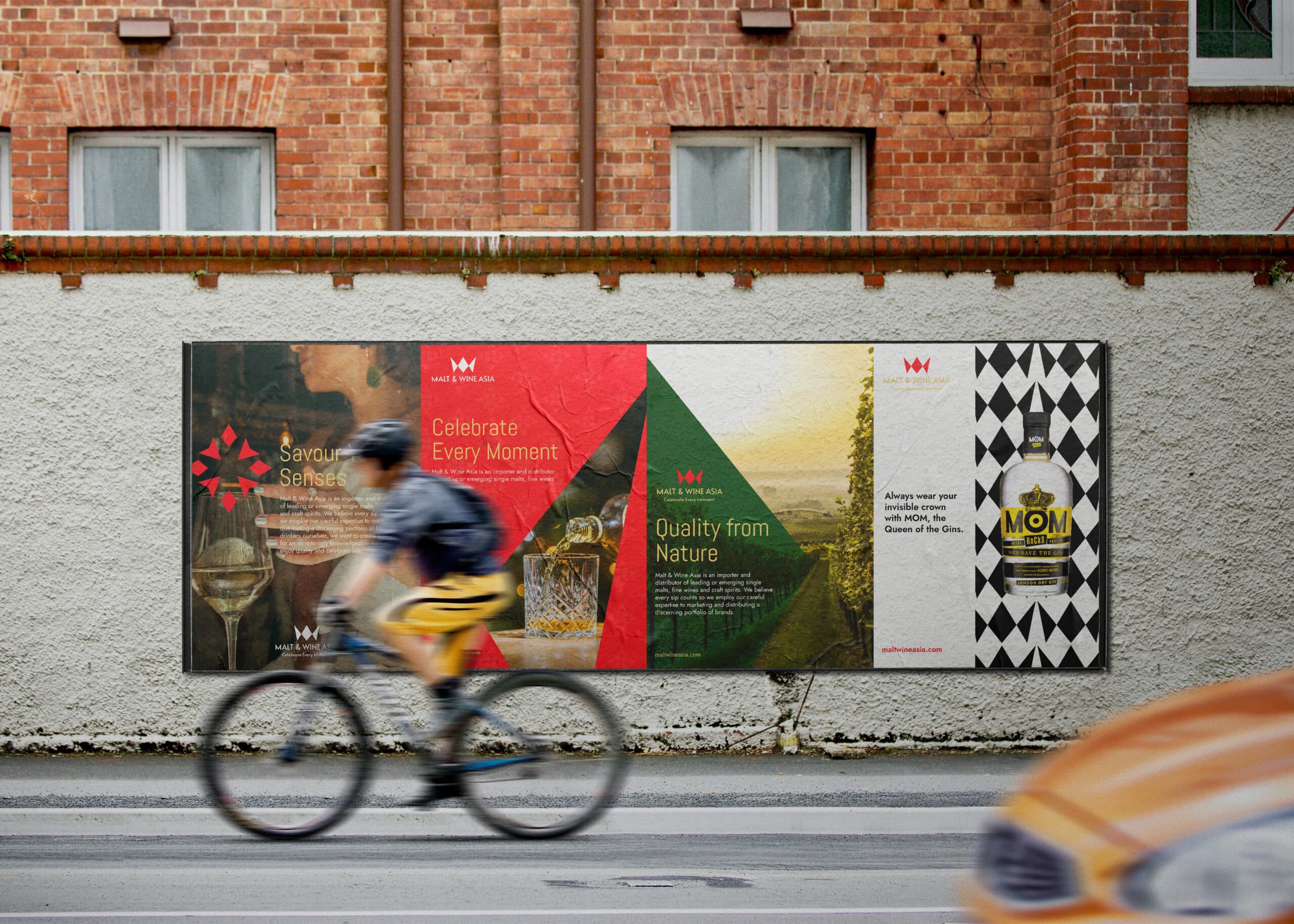
  • Crafted a distinctive brand identity that communicates premium quality and authenticity

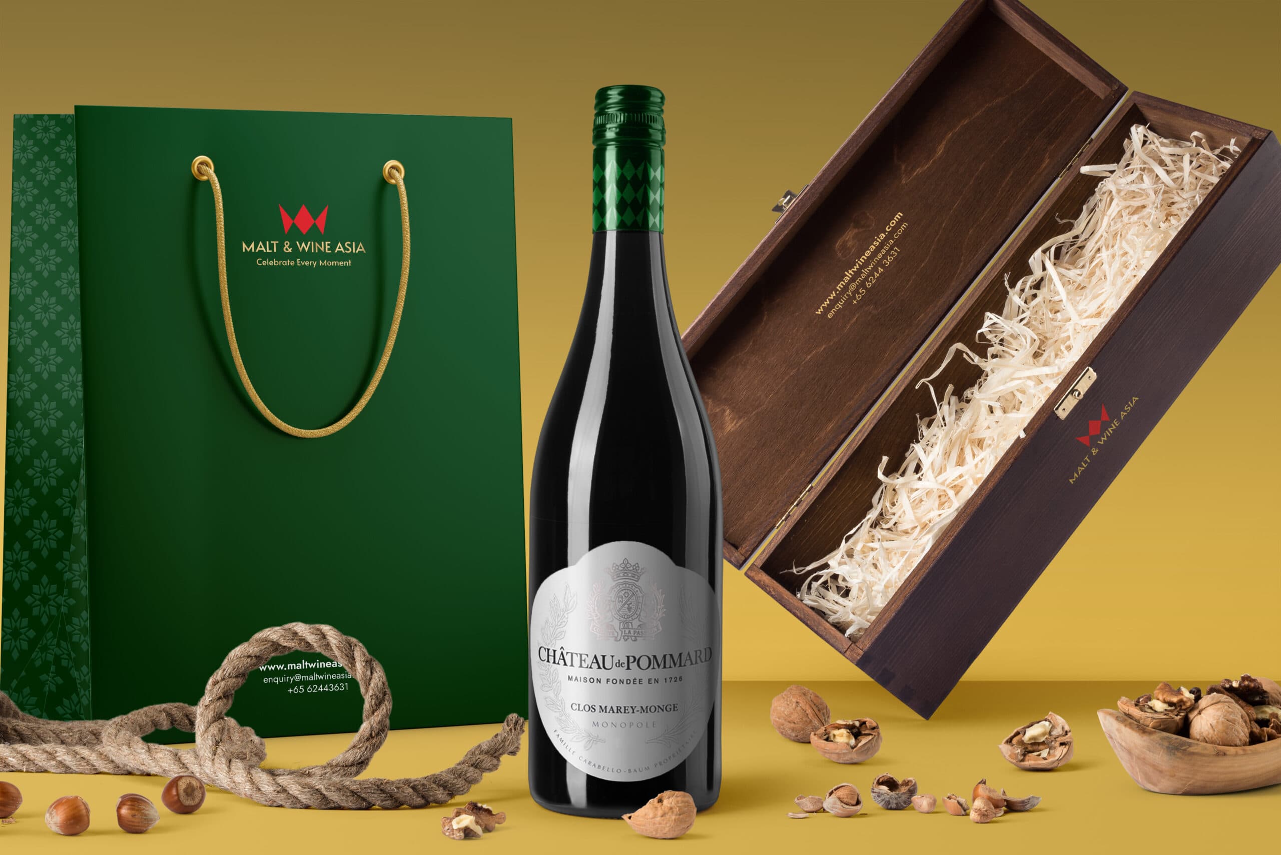
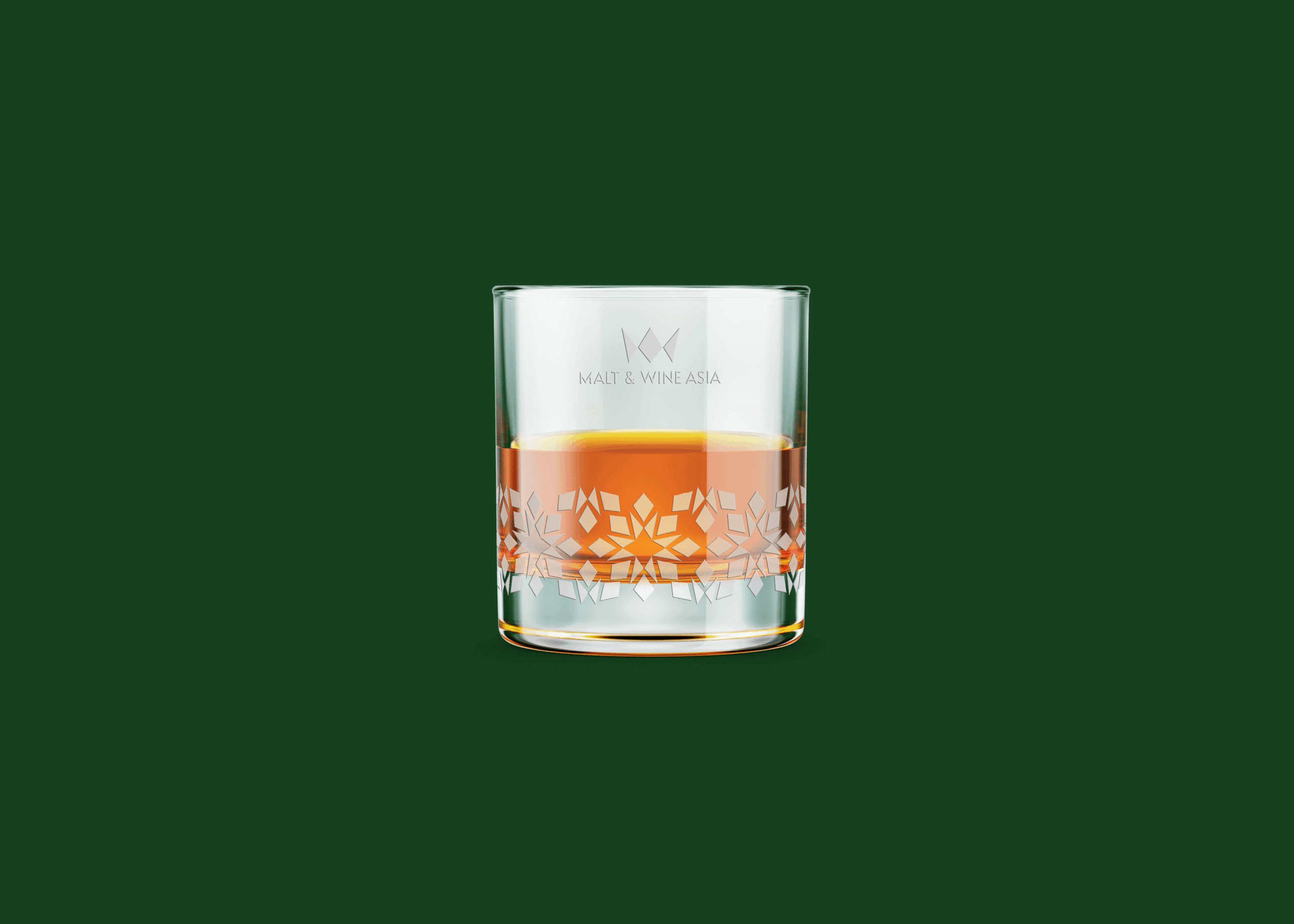
  • Designed packaging that stands out on shelf through elevated visual cues and sophistication

  • Clarified the brand’s story and offerings to engage and inform consumers quickly

  • Infused the visual system with signals of craftsmanship, trust, and aspirational appeal

BRAND POSITIONING
We recommend Malt & Wine Asia to remain an experiential brand, but impress on their abilities to deliver unforgettable and exclusive experiences for their B2C and B2B customers, so that Malt & Wine Asia complements their individual alcohol brands.

Malt & Wine Asia's new brand essence, 'Savour Your Senses', captures their knowledge and expertise to bring unique experiences and keeping up to date with the latest trends for customers to discover new drinks and drive competitive edge for businesses, while upholding integrity by only procuring drinks that they have tried and love. The brand essence is brought to life with the Explorer tone of voice to reflect Malt & Wine Asia's curiosity to seek out unexpected discoveries and unique drinking experiences for their customers, while staying current to the trend in the alcoholic beverages industry.
BRAND IDENTITY
Much like a theatrical experience, Malt & Wine Asia's refreshed brand identity is built on the idea of unveiling surprises while providing their customers with an intellectual and special experience filled with surprise and stimulation. This is made possible with their knowledge and expertise in the field. At the same time, just like how theatre encourages audiences to cherish the moment in a live performance, Malt & Wine Asia pushes their customers to savour their senses.

The graphic style is a direct adaptation of the brand's logo which is a combination of M and W. The logo symbol can be deconstructed into its individual shapes to form decorative motifs and patterns that can be applied across Malt & Wine Asia's touchpoints, thereby maintaining strong brand recognition. The motifs form embellished stars, conveying the brand's ability in igniting and sparking one's senses with an everlasting and lingering impact. Furthermore, The logo can be used in different mediums to emphasize the brand’s versatility and adaptability. In turn, depicting the brand as a trendsetter in its field. The colour palette comprises of eco-friendly green, scarlet red and gold yellow– a colour combination that conveys sustainability, trendy and elegance.
BRAND TOUCHPOINTS

To reach Malt & Wine Asia’s customers, we developed a wide range of touchpoints that seamlessly incorporates Malt & Wine Asia’s new brand positioning and identity. This includes business cards, bottle carrier, packaging, coasters, poster, and more.

These touchpoints are essential in forming a unified and consistent brand experience for Malt & Wine Asia’s customers. Combined with Malt & Wine Asia’s new colour palette and graphic identity, the wide range of touchpoints demonstrates the versatility of the graphic style in conveying the brand’s message effectively.

"With the rebranding, Malt and Wine Asia has repositioned itself as an experiential brand that delivers unforgettable and exclusive experiences for its customers to savour."

Kimming Yap
Managing Director, Creativeans
Yulia Saksen

Yulia Saksen

International Brand Consultant and Co-Founder of Creativeans

Your brand might look great. But is it working?

Discover what’s missing in your brand strategy and how a few changes can grow your business.

You want to do a brand revamp? Now what?

We’ll help you understand what’s needed, what works, and how to make your company look great.

Book a Free Brand Consultation with Yulia in 2026

JOIN THE WAITLIST
BRANDSBUILDER.AI

BrandsBuilder.ai streamlines every phase of branding, from strategy and positioning to identity creation and customer experience.

HOVARLAY

HOVARLAY transforms packaging and campaigns into powerful digital touchpoints. No apps. No reprints. No barriers.

Business Enquiry
info@creativeans.com
Career / Internship
collaborate@creativeans.com

Creativeans is an award-winning brand and design consultancy based in Singapore, Milan and Jakarta. We build brands that matter.

Singapore Registered Management Consultant © 2025 Creativeans Pte Ltd. All Rights Reserved