Brand Transformation for Businesses Growing Across Asia • Up to 50% EDG Support for Eligible Projects. Limited Time Only


Creativeans C LogoCreativeans

What If Every Package Could Tell a Story?
Building HOVARLAY’s Brand Identity to Turn Packaging into Interactive Experiences

Branding
Branding
Packaging Design
Solutions
UI/UX Design
HOVARLAY branding with a purple logo, two friendly robot-like mascots inside a glowing portal, surrounded by pastel cubes in the sky

{ Project Overview }

Building an accessible and distinctive AR brand that brings physical touchpoints to life through immersive digital experiences.

HOVARLAY is a start-up WebAR platform that enables brands and creators to build augmented reality experiences without coding or requiring audiences to download an app. Its intuitive platform makes it possible to transform packaging, print and physical environments into interactive experiences within minutes.

Creativeans built HOVARLAY’s brand from the ground up, establishing a clear positioning and distinctive identity that differentiates it from conventional AR platforms. The new brand translates complex technology into an accessible, engaging and recognisable experience across physical and digital touchpoints.

Person wearing glasses works at a workstation, modeling a 3D object on dual monitors with camera gear on the desk.

{ Creative Challenge }

An emerging AR platform needing a clear position and distinctive brand presence
  1. 01

    HOVARLAY needed a clear brand positioning that could establish its presence in the competitive MarTech landscape and communicate its value beyond the technology itself.

  2. 02

    Augmented reality was often perceived as complex, technical and costly, making it essential for HOVARLAY to clearly communicate its accessible advantages: no coding, no app downloads and the ability to build AR experiences in minutes.

  3. 03

    HOVARLAY needed a distinctive and recognisable identity that could differentiate it from conventional AR platforms while appealing to both business decision-makers and creative users.

{ The Solution }

Built an accessible and distinctive AR brand that brings physical experiences to life
  1. Positioned HOVARLAY as an accessible creative platform, empowering brands and creators to build immersive WebAR experiences without coding or app development.

  2. Created a bold and expressive brand identity that differentiates HOVARLAY from conventional technology brands while making augmented reality feel approachable, creative and engaging.

  3. Developed a cohesive brand system across physical and digital touchpoints, giving HOVARLAY a consistent and scalable foundation for its website, SaaS platform, AR experiences, marketing materials and exhibitions.

Person scanning a bright wall poster with a QR code using a smartphone, stage 1 goal displayed: find missing items.

{ THE DIFFERENCE }

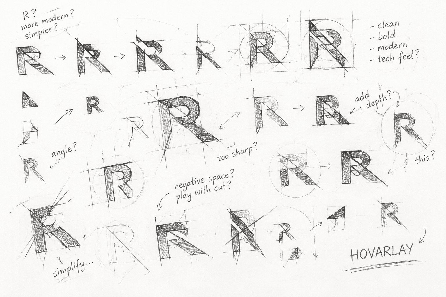
Hand-drawn grid sketches of a stylized 'R' logo with many iterations and notes like 'simplify' and 'hoverlay'.
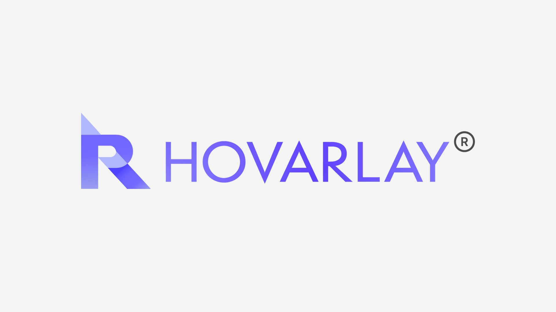
Brand logo for HOVARLAY with a stylized gradient R mark and the word HOVARLAY in purple hues.
{ BEFORE }{ AFTER }
Loading video...

{ Brand Positioning }

Turning everyday packaging into a new way for brands and people to connect.

We positioned HOVARLAY as more than an AR platform: a way for brands to extend their stories beyond the physical limits of packaging and print. By bridging physical products with digital experiences, HOVARLAY turns familiar touchpoints into opportunities for discovery and interaction.

Its no-code WebAR tools makes these experiences accessible to brands and agencies without specialist development or app downloads. Creativity and storytelling lead the experience, helping brands engage audiences, build meaningful connections and gain measurable insights from each interaction.

Two people at a convention/viewing a purple HOVARLAY box, one person filming with a smartphone to capture the packaging demo.

{ Brand Identity }

Making augmented reality feel simple, approachable and part of everyday brand experiences.

As augmented reality is often perceived as complex and dependent on coding expertise, we took a more humble and human approach to HOVARLAY’s identity. The visual language avoids overly technical expressions, presenting AR as something accessible, practical and easy to explore.

Friendly colours, playful graphic elements and a sense of movement reflect the curiosity of discovering AR for the first time. The result is an identity that feels innovative without being intimidating, helping brands and creators feel confident about bringing their ideas to life.

Person drawing three white ghost characters on a tablet with a purple background using a stylus to the right hand.
Three vertical rounded color swatches: purple #766EFD on the left, black #151515 in the middle, and white #FFFFFF on the right, labeled with their RGB/CMYK values.
Typography showcase page with large font samples on a purple background.
Hero banner with purple monsters and the text "The Face Behind the Fun" conveying a playful brand

{ Brand Touchpoints }

Creating a connected brand experience that makes augmented reality feel simple at every interaction.

HOVARLAY’s identity was extended across its website, SaaS platform, AR experiences, packaging, interactive name cards and exhibition environments. Each touchpoint uses a consistent visual language that introduces the technology in a clear, friendly and approachable way.

Across both physical and digital applications, the brand balances the credibility required for business audiences with the creativity and curiosity of AR. This cohesive system helps users understand, create and experience augmented reality without feeling overwhelmed by its technology.

Purple toy packaging box featuring a friendly white cartoon face and QR code with the slogan "I'm the Future Of Smart Packaging" on the front.
A tilted purple brochure mockup showing Hovarlay branding and device images against a gradient purple background.
Two angled business cards on a lavender background: one shows a portrait photo of Brian Tay with contact info, the other features a QR code and a blue mascot popping from a yellow box with a 'TRY ME' label.
Tilted white business card with a blue logo on a purple gradient background.
Collage of marketing materials from Hovarlay: brochures and a smartphone displaying an Instagram post on a purple backdrop.
Abstract purple illustration showing app icons on rounded squares, with the text 'SemplicitaPro Inter' across the center and color/ UI swatches nearby

Building HOVARLAY from the ground up gave us the opportunity to dene not only how the brand looks, but how it should be understood and experienced by our audience. The new identity captures the intersection of technology, creativity and interaction, giving us a strong foundation for growth and a clear framework across every brand touchpoint. It brings consistency to our digital presence and physical experiences, while giving us a clearer and more distinctive way to communicate the value HOVARLAY brings to brands and audiences.


HOVARLAY logo: a purple stylized R mark on the left with the brand name in violet uppercase letters and a circled registered symbol.
Brian Tay
Co-founder

Our Featured Work

View All Projects
Professional headshot of a smiling woman in a white blazer and burgundy blouse, hands loosely clasped.

Yulia Saksen

Co-Founder of Creativeans
International Brand Consultant

Your Brand Might Look Fine.
But Is It Working?

Learn where your brand is losing clarity, distinctiveness or consistency, and what should happen next.

Book a Free Brand Consultation with Yulia

Contact Us Now