Artistry in Gifts:
HoneySpree's Branding and Packaging Evolution

{ Project Overview }
HoneySpree is a door gifts company specialising in customisable honey favours for all occasions. This rebranding exercise repositioned HoneySpree to become a relational brand where they focus on the emotions and care they put in their products and services.
This is communicated across HoneySpree’s full suite of products and services, along with their logo, colour palette, graphic style, imagery, and accompanying key visuals. The result is a meticulous, empathetic, and generous brand that stands out amongst competitors.

{ Creative Challenge }
- 01
HoneySpree’s identity did not reflect the heartfelt care behind its products, making it hard to form emotional connections
- 02
The visual styling lacked elegance and considered detailing needed to resonate with gift-givers who seek thoughtful, high-quality favors
- 03
Existing branding was indistinct and failed to communicate the sense of warmth, nature, and generosity embodied by the products
- 04
There was no cohesive identity tying together physical products and digital touchpoints for a unified brand presence
{ The Solution }
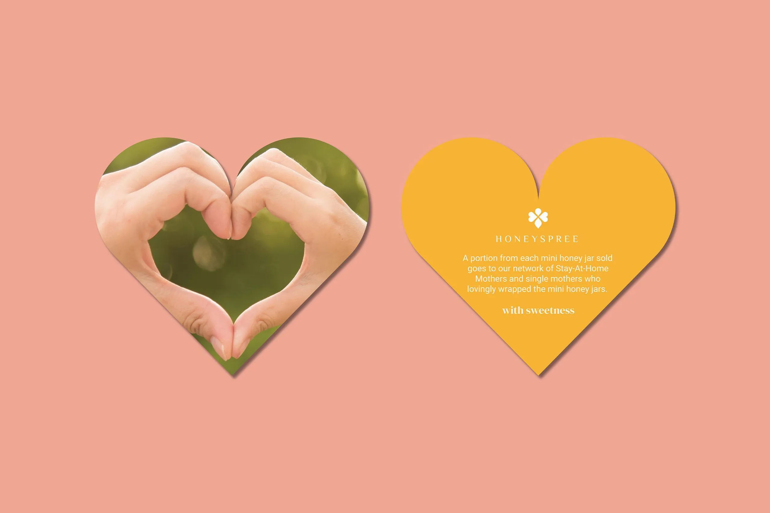
Defined the brand essence as “With Sweetness,” bringing warmth and a caregiver tone to every aspect of the brand
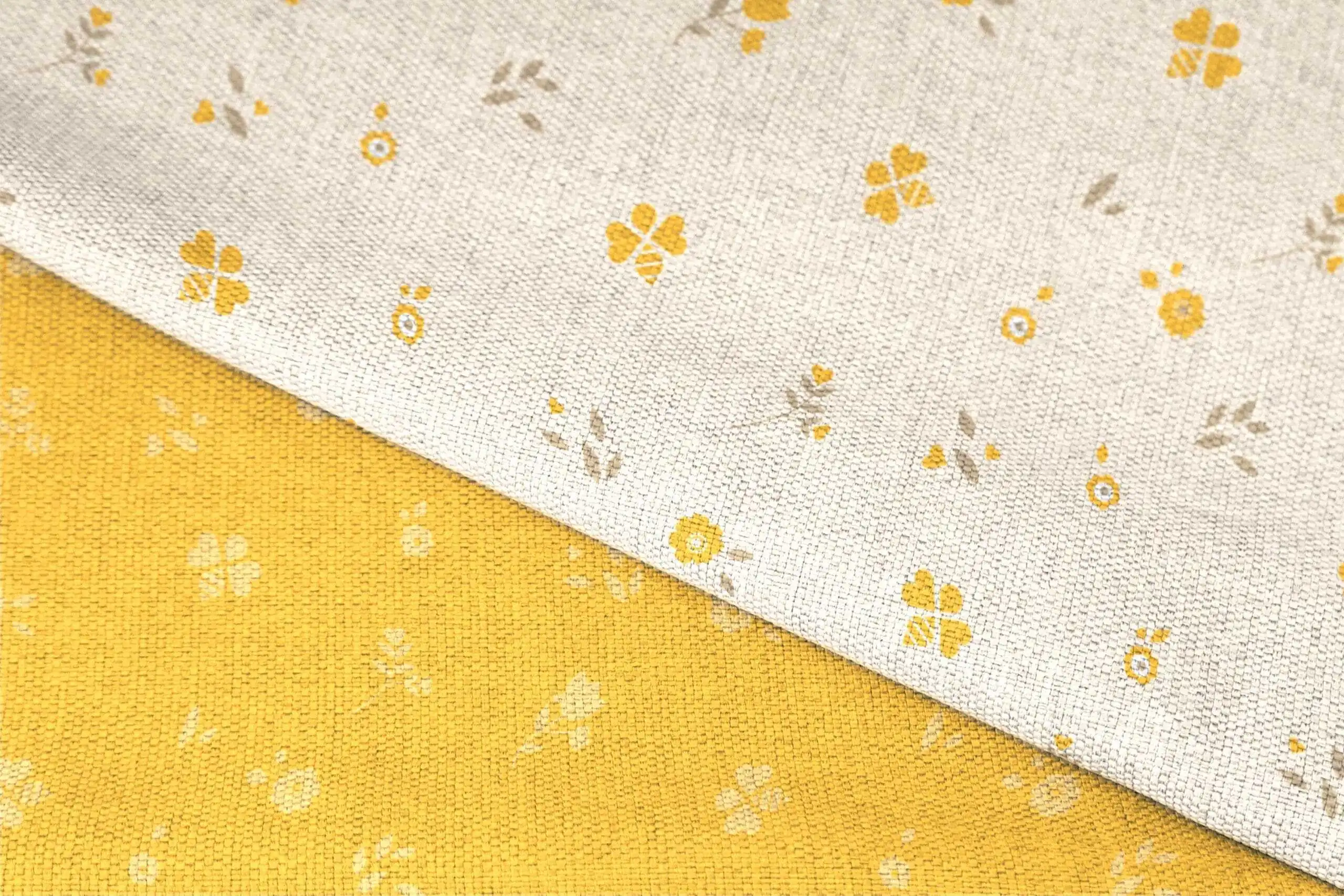
Designed an elegant logo with curvy, symbolic shapes that suggest the silhouette of a bee, and used elements of it to form subtle flower illustrations—linking identity across stationery, packaging, e-commerce, and collateral
Developed a warm and inviting color palette that visually represents concepts of honey, bees, and tenderness, reinforcing the brand’s relational positioning
Crafted imagery that combines close-up product shots, behind-the-scenes production, and scenes of nature and human bonding to evoke feelings of thoughtfulness and authenticity

{ THE DIFFERENCE }

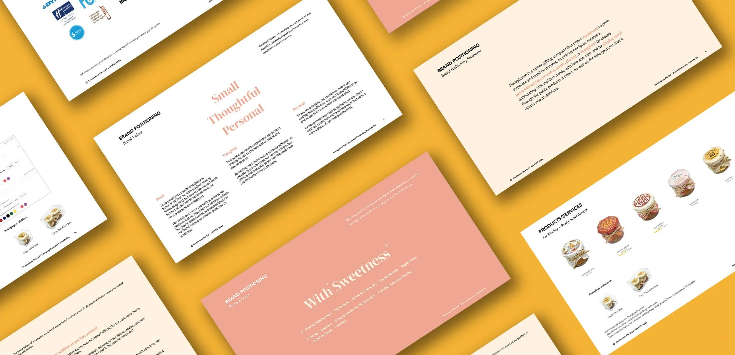
{ Brand Positioning }
{ Brand Identity }


{ Brand Touchpoints }
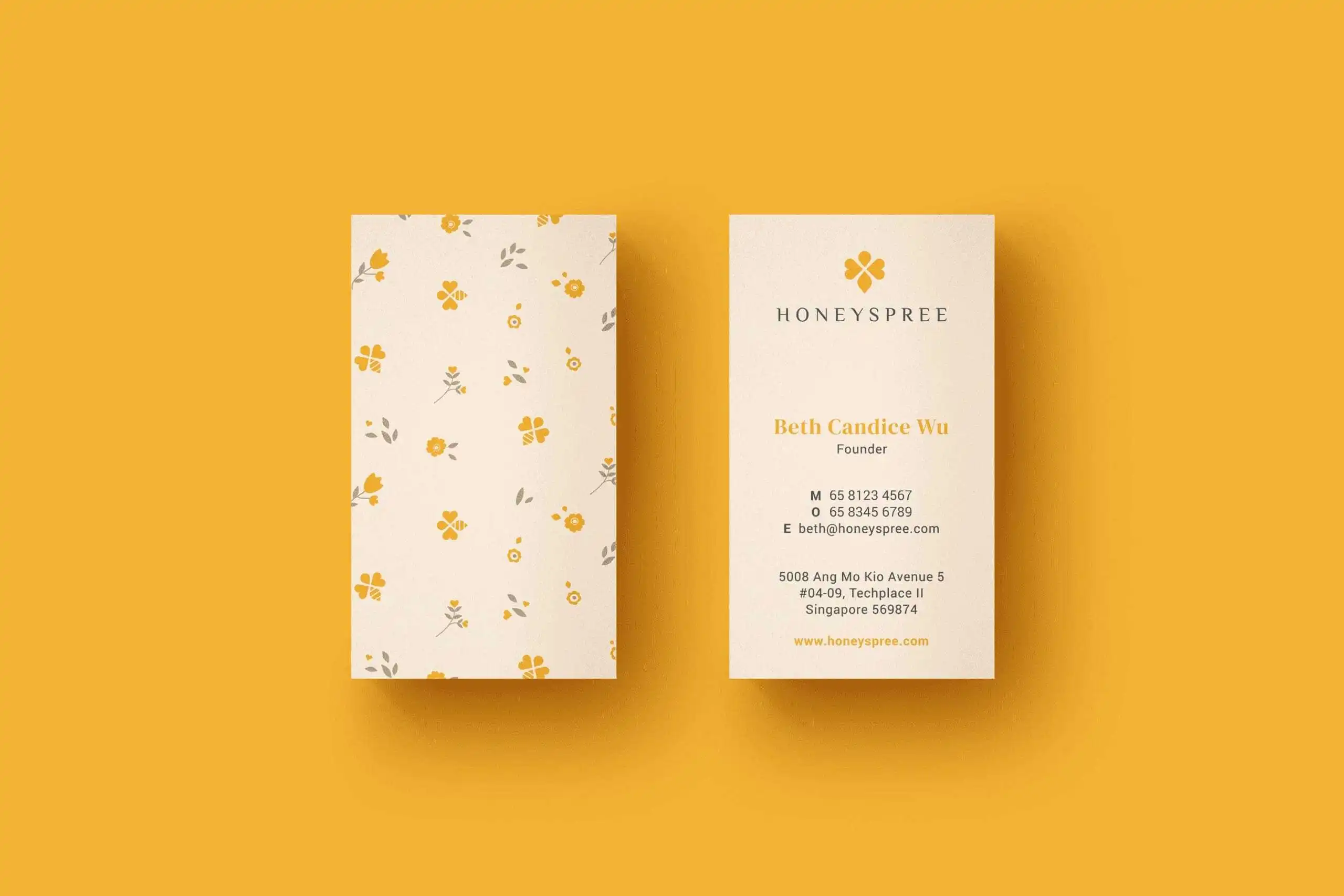
To reach HoneySpree’s customers both online and offline, we developed a wide range of touchpoints that seamlessly incorporates HoneySpree’s new brand positioning and identity.
This includes business cards, envelopes, post cards, social impact cards, jar cap and label, website, and more. These touchpoints serve as an important component in forming a harmonious and consistent brand experience for HoneySpree’s customers.
Combined with HoneySpree’s new colour palette and graphic identity, the wide range of touchpoints demonstrates versatility of the graphic style in conveying the brand’s message effectively.