Designing Confidence
for Cardinal Health,
Every Detail Matters
{ Project Overview }
Cardinal Health is a global healthcare leader providing essential medical products and solutions to hospitals, caregivers, and patients worldwide. With communication playing a vital role in healthcare settings, every material needs to be clear, accurate, and easy to understand.
We designed a suite of communication materials across key touchpoints, from enteral feeding pump guides and anti-embolism stocking kits to exhibition displays and roll-up banners. Each piece was crafted to simplify complexity, reinforce product confidence, and support Cardinal Health’s commitment to safety, precision, and patient care.

{ Creative Challenge }
- 01
Cardinal Health needed to make its wide range of medical solutions instantly understandable and visually consistent across all touchpoints.
- 02
Products included varied categories, from enteral feeding pumps to anti-embolism stockings and surgical gloves, each requiring distinct yet brand-aligned messaging.
- 03
Communication had to balance clinical accuracy with ease of understanding for healthcare professionals and end users.
- 04
Materials needed to stand out in busy hospital environments where clarity, speed, and reliability are essential.
- 05
The challenge was to translate technical information into impactful visuals that reinforce brand credibility and patient care commitment.
{ The Solution }
Designed a modular communication framework prioritising clarity, trust, and human connection.
Developed purpose-driven messaging and visuals tailored for each product category while maintaining brand consistency.
Simplified setup procedures and highlighted clinical benefits through intuitive infographics and user-focused layouts.
Unified typography, iconography, and photography under one cohesive visual language.
Applied the system across a range of materials, from instructional guides and sales kits to exhibition backdrops, reinforcing professional confidence and patient support.

{ Design Strategy }

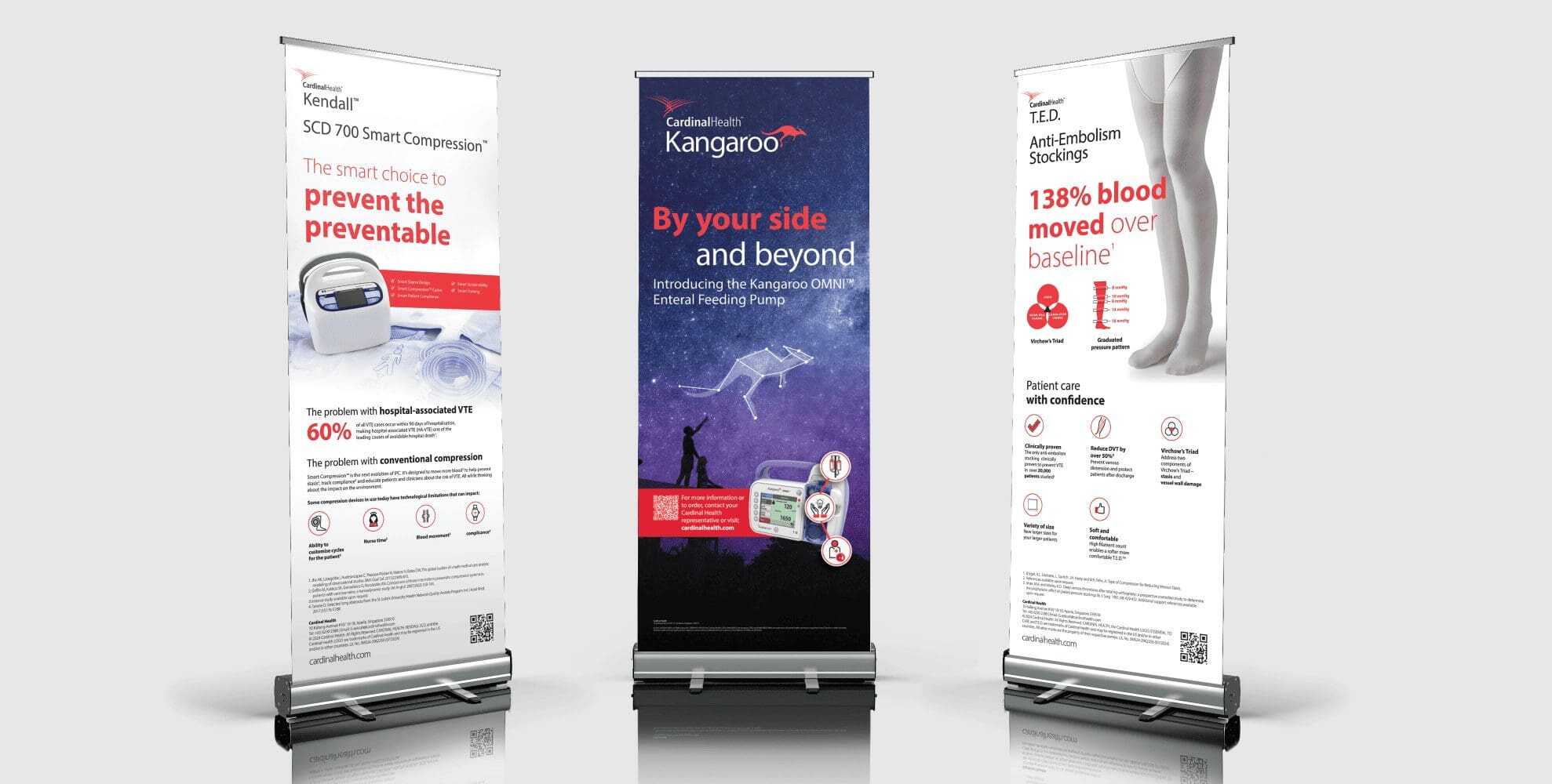
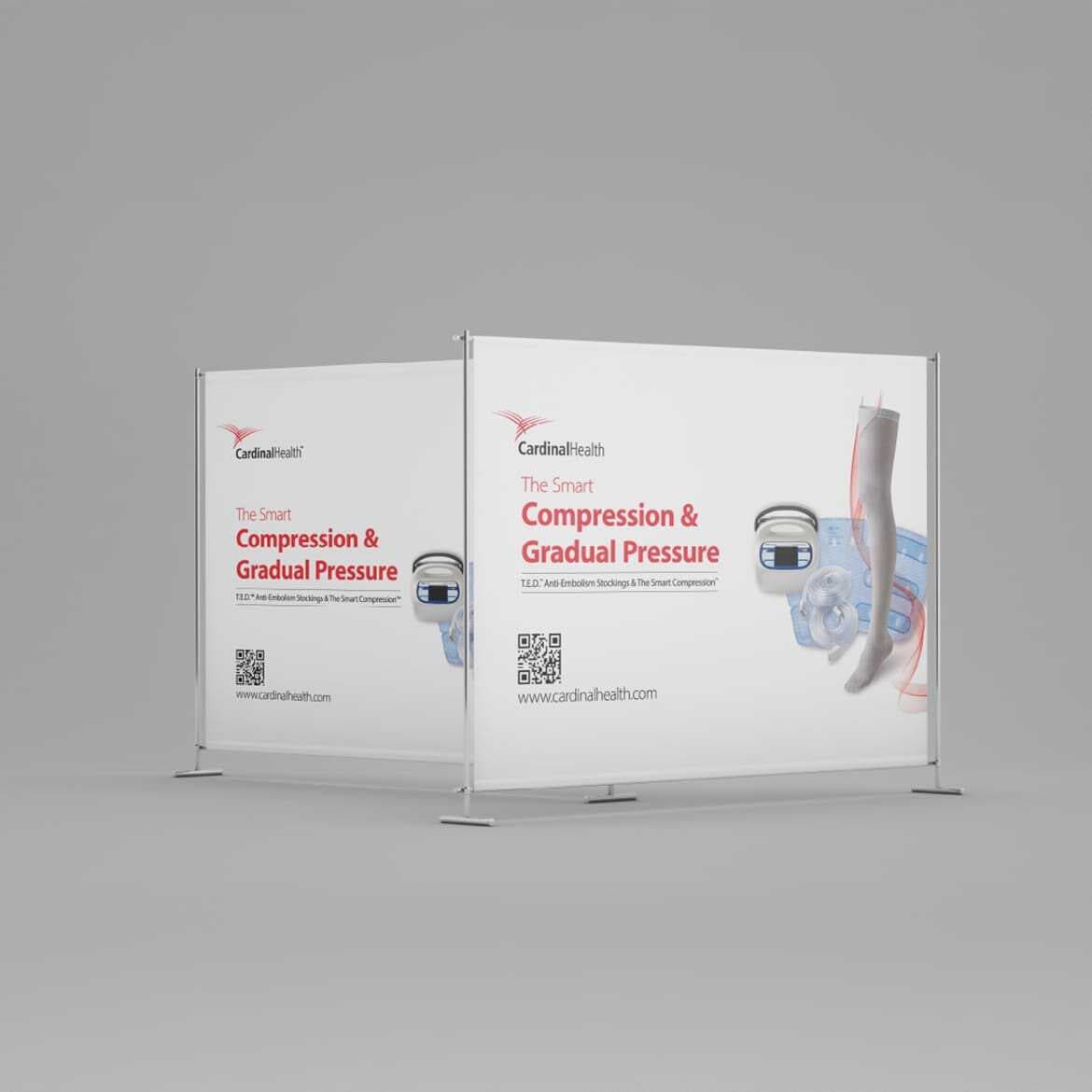
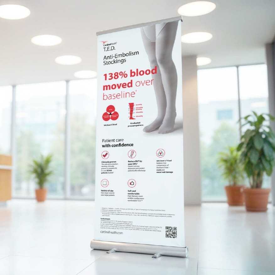
{ Brand Touchpoints }
Cardinal Health’s brand touchpoints were designed to deliver clarity, confidence, and consistency across every stage of the healthcare experience.
From instructional quick guides and clinical sales kits to roll-up banners and exhibition displays, each asset communicates vital product information with precision and visual coherence. Every touchpoint was created to help healthcare professionals understand products quickly and make informed decisions with confidence.
The brand identity is applied consistently through clean typography, purposeful iconography, and Cardinal Health’s focused red-and-white palette. Whether used in hospital wards, clinical training sessions, or healthcare conferences, these materials reinforce trust, professionalism, and Cardinal Health’s reputation as a dependable healthcare partner.

{ Communication Implementation }