{ Project Overview }
{ Creative Challenge }
- 01
With multiple business units and product categories, the brand needed a more organised system to explain its solutions clearly.
- 02
It also had to balance scientific credibility with warmth, so it could connect with farmers, customers, scientists, and communities.
- 03
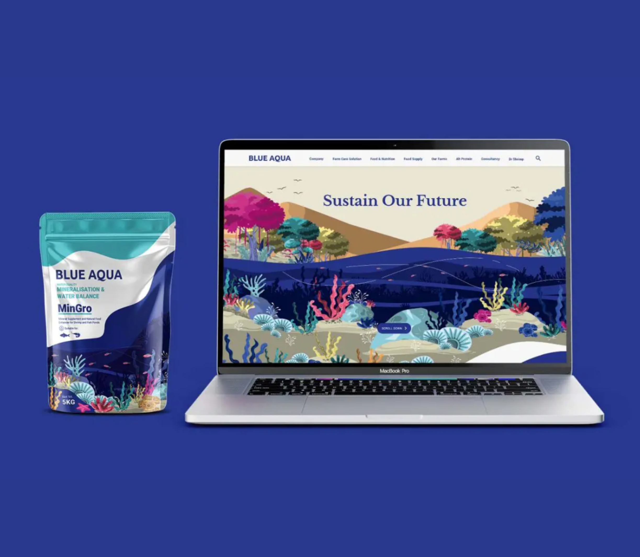
Most importantly, its purpose, “Sustain Our Future,” needed to become a flexible identity system that could work across corporate, product, and digital touchpoints.
{ The Solution }
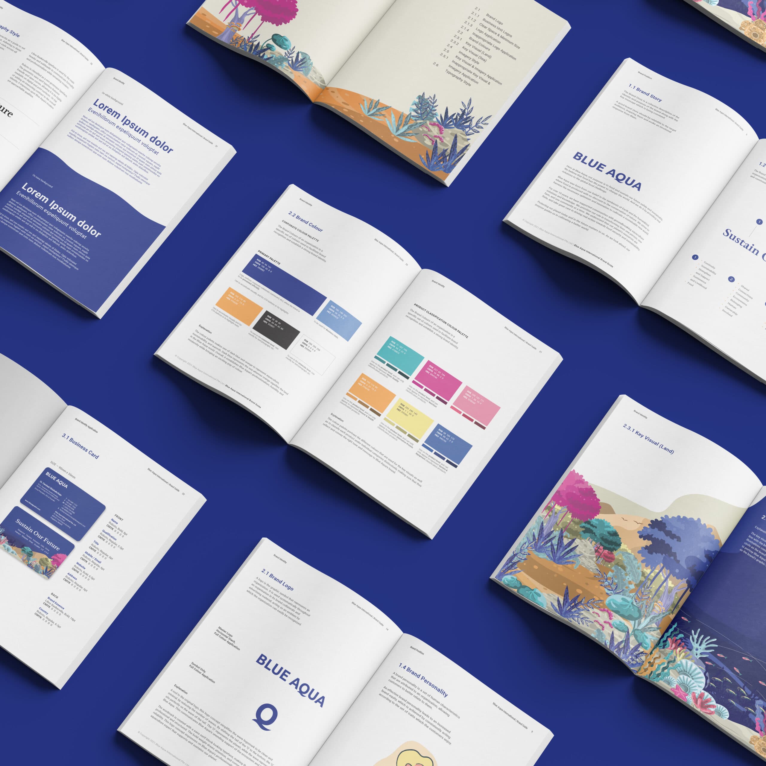
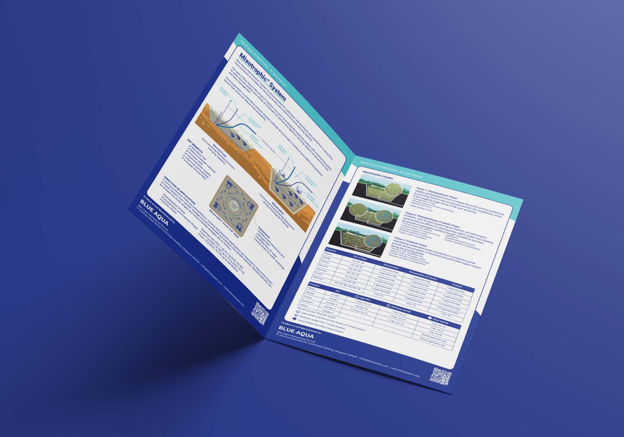
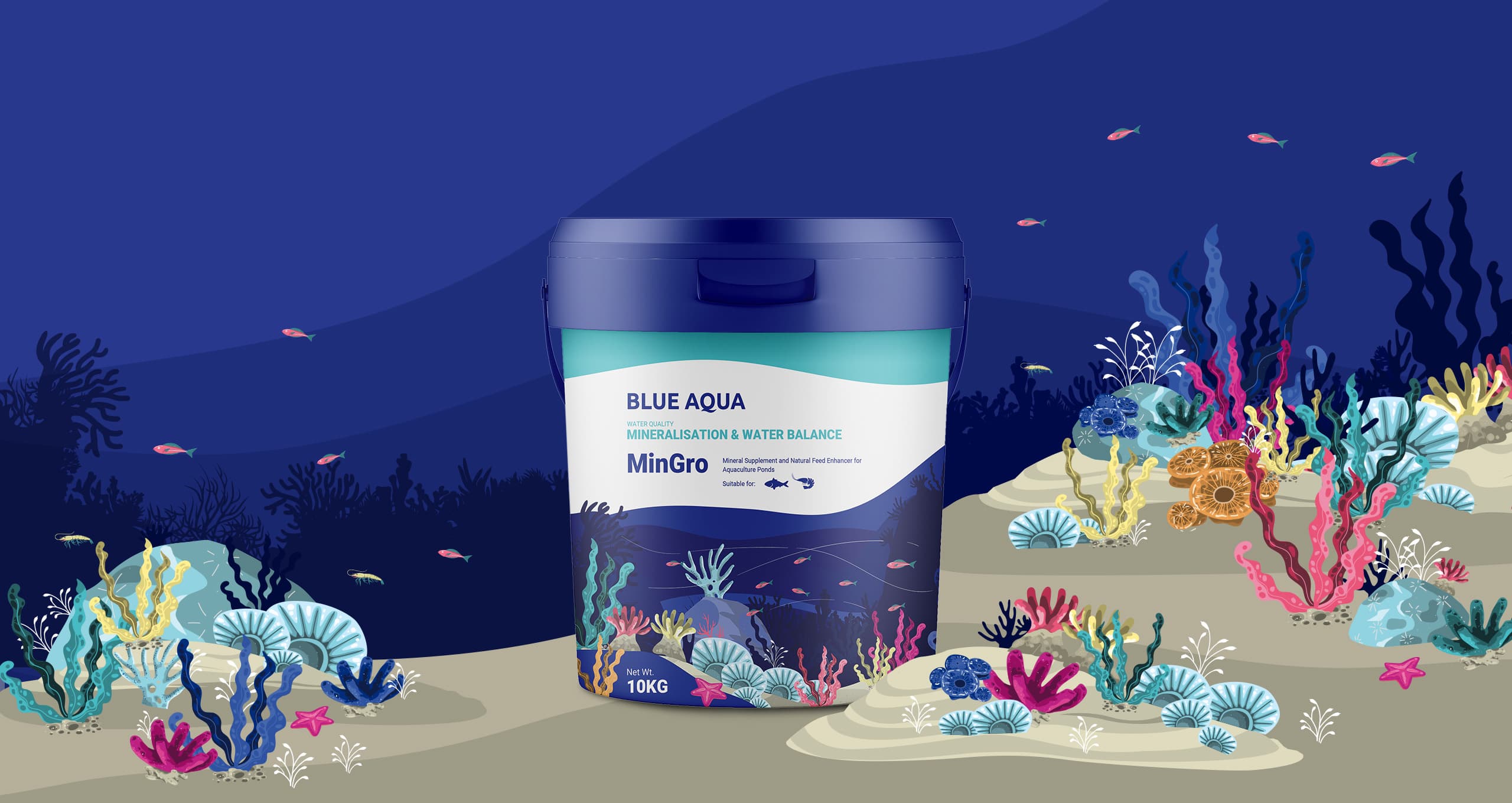
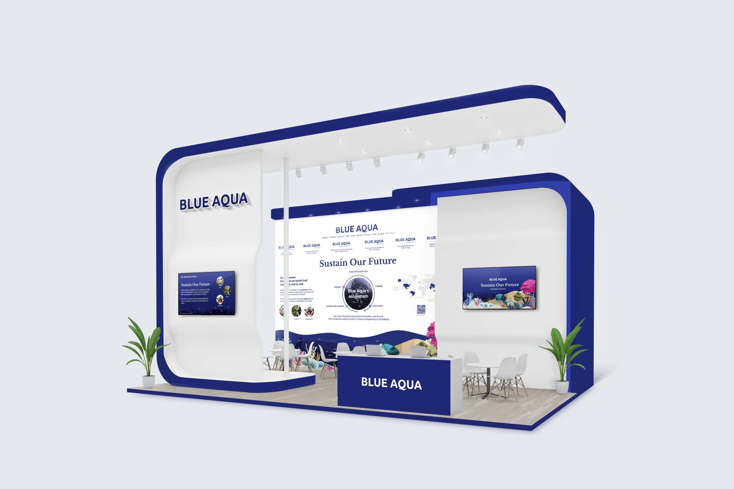
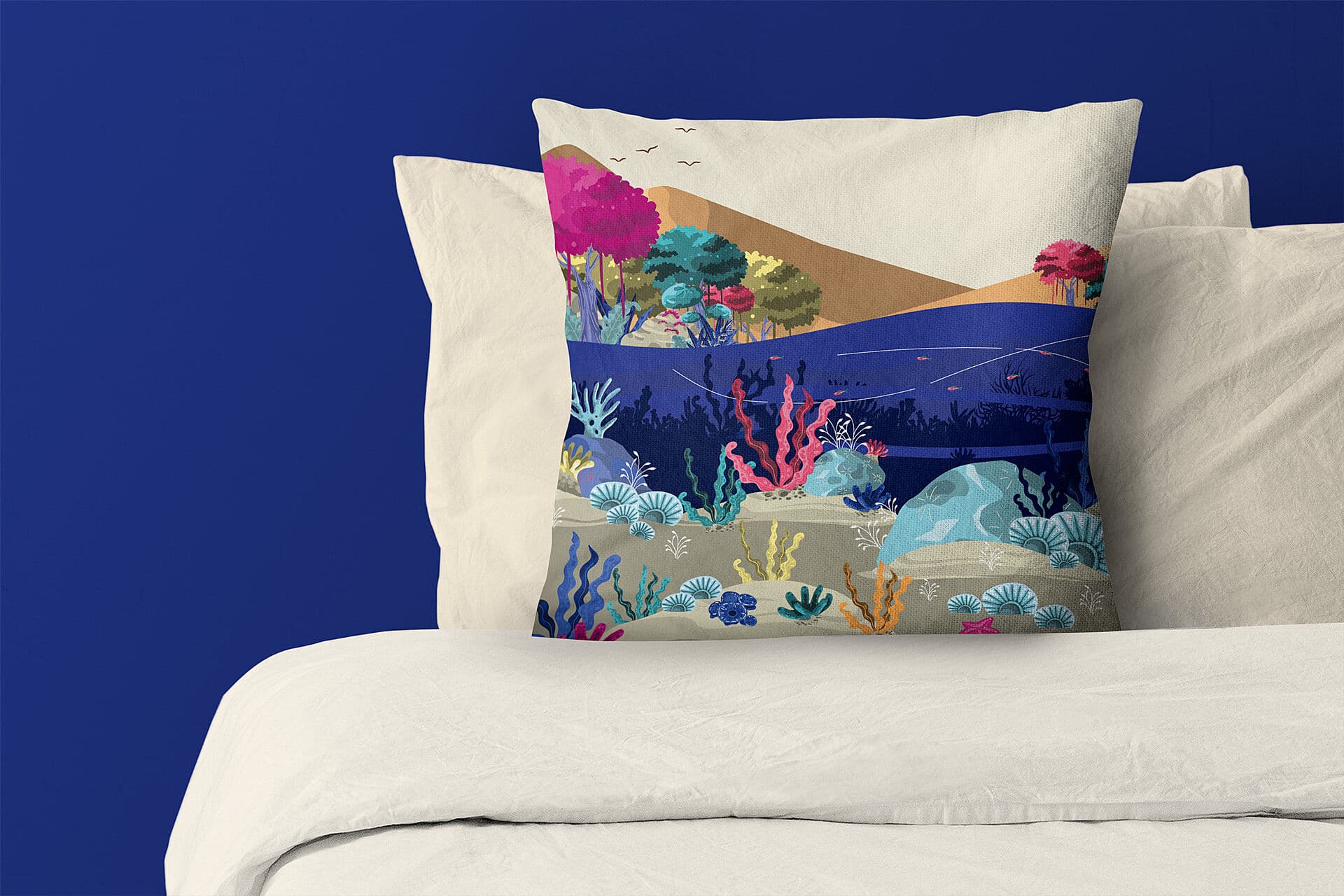
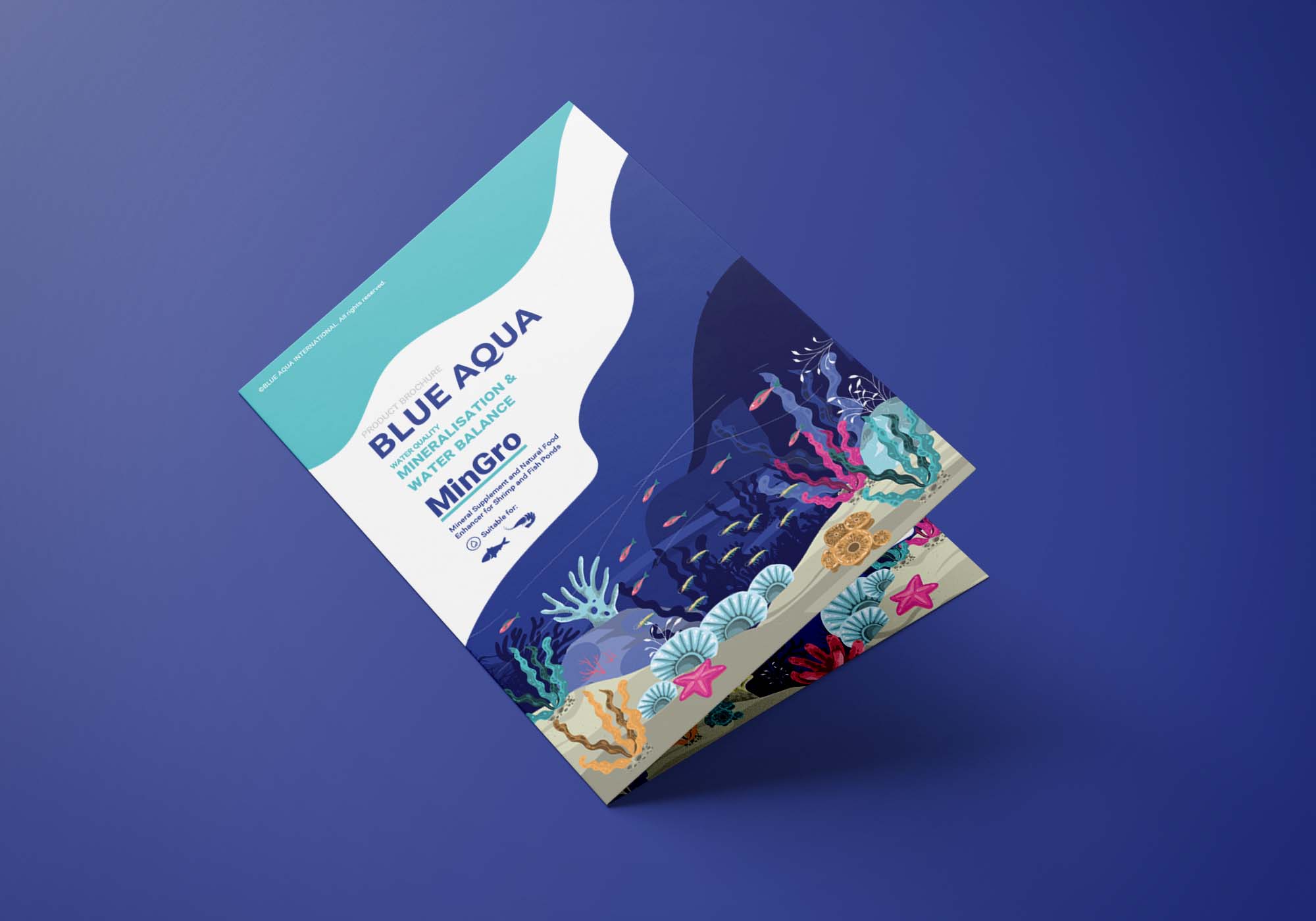
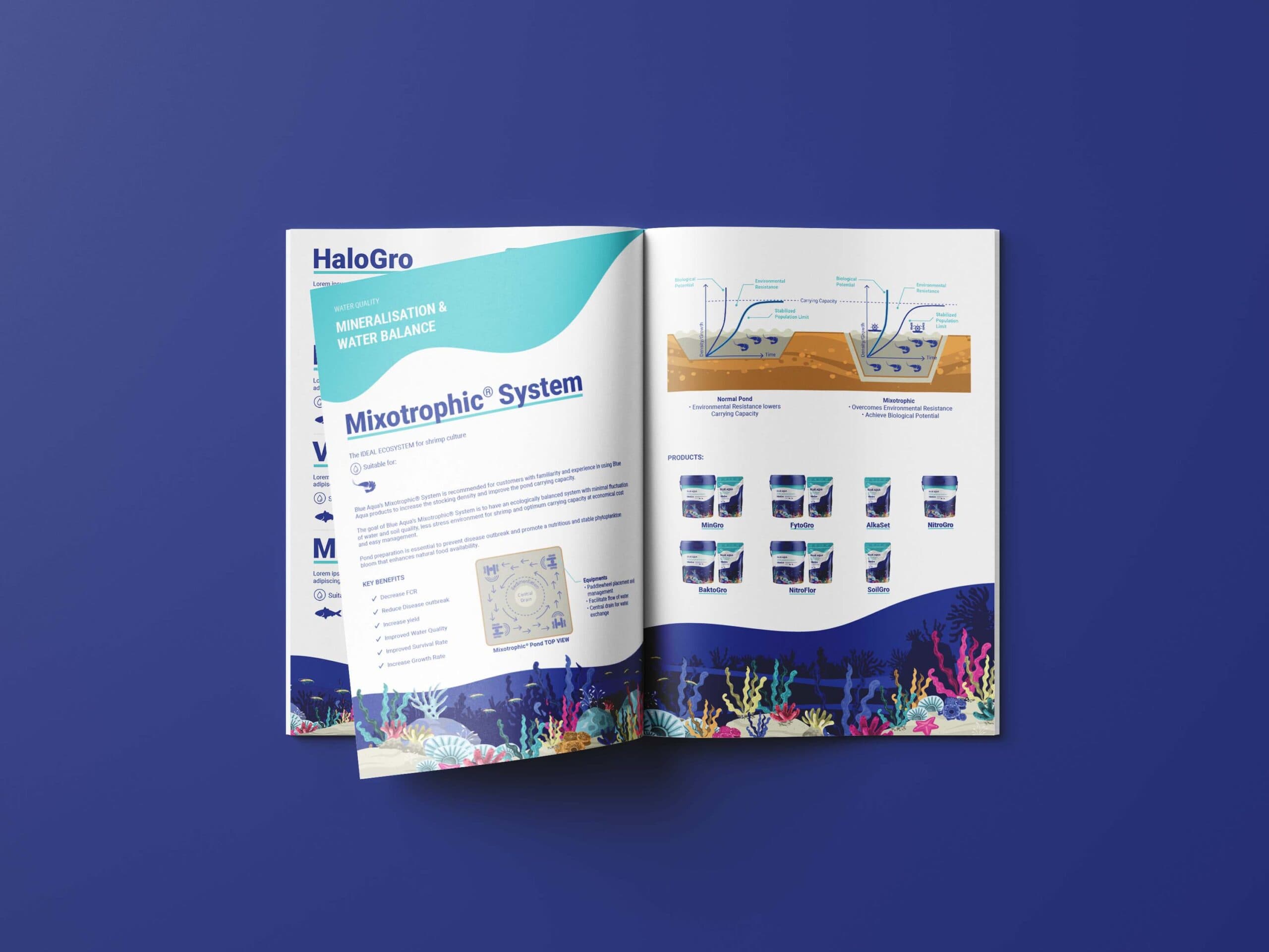
The identity combines clean layouts, organic graphic shapes, land-and-sea illustrations, and authentic aquaculture imagery to express both expertise and human touch.
A colour and icon system was developed to organise Blue Aqua’s product categories, helping audiences navigate its solutions more easily.
Across applications, the refreshed identity presents Blue Aqua as a professional, modern, and purpose-driven aquaculture brand committed to sustaining the future.

{ THE DIFFERENCE }
{ Brand Positioning }
{ Brand Identity }
{ Brand Touchpoints }


{ Brand Rollout }