{ Project Overview }
{ Creative Challenge }
- 01
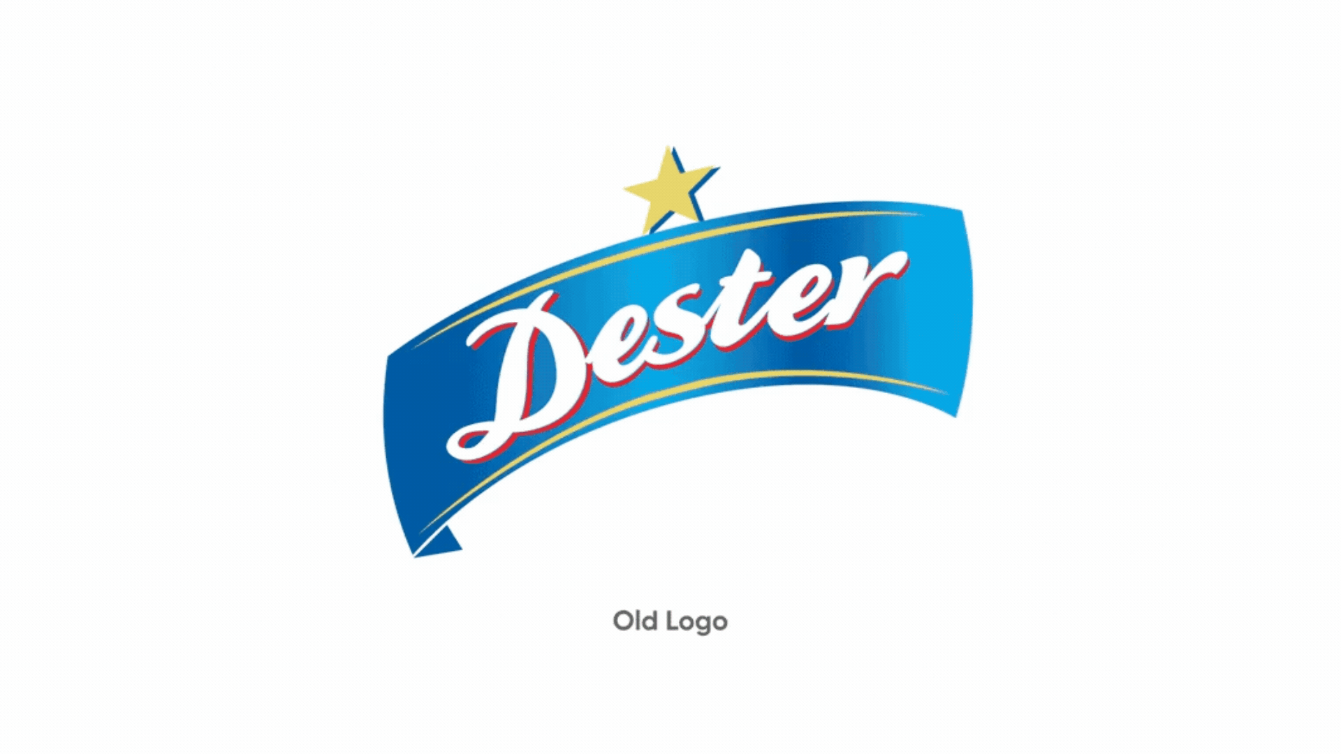
Dester had heritage and recognition but its visual identity was not updated, making it feel dated
- 02
Branding did not deeply connect with target consumers who are drawn to craft, authenticity and design-driven aesthetic
- 03
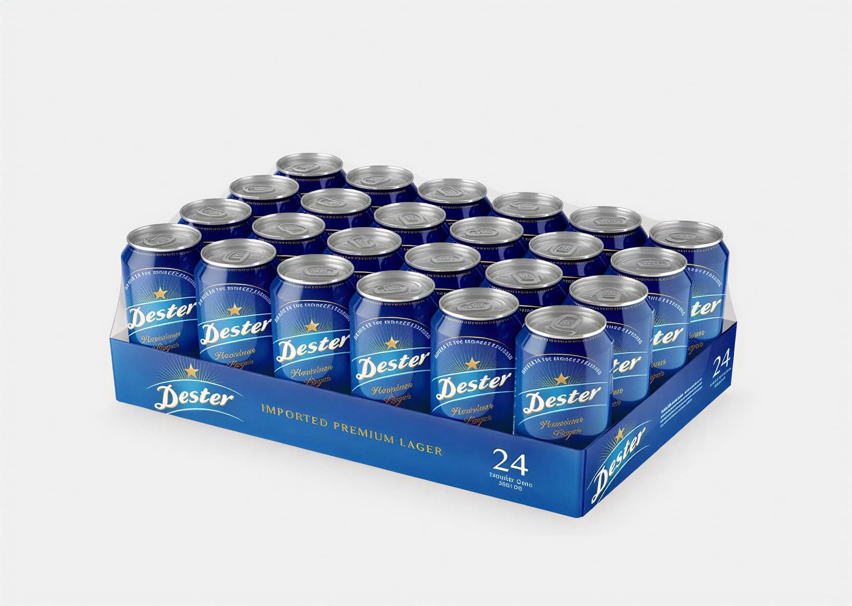
Packaging and label design lacked distinctiveness to stand out on shelves among other beer brands
- 04
Inconsistent branding elements made it harder to communicate the brand’s character and heritage
{ The Solution }
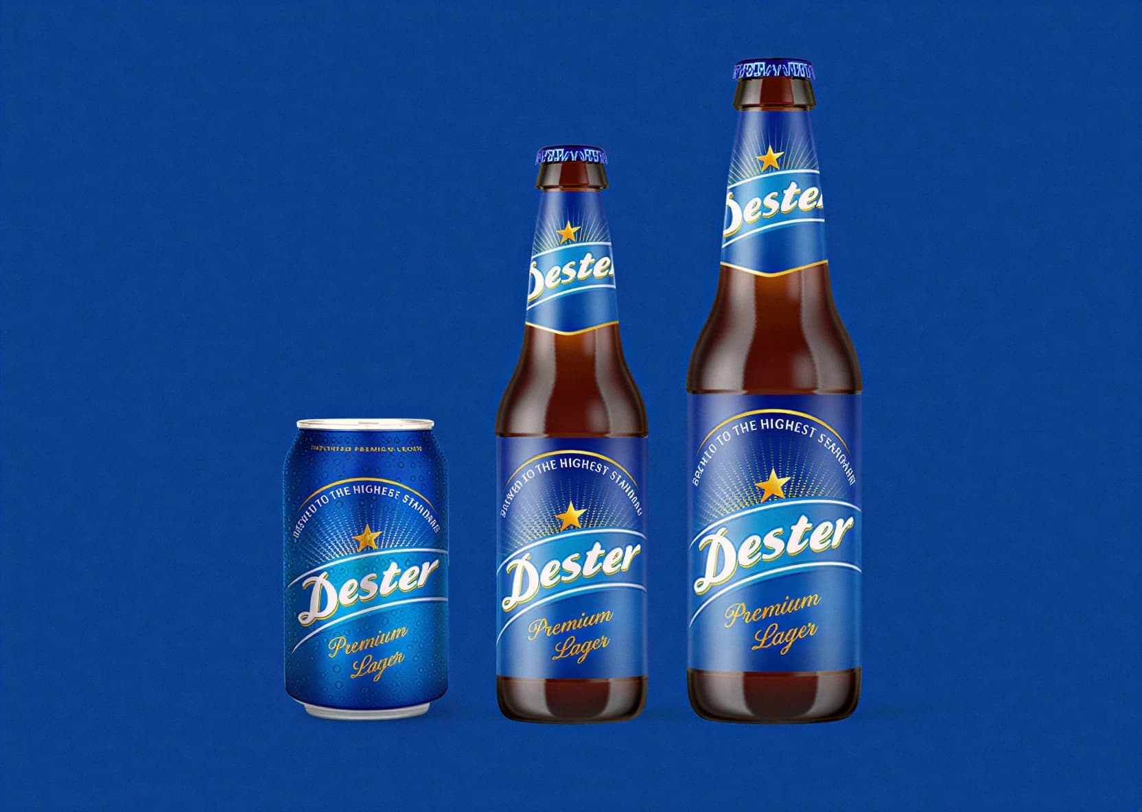
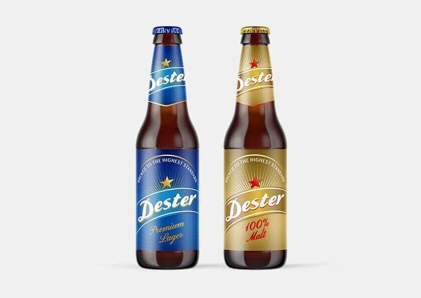
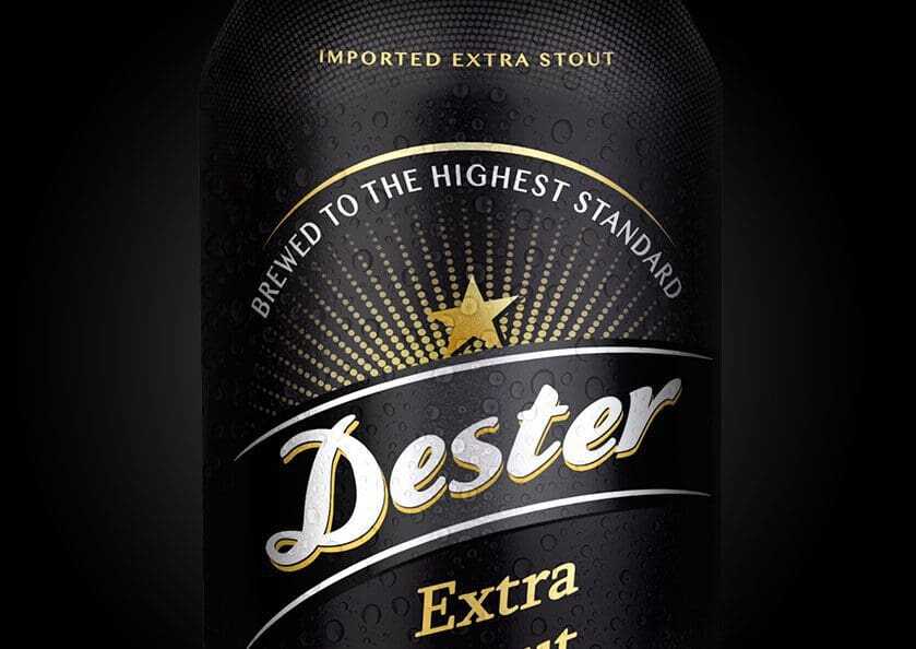
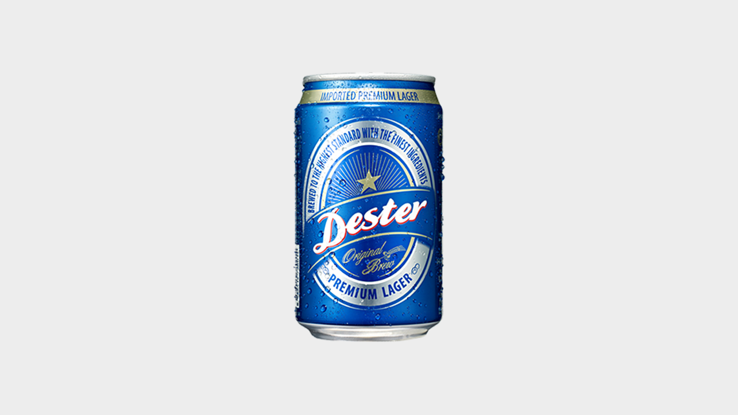
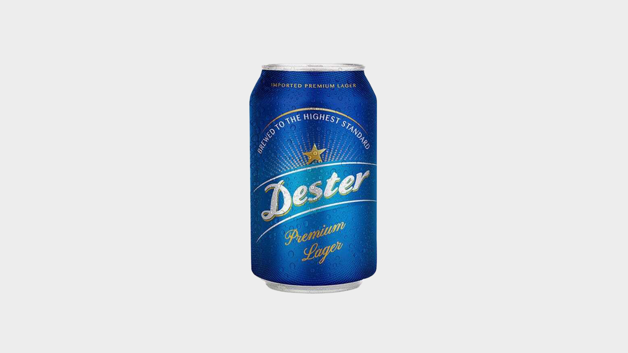
Designed a modernised logo and label system that honours Dester’s legacy while feeling fresh and current
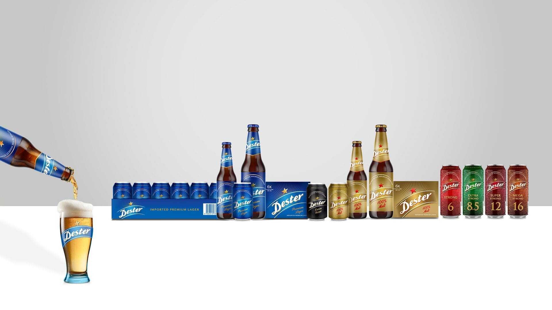
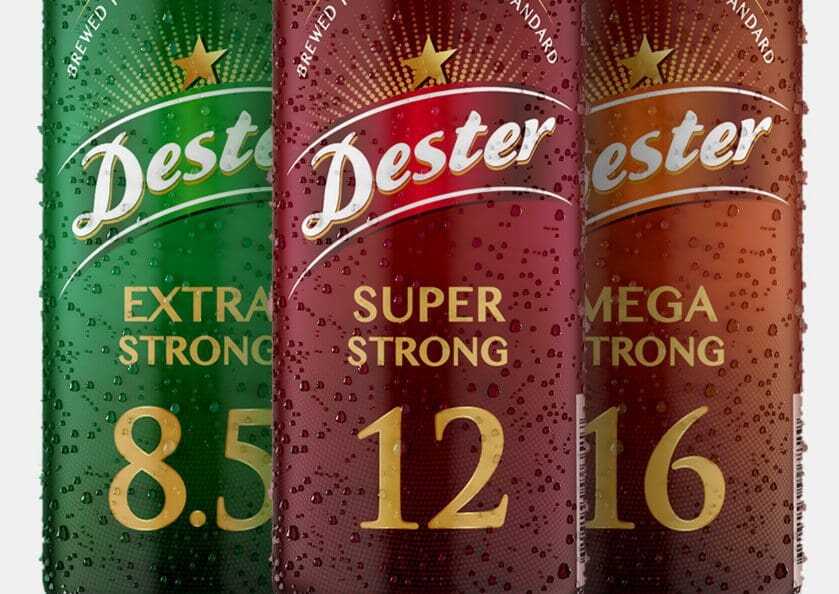
Introduced distinct packaging graphics and typography to make products more eye-catching in retail environments
Refined colour palette and visual mood to convey craft quality, authenticity, and bold personality
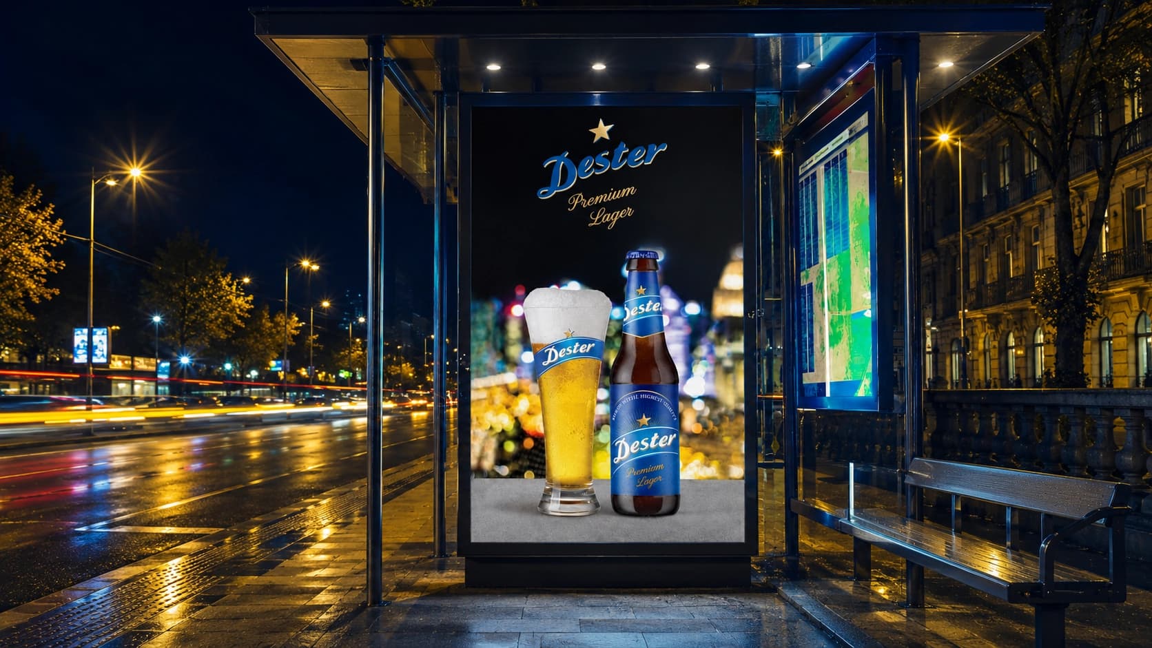
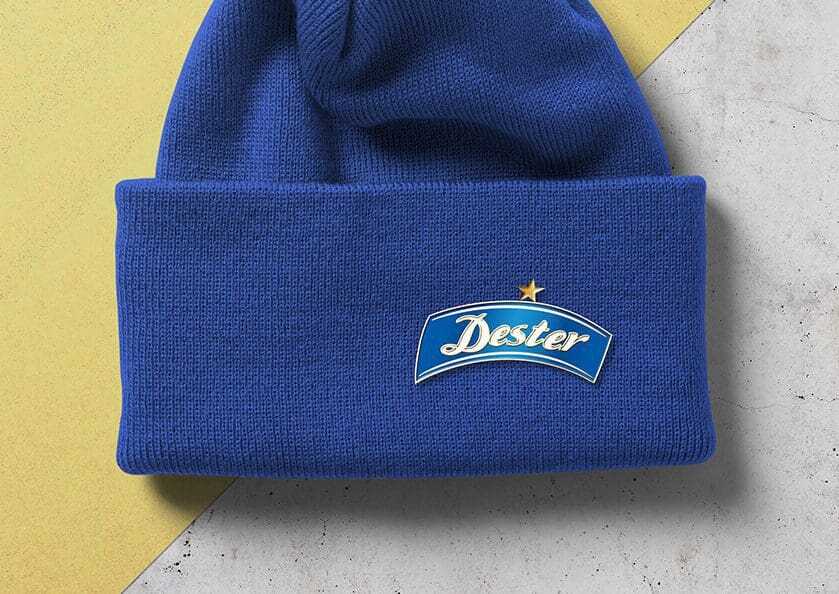
Ensured consistency across all branding touchpoints to strengthen recognition and reinforce consumer trust

{ THE DIFFERENCE }
{ Brand Identity }

{ Packaging Design }