Transforming Aeris Dynamics
for Modern Cold Chain Needs

{ Project Overview }
Based in Singapore, Aeris Dynamics provides custom cold chain packaging solutions for pharmaceutical, biotechnology, medical, and F&B sectors. Since 2001, the company has built a strong reputation for serving global clients with highly time-sensitive and temperature-controlled demands, where trust, accuracy, and consistency are critical.
Through the rebranding, we refined Aeris Dynamics’ visual identity to better communicate its role as an established partner in cold chain logistics. The new logo draws from the Golden Ratio, Divine Proportion, and the triangular symbol for insulation, creating a mark that reflects precision, balance, sustainability, and meticulous attention to detail. The result is a sharper brand presence that supports Aeris Dynamics’ continued growth across specialised and demanding industries.

{ Creative Challenge }
- 01
Aeris Dynamics’ lack of a unified brand position may confuse customers and result in a weaker brand image.
- 02
Aeris Dynamics has an inadequate brand identity, undermining its potential to strengthen its promise and reputation as a world-class provider.
- 03
Aeris Dynamics has inconsistent brand touchpoints, challenging the brand to set it apart from its competitors and making it less authoritative in the industry.
- 04
Disorganised website information architecture, leading to a high website bounce rate.
{ The Solution }
Aeris Dynamics’ new brand positioning resonates better with the current needs of its customers and communicates its services.
The new logo and brand identity make Aeris Dynamics stand out as a modern brand with a consistent graphic style that communicates the brand’s story and professionalism more effectively.
The new logo and brand identity make Aeris stand out as a modern brand with a consistent graphic style that communicates the brand’s story and professionalism more effectively.
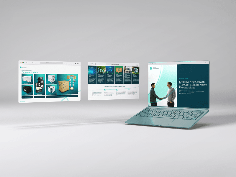
Clear website navigation and information architecture allow users to find information more efficiently and accurately, resulting in better website retention.
{ THE DIFFERENCE }


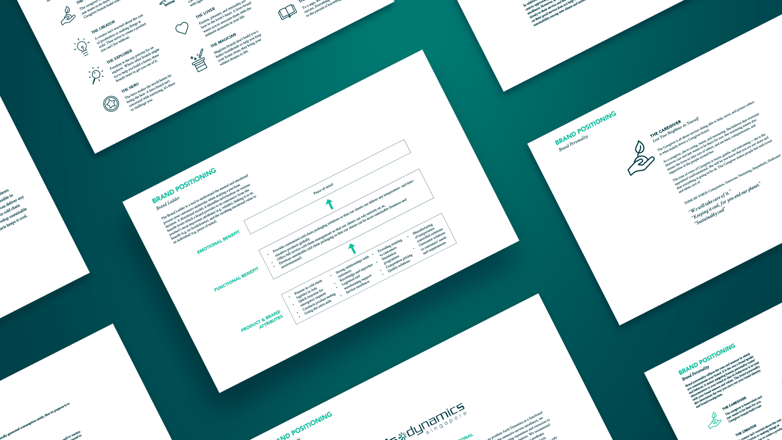
{ Brand Positioning }
{ Brand Identity }

{ Brand Touchpoints }
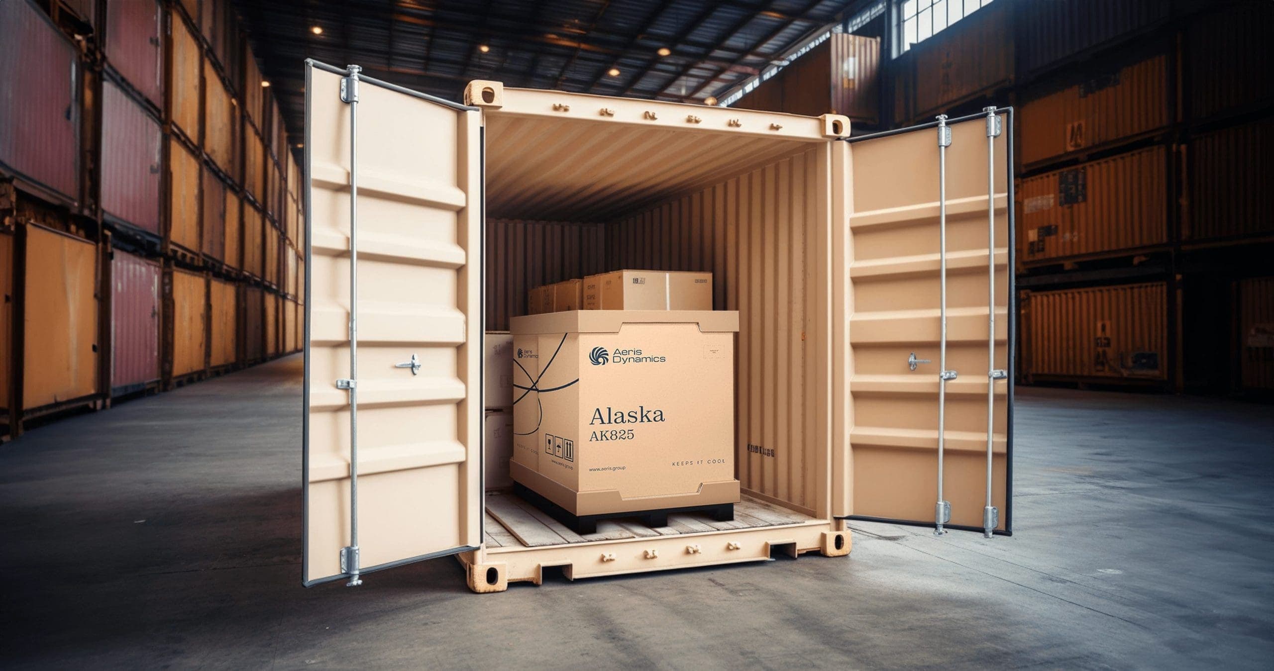
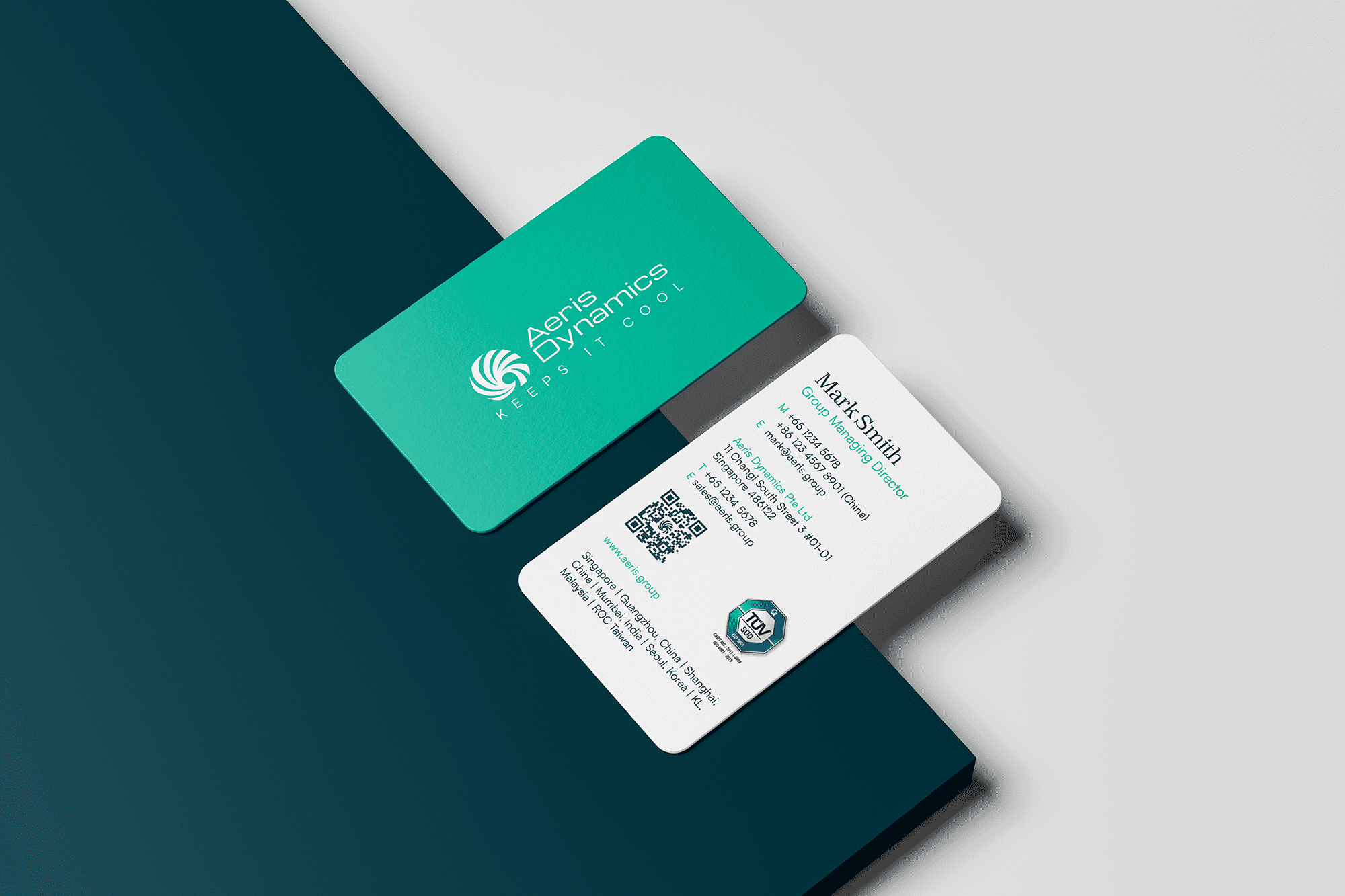
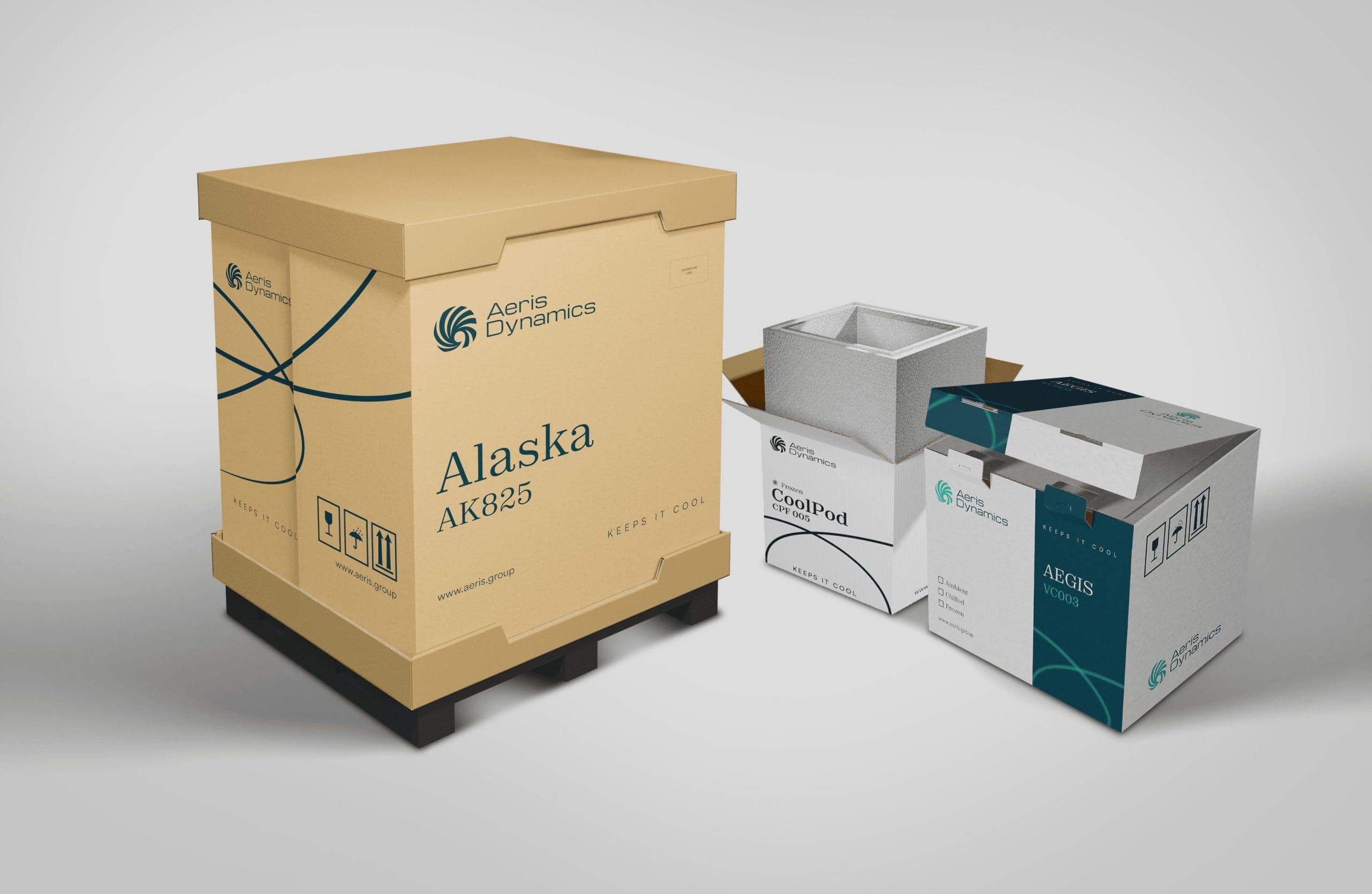
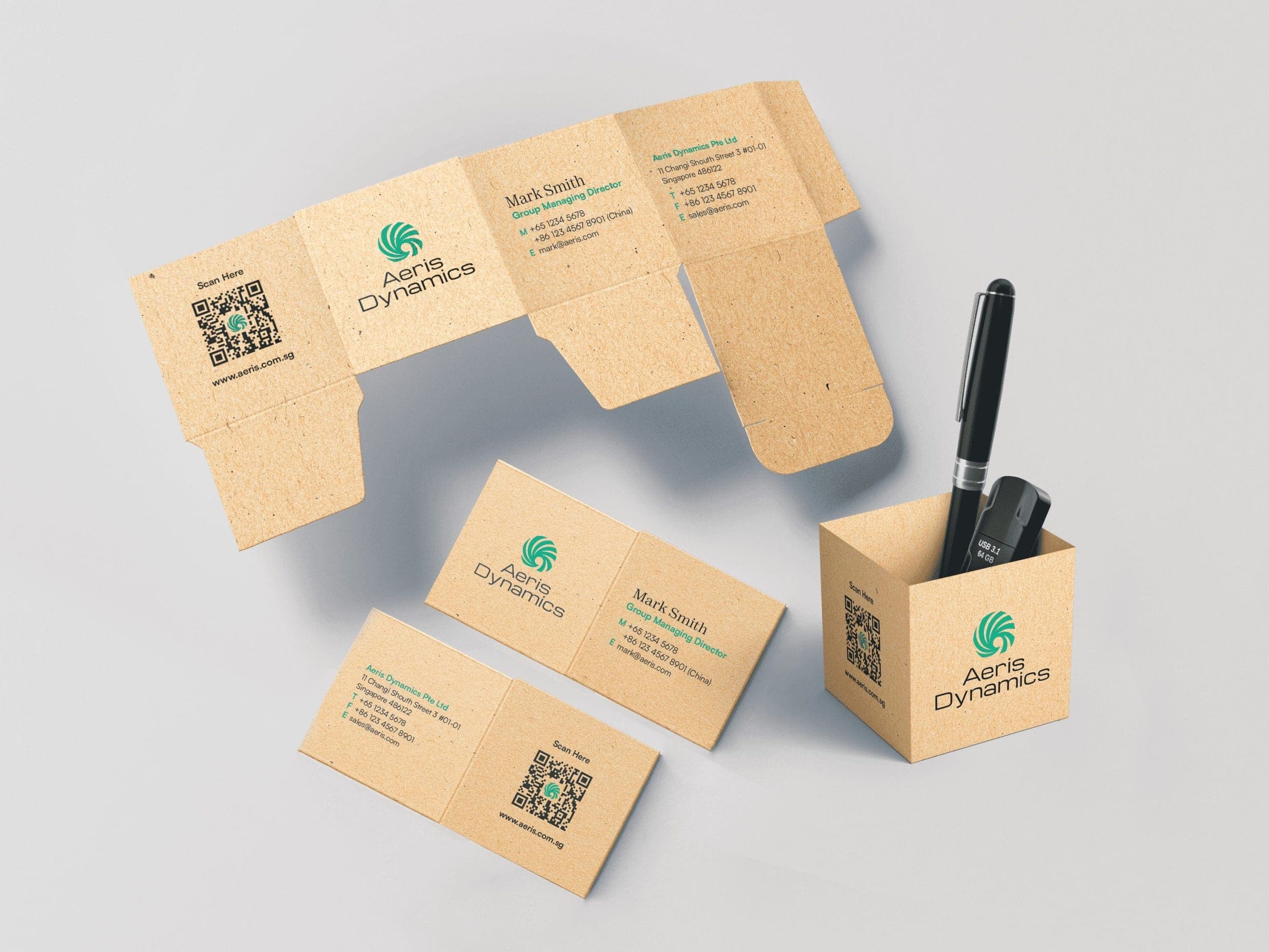
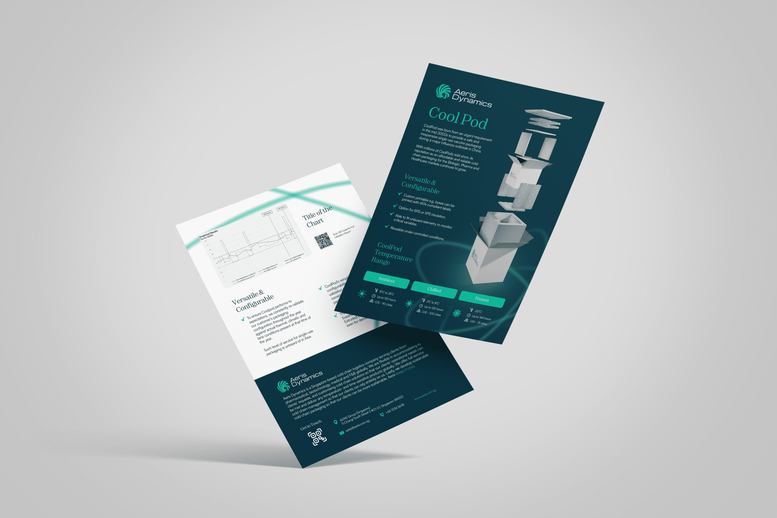
Aeris Dynamics’ brand touchpoints bring its refreshed positioning and identity into a cohesive customer experience, reinforcing the brand’s reliability across packaging, corporate materials, and digital platforms.
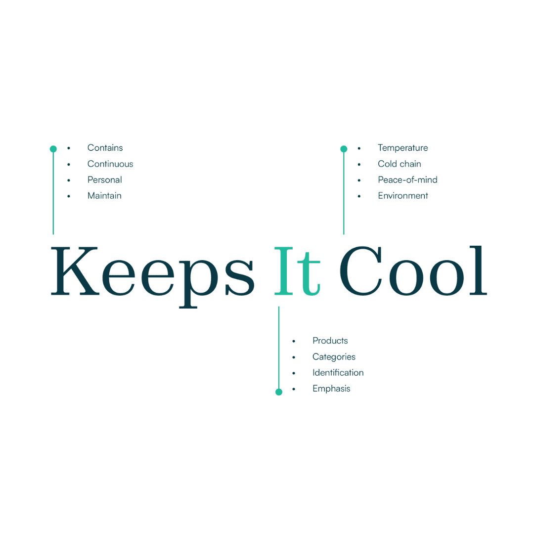
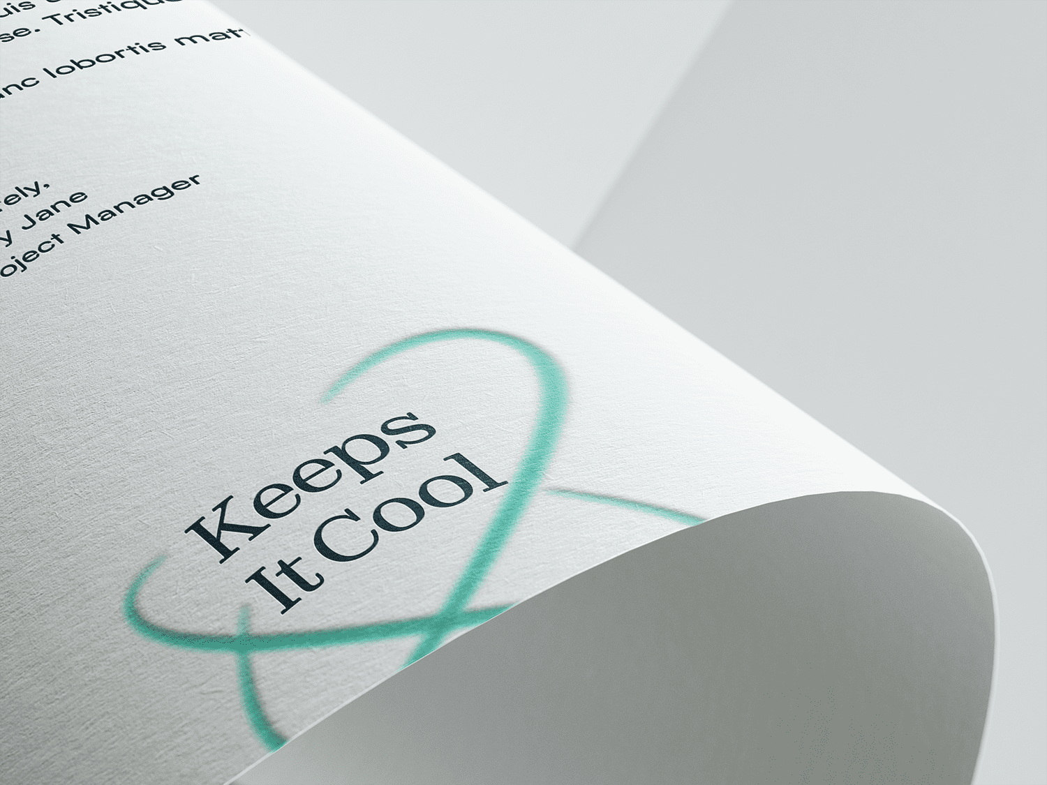
We developed touchpoints that seamlessly integrate the brand essence “Keeps It Cool” across both physical and digital applications. From packaging and business cards to website UI/UX, each touchpoint was designed to communicate professionalism, precision, and confidence while helping customers better understand Aeris Dynamics’ cold chain capabilities.
The graphic language of airflow lines, cool-toned colours, and clean layouts creates a consistent visual system across different mediums. This synergy strengthens brand recognition, making Aeris Dynamics feel more memorable, versatile, and trustworthy to its diverse audience across temperature-sensitive industries.


{ Brand Rollout }

“Through its new brand positioning, Aeris Dynamics adeptly addresses customer needs, showcasing its services effectively. The updated logo and brand identity underscore Aeris as a modern force, seamlessly merging style and professionalism to convey its unique narrative.”