Brand Transformation for Businesses Growing Across Asia • Up to 50% EDG Support for Eligible Projects. Limited Time Only


Creativeans C LogoCreativeans

Crafting Experiential-Relational
Branding for Interiors

Branding
Business Design
Communication Design
UI/UX Design
Close-up of a hand gripping a woodworking chisel over a wooden workbench with wood shavings scattered around.

{ Project Overview }

Repositioning a long-standing surface design company into a more experiential and relationship-driven brand.

Established in 1975 as Seng Lee, Admira is a trusted surface design company with a long history of serving the evolving needs of the furniture and interior design industry. With its wide range of laminate products, the brand offers long-lasting reliability, style, and one-stop solutions for designers seeking both functionality and creative inspiration.

The new brand concept shifts Admira from a primarily functional brand into an Experiential-Relational brand that places greater emphasis on genuine and interpersonal connection. This repositioning reflects Admira’s commitment to helping interior designers excel through solutions that are not only practical, but also engaging, supportive, and design-conscious.

Person uses a pen to compare color swatches and fabric samples on a worktable.

{ Creative Challenge }

A functional laminate brand needing deeper connection and identity to meet modern design demands
  1. 01

    Admira had strong technical credibility but was perceived as primarily functional, limiting emotional engagement

  2. 02

    Product range and brand architecture lacked alignment, leading to weak differentiation among laminate offerings

  3. 03

    Existing visual identity and brand touchpoints did not convey sophistication or authenticity in material detail

  4. 04

    The brand experience was fragmented; communication across showroom, products, services, and community outreach was not unified

{ The Solution }

Created a holistic brand system that celebrates material, craftsmanship, and designer relationships
  1. Shifted Admira’s positioning to an Experiential-Relational brand, focusing on helping interior designers succeed through genuine, interpersonal value

  2. Developed a layered logo system to support a master brand with sub-brands, showcasing versatility and emotional connection to client needs

  3. Defined a colour palette inspired by natural materials combined with balanced masculine and feminine traits, plus clean linework and macro photography to reveal material texture

  4. Applied the refreshed identity across all touchpoints—including product, service, showroom, events, social outreach—to give a consistent, grounded, and modern brand experience

Collage of website design mockups for an interior surfaces brand, featuring swatches, charts, and swatches of wood.

{ Brand Architecture }

Admira’s updated logo is built using a logo system structure, which expresses the company’s holistic approach in conveying experiential and relational values, its deep understanding of the different customers’ needs and its progression in the ever changing industry. The logo underlines how Admira connects with different types of clients to create a unique and impressionable brand. The master logo serves as a foundation for the brand logo system, where its sub-brands are built upon.

What is brand architecture?
Comparison infographic showing two circular process flows: Functional Brand (product-centric) vs Experiential-Relational Brand with Admira at center.

{ Brand Identity }

A refined brand identity that balances sophistication, transparency, and modern craftsmanship.

Admira’s brand identity is built around a colour palette that balances masculinity and femininity, creating a look that feels both grounded and sophisticated. Inspired by natural materials, the palette reflects the brand’s confident and contemporary character, while clean, seamless interior line-work reinforces Admira’s transparent approach and its willingness to reveal what lies beyond the surface.

This visual language is complemented by crafted work-in-progress and behind-the-scenes imagery that highlights the beauty of the design process. Admira’s photography style focuses on macro details, close-up textures, environmental shots, and candid moments at work, while the use of Gotham as the primary typeface gives the identity a sharp, modern, and technical quality that reflects the brand’s progressiveness.

White modern two-story building with a red logo and the word 'SINGLEE' on the facade, people walking along the front driveway; palm trees on the right.
Mosaic of color swatches, typography samples, and a beige design panel from a design studio board.

{ Brand Touchpoints }

Designing holistic brand touchpoints that unify Admira’s products, services, and interactions into one cohesive brand experience.

With Admira’s shift into an experiential-relational brand, its touchpoints were developed to reflect a more complete and connected brand experience. This extends across products, services, showrooms, social outreach, events, and collaborative efforts, allowing the brand to engage audiences in a more meaningful and immersive way.

By bringing together both tangible and intangible brand assets, Admira creates a more wholesome and consistent experience across every interaction. This approach strengthens the brand’s presence while reflecting its commitment to design, relationship-building, and customer experience.

Close-up of a textured light-gray book cover with copper lettering reading 'SURFACES' at an angle.
Blue business card with a white logo resting on a textured dark-blue box surface.
Poster on an easel in a bright gallery, showing a hand drawing with a pen and blue geometric accent text reading From the Art to the Surface (exhibit poster).
Stack of gray-toned brochures with 'DREAMS' in orange, featuring vineyard and barrel imagery on a light background
Open interior design magazine showing furniture photos and wood finishes with headings Contemporary Walnut and Modern Curvature on light gray background.
Black hardcover booklet with gold Japanese text, CERAL 2019, AICA logo, standing upright with a blurred wall shadow in the background.
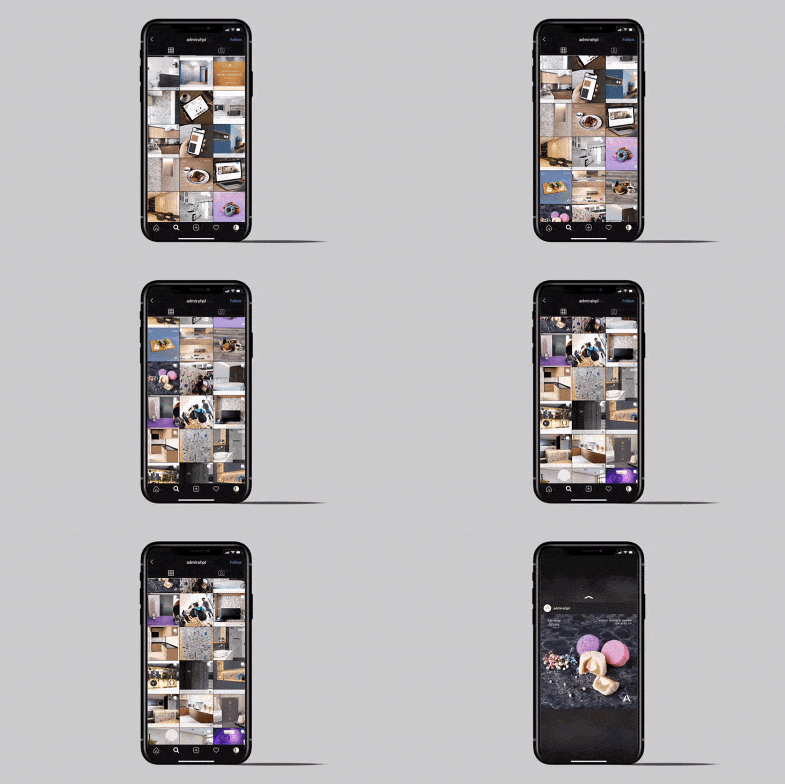
Smartphone showing an Instagram grid of photo thumbnails on a dark device against a light gray background.
Open brochure mockup showing color swatches, grayscale photos, and sample text on a tilted page on a blue surface beyond a gray background.
Plate of Hainanese chicken rice with cucumber slices on a blue patterned plate and small bowls nearby on a concrete surface, conveying a complete meal starter image for a recipe collection.
Group of about 20 event attendees posing for a photo in front of a 'The Stories' backdrop at a conference.

“We were very satisfied with the amount of data collected, and with their analysis and recommendations, we identified how to create a unique brand position for our company. We have seen increased brand awareness and now have a strong differentiation factor from our competitors, our sales team have also been reporting positive feedback from customers.”


Peach-colored logo featuring a large stylized letter A above a partially visible wordmark.
Jake Tan
Executive Director, Admira

Our Featured Work

View All Projects
Professional headshot of a smiling woman in a white blazer and burgundy blouse, hands loosely clasped.

Yulia Saksen

Co-Founder of Creativeans
International Brand Consultant

Your Brand Might Look Fine.
But Is It Working?

Learn where your brand is losing clarity, distinctiveness or consistency, and what should happen next.

Book a Free Brand Consultation with Yulia

Contact Us Now