
Global Rebrand
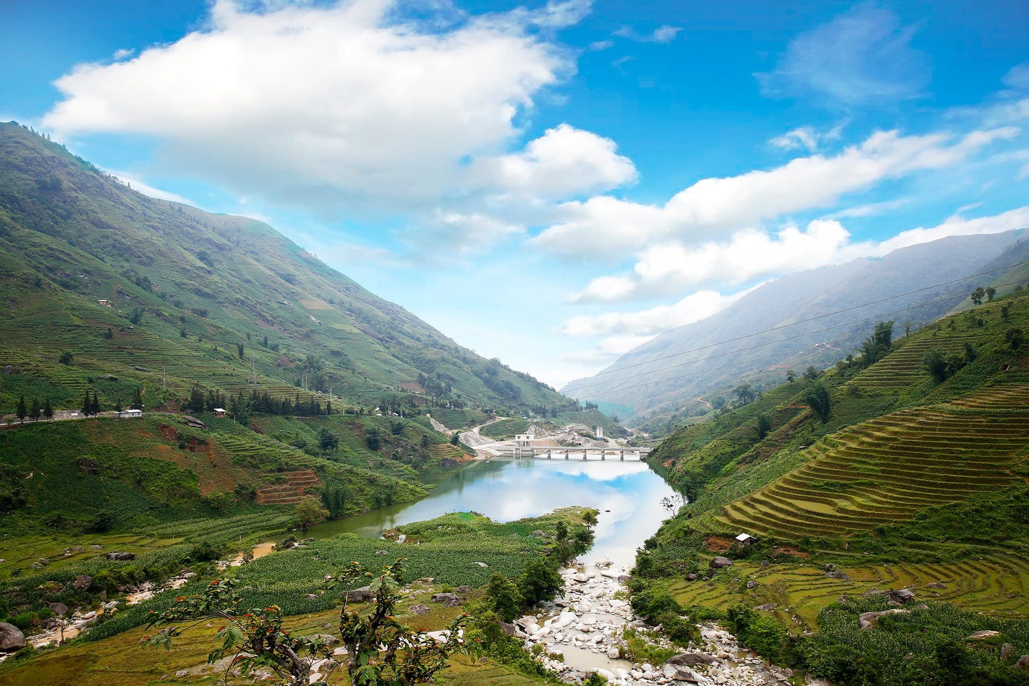
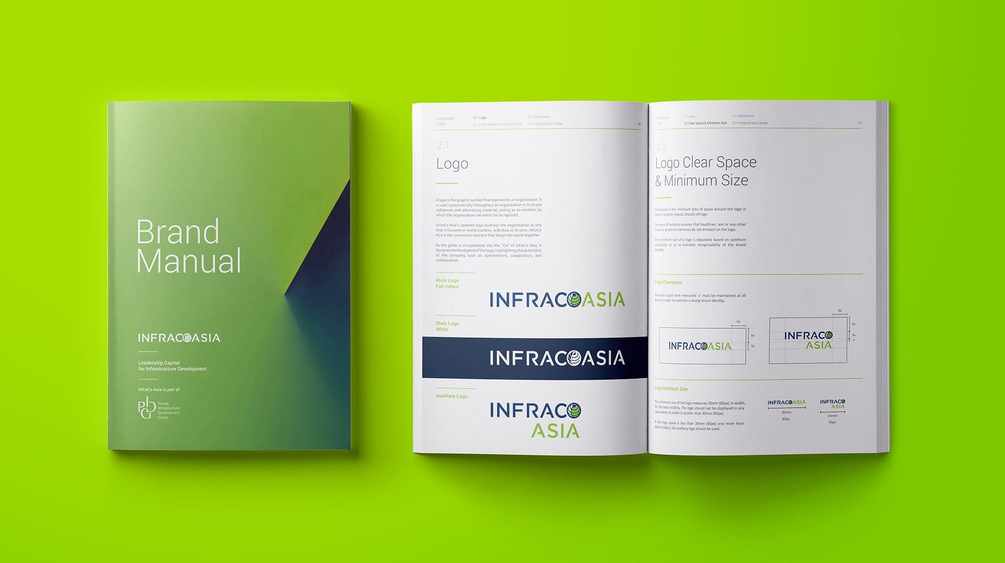
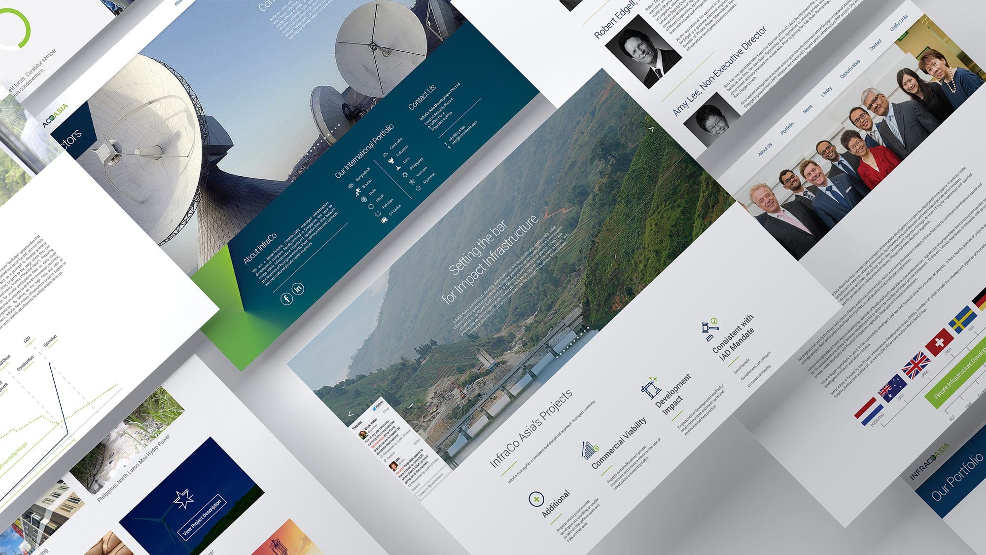
InfraCo Asia is a commercially managed infrastructure development and investment company of the Private Infrastructure Development Group (PIDG). It funds high-risk infrastructure development activities in South and South East Asia by taking an equity stake with a focus on socially responsible and commercially viable infrastructure projects. We developed InfraCo Asia’s new brand identity, touch points and worked with them to implement the entire brand roll out. The logo positions the organisation, InfraCo Asia as one that is focused on world matters, with Asia at it’s core. The globe is incorporated into the “Co” of InfraCo Asia to highlight the brand values of the company.
Positioning an Infrastructure Investor as a Leader in Responsible Development
THE CREATIVE CHALLENGE
A lack of clear brand identity and local-relevance reducing investor trust and visibility
-
InfraCo Asia is a development and investment company focused on early-stage infrastructure projects in South and Southeast Asia but lacked a strong, unified brand identity
-
The absence of a distinctive logo or visual positioning made InfraCo Asia less recognizable and made it harder to communicate its seriousness and credibility
-
Brand touchpoints were inconsistent across countries, reducing clarity for both investors and local stakeholders
-
Without meaningful localization in design, the company risked being seen as generic rather than someone deeply grounded in the markets it serves
THE SOLUTION
Built a brand system that balances global gravitas with local relevance to build trust and clarity
-
Developed a new brand identity around the concept of “Leading Responsibly” to signal both impact and governance
-
Created a logo incorporating a globe within the “Co” in InfraCo Asia, highlighting its focus on Asia and world matters
-
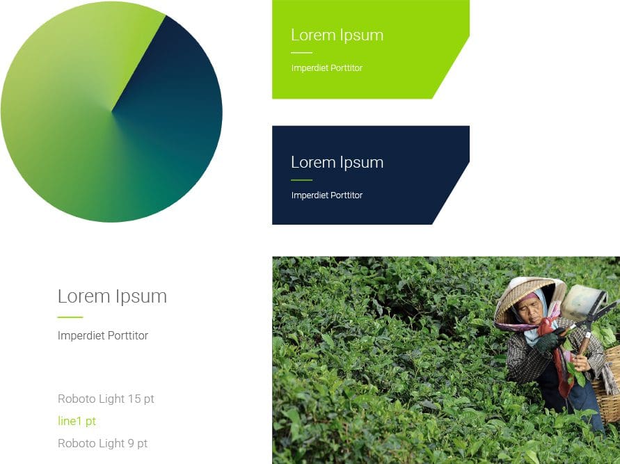
Instituted an upward-moving graphic language at a 60-degree angle to express forward momentum and responsibility
-
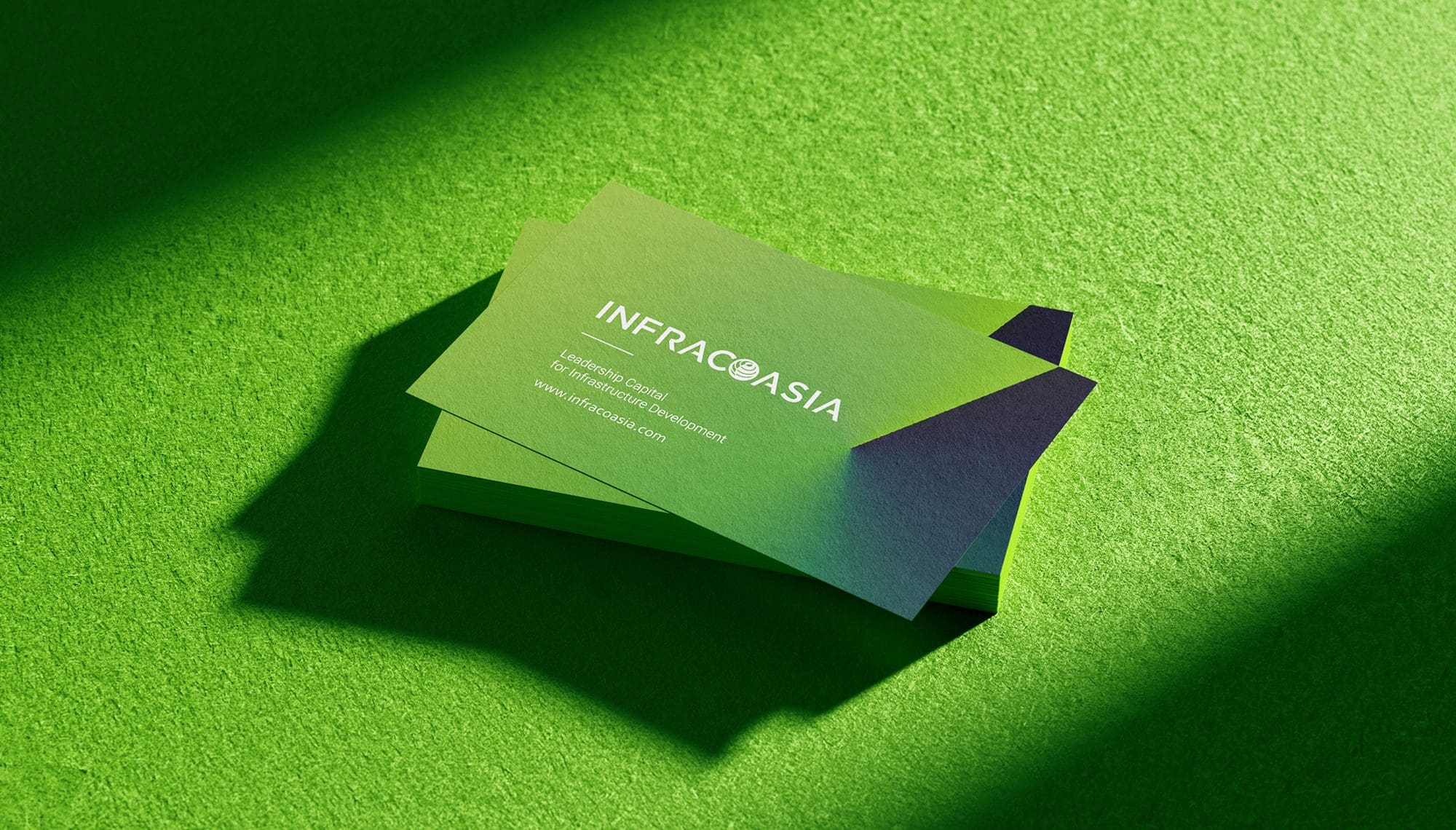
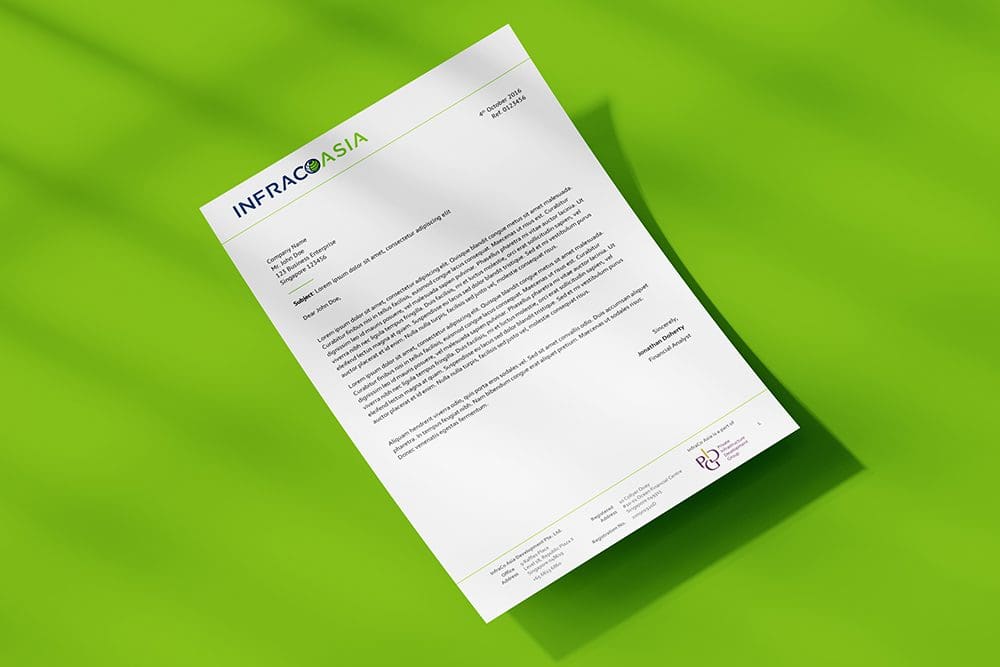
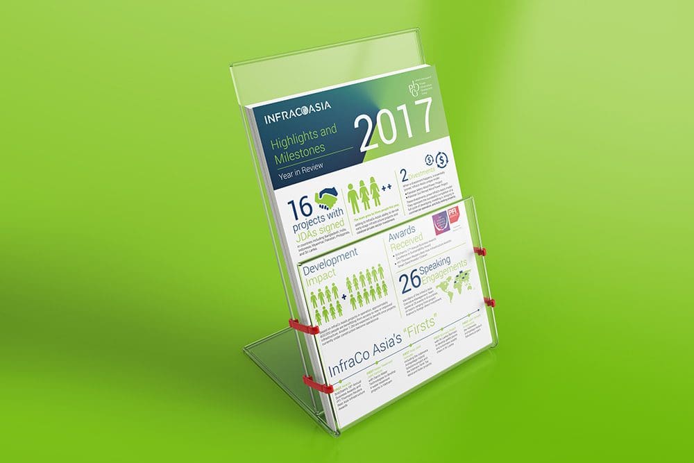
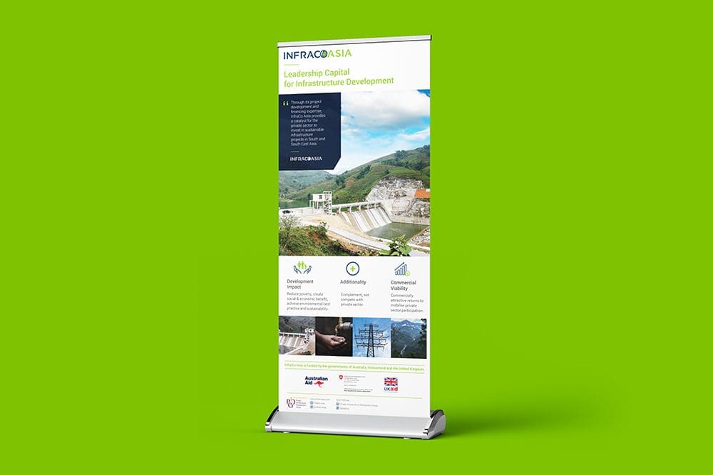
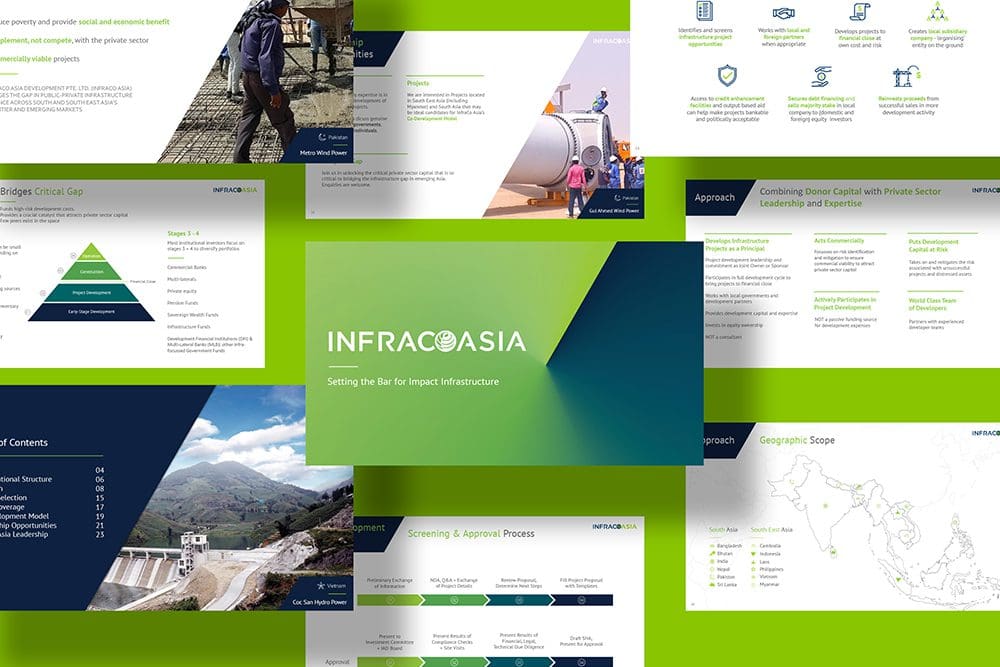
Rolled out the unified identity across all brand touchpoints including stationery, marketing collateral, website, to ensure a coherent message and enhanced experience for investors, partners, and beneficiaries
Brand Identity
Localised Brand Elements
BRAND TOUCH POINTS
Touch points from corporate stationery, physical and digital marketing collateral to website are designed in congruent to the new brand identity to maintain a consistent message and brand experience across the countries and customers they serve. The website is developed to be experiential, informative and responsive to serve as a first point-of-touch for both investors, customers and employees.


“It was always important to us to work with a local Singaporean company, and Creativeans combine international design expertise with regional knowledge and affordability. Their small team have provided an attentive service you perhaps wouldn’t find with a larger company.”


Yulia Saksen
International Brand Consultant and Co-Founder of Creativeans
Your brand might look great. But is it working?
Discover what’s missing in your brand strategy and how a few changes can grow your business.
You want to do a brand revamp? Now what?
We’ll help you understand what’s needed, what works, and how to make your company look great.
Book a Free Brand Consultation with Yulia in 2026
CONTACT US NOW
BRANDSBUILDER.AI
BrandsBuilder.ai streamlines every phase of branding, from strategy and positioning to identity creation and customer experience.
HOVARLAY
HOVARLAY transforms packaging and campaigns into powerful digital touchpoints. No apps. No reprints. No barriers.
Business Enquiry
info@creativeans.comCareer / Internship
collaborate@creativeans.com
Creativeans is an award-winning brand and design consultancy based in Singapore, Milan and Jakarta. We build brands that matter.


 Singapore
  Indonesia
  Italy
Italy